 Google Ads
 Meta Ads
 Email marketing
 Lightspeed eCom Toolkit
 Shopify Toolkit
Your product page,
redesigned.
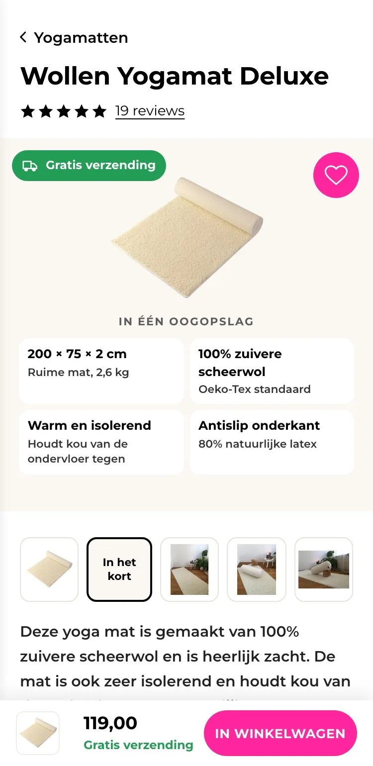
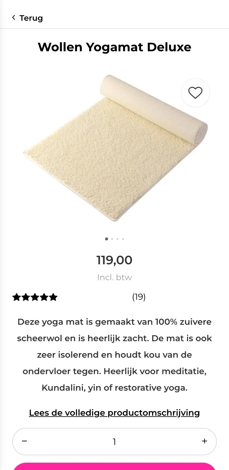
A new design for the product page of yogisha.nl: Wollen Yogamat Deluxe (wool yoga mat). Below you see every screen before and after, and what we improved.
- 15 before-and-afters
- 24 improvements
- yogisha.nl
Every screen, compared.
Pick a screen and drag across the screenshot. On the left you see the current page of yogisha.nl, on the right the new design.
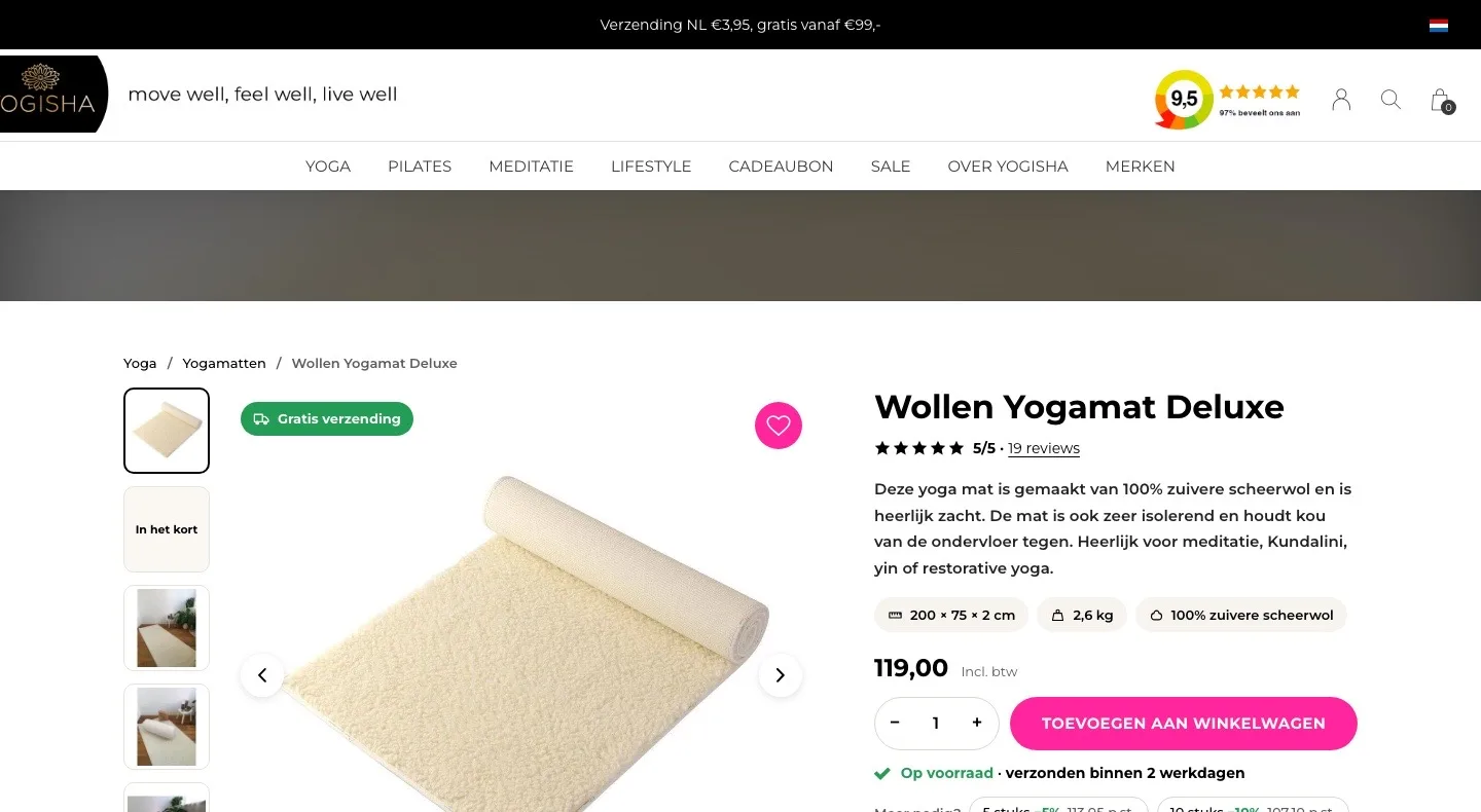
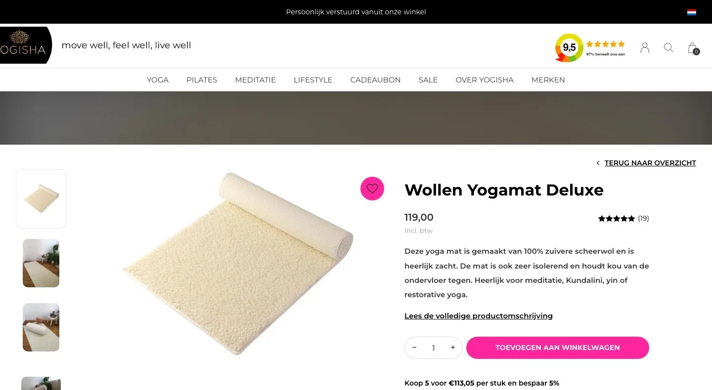
Product page.
The mat, the size and the score at a glance.
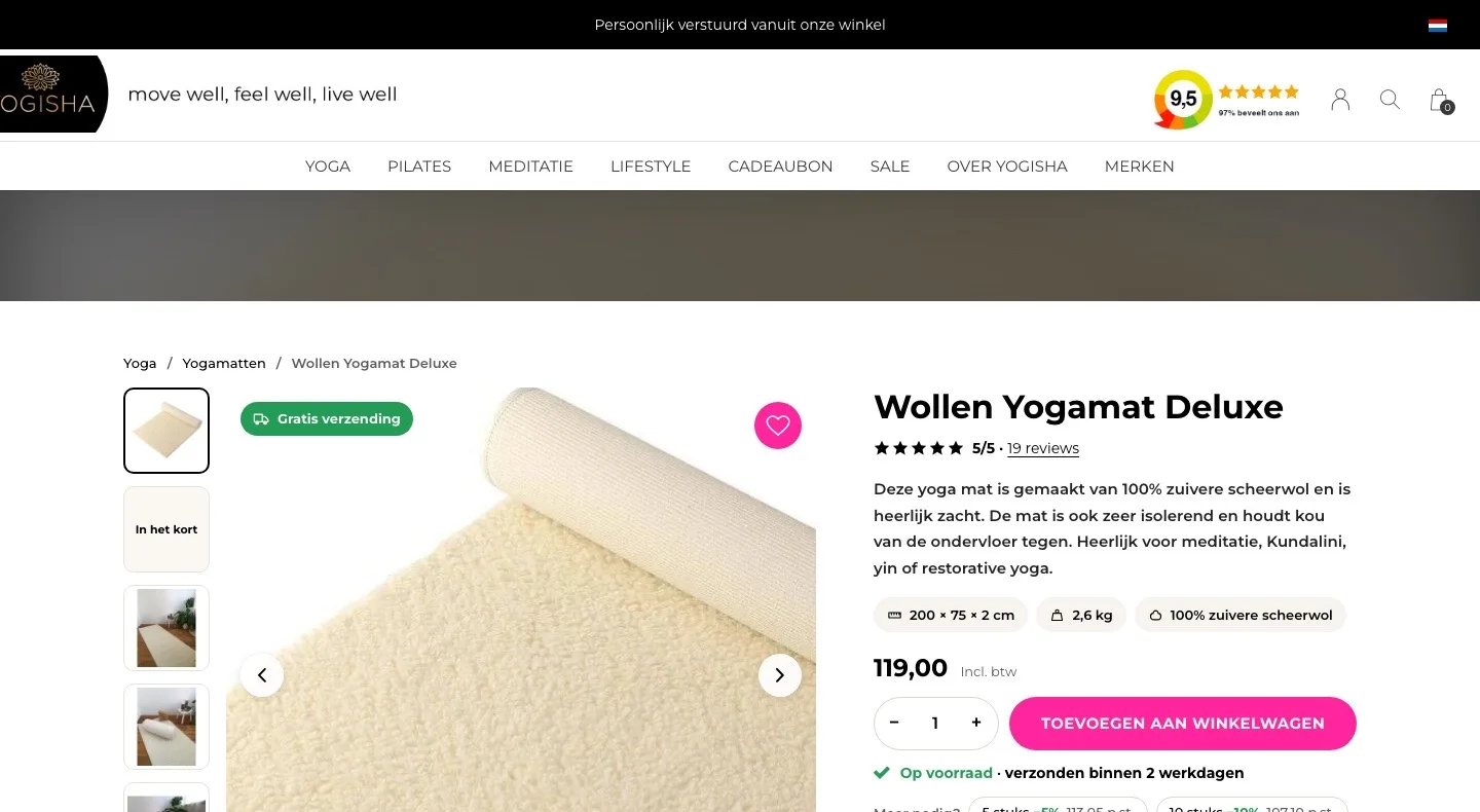
- 01Free shipping in viewFirst you had to do the math yourself with ‘gratis vanaf €99,-’ (free from €99). Now ‘Gratis verzending’ (Free shipping) is on the photo, because this mat costs €119.
- 02Size and material up frontDimensions, weight and material were deep in the description. Now you see 200 × 75 × 2 cm, 2.6 kg and 100% virgin wool right away.
- 03Score by the nameSmall stars on the right with ‘(19)’. Now 5/5 with ‘19 reviews’ sits below the title, one click away from the reviews.
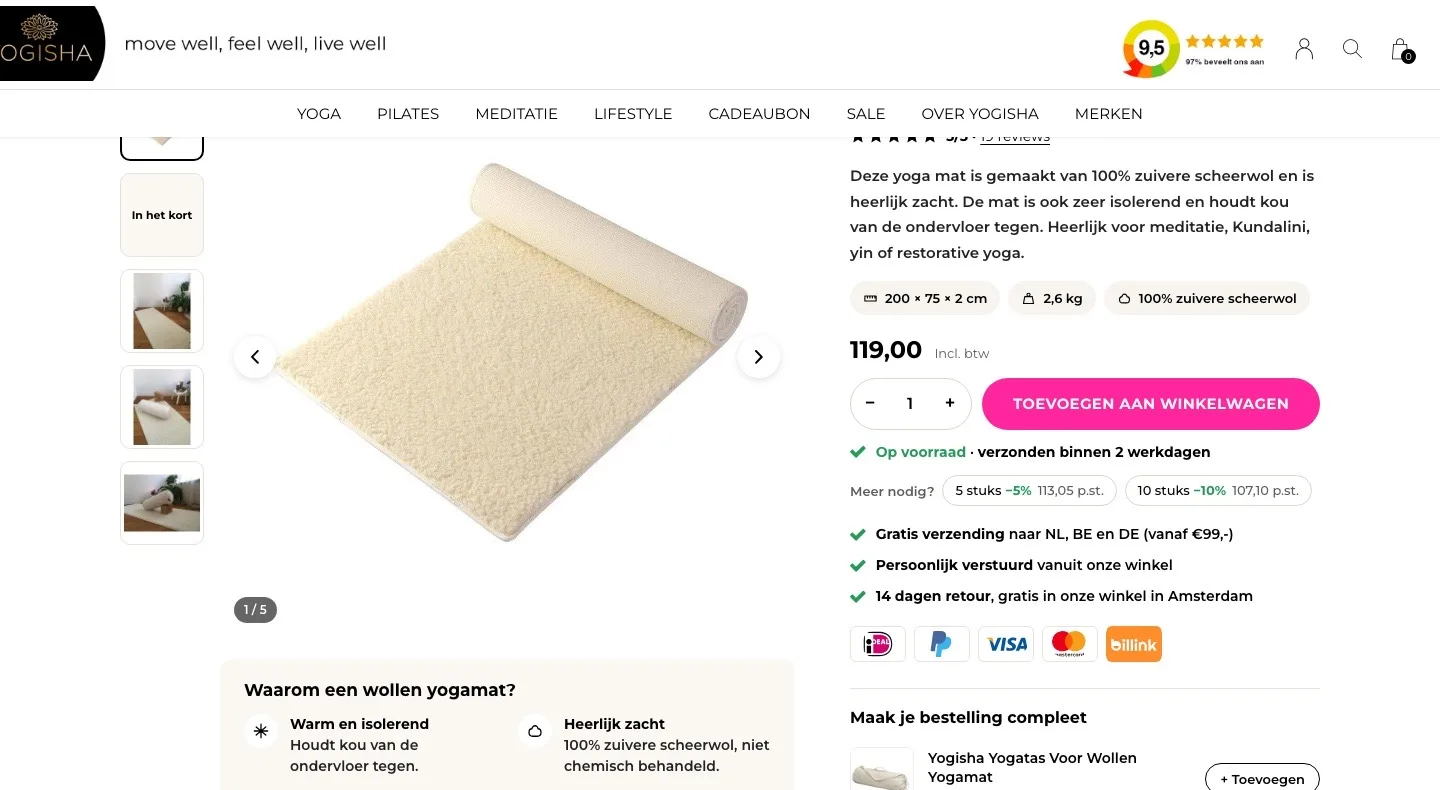
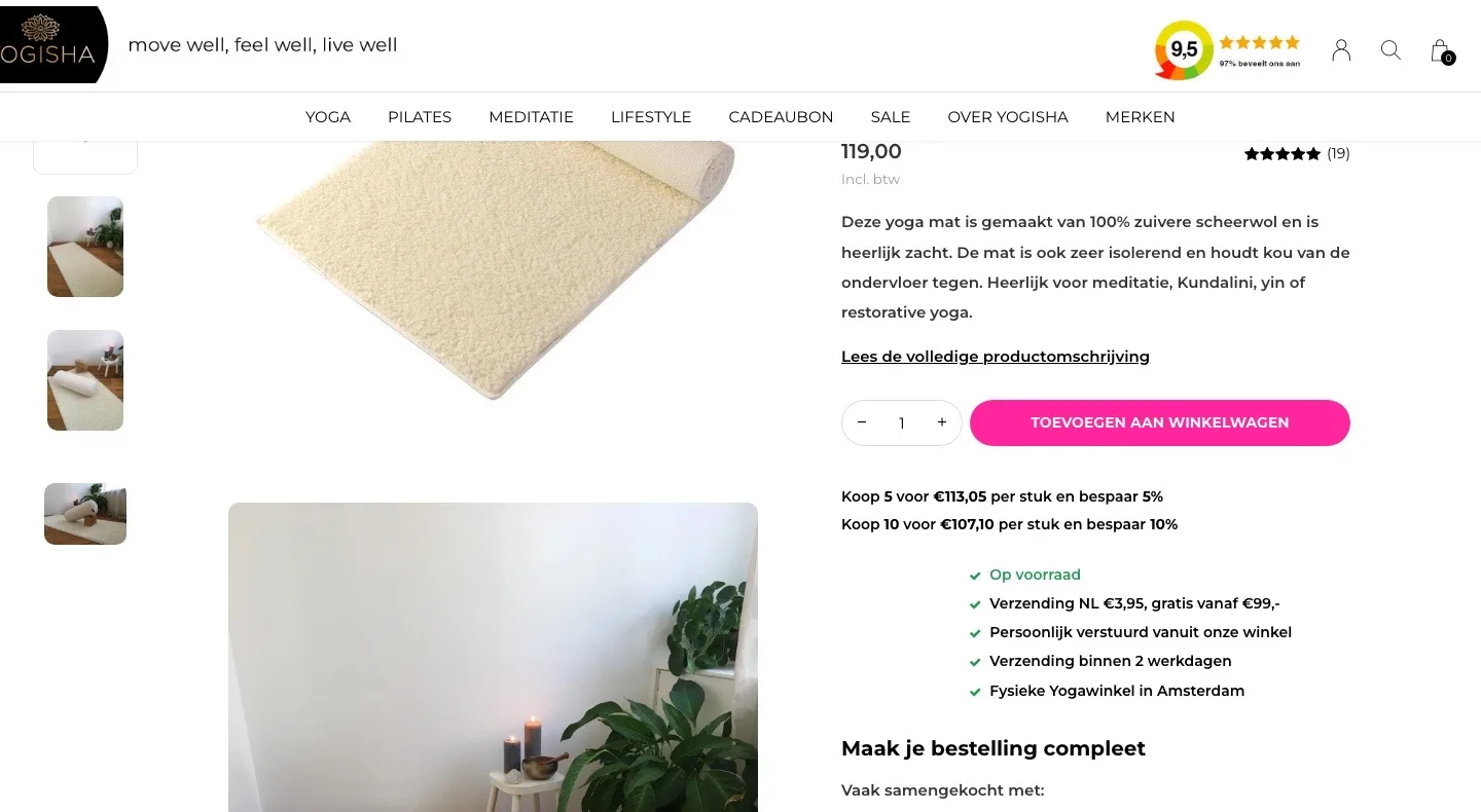
Choosing and buying.
Delivery time, discount and payment right by the button.
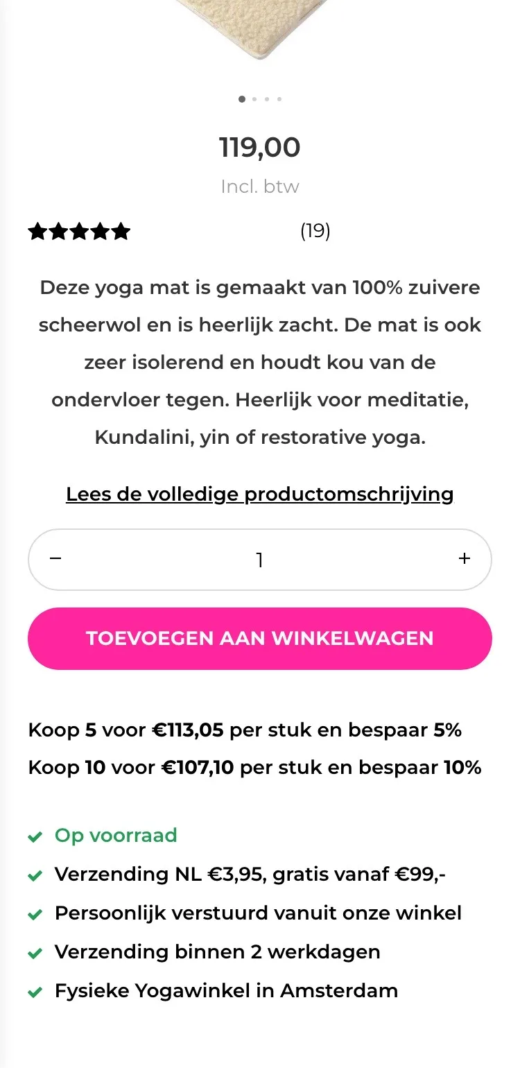
- 01Delivery time below the button‘Op voorraad’ (In stock) sat loose below the volume discount lines. Now you read right below the button: in stock and shipped within 2 working days.
- 02Volume discount you can click‘Koop 5 voor €113,05’ (Buy 5 for €113.05) was just text. Now you click 5 or 10 pieces and immediately see what you save.
- 03Payment and returns visiblePayment methods and returns were not by the button. Now you see the logos and ‘14 dagen retour, gratis in onze winkel’ (14-day returns, free in our store).
Photos.
All photos side by side, and zoom in on the wool.
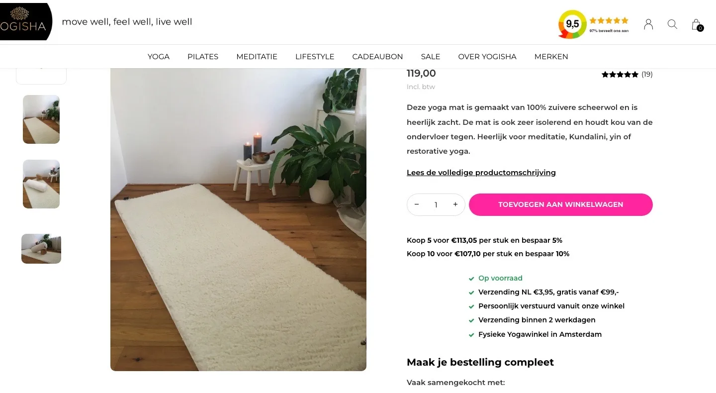
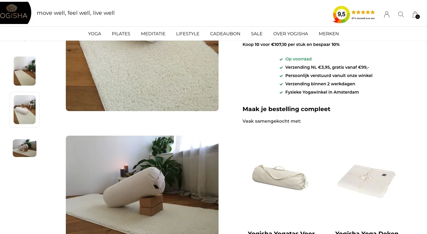
- 01All photos at a glanceFour large photos were stacked one below the other, over 2,000 pixels of scrolling. Now you click through with thumbnails and arrows next to one large photo.
- 02Zoom in on the woolMove your mouse over the photo and you see the wool up close. That way you can almost feel how soft the mat is before you order.
- 03Short path to Yoga mats‘Terug naar overzicht’ (Back to overview) did not say where to. Now ‘Yoga / Yogamatten’ (Yoga / Yoga mats) sits at the top, so comparing is one click away.
Below the photo.
Why wool, what goes with it and where you can feel it.
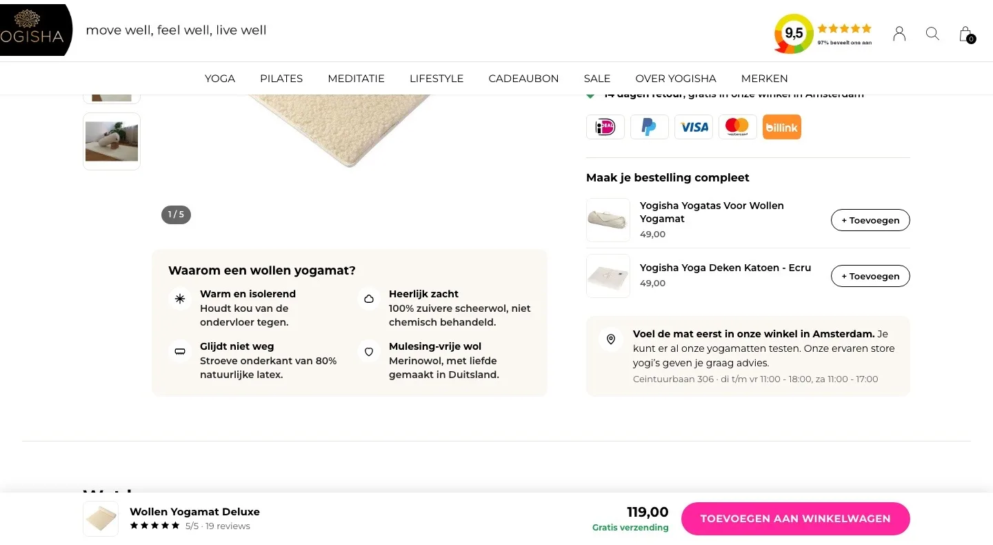
- 01Why a wool yoga mat?The benefits were scattered through a long text. Now warm, soft, non-slip and mulesing-free are lined up below the photo.
- 02Add-ons in one clickThe yoga bag and blanket were large cards without a button. Now you add them in one click with ‘+ Toevoegen’ (+ Add).
- 03Feel it in the store first‘Fysieke Yogawinkel in Amsterdam’ (Physical yoga store in Amsterdam) was a loose line. Now the address, the opening hours and the fact that you can test all mats are shown.
Reviews.
Your 19 five-star reviews higher up the page.
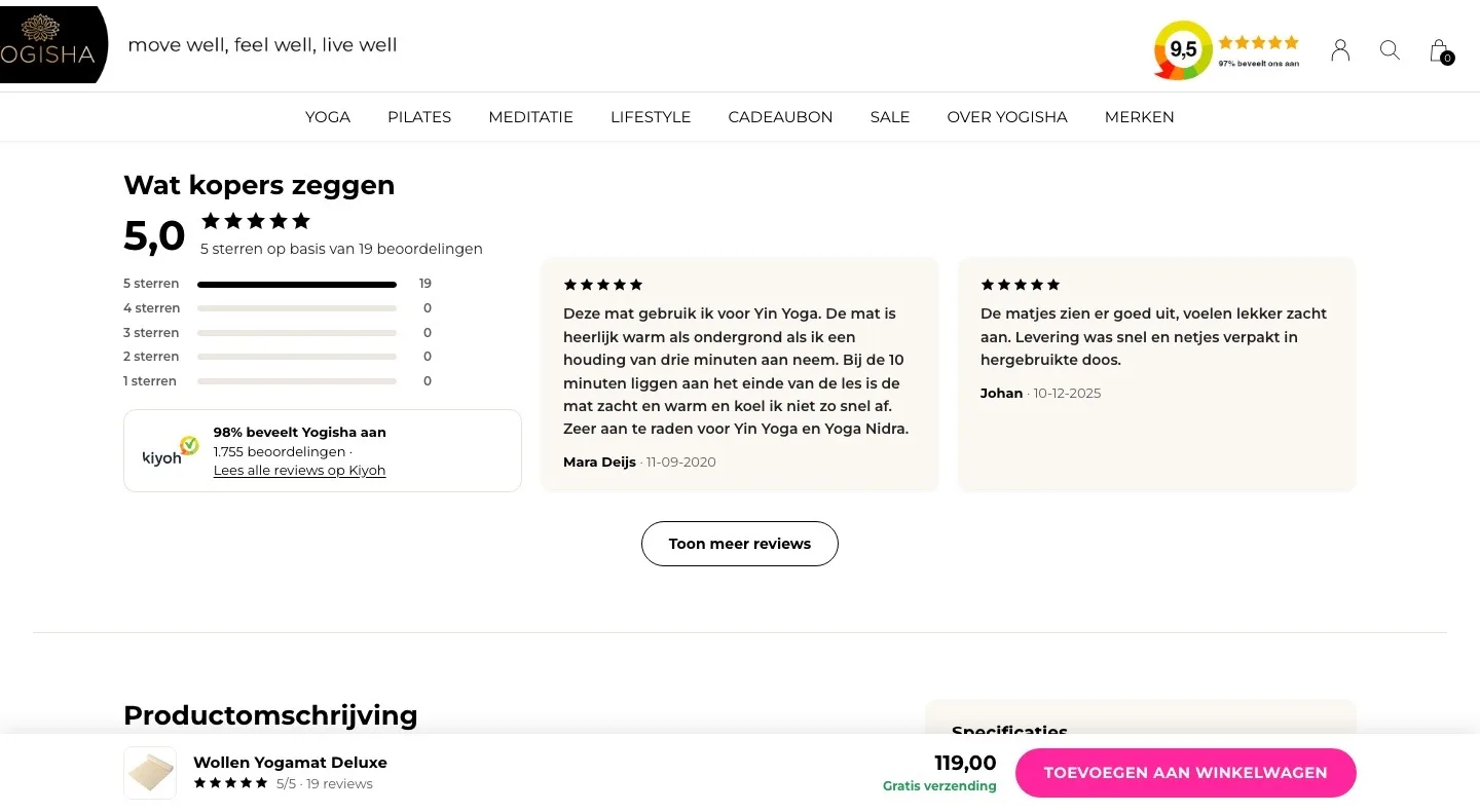
- 01Reviews right after the buy boxThe reviews only came after the entire description. Now they follow right after the buy box, where the doubt is.
- 02Score at a glanceFirst a single line, ‘5 sterren op basis van 19’ (5 stars based on 19). Now you see 5.0 with the breakdown, and that 98% recommend Yogisha on Kiyoh.
- 03Two reviews highlightedTwo short reviews and a link. Now two detailed reviews sit next to the score, and the button opens five more each time.
About the mat.
Description and specifications side by side.
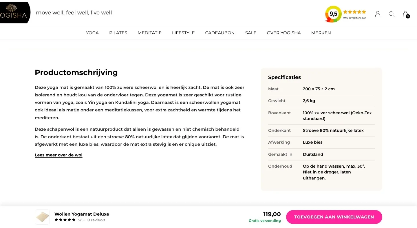
- 01Specifications in a tableSize, weight and material were loose lines in the text. Now you read them in one table next to the description.
- 02Shorter, more on requestThe story about the wool was a long wall of text. Now you read the essentials, and expand ‘Lees meer over de wol’ (Read more about the wool).
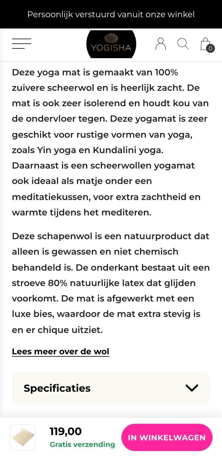
- 03Button always within reachWhile reading, the button was out of view. Now a bar stays at the bottom with photo, price, free shipping and button.
Questions and contact.
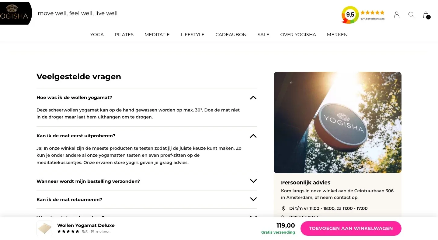
Answers to the questions customers would otherwise email.
- 01Questions on the pageWashing, trying out and returns were only on the FAQ page. Now the answers are on the page itself.
- 02Personal advice close byPhone and email were only in the footer. Now they sit next to the questions, with the store photo and opening hours.
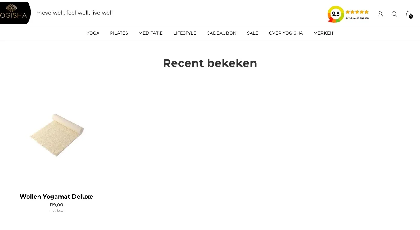
- 03Room for what helps‘Recent bekeken’ (Recently viewed) only showed this mat itself. That space now goes to questions and contact.
Product page.
Name, score and photo in view right away.
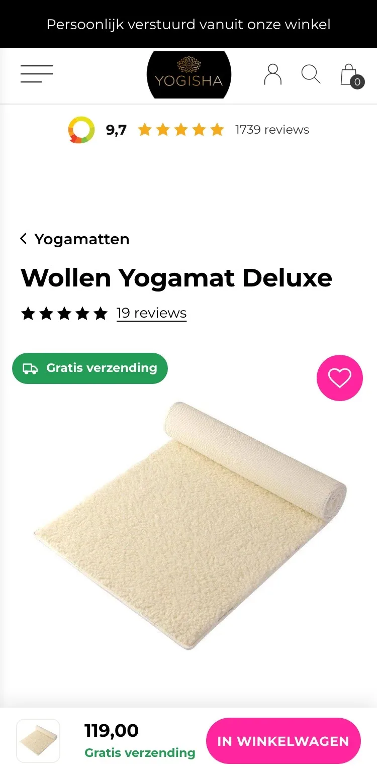
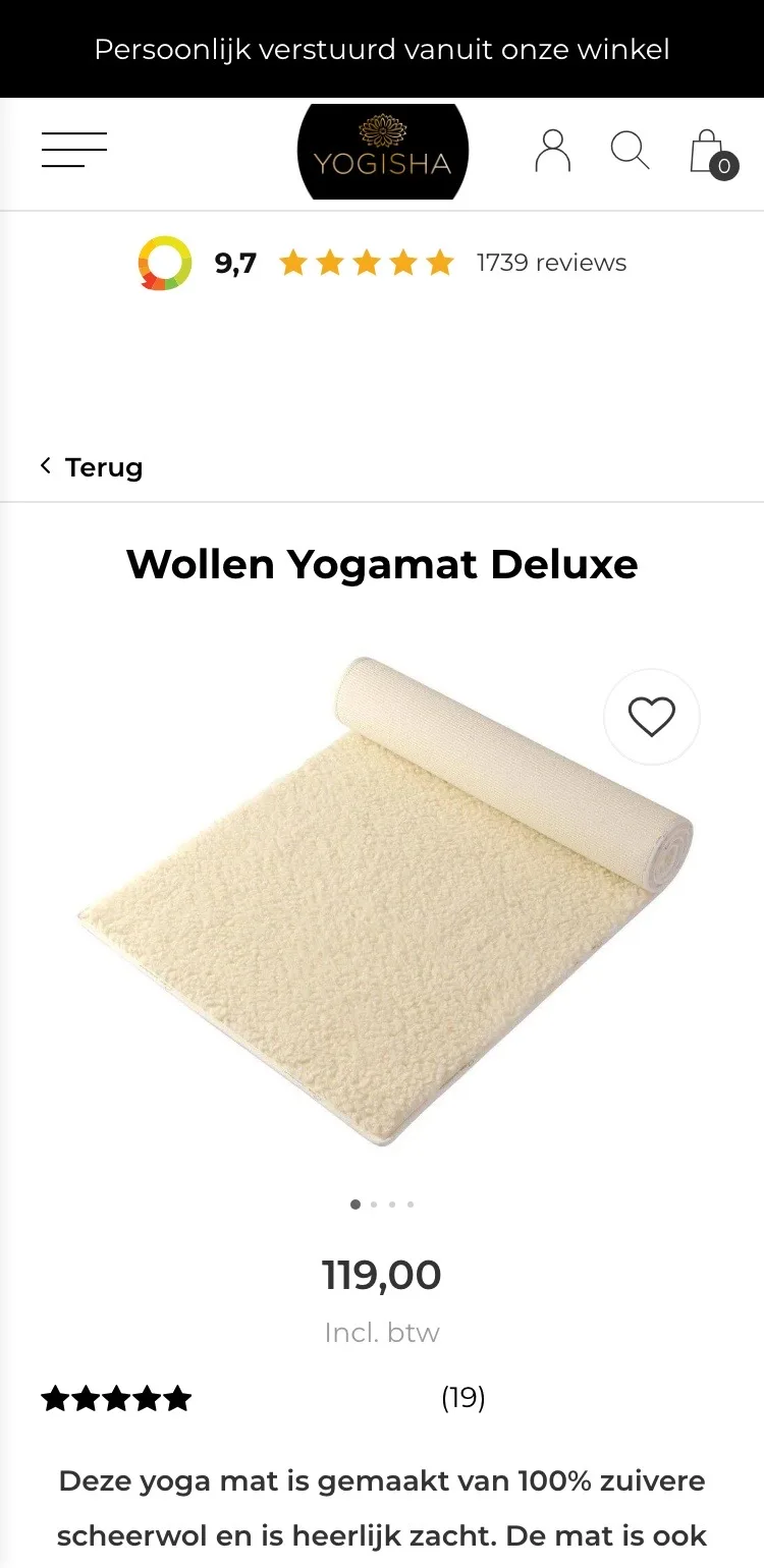
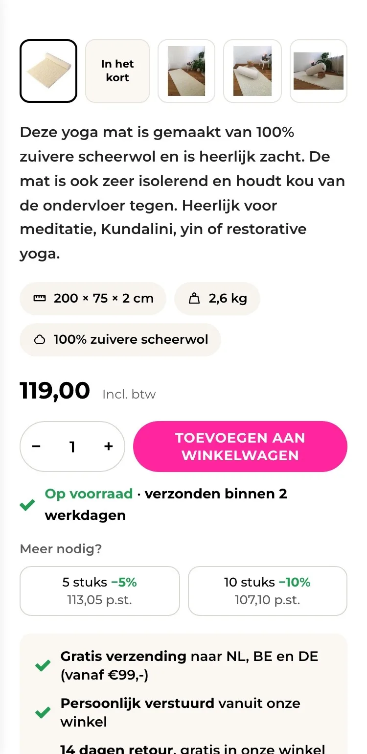
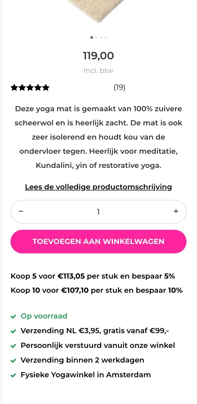
- 01Back to Yoga mats‘Terug’ (Back) did not say where to. Now ‘‹ Yogamatten’ (‹ Yoga mats) takes you to all yoga mats in one tap to compare.
- 02Score below the nameThe stars only appeared below the photo and the price. Now they sit with ‘19 reviews’ right below the title.
- 03Free shipping on the photoFirst you had to do the math yourself with ‘gratis vanaf €99,-’ (free from €99). Now ‘Gratis verzending’ (Free shipping) is right on the photo.
Choosing and buying.
Key figures, price and button together.
- 01Size and material up frontSize and weight were in the text, far below the button. Now they are three short labels above the price.
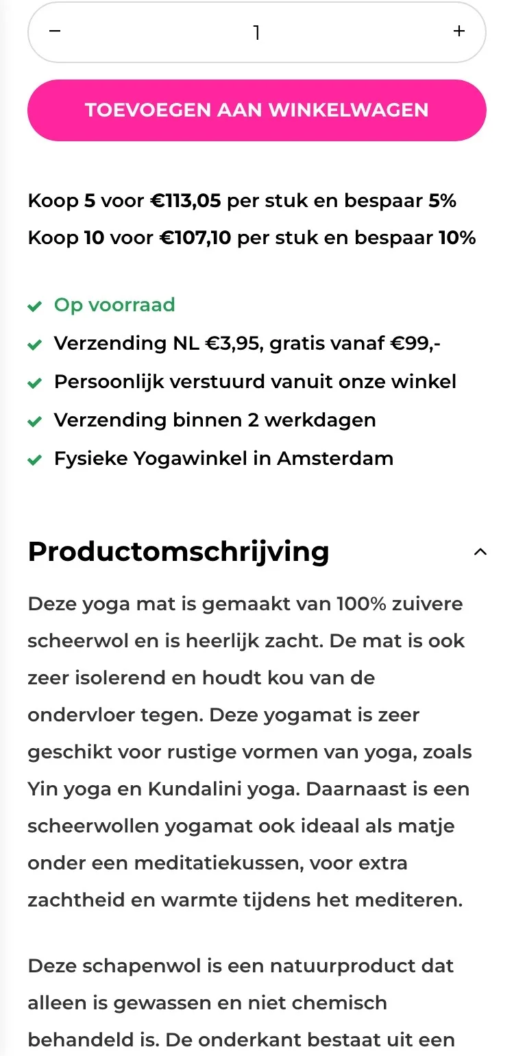
- 02Delivery time below the button‘Op voorraad’ (In stock) sat below the volume discount lines. Now you read right below the button that the mat ships within 2 working days.
- 03Volume discount you can tap‘Koop 5 voor €113,05’ (Buy 5 for €113.05) was just text. Now you tap 5 or 10 pieces, with the price per piece shown.
Guarantees and extras.
What you can count on, and what goes with it.
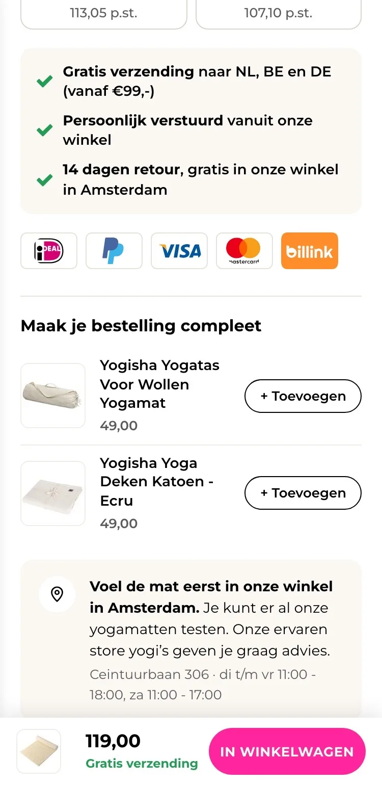
- 01Benefits in a calm panelFive loose lines below the volume discount. Now shipping, personally sent and 14-day returns sit together in one panel.
- 02Payment logos by the buttonHow you could pay was not on the page. Now you see iDEAL, PayPal, Visa, Mastercard and Billink.
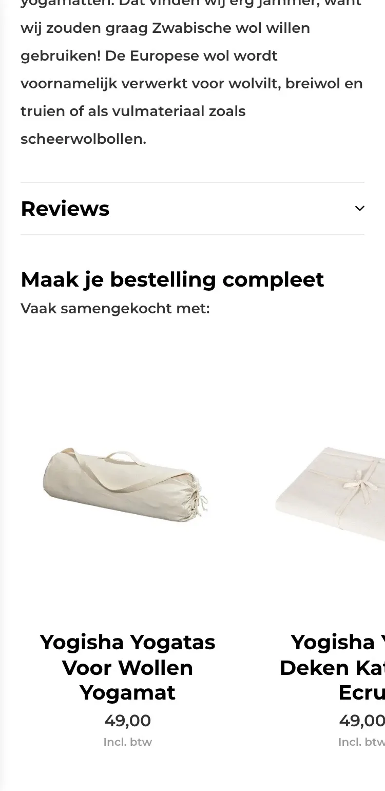
- 03Add-ons in one tapThe yoga bag and blanket only came after the reviews. Now they sit right below the button, with ‘+ Toevoegen’ (+ Add).
Photos.
Swiping with thumbnails, and an image with the essentials.
- 01Thumbnails instead of dotsFour dots below the photo. Now you see all photos as small images and tap straight to the one you want.
- 02At a glanceThe second image lines up size, wool, warmth and non-slip, even for those who read nothing else.
- 03Button always within reachIf you scrolled further, you had to go back to the button. Now a bar with price, free shipping and button always stays at the bottom.
Reviews.
Open, and high up the page.
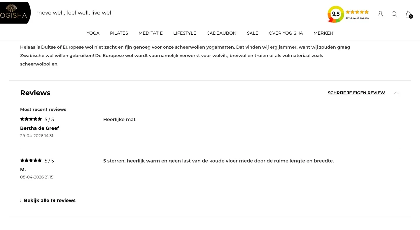
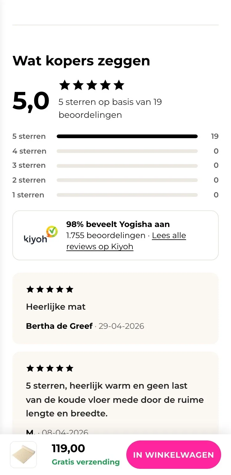
- 01Reviews open and higherThe reviews were in a collapsed block, below the entire description. Now they are open, right after the buy box.
- 025.0 with the breakdownYou see at a glance that all 19 ratings are five stars, without opening anything.
- 03Kiyoh includedNext to the product reviews you see that 98% recommend Yogisha, from 1,755 ratings on Kiyoh.
About the mat.
Quick to read, and the menu comes back.
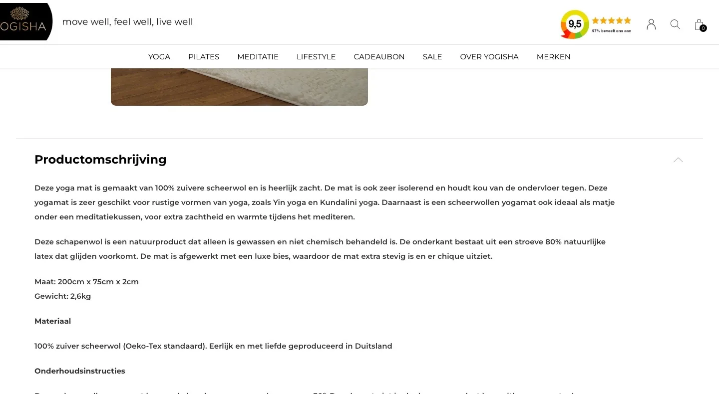
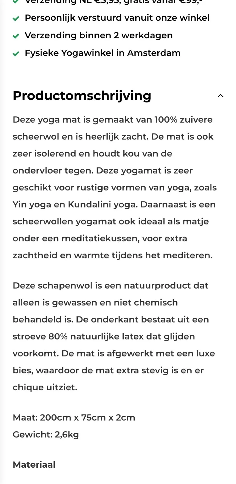
- 01Specifications collapsedThe description ran on into size, material and care. Now you read the text first and expand the specifications.
- 02Read more about the woolThe whole story about the wool was written out. Now you only read it if you want to know more.
- 03Menu back when scrolling upThe menu disappeared when scrolling and never came back. Now it returns as soon as you scroll up a little.
Questions and contact.
Answers to the questions customers would otherwise email.
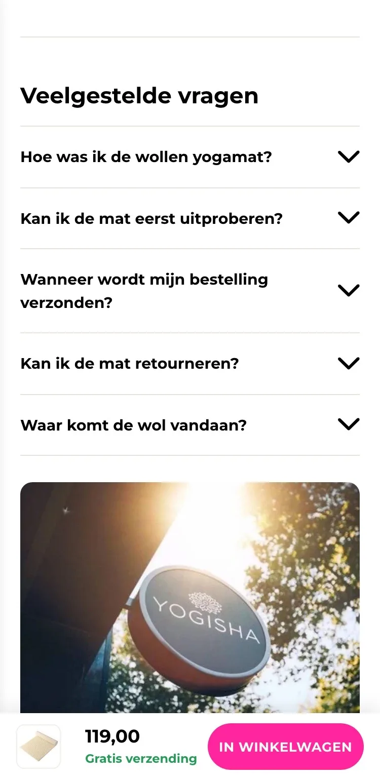
- 01Questions on the pageWashing, trying out and returns were only on the FAQ page. Now you tap the answers open right here.
- 02Personal advice close byPhone and email were only in the footer. Now they sit below the questions, with the store photo and opening hours.
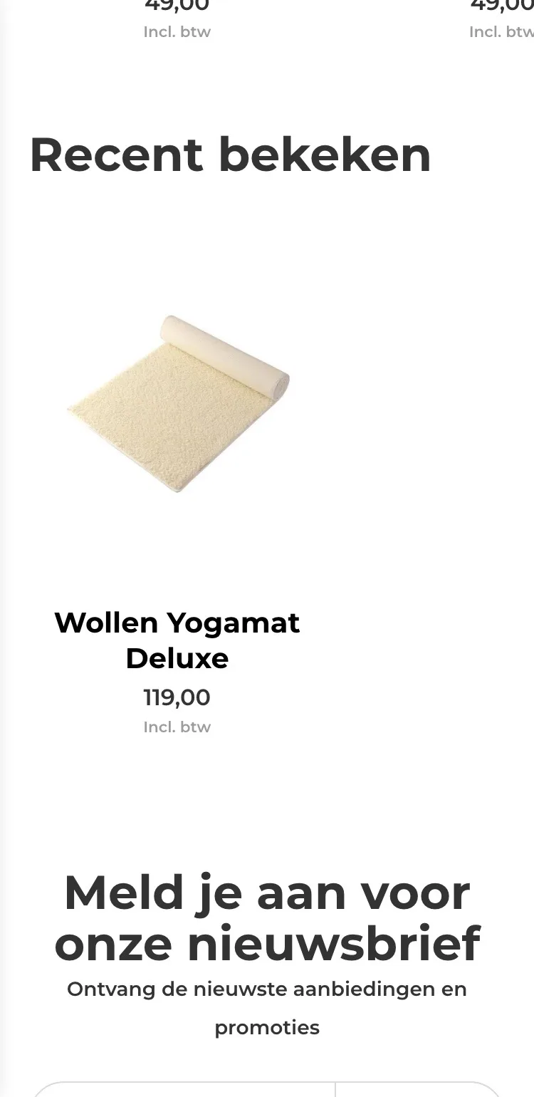
- 03Room for what helps‘Recent bekeken’ (Recently viewed) only showed this mat itself. That space now goes to questions and contact.
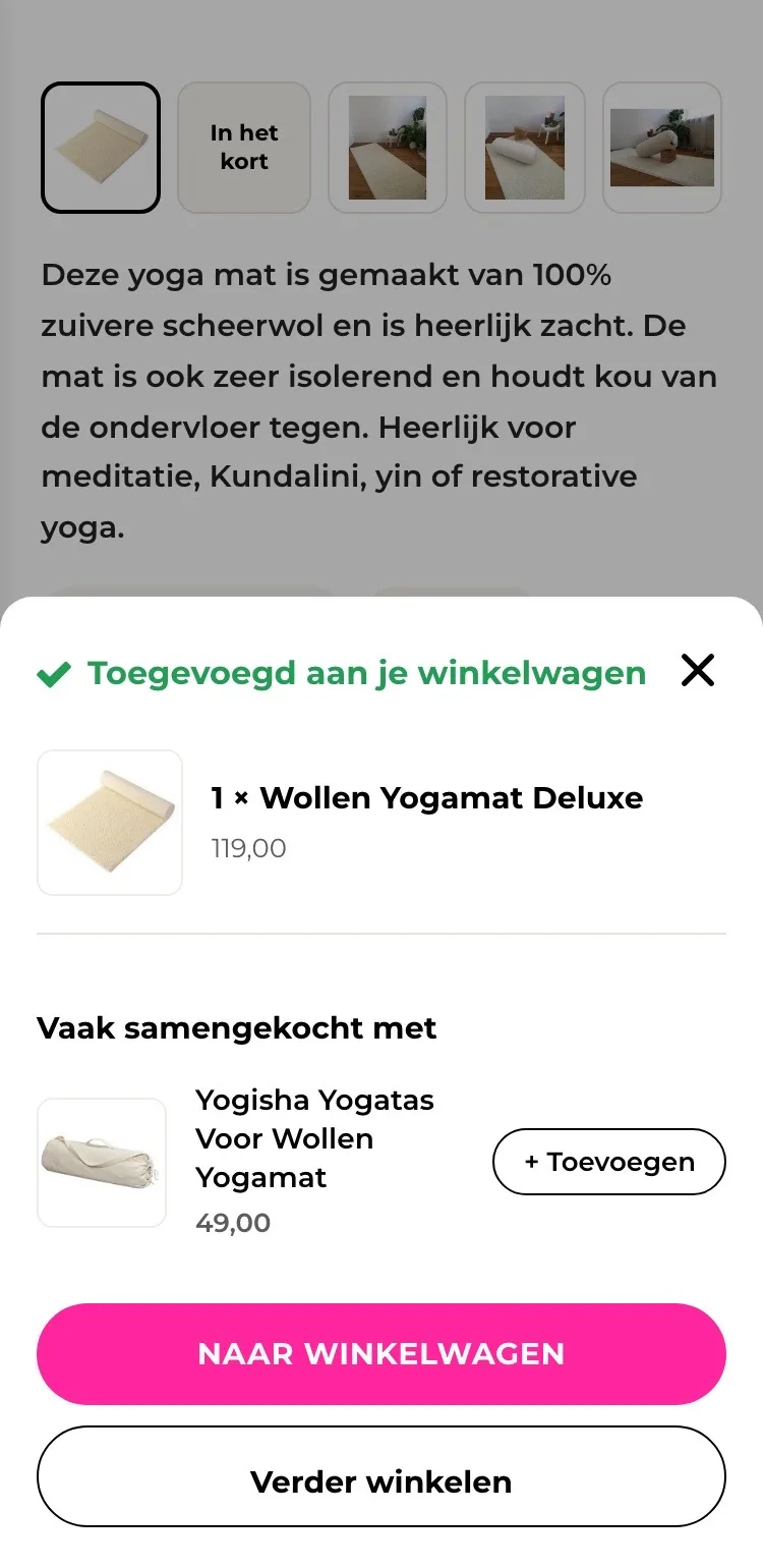
After adding to cart.
See right away that it worked.
- 01Confirmation in viewAfter adding, you immediately see your product and quantity in a panel at the bottom, and you simply stay on the page.
- 02Add the yoga bagThe yoga bag for this mat is shown in the confirmation. With ‘+ Toevoegen’ (+ Add) you add it straight away.
- 03Two clear buttons‘Naar winkelwagen’ (To cart) and ‘Verder winkelen’ (Continue shopping) sit one below the other, so you choose what to do.
Click through the new design yourself.
The design works like a real page, on desktop and on your phone. You just can’t place an order with it yet.
From design to more orders.
This is how we take the new design live, and measure what it delivers.
- 01Only the pageHeader, menu, USP bar and footer stay exactly as they are now. We only change the content of the product page.
- 02Test first, then go liveWe run the new design in an A/B test next to the current page and measure orders per visitor.
- 03Your own strengthsYour own photos, visuals, reviews and tone of voice: it all came from you already, just in a better place.
This design live
on your online store?
With the AI Design Agent, we put this design on your existing online store, and then keep improving it every month with CRO. Built by our specialists. Without spending thousands of euros a month on it.
- No rebuild, no migration
- Your back office stays the way you know it
- Only goes live after your approval
- 01Ongoing development for a fixed monthly feeNo separate quotes for every change. If we see an opportunity or you have an idea, we build it.
- 02CRO improvements, implemented right awayWe analyze your online store and implement improvements in days instead of months.
- 03Safe, and you see what changesWe build and test everything in a preview first. It only goes live after your approval, and every version is saved.