 Google Ads
 Meta Ads
 Email marketing
 Lightspeed eCom Toolkit
 Shopify Toolkit
Your product page,
redesigned.
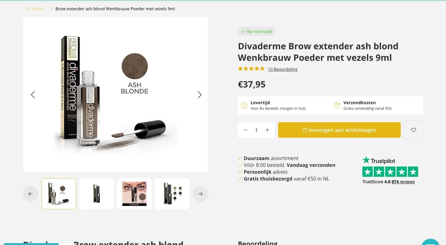
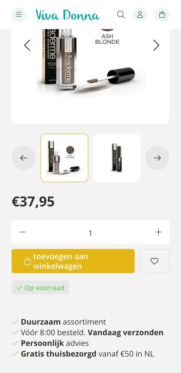
A new design for the product page of vivadonna.nl: Divaderme Brow Extender Ash Blond (eyebrow powder with fibers, 9 ml). Below you see every screen before and after, and what we improved.
- 13 before-and-afters
- 18 improvements
- vivadonna.nl
Every screen, compared.
Pick a screen and drag across the screenshot. On the left you see the current page of vivadonna.nl, on the right the new design.
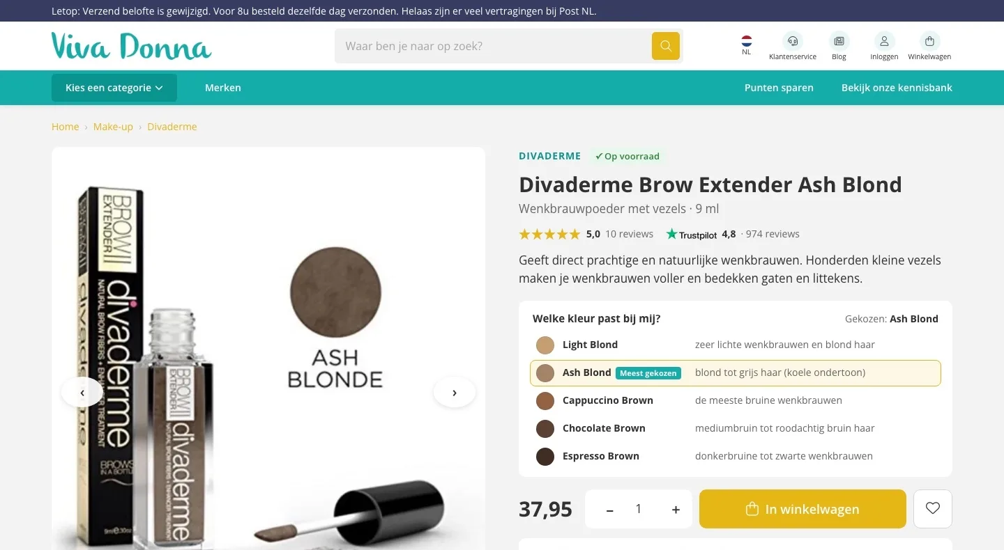
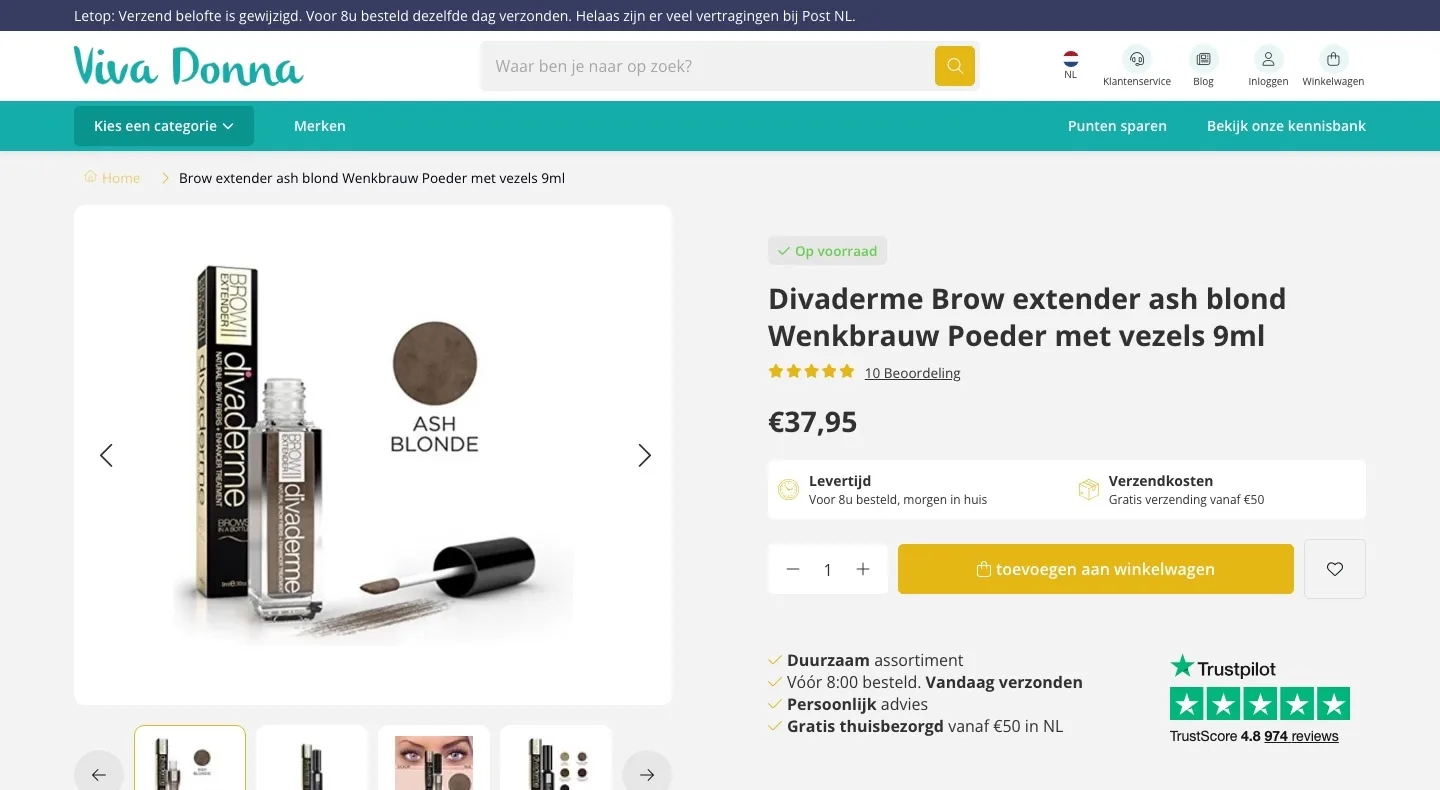
Product page.
Color, score and button at a glance, above the fold.
- 01All colors with adviceOnly Ash Blond was shown here. Now you choose from all five colors, each with the hair it suits. That way you pick the wrong color less often.
- 02Score right by the nameThere were five stars and ‘10 Beoordeling’ (10 Rating). Now you see the 5.0 from the reviews and the Trustpilot score of 4.8 right next to the title.
- 03Price, quantity and button in one rowDelivery time and shipping costs sat between price and button. Now price, quantity and ‘In winkelwagen’ (Add to cart) are together, with delivery below.
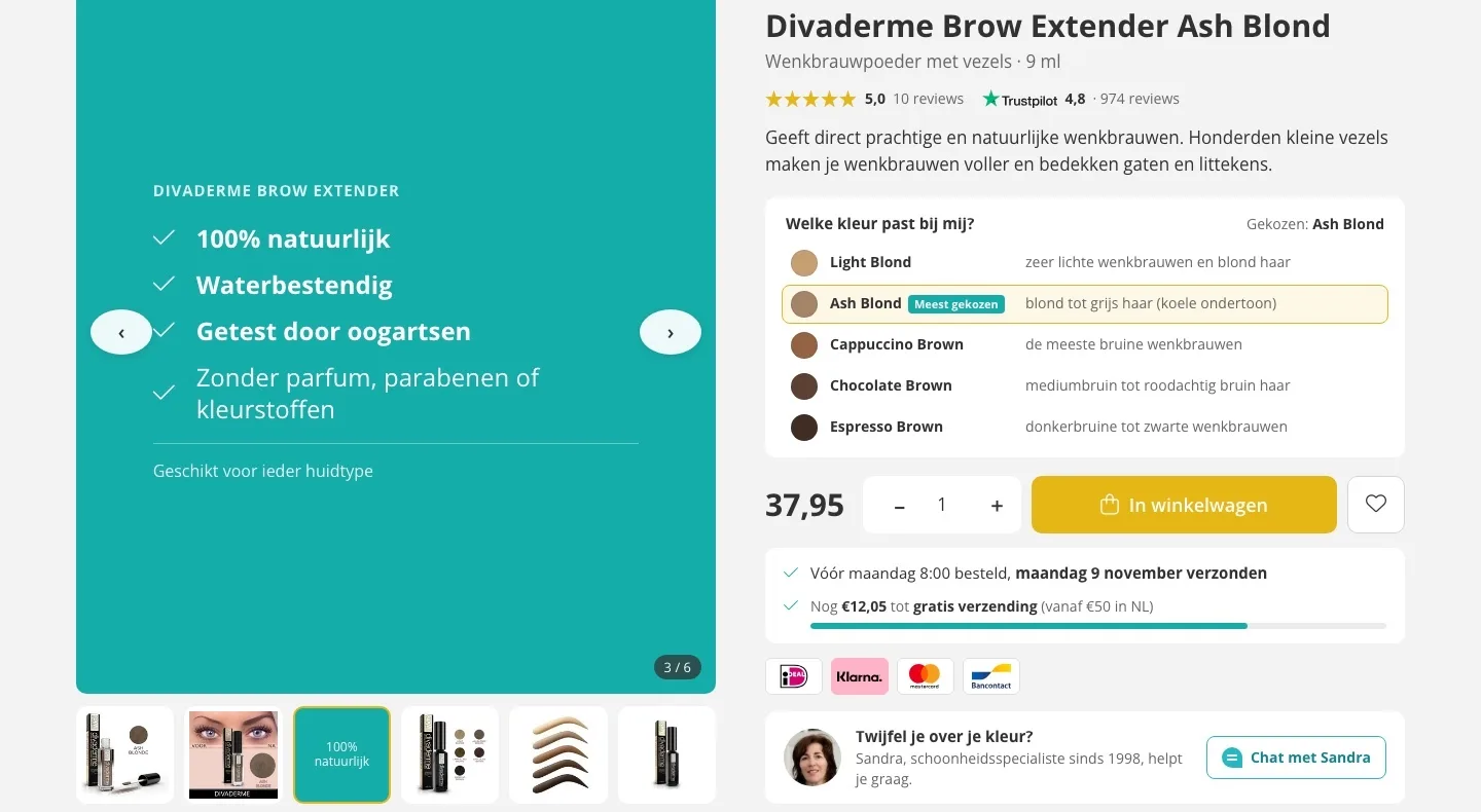
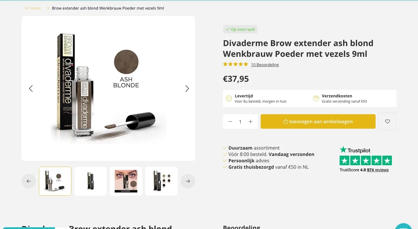
The photos.
All images in view, with the product’s promise alongside.
- 01All photos in one rowFour small images fit below the photo, the rest were behind arrows. Now all six images sit in a row below a larger photo.
- 02The benefits as an imageAmong the photos there is now an image with ‘100% natuurlijk’ (100% natural), ‘Waterbestendig’ (Water-resistant) and ‘Getest door oogartsen’ (Tested by ophthalmologists), where you are looking anyway.
- 03Zoom in on the fibersMove over the photo and it zooms in. That way you see the color and the bottle up close, just like in a store.
Reviews.
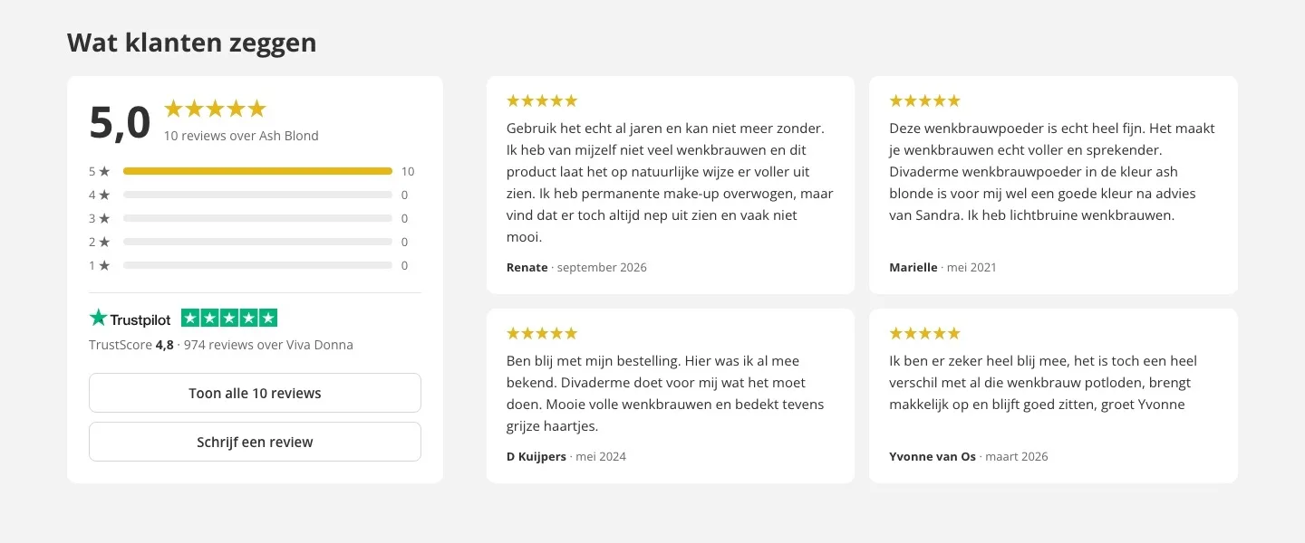
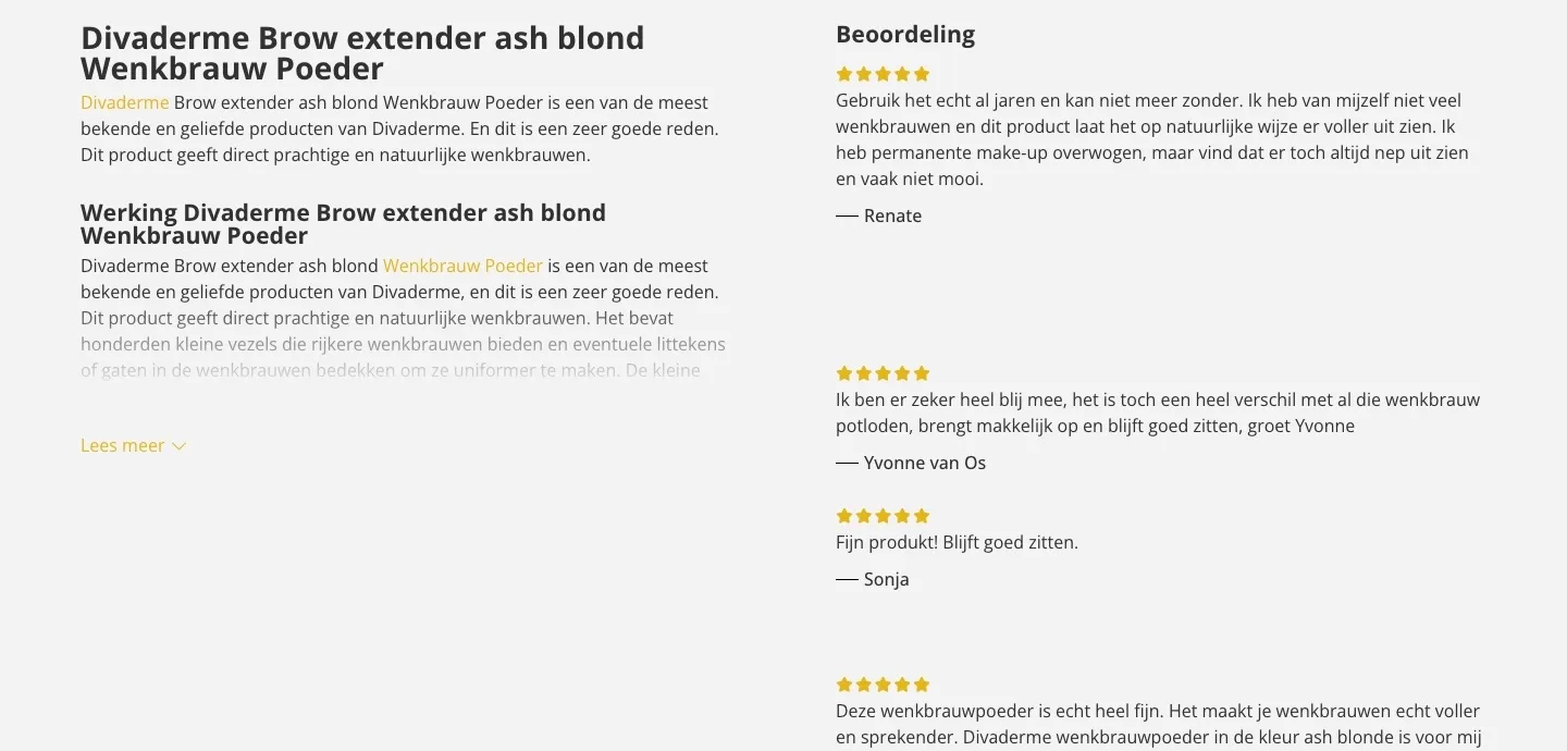
Ten times five stars, neatly together.
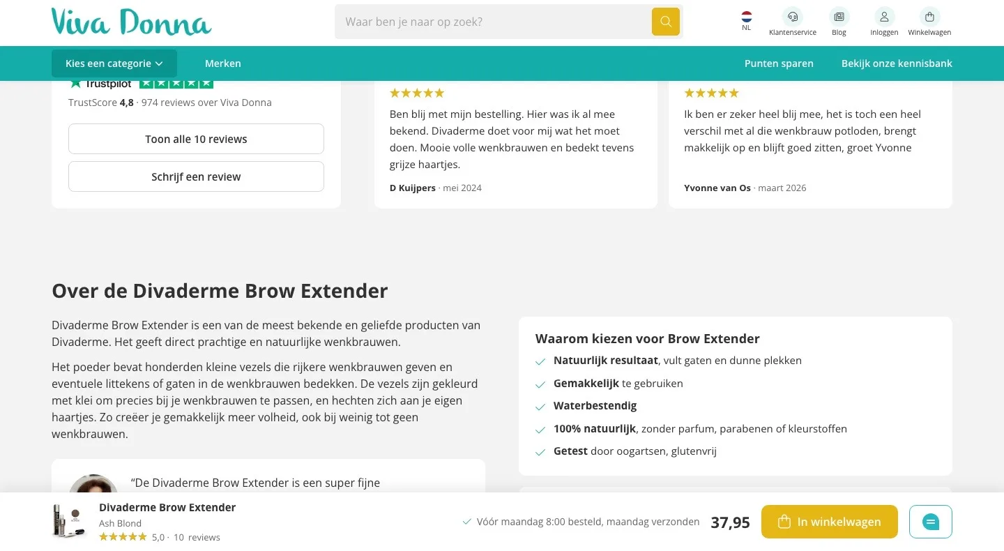
- 01The score at a glanceLoose reviews with big white gaps and three pages. Now you first see the 5.0 with the breakdown per star.
- 02Readable cardsThe reviews sit in equal cards with name and date. The rest opens with one click, without paging through.
- 03Trustpilot includedBelow the product reviews is your store’s Trustpilot score: 4.8 from 974 reviews.
About the product.
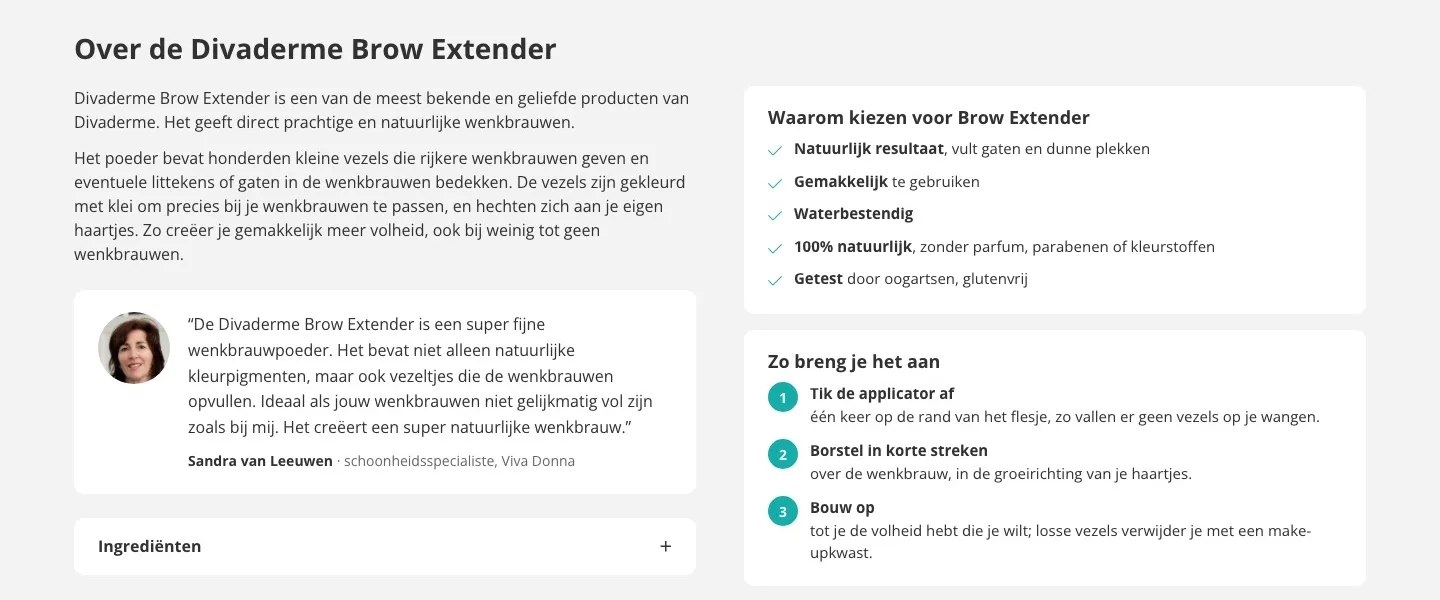
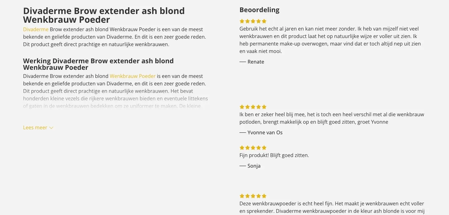
What you want to know, without clicking ‘Lees meer’ (Read more).
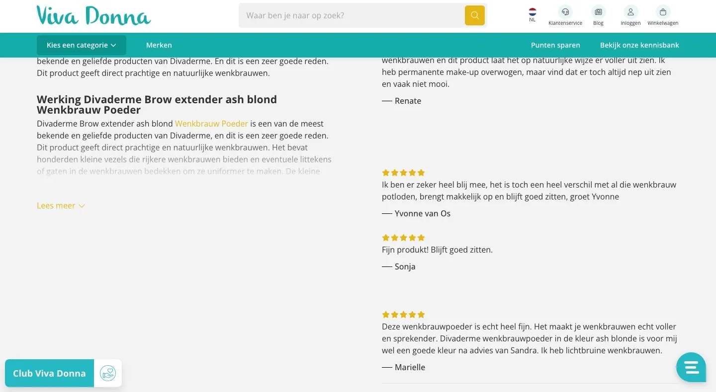
- 01Text no longer half hiddenThe description faded out after a few lines. Now the essentials are in two short paragraphs, without ‘Lees meer’ (Read more).
- 02Sandra’s experience in viewHer own experience was buried deep in the text. Now it is a quote with her photo: personal advice, visible.
- 03Benefits and steps as a list‘100% natuurlijk’ (100% natural), ‘waterbestendig’ (water-resistant) and the three steps to apply it are now in two calm blocks.
Frequently asked questions.
Answers to the questions you get most often.
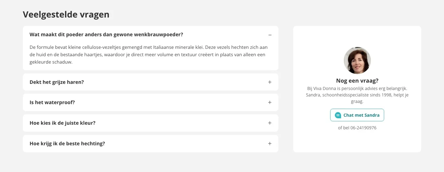
- 01Frequently asked questions on the pageThe questions were in a blog post, via a link in the hidden text. Now you read the answers right below the product.
- 02Chat with SandraNext to the questions is Sandra, with a button to the chat you already use, and the phone number.
- 03One question open, the rest closedThe first question is open, so you see how it works. The rest open with one click and the page stays short.
While scrolling.
The button stays within reach while you read.
- 01Sticky buy barWhile reading, there was no button in view. Now the bottom always shows the photo, the color, the price and the button.
- 02Shipping day in the barWhen your order ships stays visible while you read the reviews and the explanation.
- 03Chat in the barThe chat button and the Club button floated over the text. As soon as the bar appears, the chat sits inside it and everything stays readable.
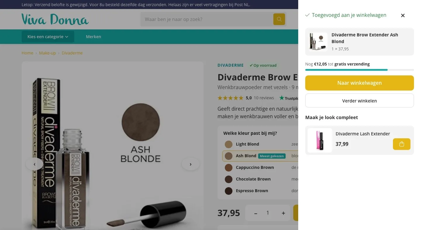
After adding to cart.
A clear next step, and a reason to add something.
- 01Confirmation with your colorAfter adding, you immediately see which color and how many are in your cart, without leaving the page.
- 02€12.05 to go for free shippingAt €37.95 you just miss the €50 threshold. The bar shows how much is still missing.
- 03The Lash Extender in one clickAdd it and your order ships for free. That makes buying more a logical step.
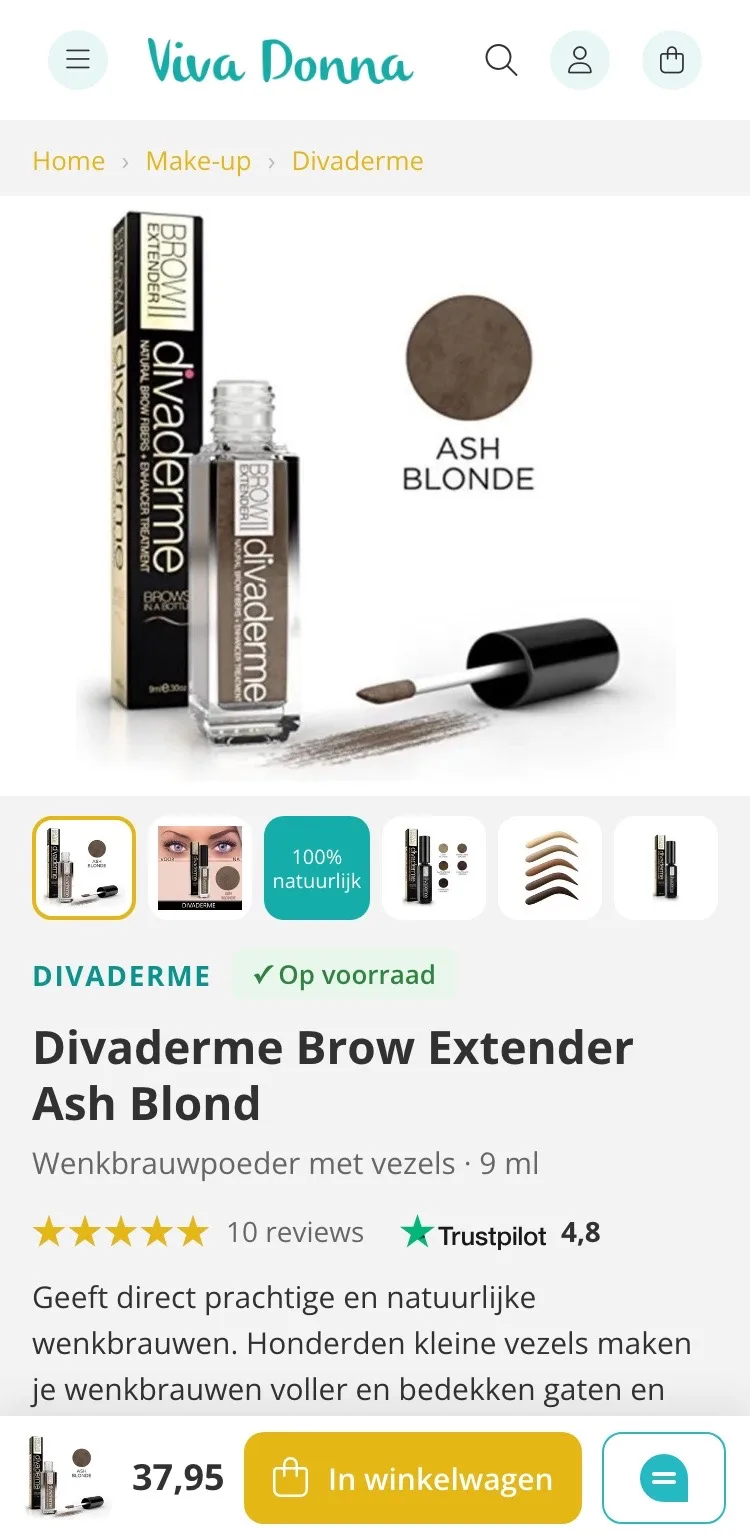
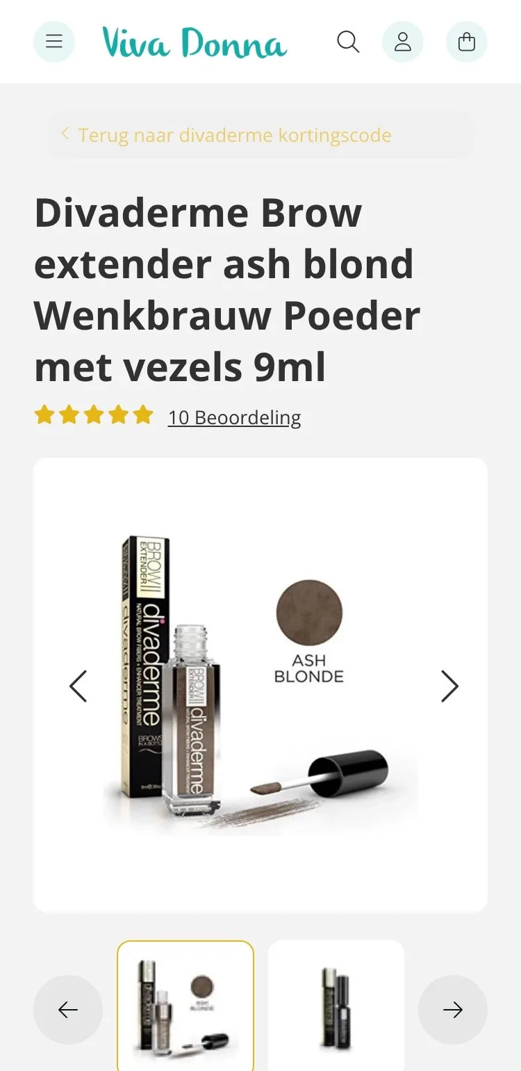
Product page.
On mobile, everything you need on the first screen.
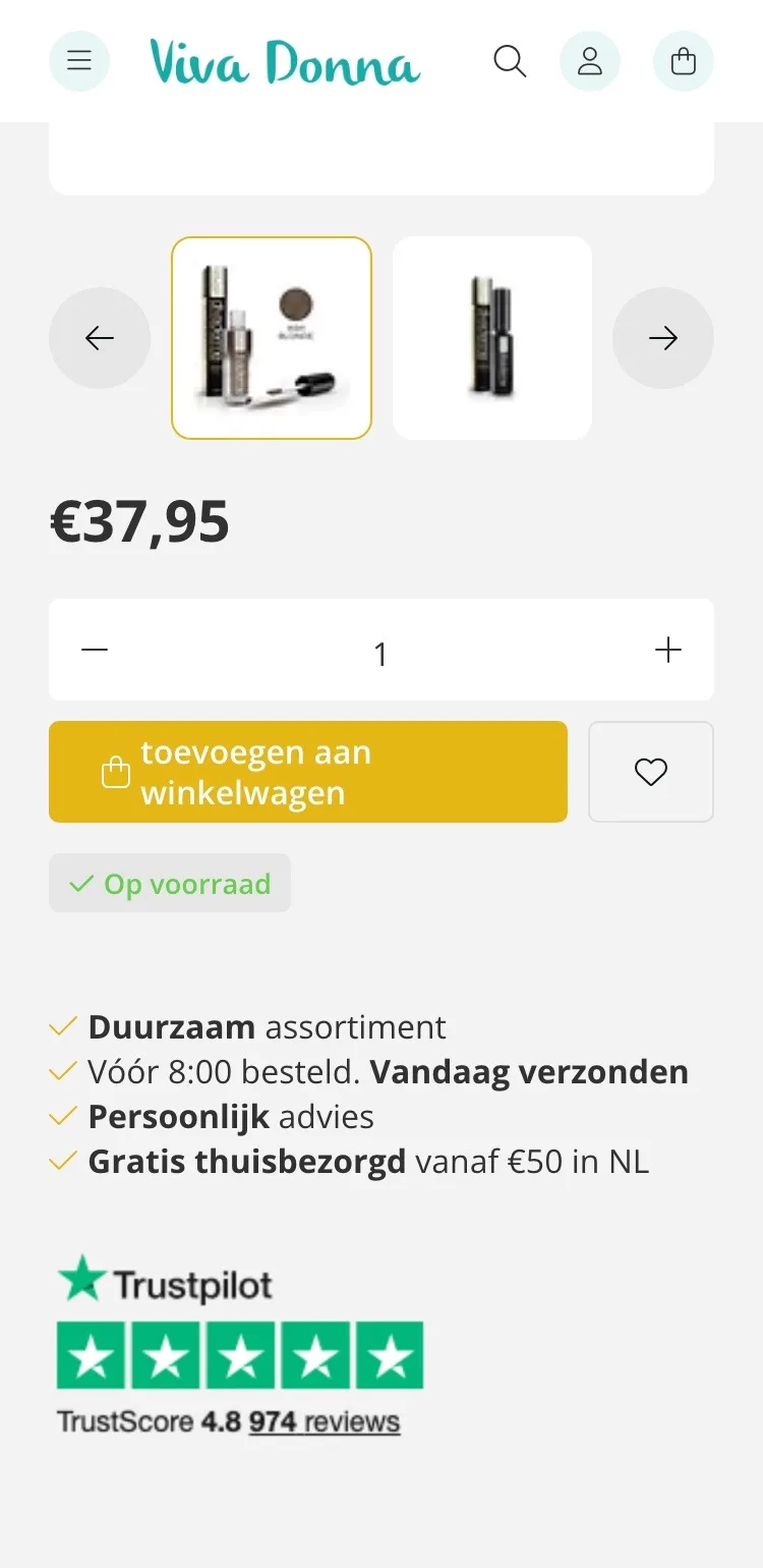
- 01Always a button at the bottomThe first screen had no button. Now the bottom always shows the price, ‘In winkelwagen’ (Add to cart) and the chat.
- 02All photos as small imagesTwo small images fit between the arrows. Now you see all six photos in one row, including ‘100% natuurlijk’ (100% natural).
- 03Where you are‘Terug naar divaderme kortingscode’ (Back to divaderme discount code) becomes ‘Home › Make-up › Divaderme’, so you can easily keep browsing.
Color and buying.
Pick your color by your hair color, and see when it arrives.
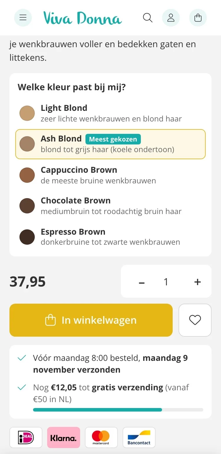
- 01Which color suits me?The other colors only appeared at the bottom. Now you choose from all five, each with the hair it suits.
- 02Shipping day by the button‘Vóór 8:00 besteld, vandaag verzonden’ (Ordered before 8:00, shipped today) sat loose in a list. Now the shipping day with its date is right below the button.
- 03Free shipping in sightA bar shows how much is still missing to reach €50. That invites you to add something.
Reviews.
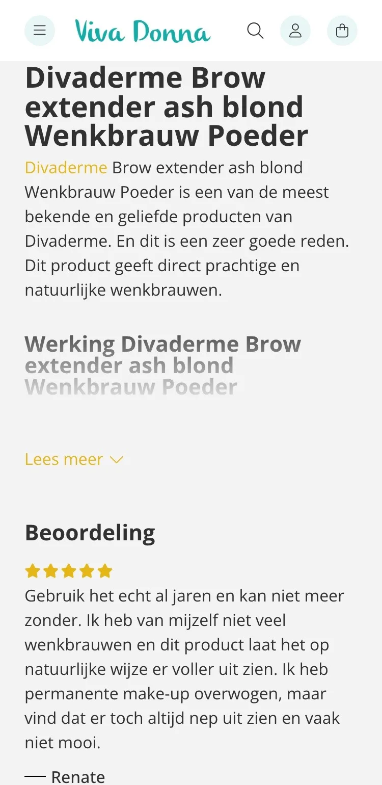
Your customers’ 5.0, right after the buy box.
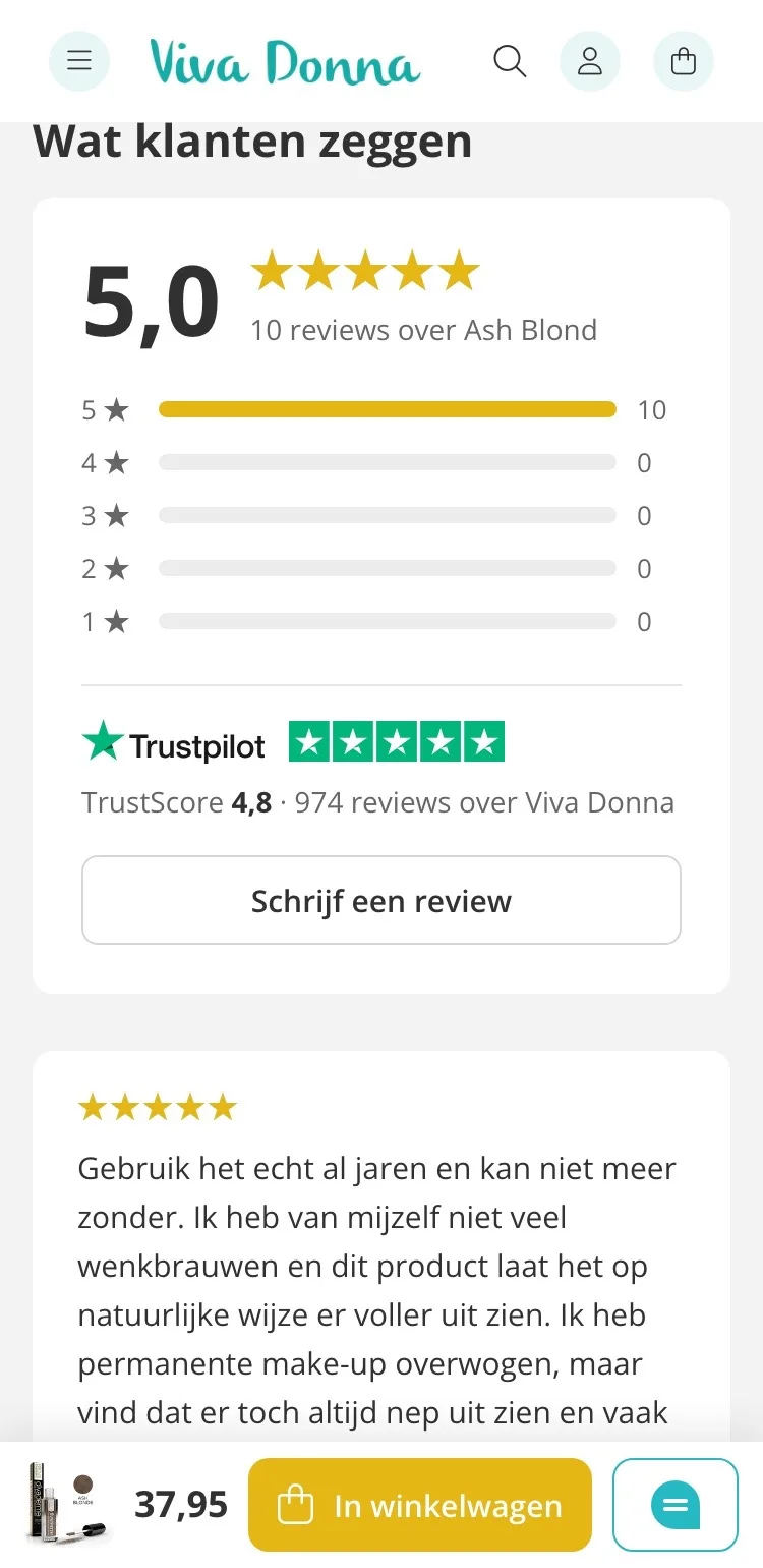
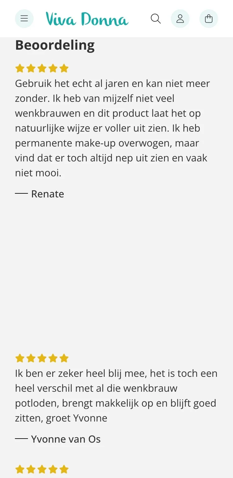
- 01Higher up the pageThe reviews only came after the product description. Now they sit right below the buy box, where you hesitate.
- 02Score with breakdownFirst the 5.0 with the breakdown per star, then the cards. No more big white gaps between the reviews.
- 03Trustpilot includedThe Trustpilot score of 4.8 from 974 reviews sits with the product reviews, with the platform’s logo.
About the product.
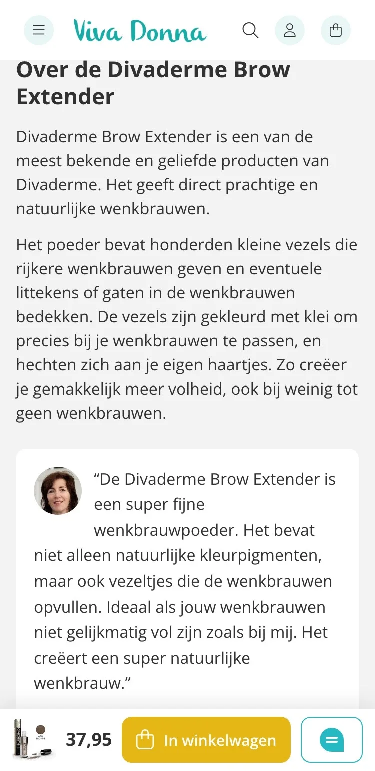
Quick to read, even on a small screen.
- 01No longer half hiddenThe text faded out after a few lines, with ‘Lees meer’ (Read more). Now you read the essentials in two short paragraphs.
- 02Sandra’s experienceHer personal experience with the product is shown as a quote with her photo. Advice from a beauty specialist.
- 03How to apply itThe three steps and the benefits are in short blocks, easy to scan on your phone.
Complete your look.
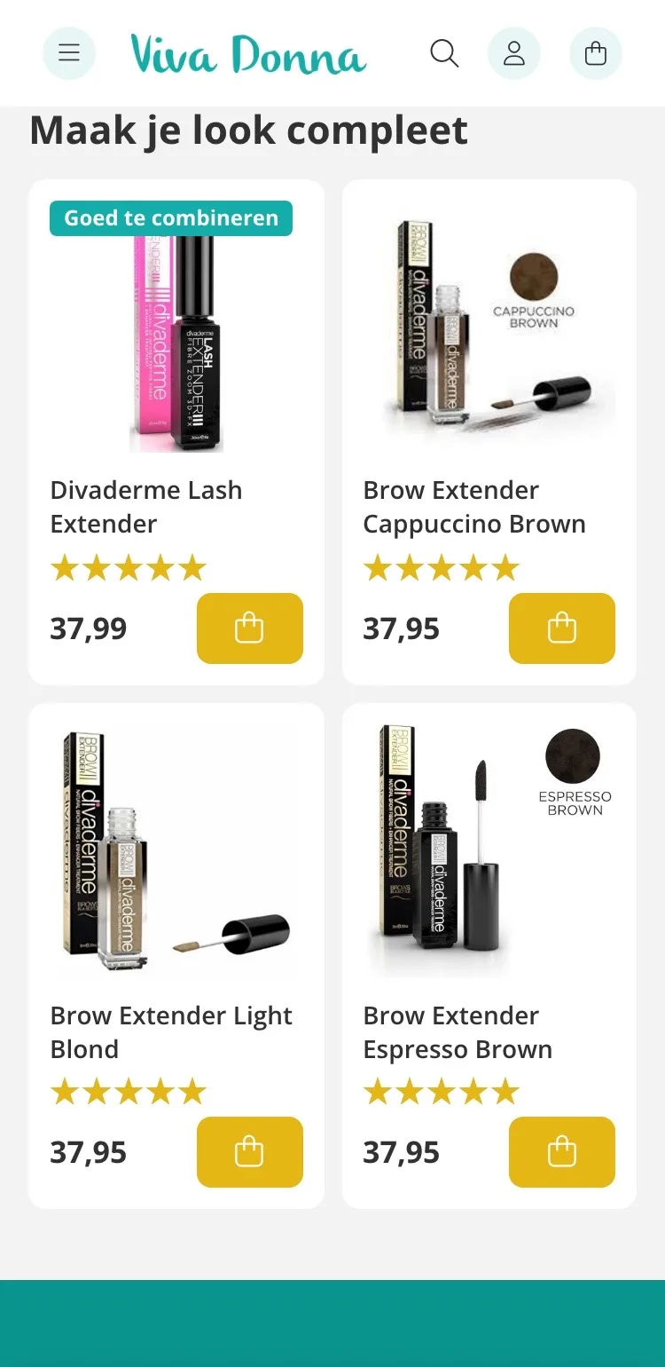
What goes with it, at a glance.
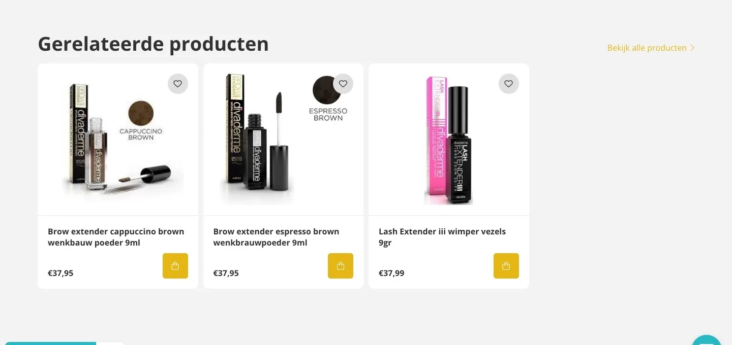
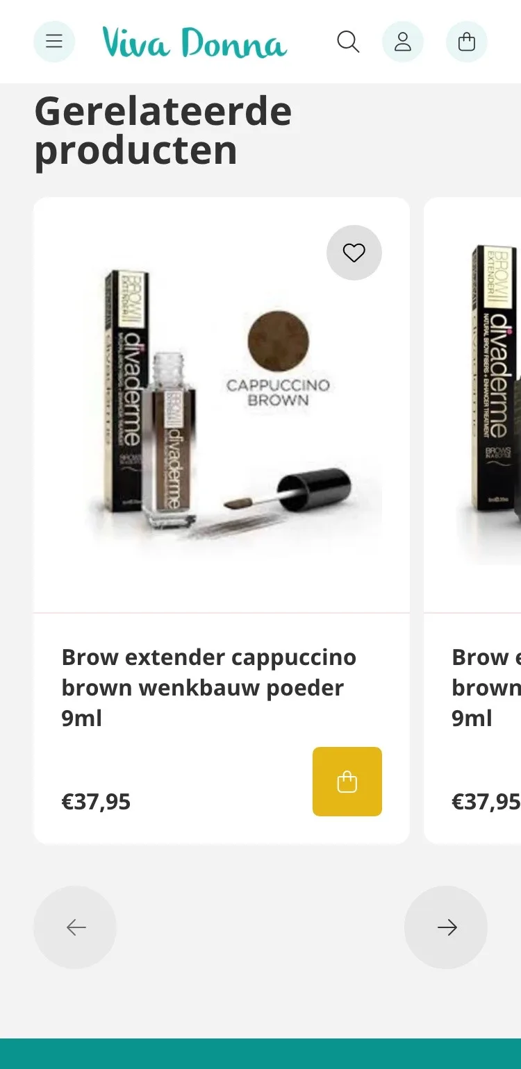
- 01Four products in viewYou saw one and a half products and had to swipe. Now four cards sit in two rows, all on one screen.
- 02Lash Extender firstThe Divaderme Lash Extender comes first, labeled ‘Goed te combineren’ (Goes well with it): the logical addition to your brows.
- 03Add right awayEvery card has a button, so you add something without leaving the page.
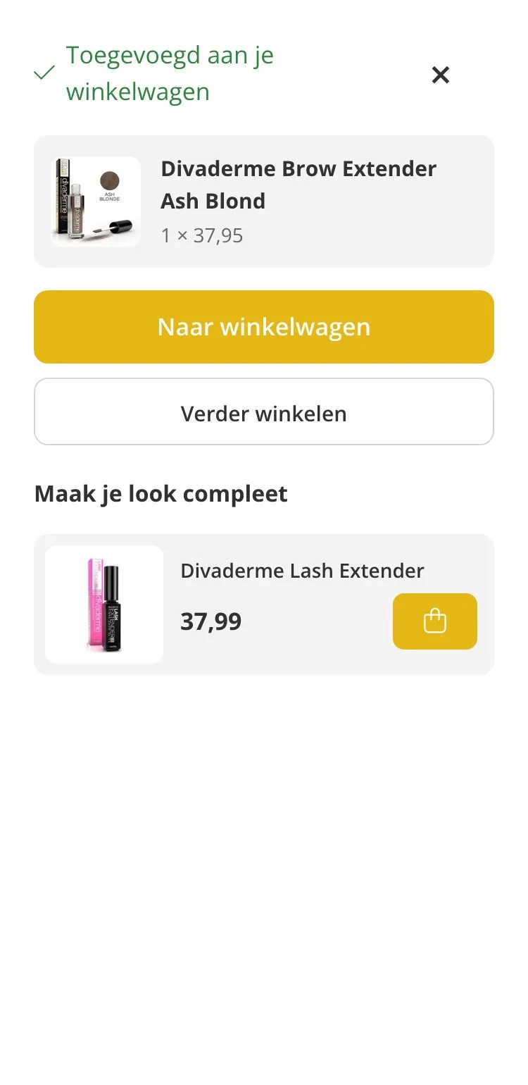
Ordering.
A clear next step after adding to cart.
- 01Confirmation with your colorAfter adding, you immediately see which color and what quantity you put in your cart.
- 02To cart or keep browsingTwo clear buttons: you decide whether to check out right away or keep looking for a bit.
- 03Complete your lookThe Lash Extender sits below, added with one tap.
Click through the new design yourself.
The design works like a real page, on desktop and on your phone. You just can’t place an order with it yet.
From design to more orders.
This is how we take the new design live, and measure what it delivers.
- 01Only the pageHeader, menu, USP bar and footer stay exactly as they are now. We only change the content of the product page.
- 02Test first, then go liveWe run the new design in an A/B test next to the current page and measure orders per visitor.
- 03Your own strengthsYour own photos, visuals, reviews and tone of voice: it all came from you already, just in a better place.
This design live
on your online store?
With the AI Design Agent, we put this design on your existing online store, and then keep improving it every month with CRO. Built by our specialists. Without spending thousands of euros a month on it.
- No rebuild, no migration
- Your back office stays the way you know it
- Only goes live after your approval
- 01Ongoing development for a fixed monthly feeNo separate quotes for every change. If we see an opportunity or you have an idea, we build it.
- 02CRO improvements, implemented right awayWe analyze your online store and implement improvements in days instead of months.
- 03Safe, and you see what changesWe build and test everything in a preview first. It only goes live after your approval, and every version is saved.