 Google Ads
 Meta Ads
 Email marketing
 Lightspeed eCom Toolkit
 Shopify Toolkit
Your product page,
redesigned.
A new design for the product page of taartdecoratief.nl: FunCakes Mix for Enchanted Cream 900g. Below you see every screen before and after, and what we improved.
- 11 before-and-afters
- 21 improvements
- taartdecoratief.nl
Every screen, compared.
Pick a screen and drag across the screenshot. On the left you see the current page of taartdecoratief.nl, on the right the new design.
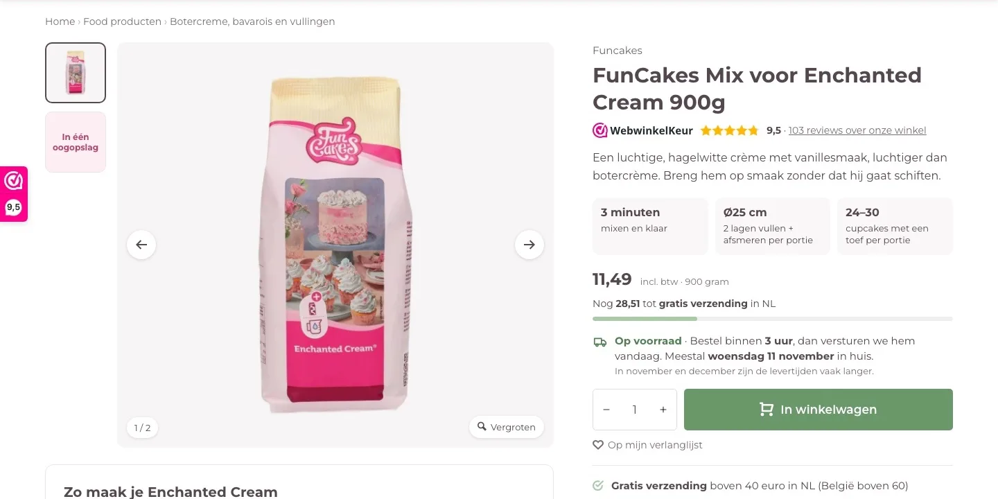
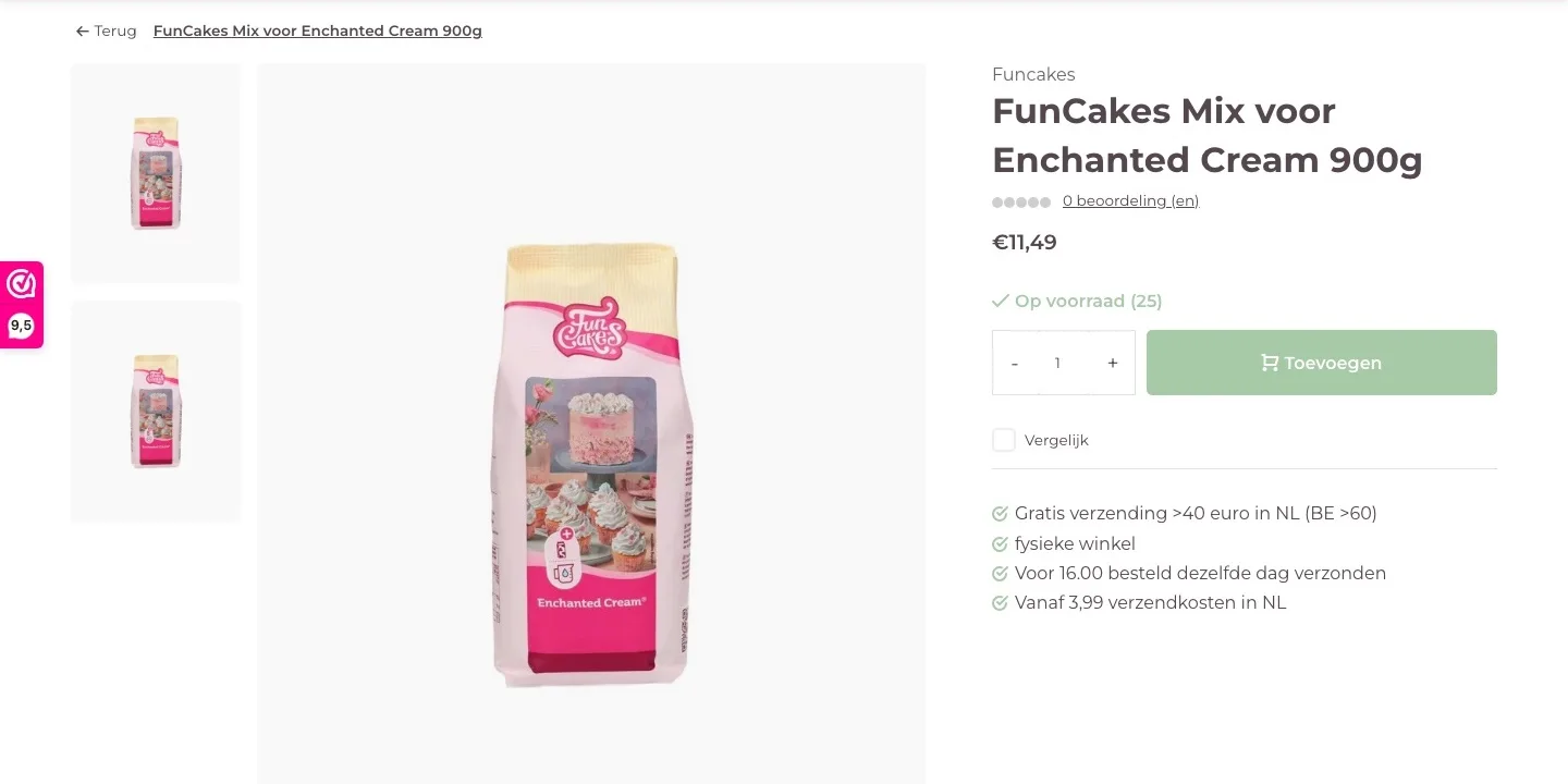
Product page.
Trust, yield and delivery at a glance.
- 019.5 instead of 0 reviewsBelow the name it said ‘0 beoordeling (en)’ (0 review(s)) with gray stars. Now you see the 9.5 from WebwinkelKeur, and that builds trust right away.
- 02What you make with itHow much cake one portion fills was buried deep in the text. Now you see it right away: 3 minutes of mixing, Ø25 cm or 24– 30 cupcakes.
- 03When it arrivesIt said ‘Voor 16.00 besteld dezelfde dag verzonden’ (Ordered before 4 p.m., shipped the same day), with no delivery day. Now you read how much time you have left and on which day it usually arrives.
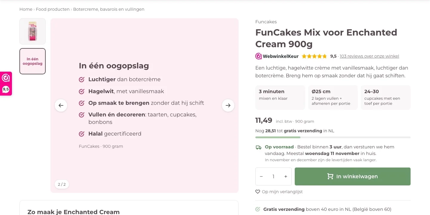
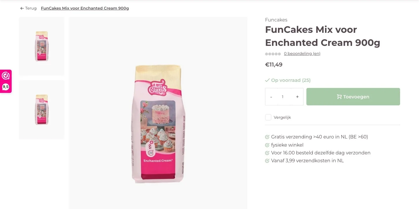
Photos and buy button.
A second image that adds something, and a button that stands out.
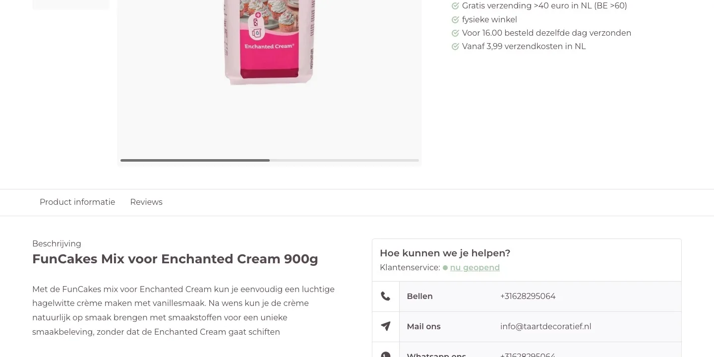
- 01At a glanceThe two photos were almost the same. The second image now lines up the strong points: light, snow-white and it doesn’t curdle.
- 02Free shipping in sightBy the button it said ‘Gratis verzending >40 euro’ (Free shipping over €40). Now it says ‘Nog 28,51 tot gratis verzending’ (28.51 more to free shipping) and the bar fills up with your order.
- 03One clear button‘Vergelijk’ (Compare) sat right below the button. Now there is one button, in a darker shade of your green that’s easier to read.
Preparation and trust.
Everything that removes doubt, next to the photo and by the button.
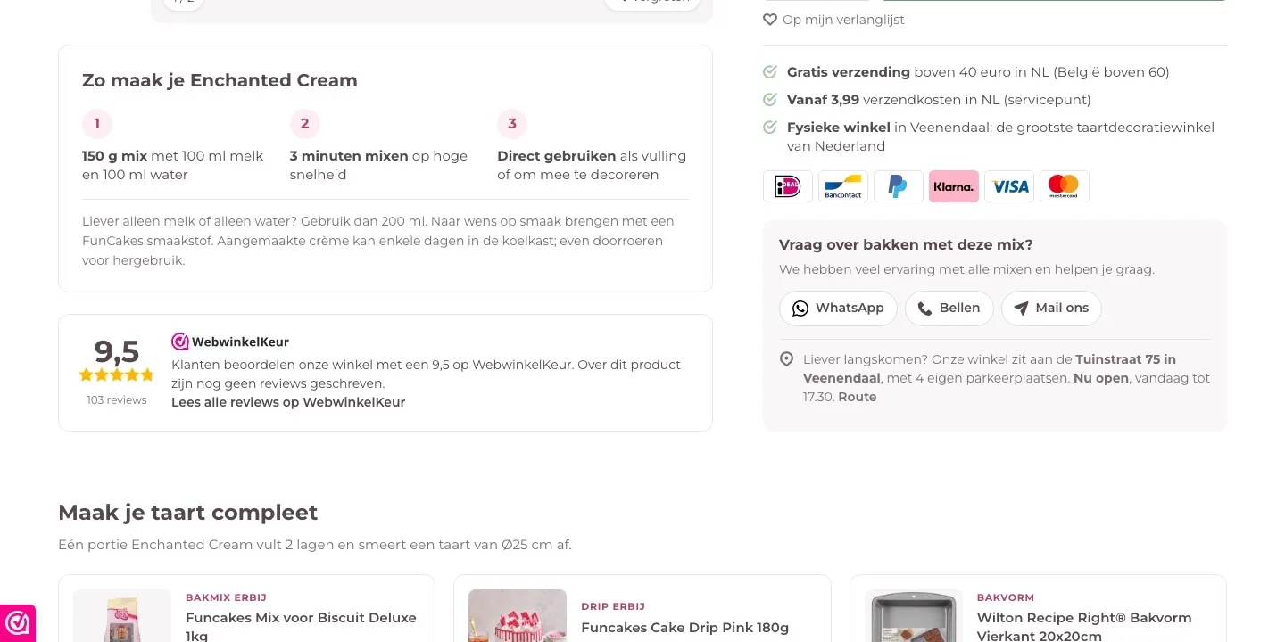
- 01How to make itThe preparation was a long paragraph in the text. Now the 3 steps sit right below the photo: weigh, mix and ready to use.
- 02Logos and scoreYou only saw the payment methods in the footer. Now the logos sit by the button, and below the photo is the 9.5 with a link to all reviews.
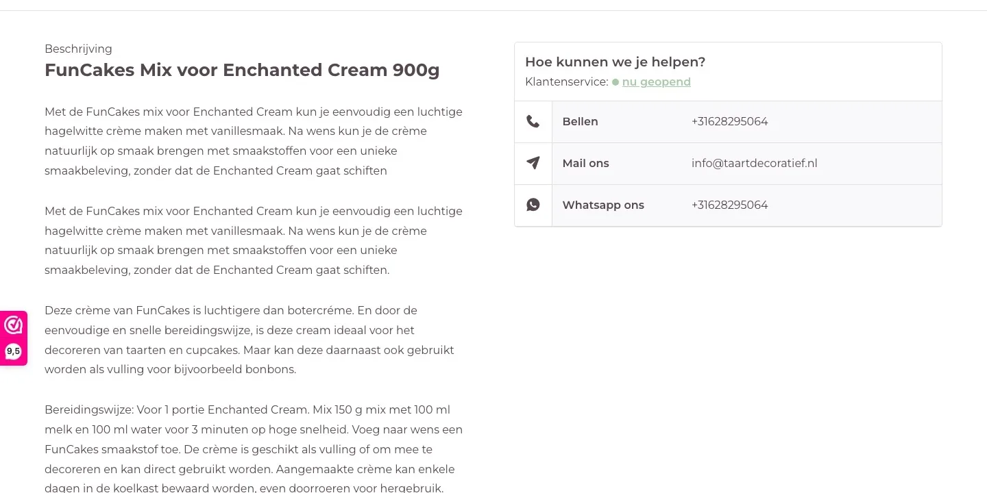
- 03Help and a store nearbyWhatsApp, call and email were next to the text. Now they sit by the button, with the address, the opening hours and a directions link.
Complete your cake.
Products that go with it, after the buy button.
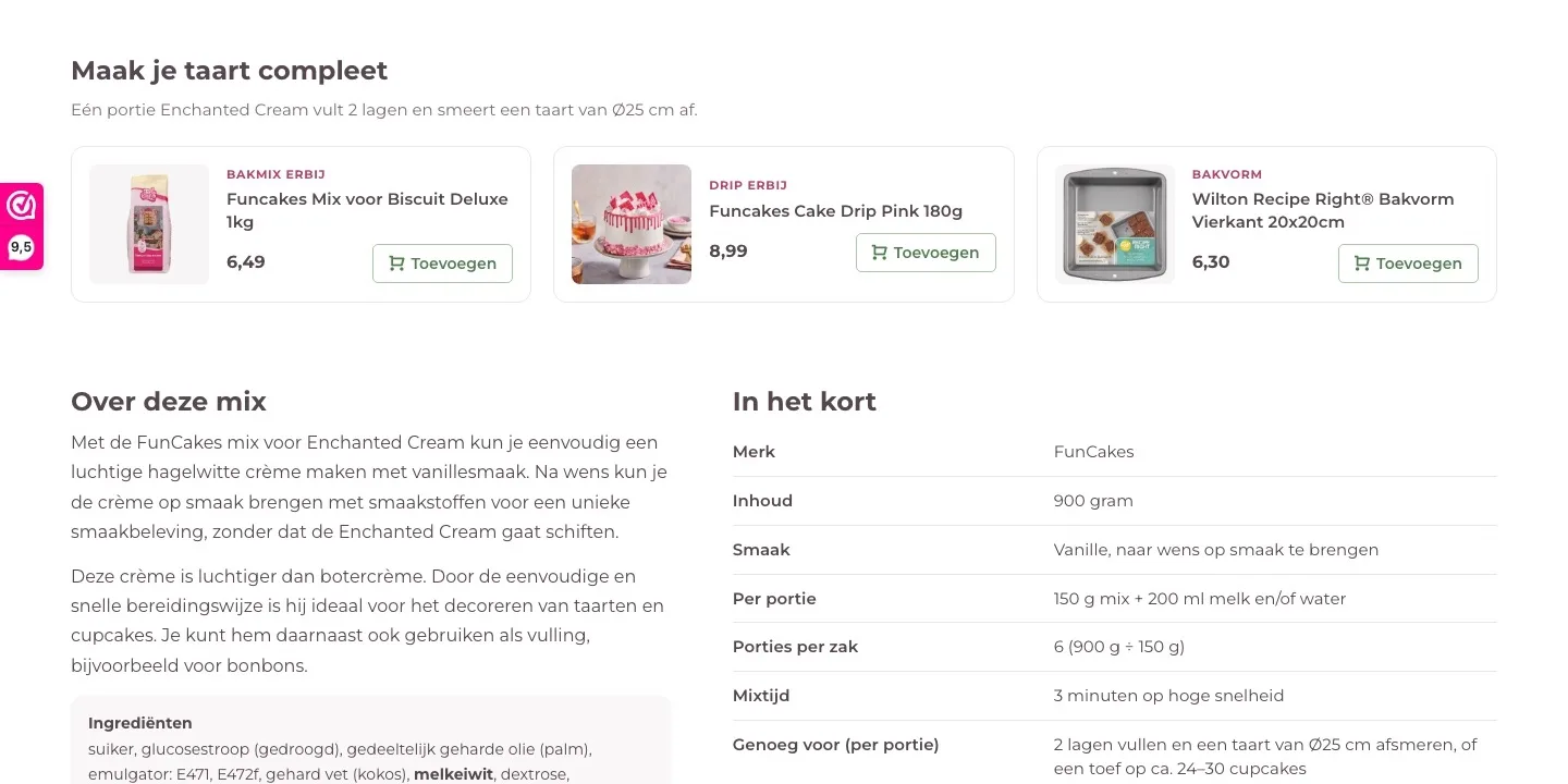
- 01What else goes with itThere were no other products on the page. Now you see a baking mix, a drip and a baking pan that go with this cream.
- 02Clear at a glanceEach product has a label, like ‘Bakmix erbij’ (Add a baking mix) or ‘Drip erbij’ (Add a drip). That way you see right away why it belongs.
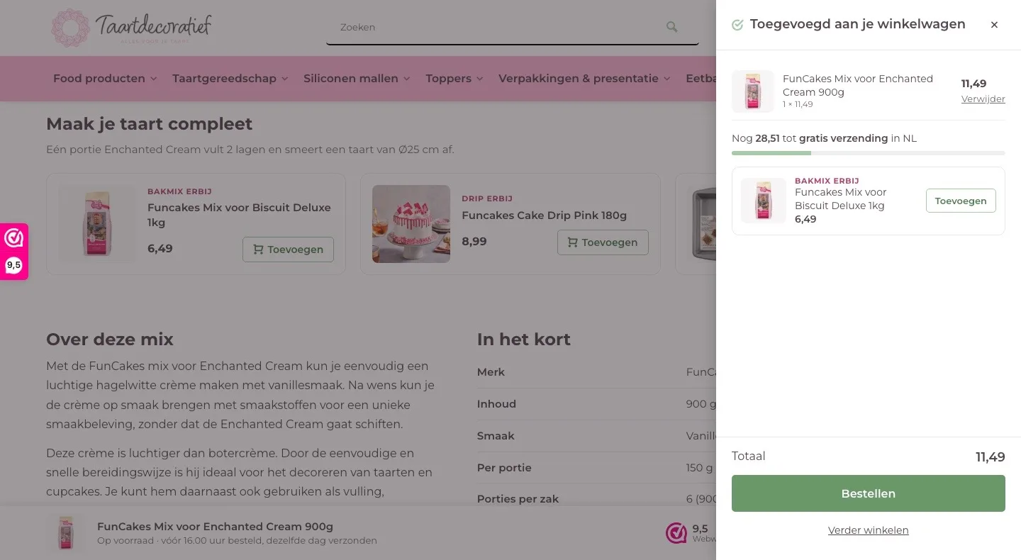
- 03Free shipping soonerWith one click on ‘Toevoegen’ (Add) it’s in your cart and the bar moves toward €40. That brings free shipping within reach.
About this mix.
Quick to read, with the facts in an overview.
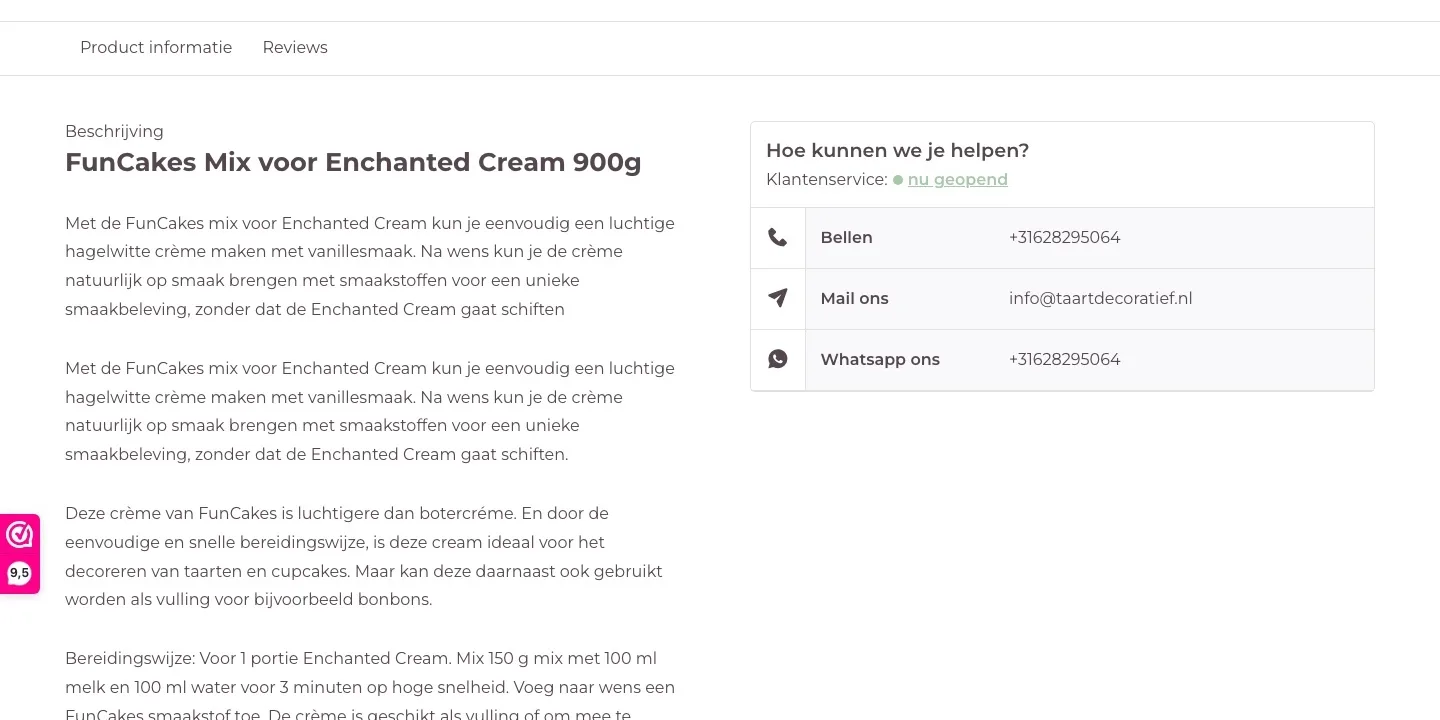
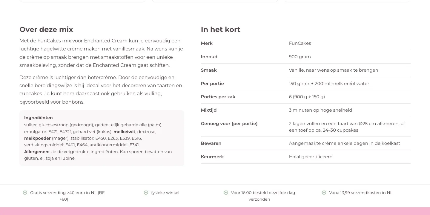
- 01No duplicate textThe first paragraph appeared twice, one below the other. Now you read a short description without repetition.
- 02In shortMixing time and yield were scattered across long paragraphs, the contents as a separate line at the bottom. Now they’re in an overview, with the number of portions per bag.
- 03Allergens easy to findThe ingredients were at the bottom of a long text. Now they sit in their own box with the heading Ingrediënten (Ingredients), separate from the description.
Buy bar and cart.
The button always within reach, and then a clear next step.
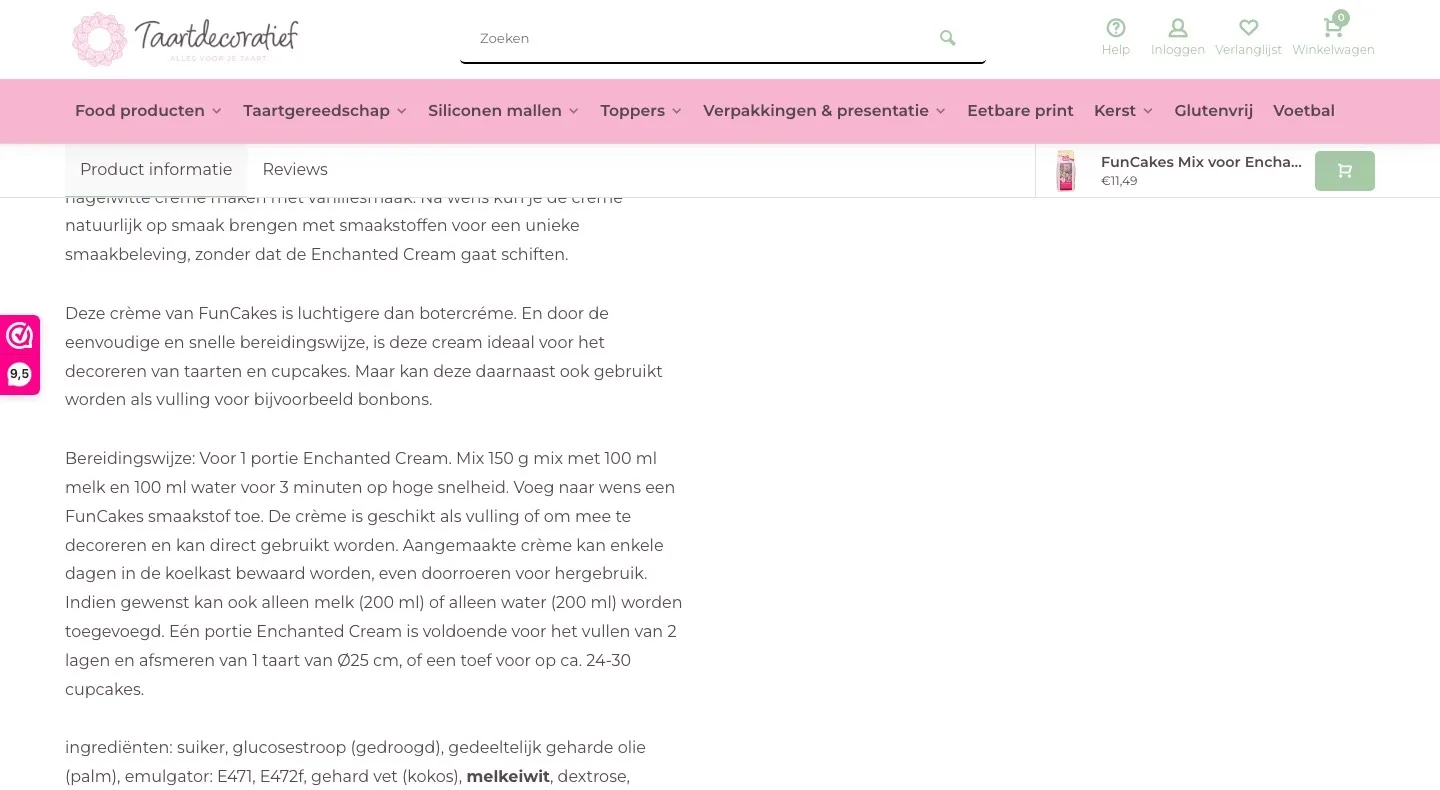
- 01Buy bar with scoreAt the top was a narrow bar with photo, name and price, with only an icon as the button. Now the bar sits at the bottom, with the 9.5 and an ‘In winkelwagen’ (Add to cart) button.
- 02Cart stays openThe mini cart closed after a few seconds or when you scrolled. Now it stays open, and a bar shows how much you still need for free shipping.
- 03A tip that fitsThe cart shows a baking mix that goes with the cream. One click and it’s added.
Product page.
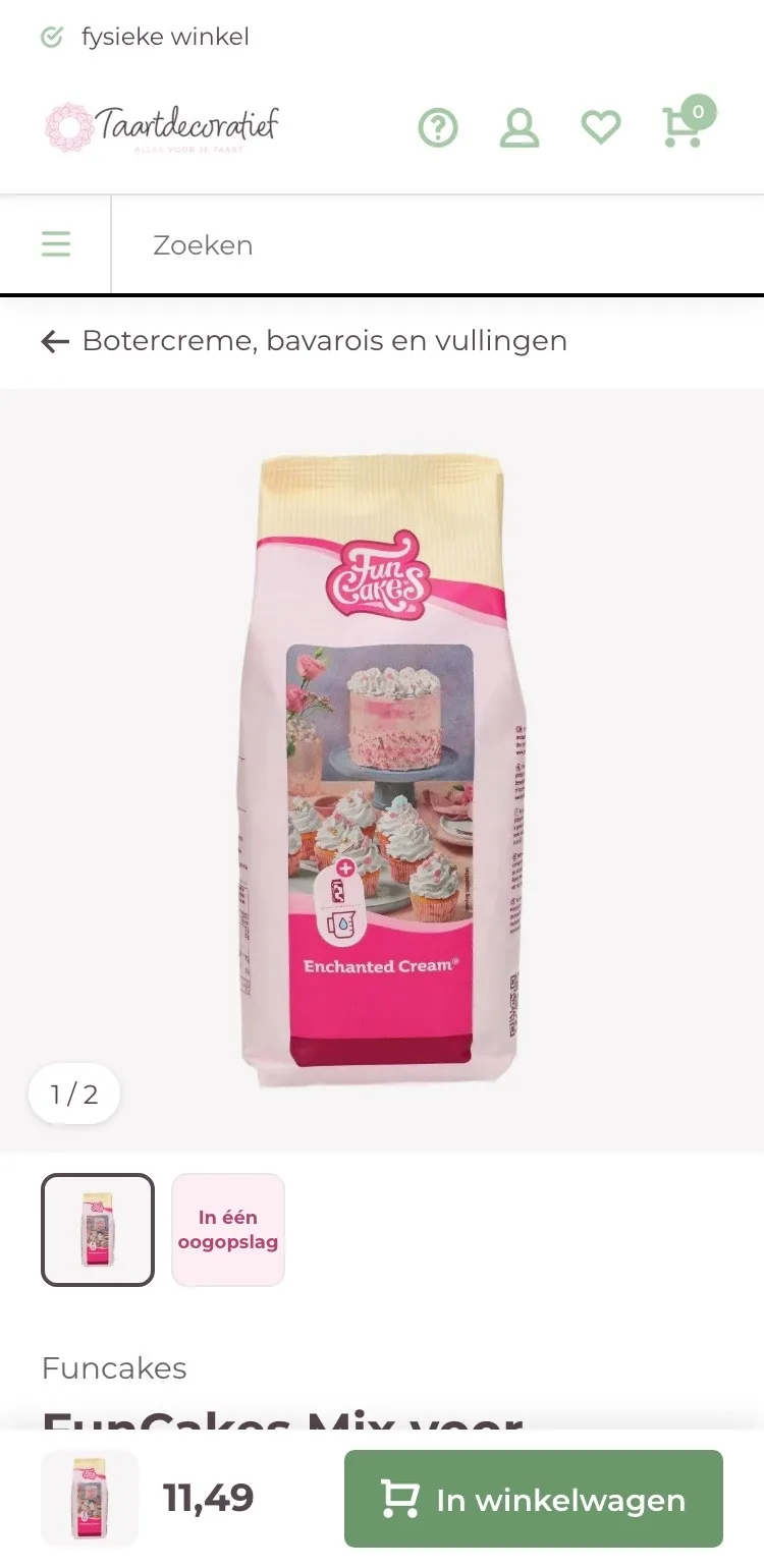
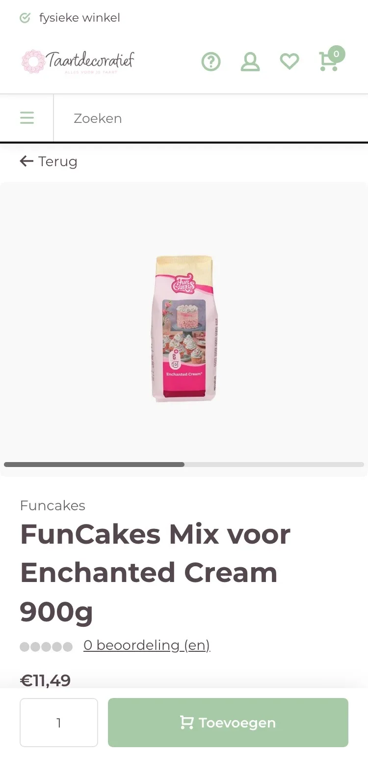
On mobile, the photo and the way back right in view.
- 01Back to the category‘Terug’ (Back) took you to the previous page. Now one tap takes you to all buttercreams, bavarois and fillings.
- 02Thumbnails below the photoBelow the photo was a small scroll bar, without thumbnails. Now you see the photo and ‘In één oogopslag’ (At a glance) as thumbnails.
- 03Button always at the bottomThe bar at the bottom stays, now with the photo and the price, and with a button that’s easier to read.
Price and buy button.
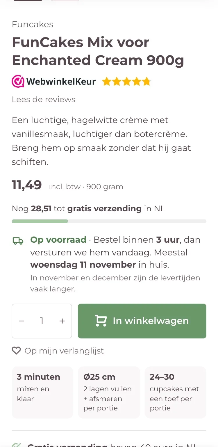
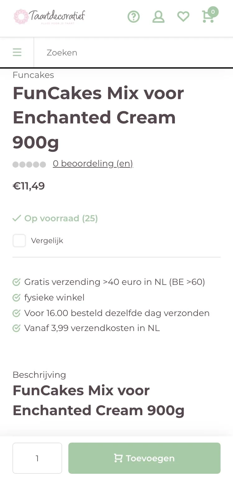
Score, delivery and button together in view.
- 01WebwinkelKeur by the name‘0 beoordeling (en)’ (0 review(s)) with gray stars has been replaced by the WebwinkelKeur stars and a link to the reviews.
- 02Delivery and shippingIt said ‘dezelfde dag verzonden’ (shipped the same day), with no delivery day. Now you read when it’s usually delivered, and how much you still need for free shipping.
- 03Buy button on the pageOn mobile the buy button was only in the bar at the bottom. Now it also sits right below the price.
Trust and help.
Why buy from you, and who you can ask.
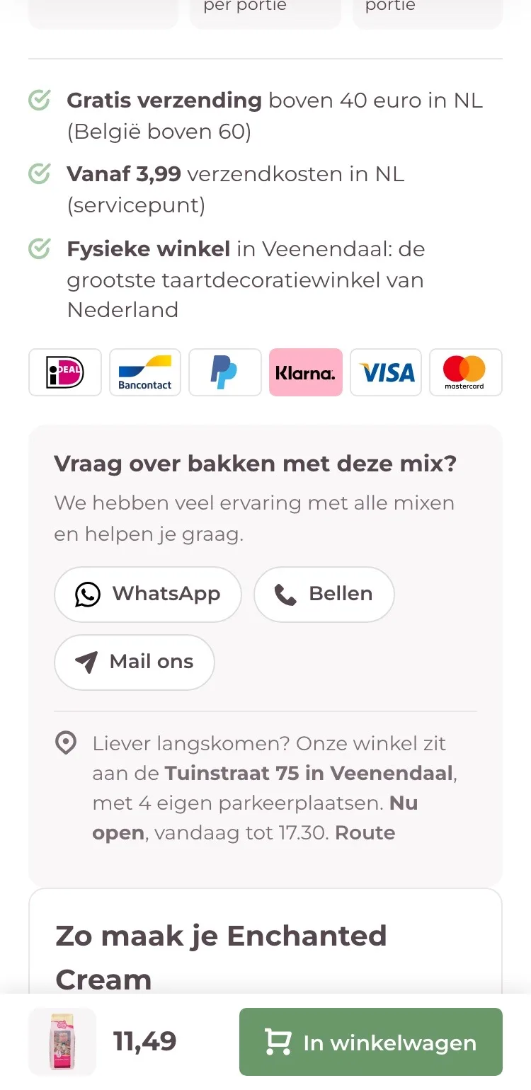
- 01Strong points in boldThe four USPs were in thin text. Now the most important part stands out, with ‘de grootste taartdecoratiewinkel van Nederland’ (the largest cake decorating store in the Netherlands).
- 02Payment logos by the buttonYou only saw the payment methods at the very bottom. Now the logos sit right below the benefits.
- 03Ask usContact only came after the long text. Now WhatsApp, call and email sit by the button, with the store’s address.
Complete your cake.
Baking mix, drip and baking pan after the buy button.
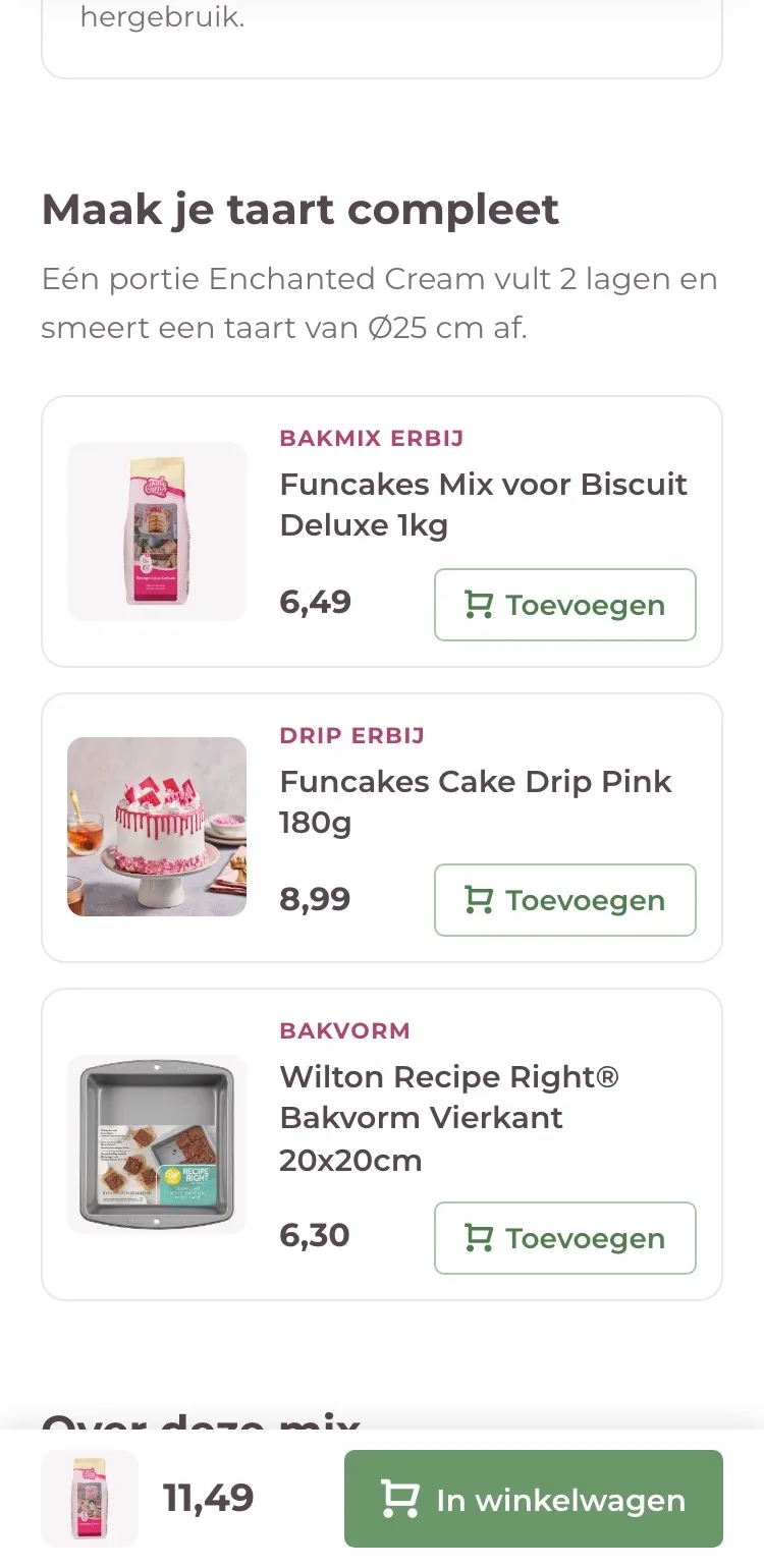
- 01What else goes with itAfter the long text there was nothing else to buy. Now you see three products that go with the cream.
- 02A label per product‘Bakmix erbij’ (Add a baking mix), ‘Drip erbij’ (Add a drip) and ‘Bakvorm’ (Baking pan): at a glance you see what it is.
- 03Add with one tapEach product has its own button, so you don’t have to leave the page.
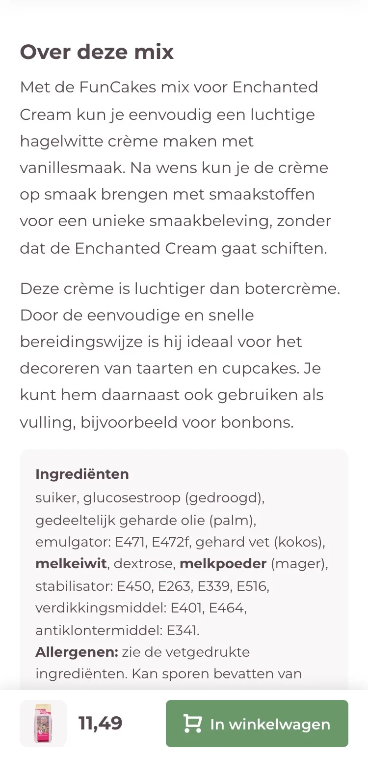
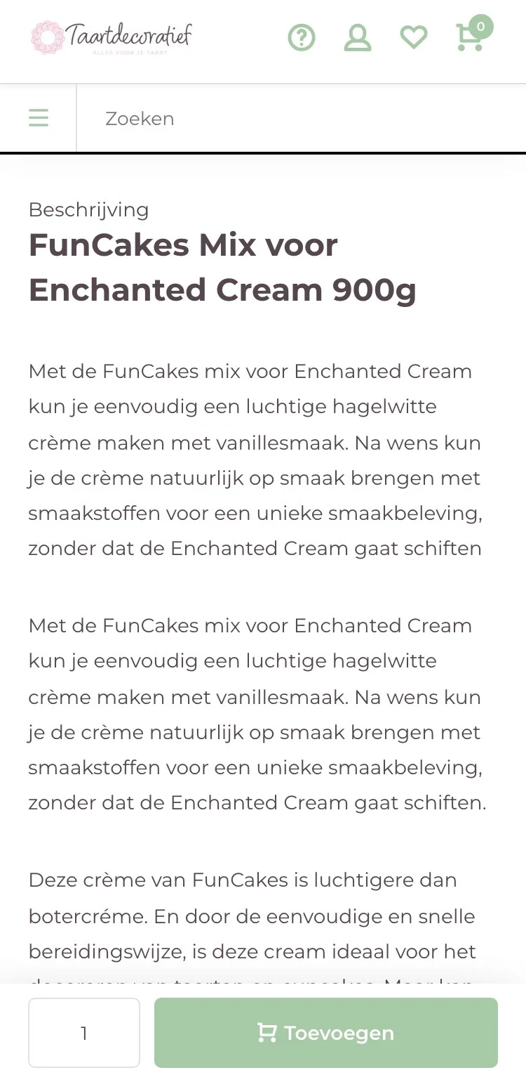
About this mix.
A short text and the ingredients in their own box.
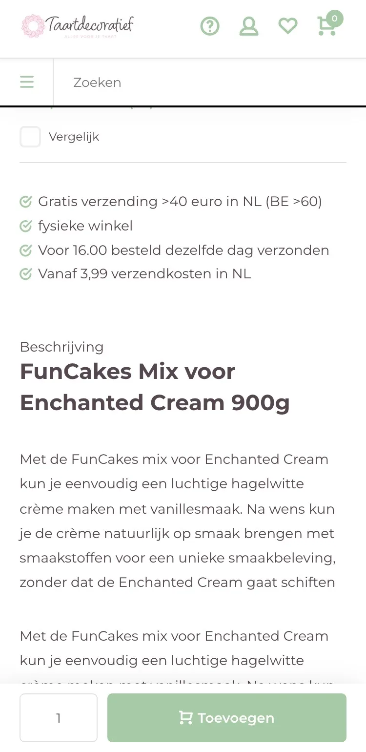
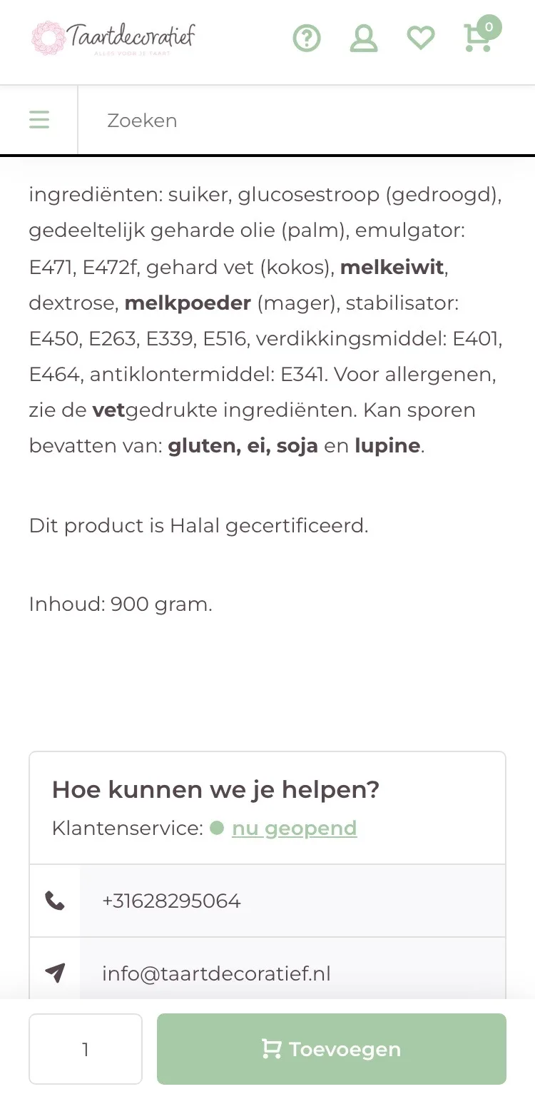
- 01No duplicate textThe first paragraph appeared twice, one below the other. Now you read it once, short and clear.
- 02Allergens in their own boxIngredients and allergens were at the bottom of the text. Now they sit in their own box with the heading Ingrediënten (Ingredients), separate from the description.
- 03Preparation in stepsThe preparation was a long paragraph in the text. Now it’s in 3 short steps below the buy button.
Click through the new design yourself.
The design works like a real page, on desktop and on your phone. You just can’t place an order with it yet.
From design to more orders.
This is how we take the new design live, and measure what it delivers.
- 01Only the pageHeader, menu, USP bar and footer stay exactly as they are now. We only change the content of the product page.
- 02Test first, then go liveWe run the new design in an A/B test next to the current page and measure orders per visitor.
- 03Your own strengthsYour own photos, visuals, reviews and tone of voice: it all came from you already, just in a better place.
This design live
on your online store?
With the AI Design Agent, we put this design on your existing online store, and then keep improving it every month with CRO. Built by our specialists. Without spending thousands of euros a month on it.
- No rebuild, no migration
- Your back office stays the way you know it
- Only goes live after your approval
- 01Ongoing development for a fixed monthly feeNo separate quotes for every change. If we see an opportunity or you have an idea, we build it.
- 02CRO improvements, implemented right awayWe analyze your online store and implement improvements in days instead of months.
- 03Safe, and you see what changesWe build and test everything in a preview first. It only goes live after your approval, and every version is saved.