 Google Ads
 Meta Ads
 Email marketing
 Lightspeed eCom Toolkit
 Shopify Toolkit
Your product page,
redesigned.
A new design for the product page of scholten-hulpmiddelen.nl: MultiMotion Curve rollator (green). Below you see every screen before and after, and what we improved.
- 14 before-and-afters
- 23 improvements
- scholten-hulpmiddelen.nl
Every screen, compared.
Pick a screen and drag across the screenshot. On the left you see the current page of scholten-hulpmiddelen.nl, on the right the new design.
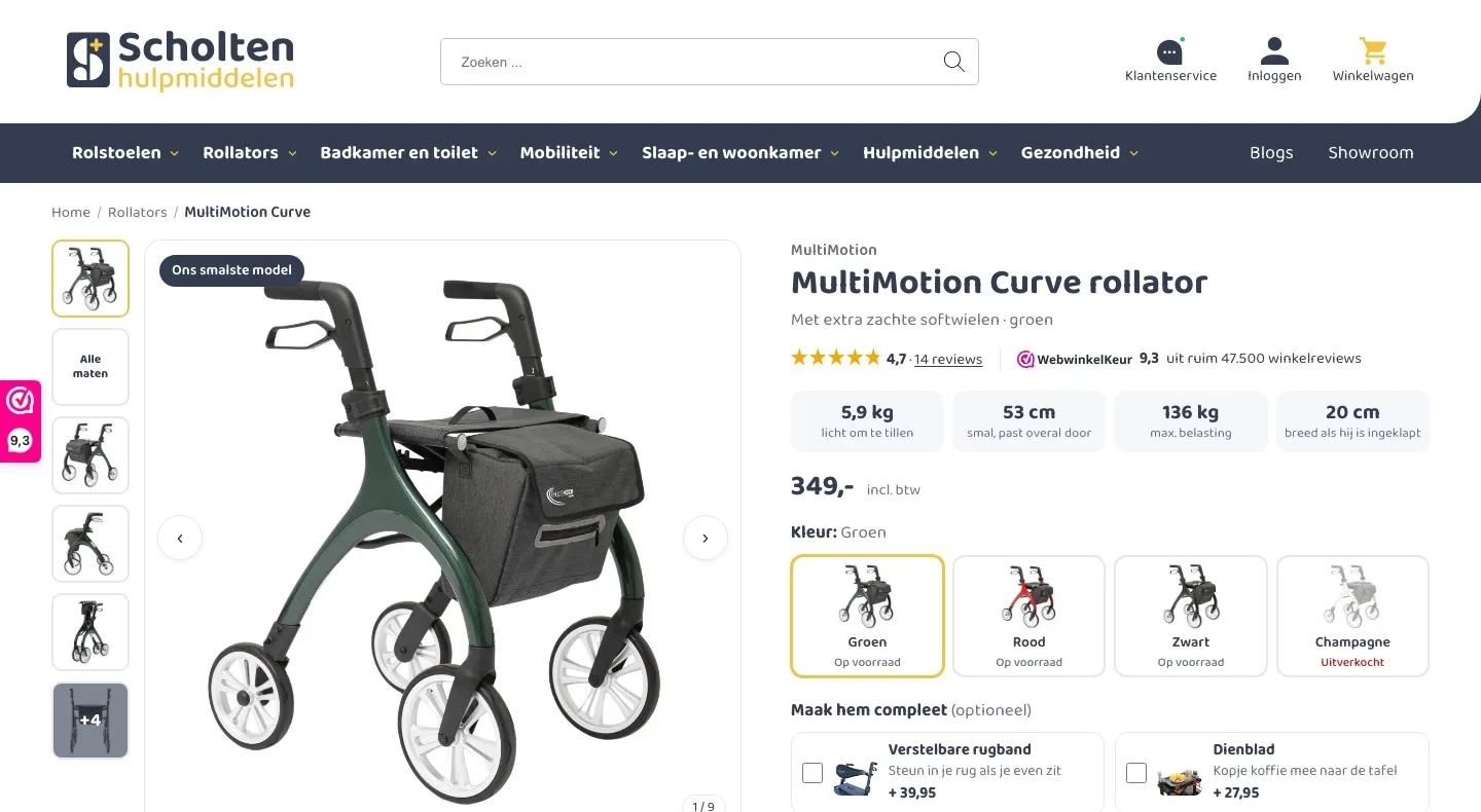
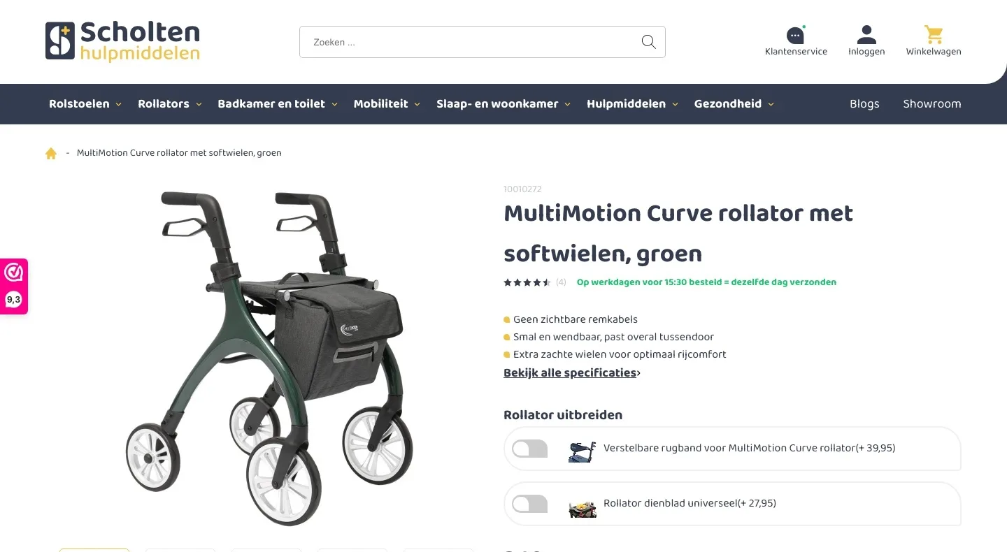
Product page.
Everything you want to know about a rollator, right next to the photo.
- 01Score and key figures by the titleThe 9.3 from WebwinkelKeur was only in the sidebar. Now it sits below the title, next to the key figures.
- 02Choosing a color with stock statusChampagne looked available to choose, but was sold out. Now you see for each color whether it is in stock.
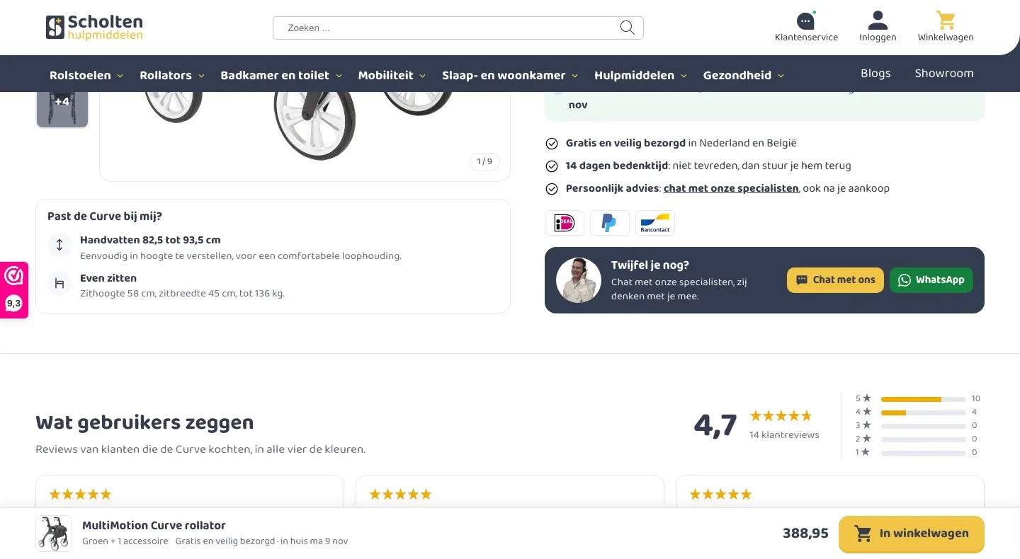
- 03Photos and dimensions at a glanceThumbnails next to the photo show everything at once, plus an image with all the dimensions of the Curve.
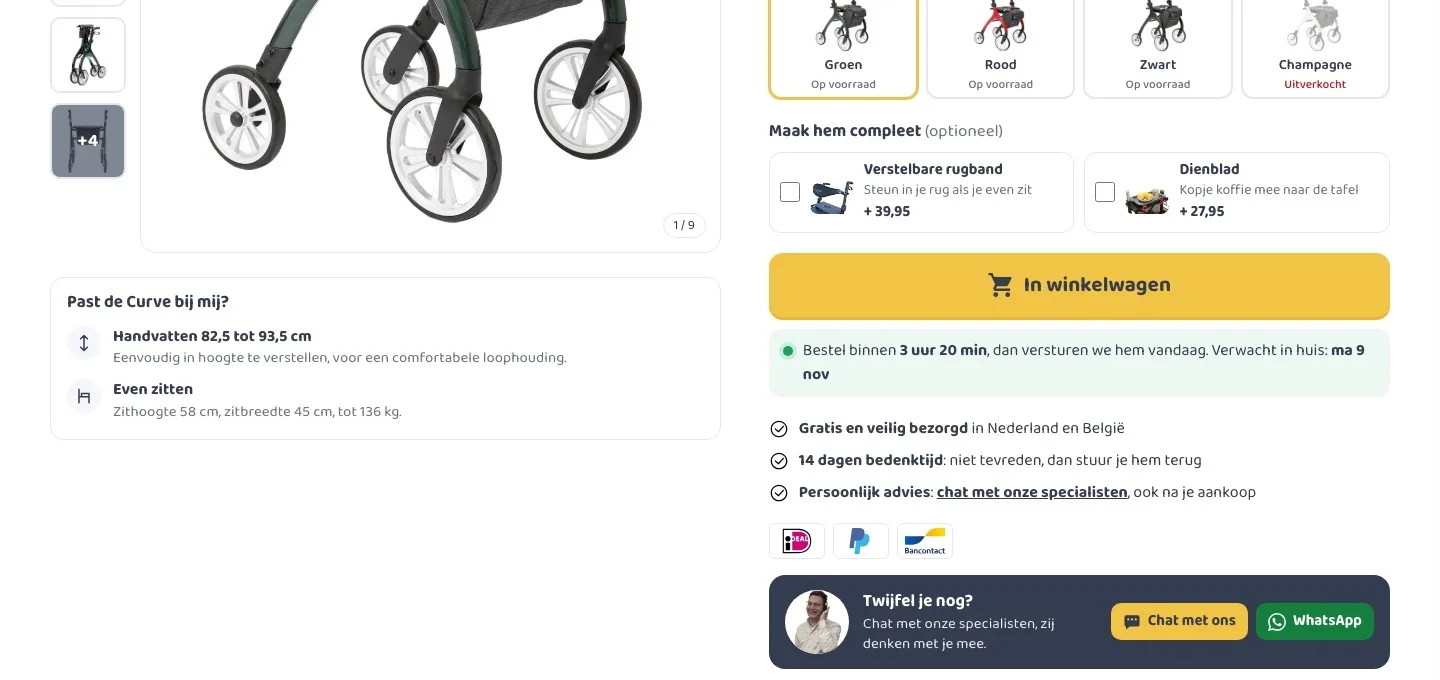
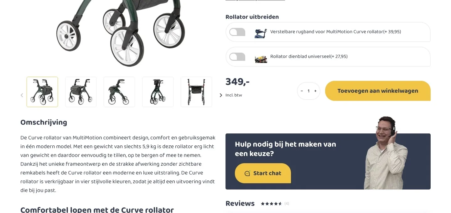
Around the button.
All the reassurance in the spot where the visitor decides.
- 01Accessories with what they do for youToggles with a long product name say little. Now you see what you get out of them, like support for your back when you sit down for a moment.
- 02Delivery day and guaranteesIf you know when the rollator will arrive and that you can return it, you order sooner. That is now below the button, together with the payment logos.
- 03‘Does it suit me?’ answeredThe handle height was further down in a table. Now handle height, seat height and maximum weight are in one block below the photo.
Reviews.
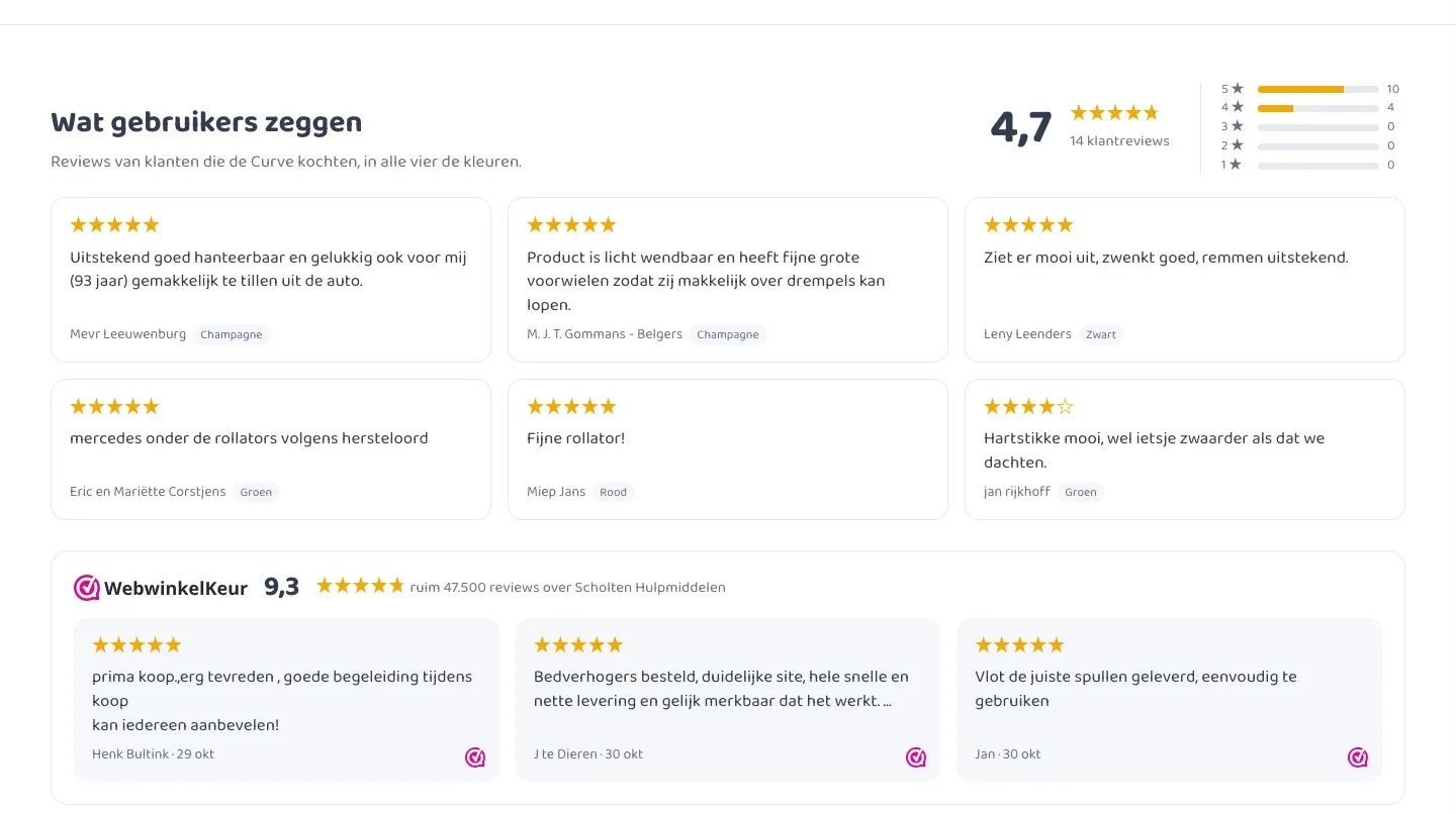
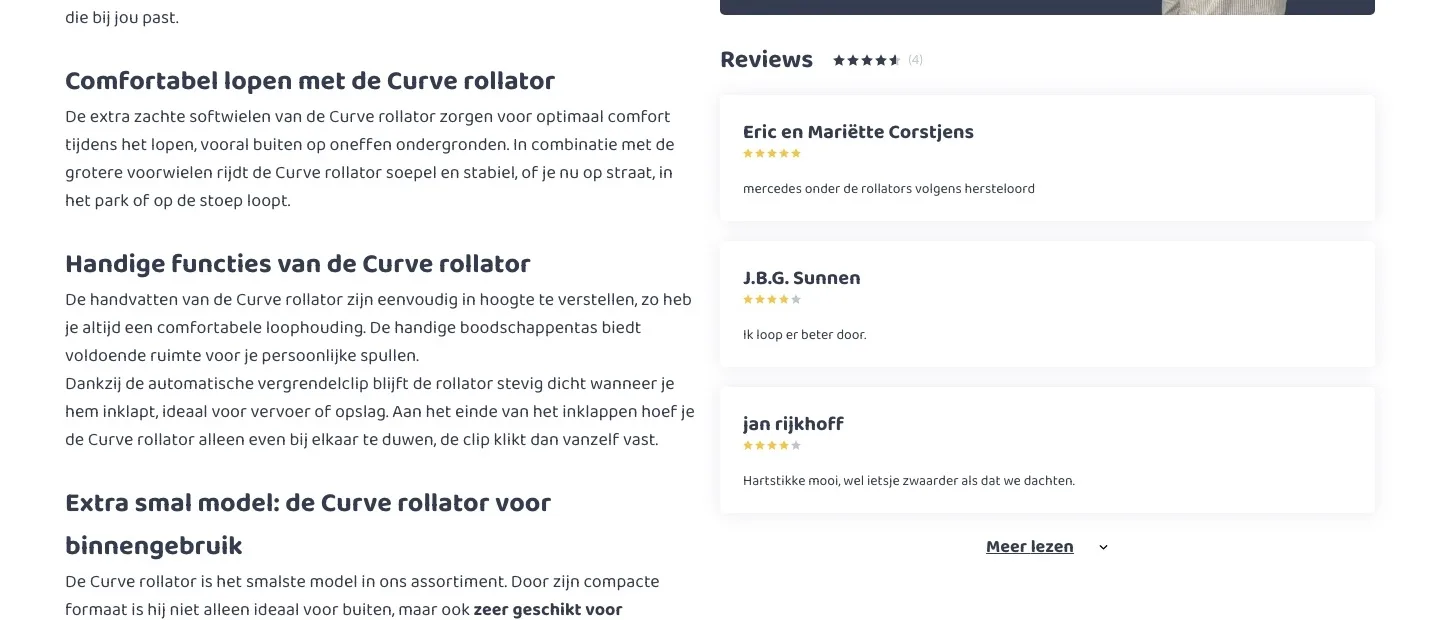
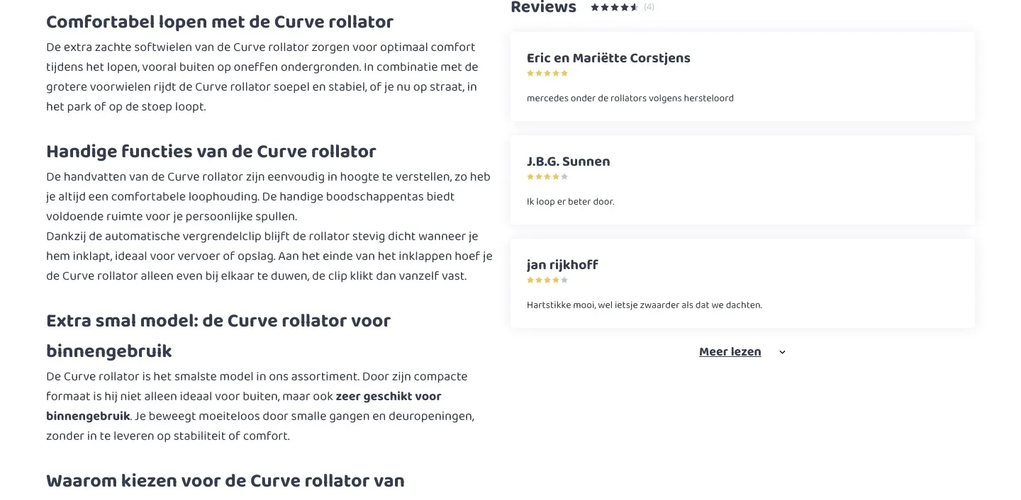
Proof from customers, right below the buy box.
- 01Score with breakdownThree short reviews sat in a narrow column. Now the 4.7 with its breakdown is shown large above them.
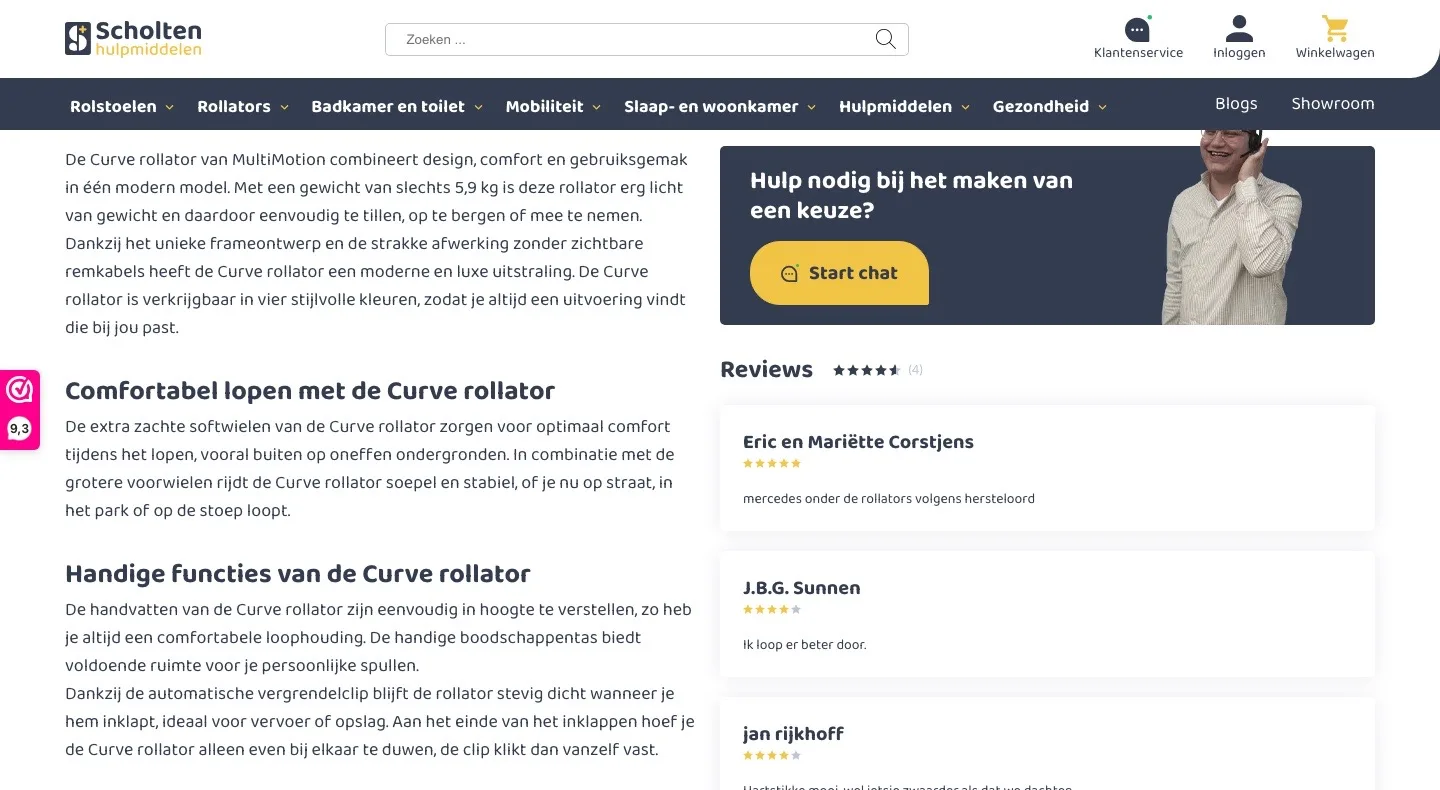
- 02Reviews of all colorsOnly the four reviews of the green one were visible. Now reviews of all colors are shown, and the 4.7 from all fourteen.
- 03WebwinkelKeur with reviewsThe reviews said nothing about the store itself. Now WebwinkelKeur is included: the 9.3 and three recent reviews.
Why the Curve?.
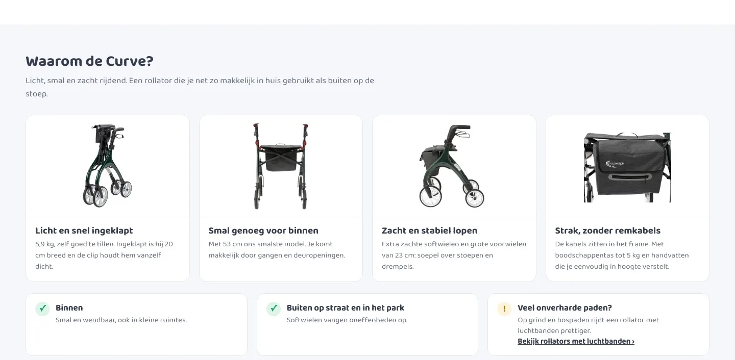
From a long wall of text to benefits you see at a glance.
- 01Benefits with imagesThe strong points were hidden in four blocks of text. Now you see light, narrow, smooth-rolling and sleek right away in images.
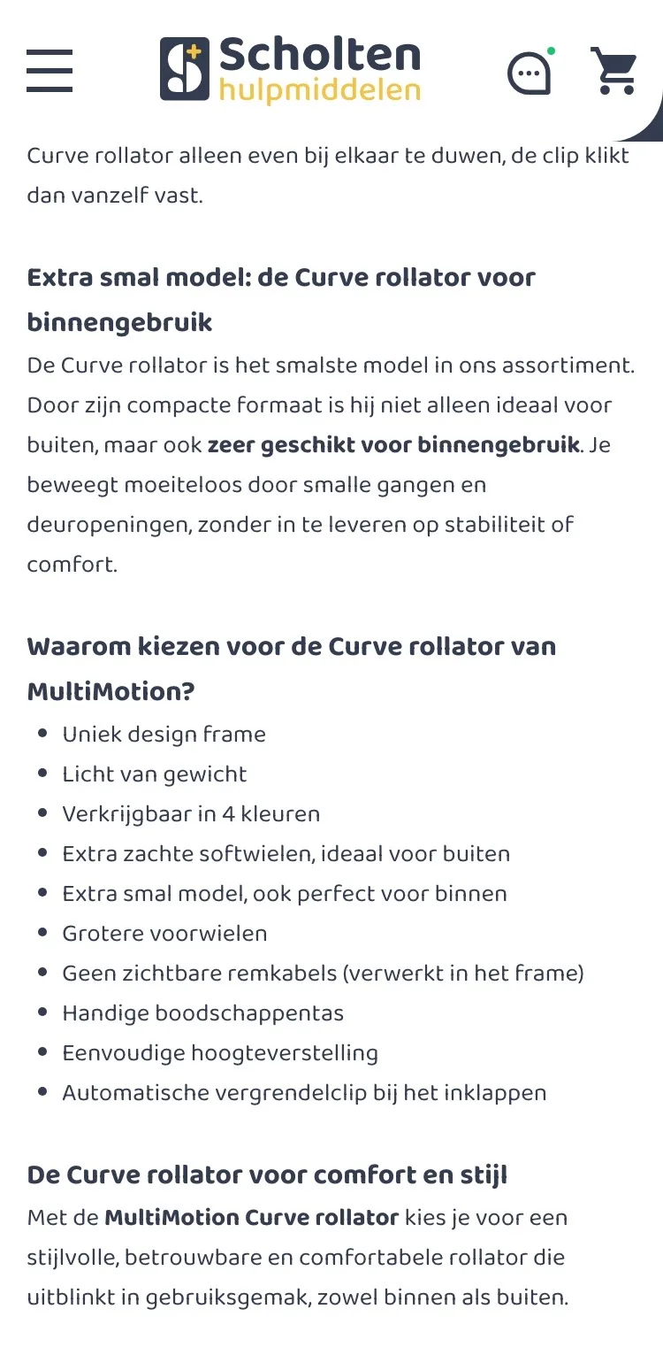
- 02What it is suitable forIndoors, and outdoors on the street or pavement, as the description says. If you often walk on unpaved paths, you see a link to rollators with air tires.
- 03Every benefit with its measurement‘Extra smal’ (extra narrow) and ‘grotere voorwielen’ (larger front wheels) were listed without measurements. Now they are included: 53 cm wide, 23 cm front wheels, 20 cm folded.
Description and specifications.
Quick to read, with all the dimensions neatly together.
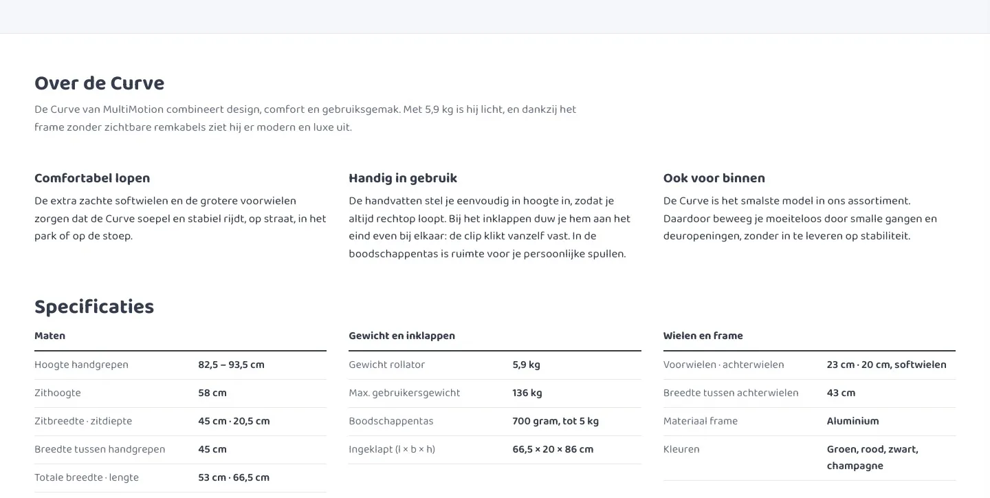
- 01Description in three blocksHardly anyone reads long paragraphs. Three short blocks side by side say the same in a few seconds.
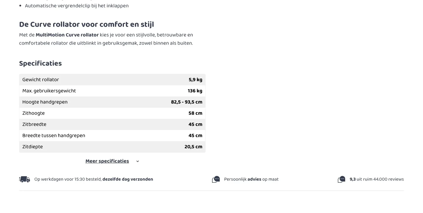
- 02All specifications openHalf of the dimensions were behind ‘Meer specificaties’ (More specifications). Now everything is open, grouped into dimensions, weight and wheels.
- 03No more searchingIf you are unsure, you compare dimensions. In three calm groups you find the seat height or width right away.
Questions and contact.
Answers on the page itself, and quick contact if you are unsure.
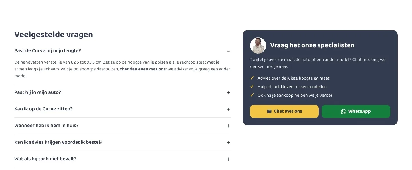
- 01Frequently asked questionsThere were no questions on the page. Now height, the car, sitting, delivery and returns are answered right there.
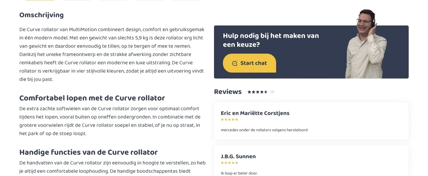
- 02Chat and WhatsAppThe page only had ‘Start chat’. Now you choose: chat or WhatsApp, with the specialist in view.
- 03Advice at the right momentIf you are reading the questions, you are still unsure. That is exactly where the invitation to just ask now sits.
While scrolling.
The button stays within reach, without making things busy.
- 01Buy bar with photoAfter scrolling, the button was out of view. Now a bar at the bottom shows photo, color, accessories, price and button.
- 02Delivery day in the bar‘Gratis en veilig bezorgd · in huis ma 9 nov’ (Free and safe delivery · at your home Mon 9 Nov) is in the bar too. That keeps the promise visible while you read.
- 03No empty areasPhoto and buy box scroll along together and end at the same point. The page stays calm and balanced.
Product page.
On mobile, the rollator and all photos in view right away.
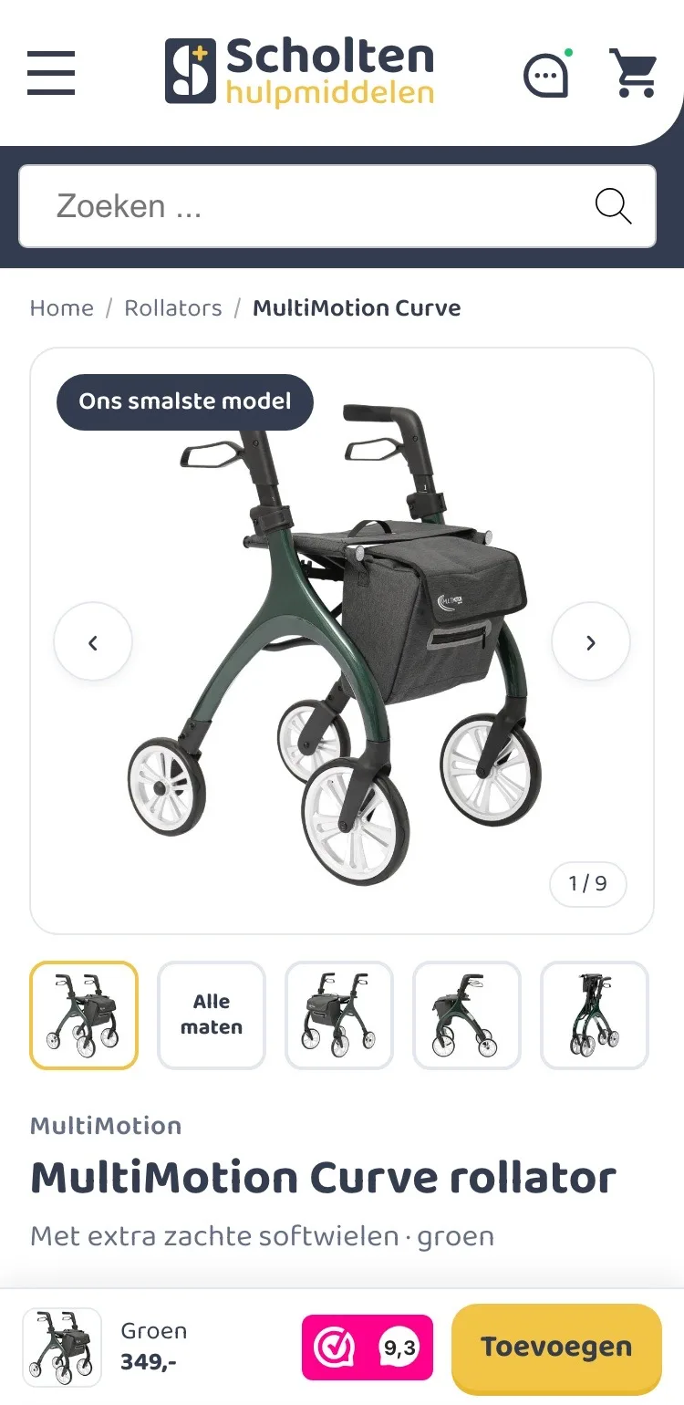
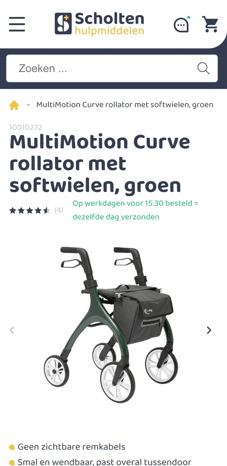
- 01Path back to rollatorsThe breadcrumb only showed a house icon and the product name. Now one tap takes you back to all rollators.
- 02All photos as thumbnailsWith only arrows, you cannot see what is still to come. Thumbnails below the photo show everything, including the dimensions.
- 03Button always within reachThe button was far below the fold. Now a bar with price and ‘Toevoegen’ (Add) sits at the bottom straight away.
Color and accessories.
From loose toggles to choices you understand right away.
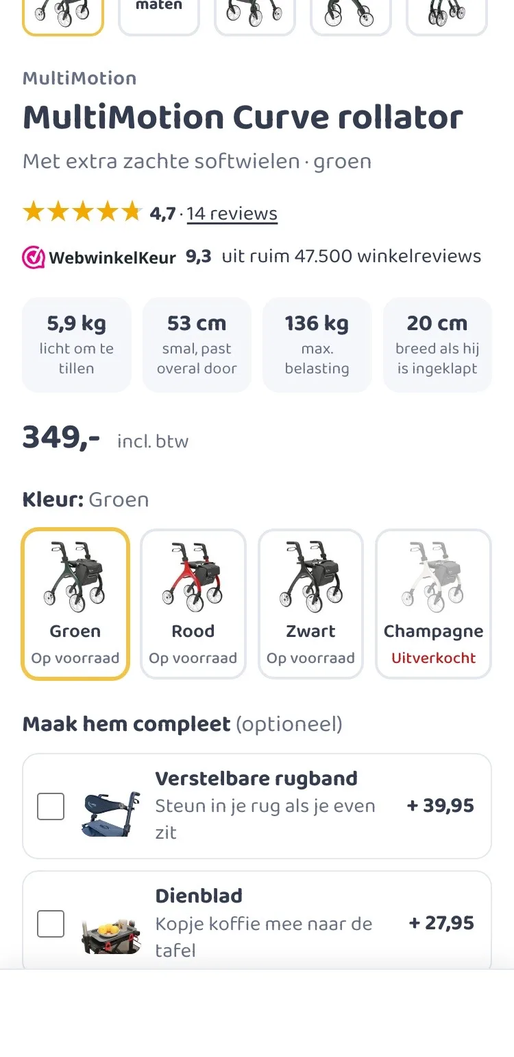
- 01Score and key figuresBelow the title you now see the 4.7, the 9.3 from WebwinkelKeur and four key figures. What you want to know, without scrolling.
- 02Color with stock statusFor each color you see whether it is in stock. If you want champagne, you leave your email address for when it is back.
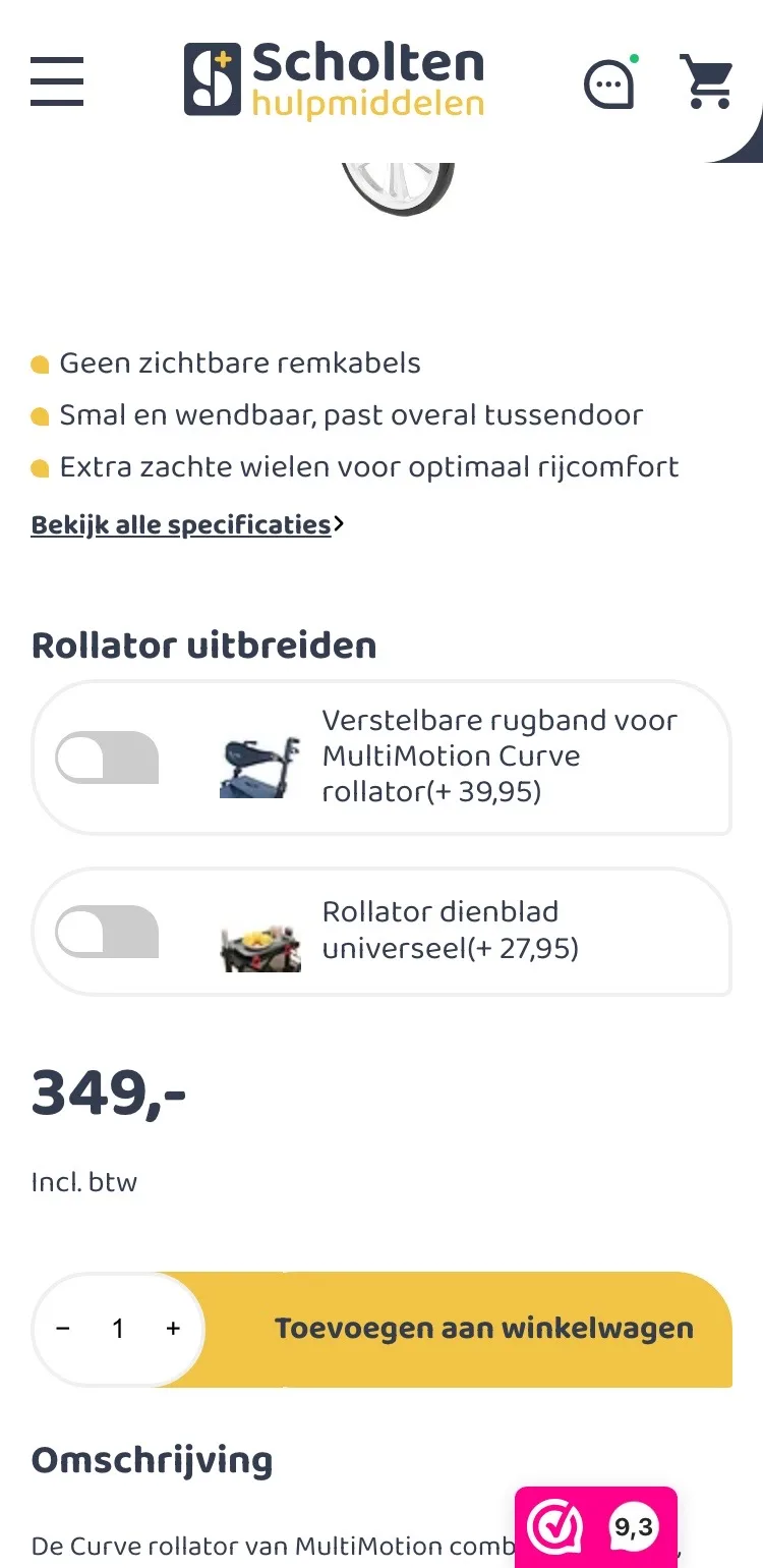
- 03Accessories with what they do for youNo toggles with long names, but cards with a photo and what they do for you. Tick them and the total appears below the price.
Around the button.
All guarantees in one place, right below the button.
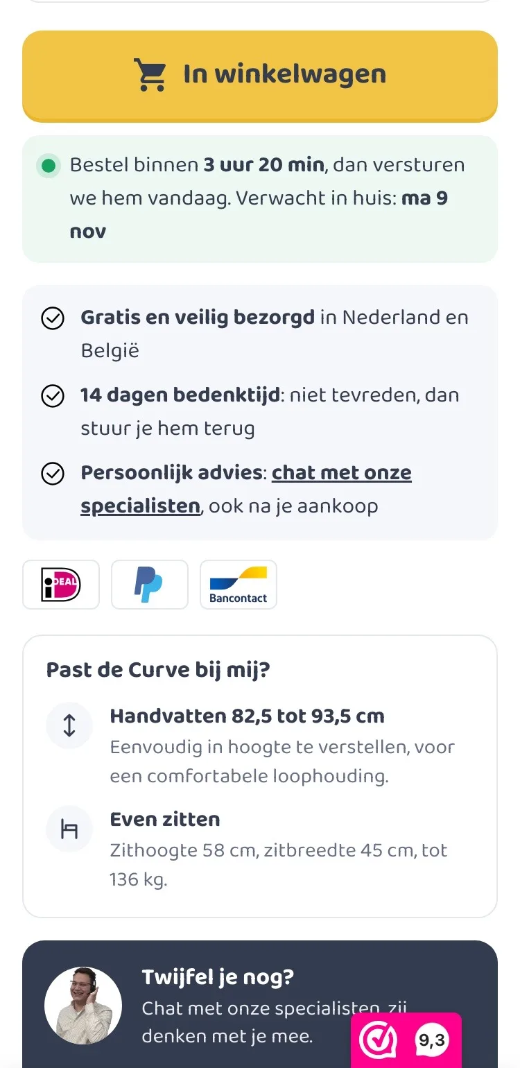
- 01Delivery day by the buttonThe description started right below the button. Now that is where you read when the rollator will be at your home.
- 02Guarantees and payment logosFree delivery, 14-day cooling-off period and personal advice are on a gray panel, with the payment logos below.
- 03Does it suit me?How high the handles go and how high you sit is now right below the button. Unsure? Chat or WhatsApp.
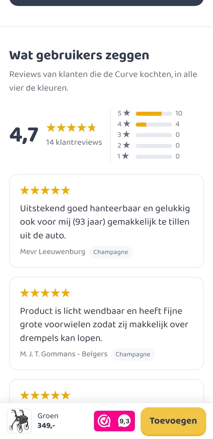
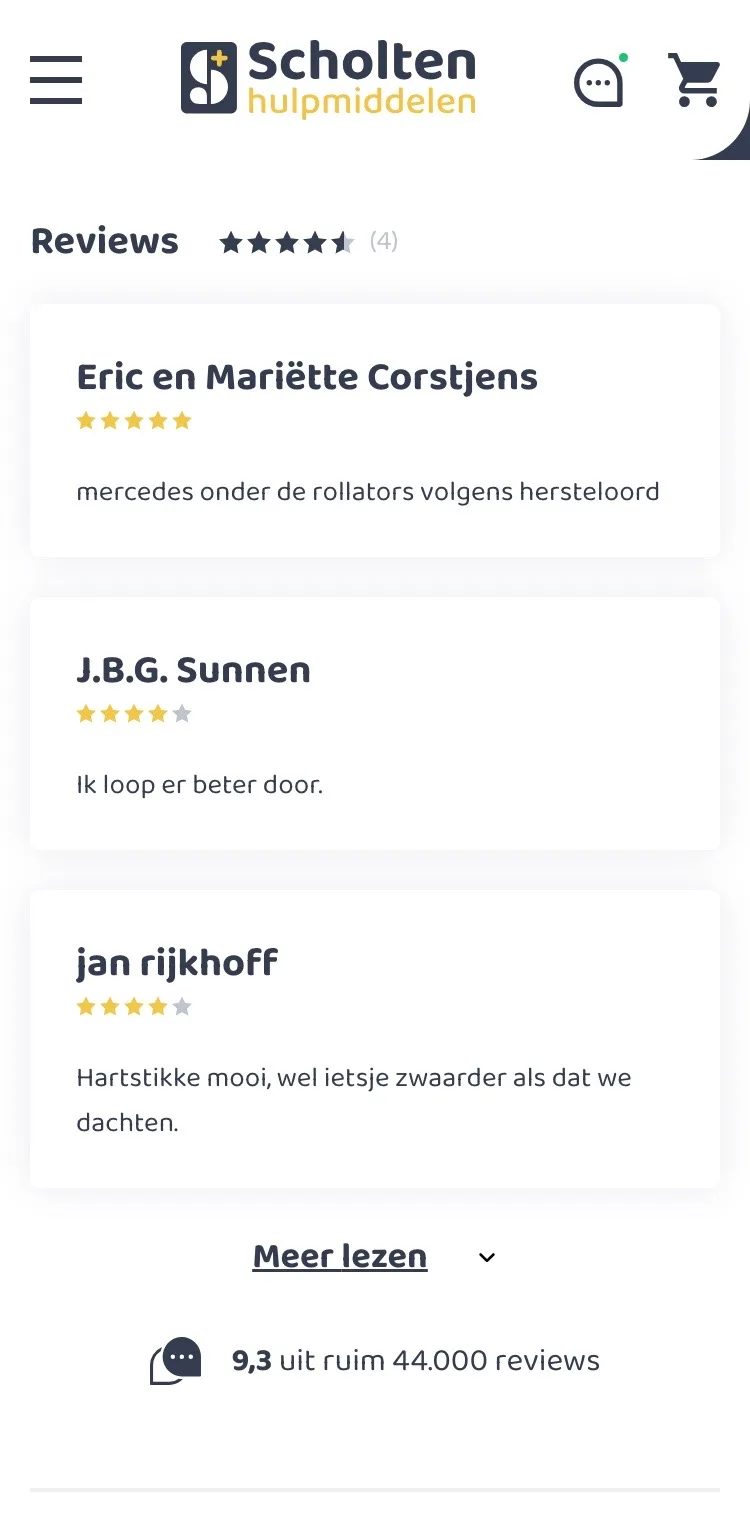
Reviews.
Customer trust, clearly laid out on a small screen.
- 01Score with breakdownSmall stars and ‘(4)’ said little. A large 4.7 with its breakdown shows at a glance how satisfied customers are.
- 02Full reviewsReviews of all colors, easy to read one below the other, with the color shown. One tap to read more.
- 03Right after the buy boxThe reviews sat below the long description and the table. Now they come right after the button, where the doubt is.
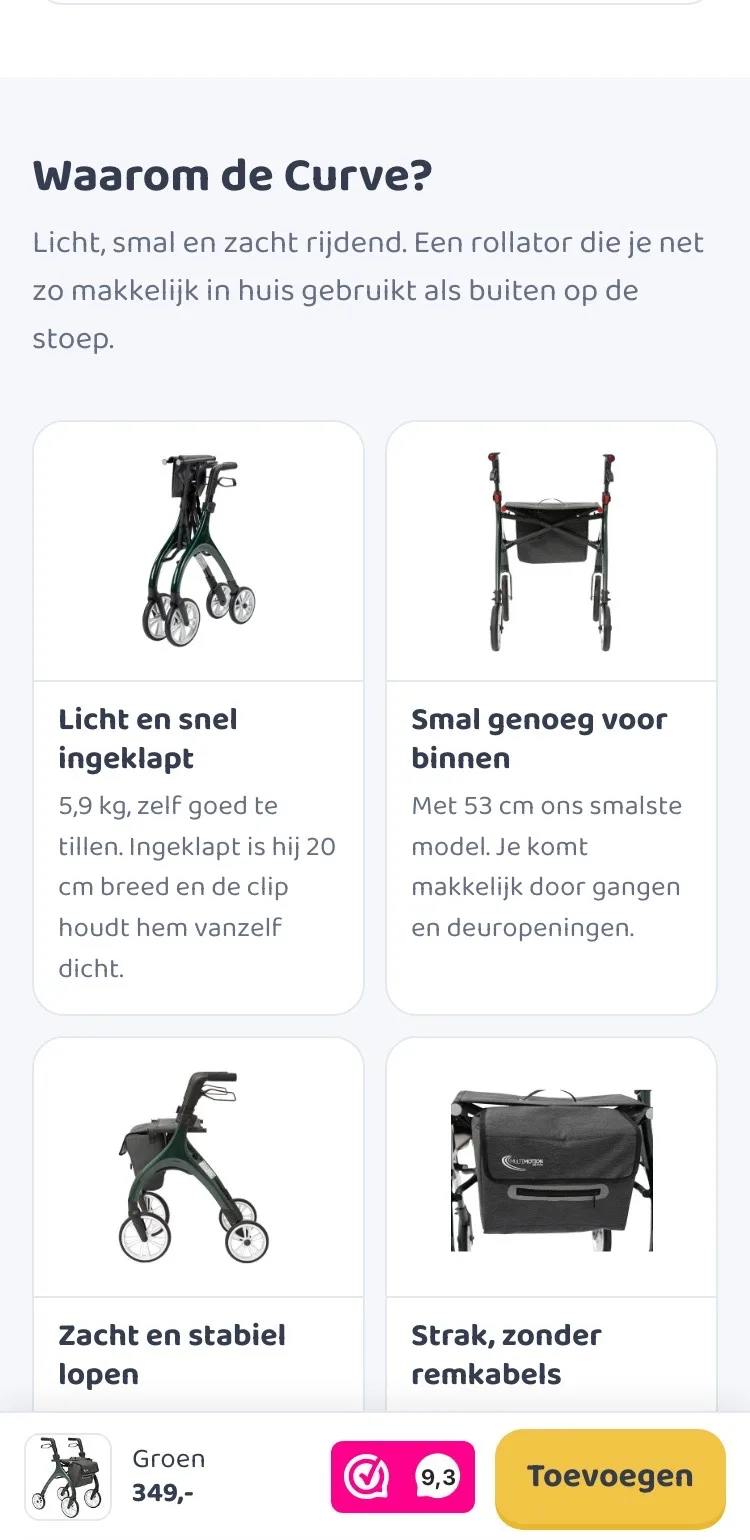
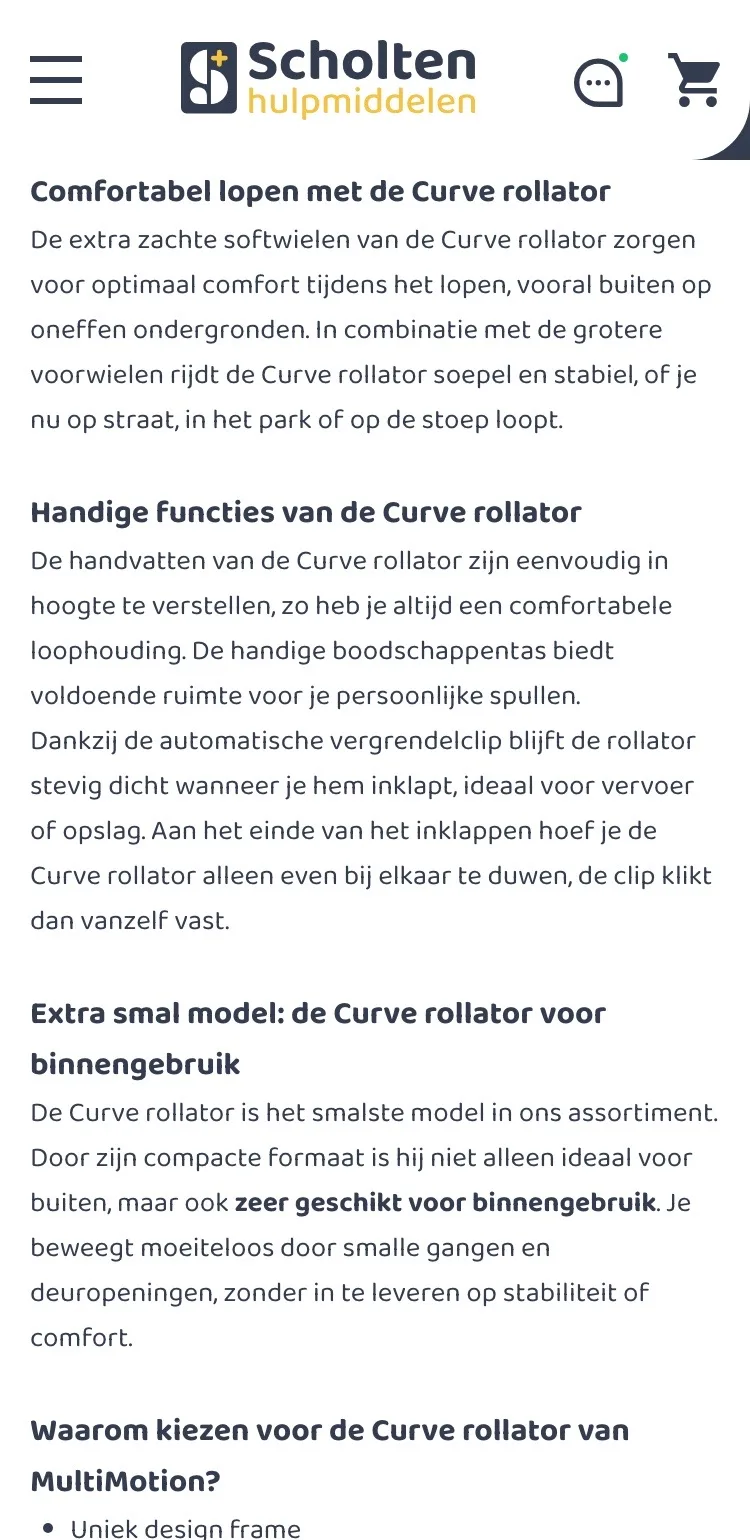
Why the Curve?.
From dense text to benefits you scan on the go.
- 01Benefits with imagesNobody reads one long wall of text on a phone. Four blocks with photos say the same in a few seconds.
- 02Two side by sideOn a small screen the benefits sit two by two. That keeps it short and you see more at once.
- 03Suitable forIndoors and outdoors are listed with a tick. If you often walk on unpaved paths, you immediately see a link to rollators with air tires.
Questions and contact.
Answers without searching, and contact the way you prefer.
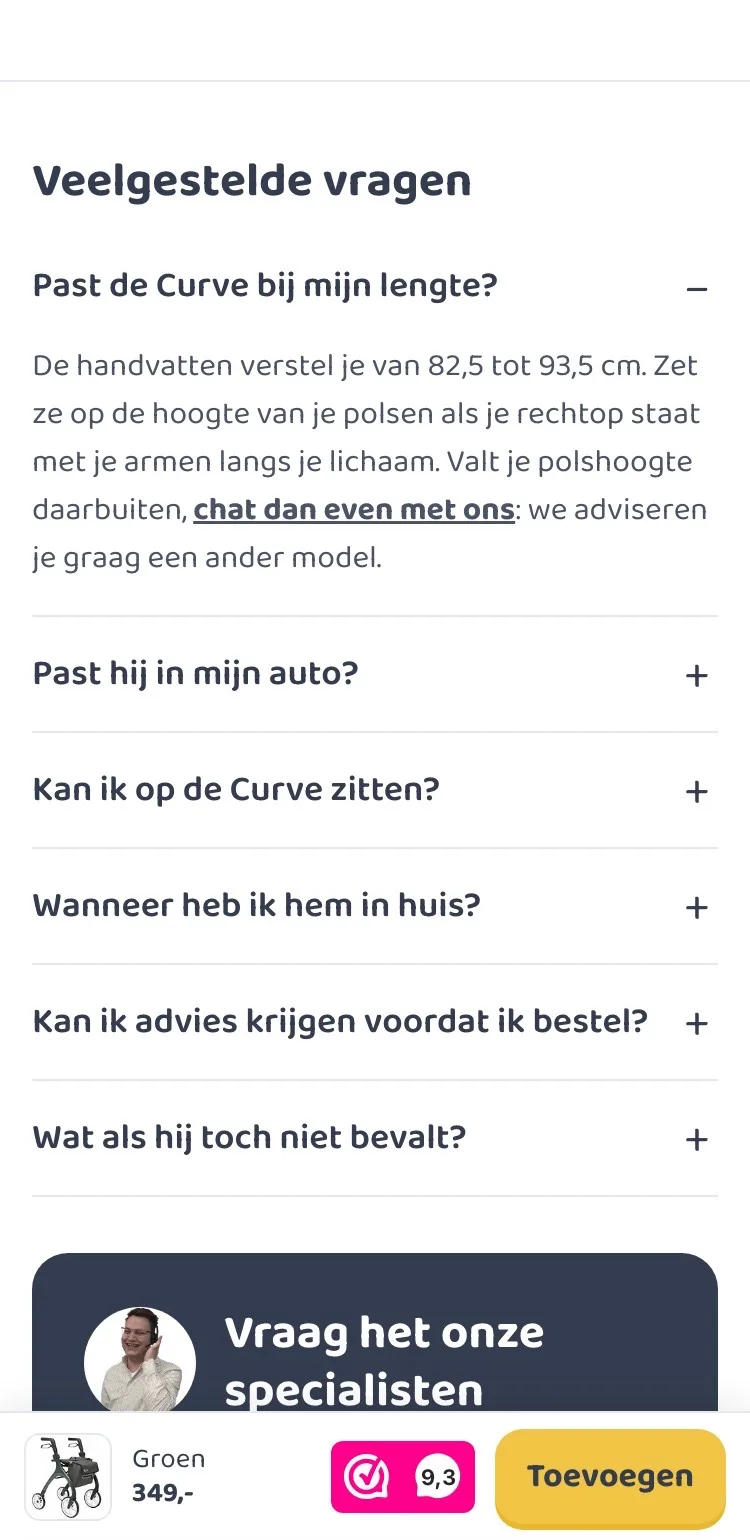
- 01Frequently asked questionsThere were no questions on the page. Now height, the car, sitting, delivery and returns are one tap away.
- 02Chat and WhatsAppThe page only had ‘Start chat’. Now you choose chat or WhatsApp, with the specialist’s photo alongside.
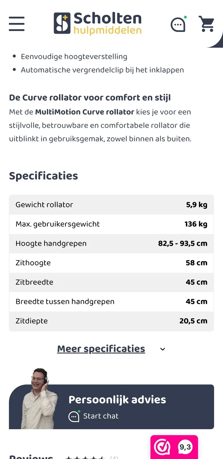
- 03Specifications collapsedThe long table is behind one button, so the page stays short for anyone who wants to order quickly.
Ordering.
Always a button within reach, and a clear confirmation.
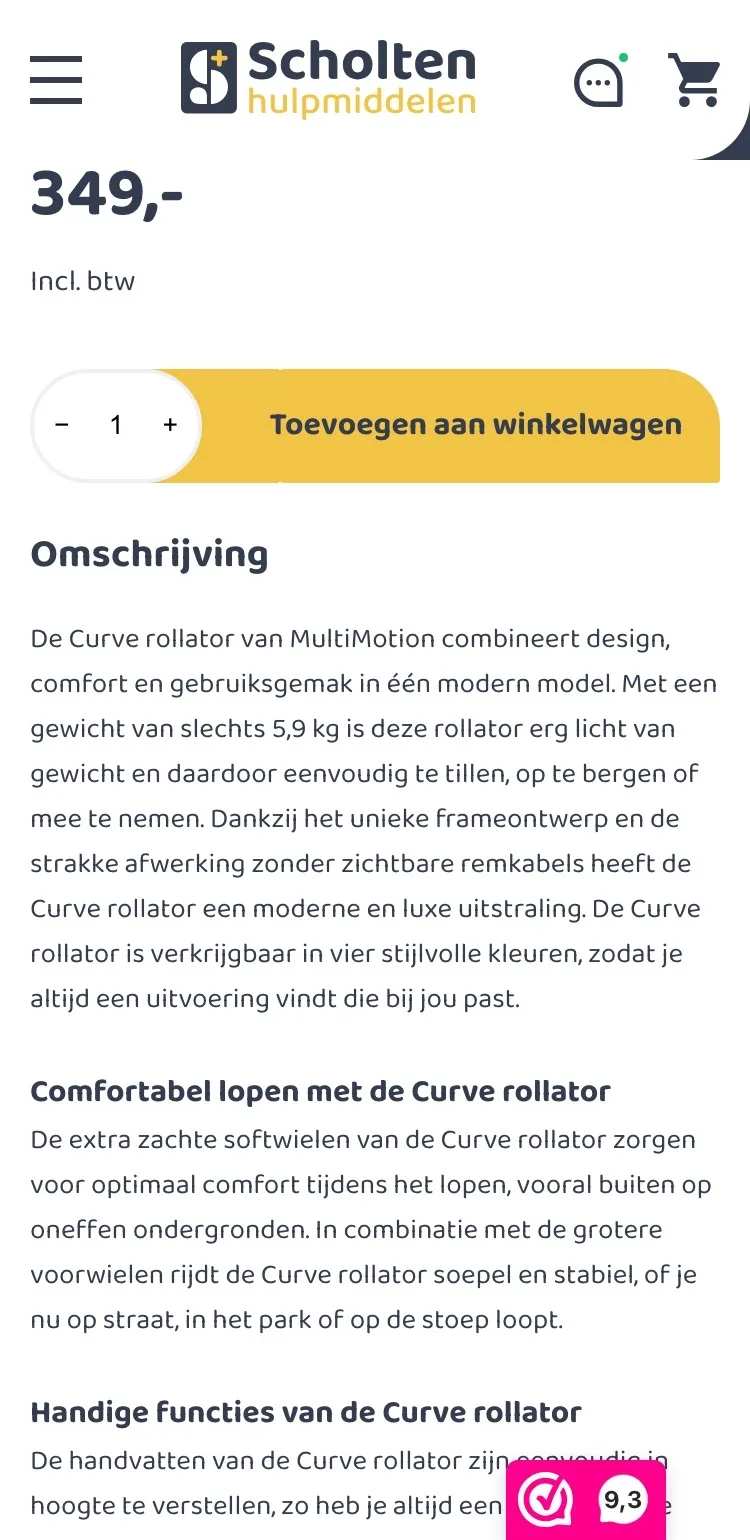
- 01Sticky buy barWhile reading, there was no button in view. Now the bottom always shows your color, the price and ‘Toevoegen’ (Add).
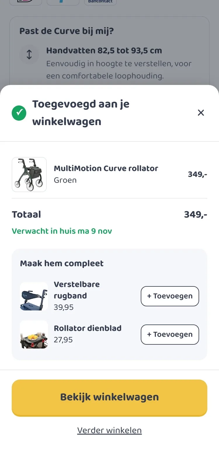
- 02Confirmation with delivery dayAfter adding, you immediately see what is in your cart and when it will be at your home.
- 03Complete itThe back strap and the tray are offered one more time, each added with one tap.
Click through the new design yourself.
The design works like a real page, on desktop and on your phone. You just can’t place an order with it yet.
From design to more orders.
This is how we take the new design live, and measure what it delivers.
- 01Only the pageHeader, menu, USP bar and footer stay exactly as they are now. We only change the content of the product page.
- 02Test first, then go liveWe run the new design in an A/B test next to the current page and measure orders per visitor.
- 03Your own strengthsYour own photos, visuals, reviews and tone of voice: it all came from you already, just in a better place.
This design live
on your online store?
With the AI Design Agent, we put this design on your existing online store, and then keep improving it every month with CRO. Built by our specialists. Without spending thousands of euros a month on it.
- No rebuild, no migration
- Your back office stays the way you know it
- Only goes live after your approval
- 01Ongoing development for a fixed monthly feeNo separate quotes for every change. If we see an opportunity or you have an idea, we build it.
- 02CRO improvements, implemented right awayWe analyze your online store and implement improvements in days instead of months.
- 03Safe, and you see what changesWe build and test everything in a preview first. It only goes live after your approval, and every version is saved.