 Google Ads
 Meta Ads
 Email marketing
 Lightspeed eCom Toolkit
 Shopify Toolkit
Your product page,
redesigned.
A new design for the product page of rijwielcashencarry.nl: Giant Defy Advanced 0 2026 Meteorite Mist. Below you see every screen before and after, and what we improved.
- 17 before-and-afters
- 26 improvements
- rijwielcashencarry.nl
Every screen, compared.
Pick a screen and drag across the screenshot. On the left you see the current page of rijwielcashencarry.nl, on the right the new design.
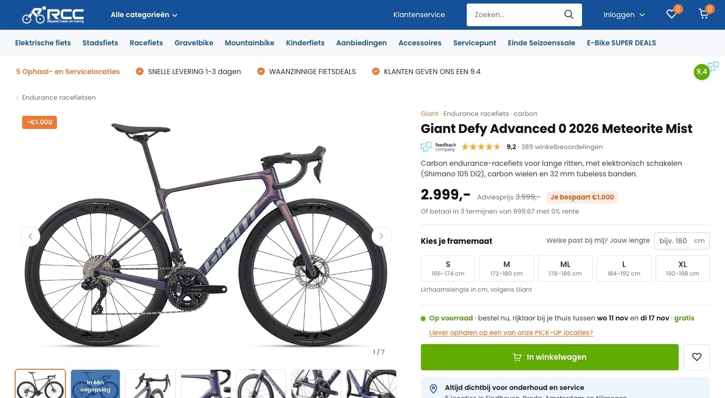
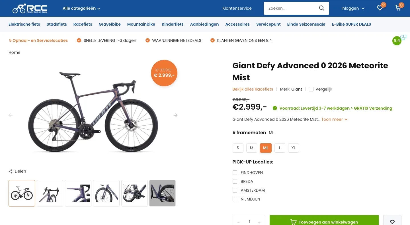
Product page.
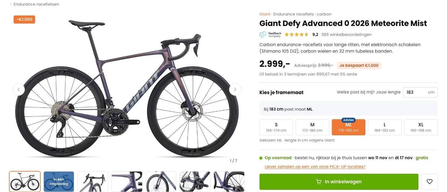
Price, savings and reassurance right below the name.
- 01Score by the titleThere was no score by the title. Now the 9.2 from Feedback Company, with its logo, sits right below the name, where you decide.
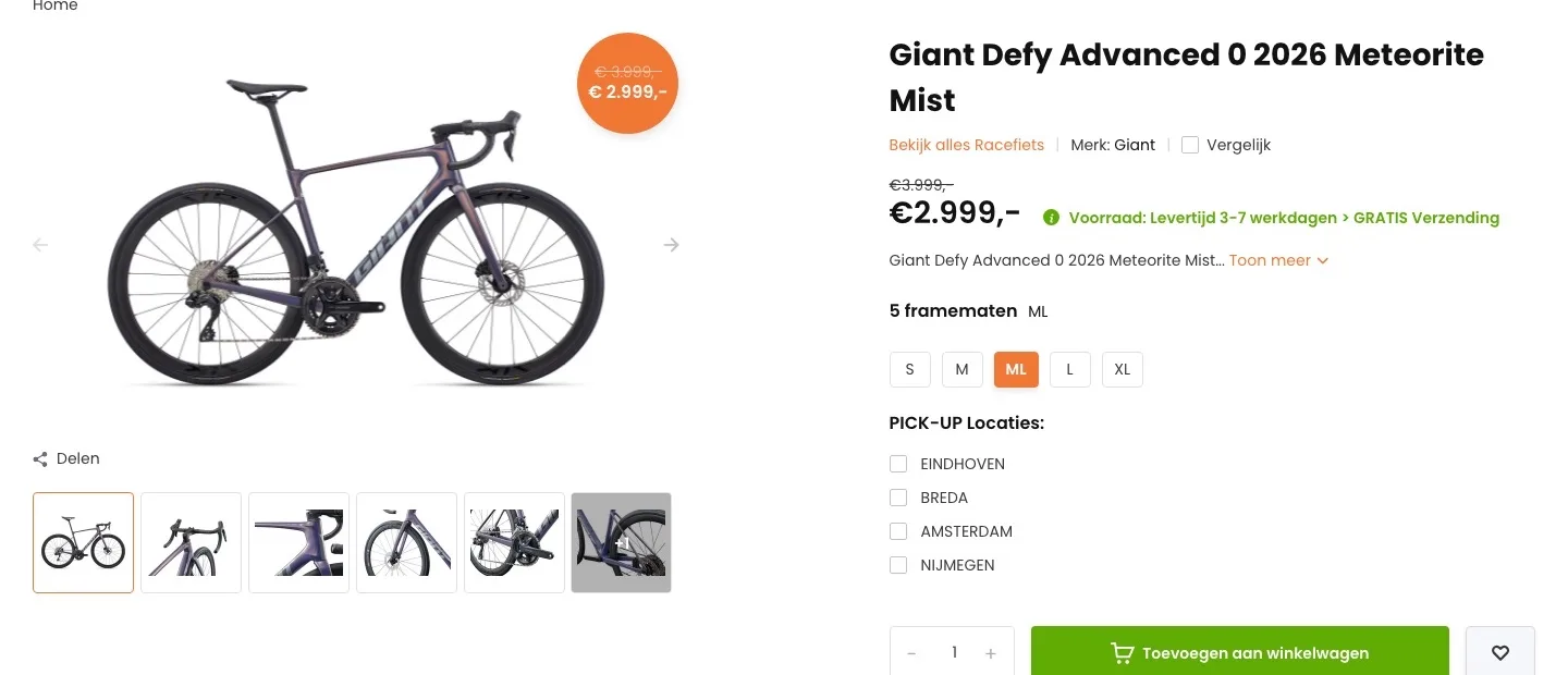
- 02What you save, in one lineAn orange circle sat over the photo. Now the price, recommended retail price and ‘Je bespaart €1.000’ (You save €1,000) sit side by side.
- 03What it is, in one sentenceThere was a cut-off sentence with ‘Toon meer’ (Show more). Now you read right away who the bike is for and what makes it special.
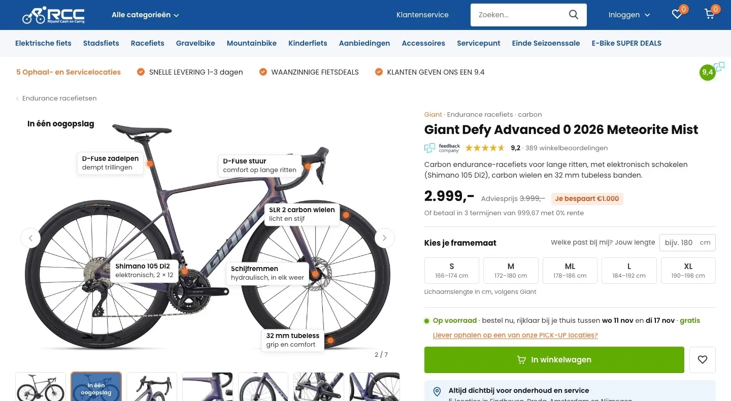
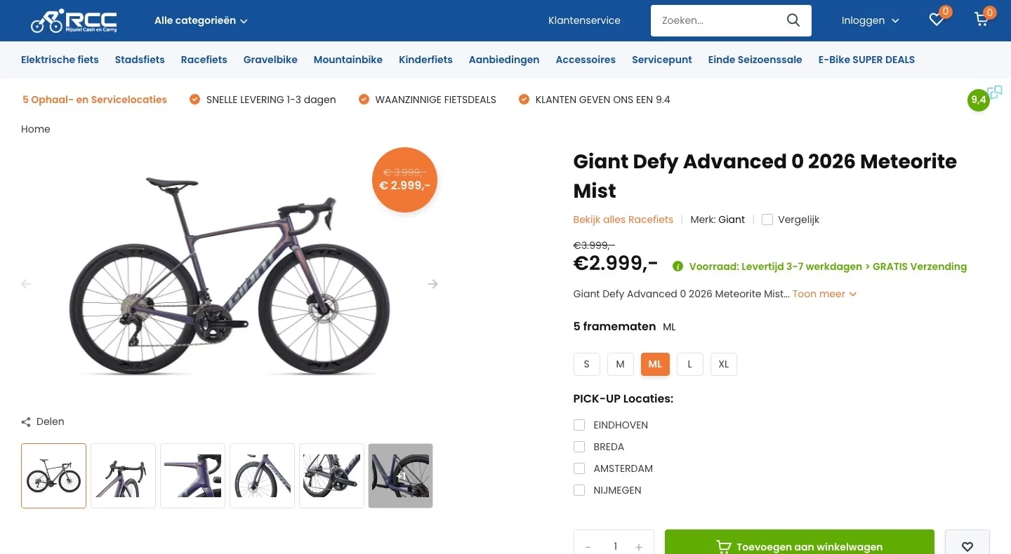
Gallery.
The photo now shows why this bike is worth its price.
- 01At a glanceThe technology was hidden in long text. A second image now points out the Di2, carbon wheels and comfort on the bike.
- 02Photo without a price circleThe discount sat as a circle over the bike. Now you see the whole bike and ‘−€1.000’ sits small in the corner.
- 03All images in a rowSeven thumbnails below the photo with a counter, so you see how many images there are and can browse quickly.
Choose your frame size.
No more doubt about the size before you press the button.
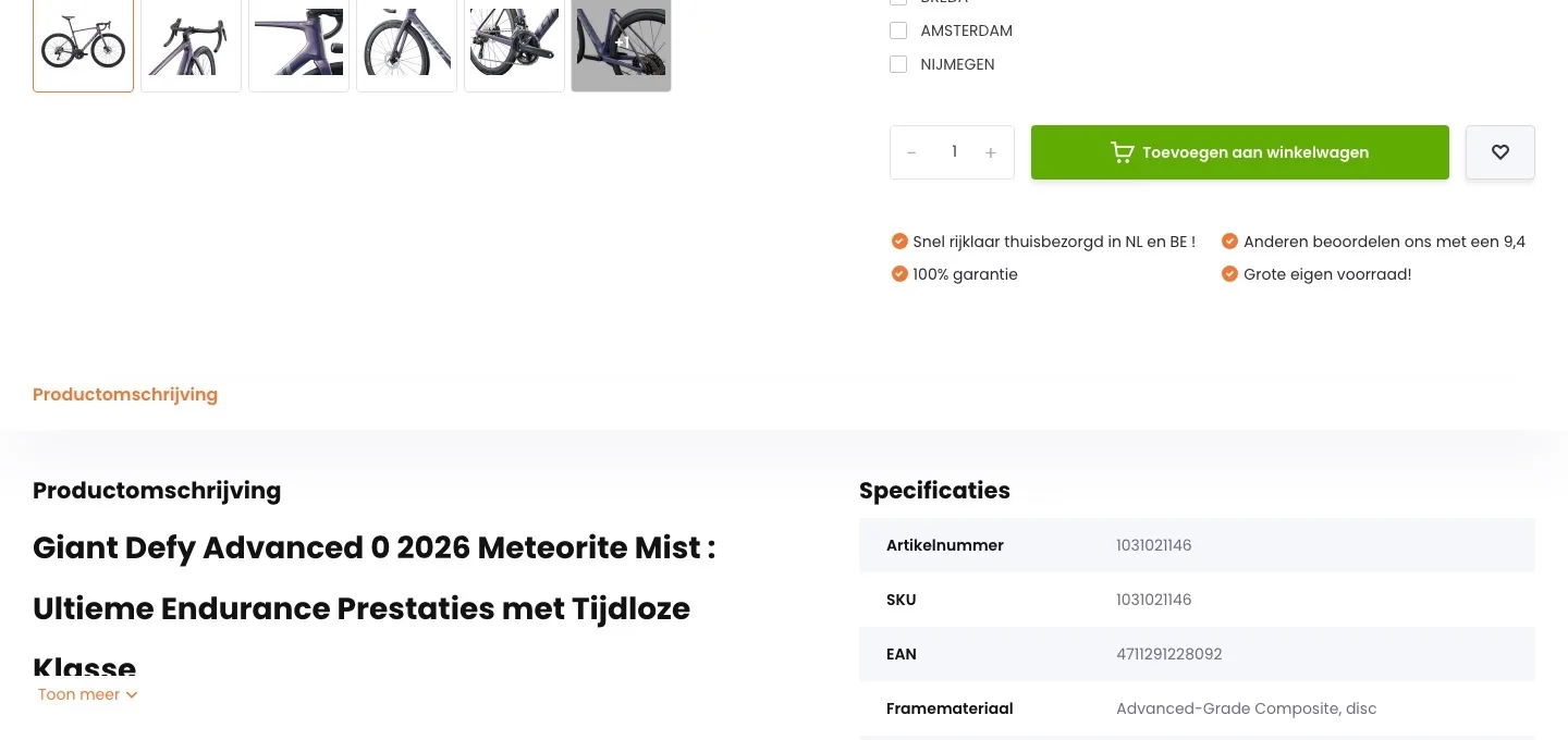
- 01No size preselectedML was already selected. Anyone who misses that orders the wrong size. Now you choose yourself, with the height range below each size.
- 02Advice based on your heightEnter your height and the right size gets the label ‘Advies’ (Recommended). That way you order the right size and fewer bikes come back.
- 03Heights according to GiantEach size shows Giant’s own height range, so the advice matches the manufacturer.
Around the button.
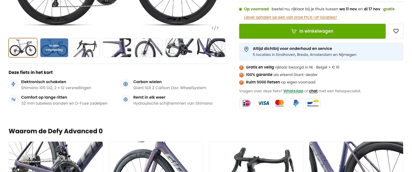
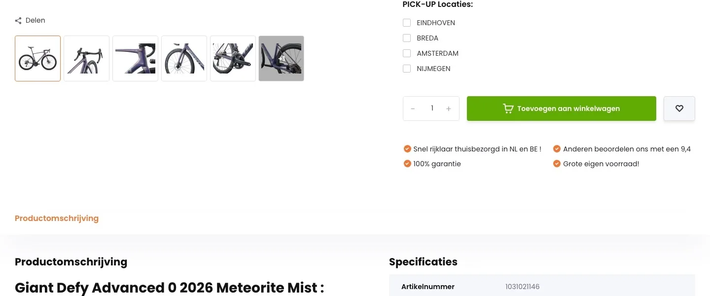
Everything you want to know, right where you decide.
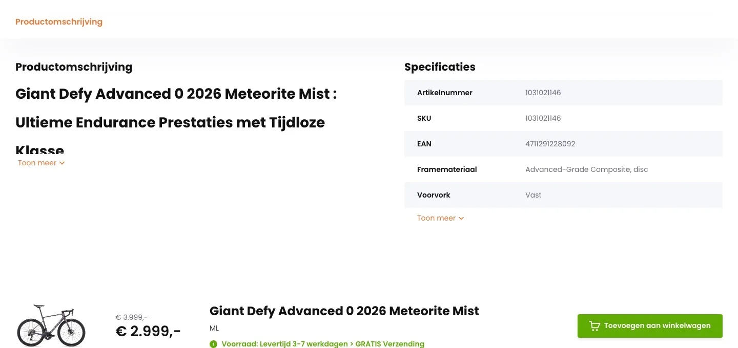
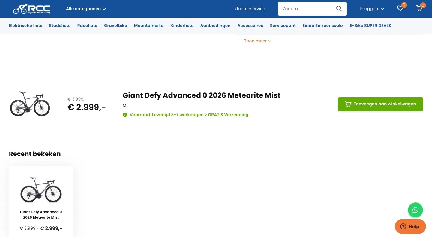
- 01Know when it arrivesIt said ‘levertijd 3-7 werkdagen’ (delivery time 3-7 working days). Now you see between which two dates the bike will be at your home, ready to ride.
- 02Delivery or pickupFour separate ‘PICK-UP’ checkmarks made it unclear. Now it’s delivered ready to ride, and you choose pickup with one link.
- 03Close by for maintenanceWith a road bike of almost €3,000, the service afterwards matters. Now you immediately see there are 5 locations, with the payment logos below.
In short.
From a cut-off heading to what makes the bike special.
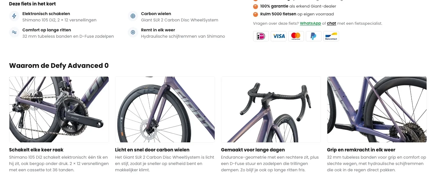
- 01The four strong pointsThe description started with a long heading and ‘Toon meer’ (Show more). Now Di2, carbon wheels, comfort and brakes are in one row.
- 02An image with every reasonEach point under ‘Waarom de Defy’ (Why the Defy) has a detail photo, so you see what you’re paying for.
- 03Quick to readEach reason is two sentences. Anyone comparing it with another bike gets the answer quickly.
Description and specifications.
Text and table side by side, only the details that count.
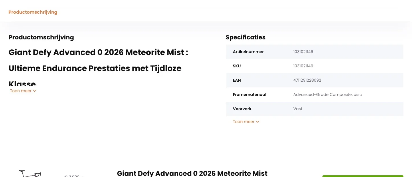
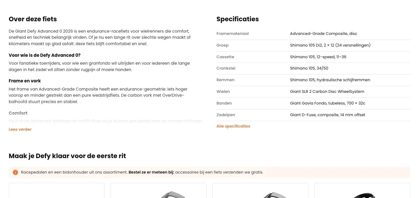
- 01Text with subheadingsA long text behind ‘Toon meer’ (Show more). Now short subheadings tell you who it’s for and how it rides.
- 02Specifications that countThe table started with item number, SKU and EAN. Now groupset, wheels, tires and brakes are at the top.
- 03Eight lines that countThere were five lines, three of them numbers. Now you see eight specifications, and the rest are behind ‘Alle specificaties’ (All specifications).
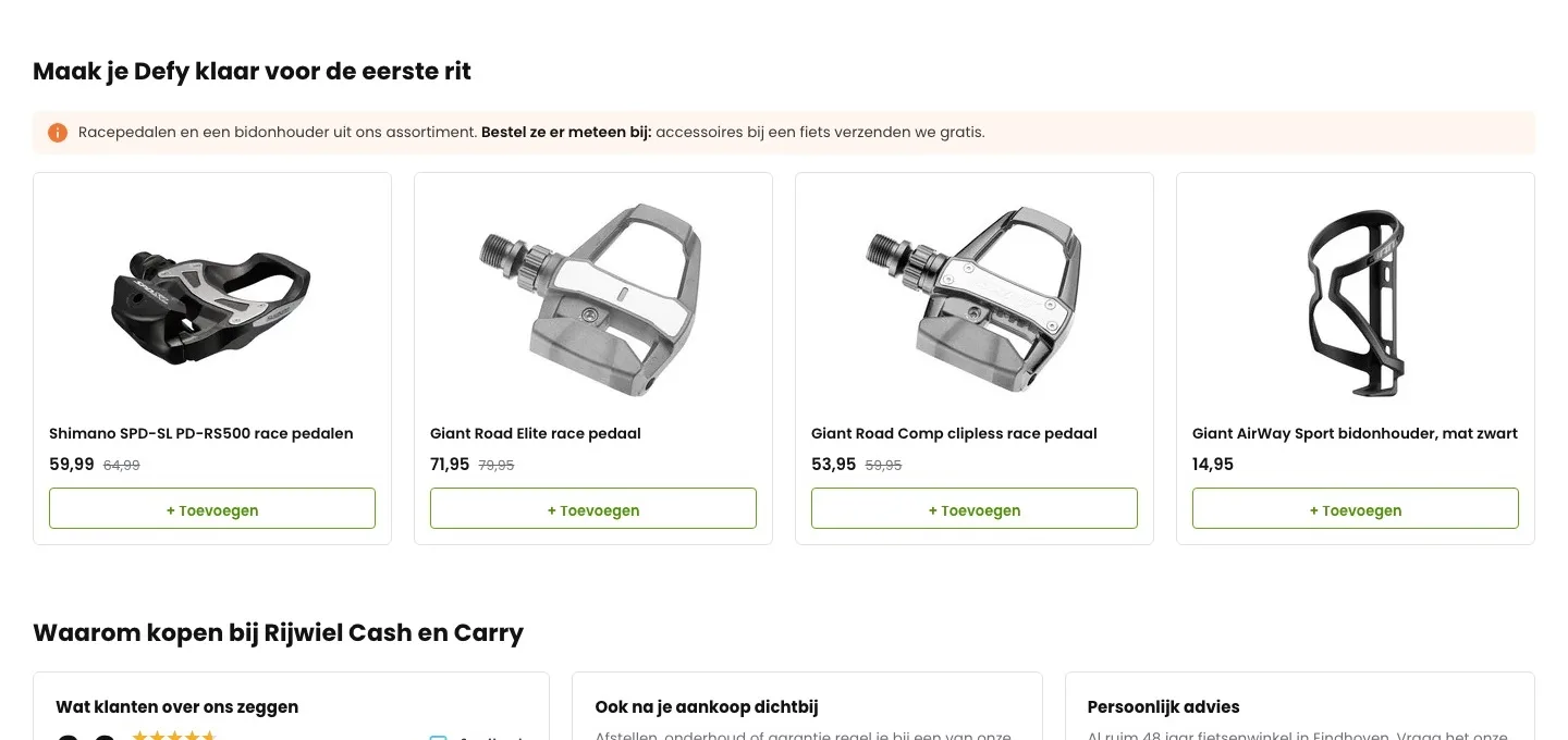
Ready for the first ride.
Pedals and a bottle cage, added with one click.
- 01Shipped free with the bikeThat accessories ship free with a bike was only on the shipping page. Now it’s right above the pedals.
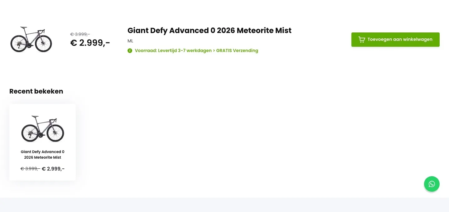
- 02Add right away‘Recent bekeken’ (Recently viewed) showed this same bike. Now you see pedals and a bottle cage, each with ‘+ Toevoegen’ (+ Add).
- 03From your own rangeOnly items you sell yourselves, with their own price and discount.
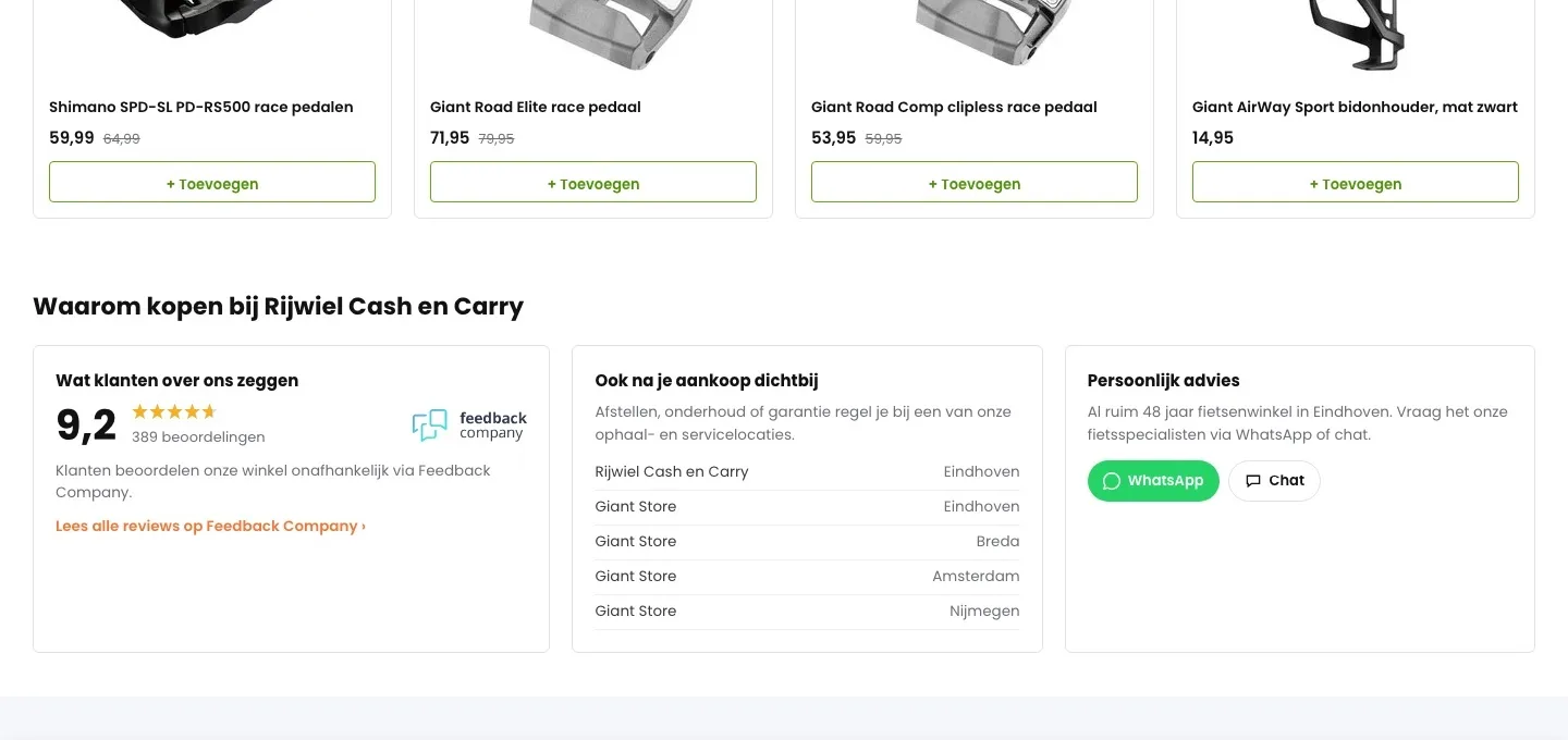
Why Rijwiel Cash en Carry.
The score that was already there, now with reviews, locations and advice.
- 019.2 with reviewsBy the button it said ‘Anderen beoordelen ons met een 9,4’ (Others rate us 9.4). Now you see the current 9.2 from 389 reviews, with a link to all reviews.
- 02Close by after your purchase tooAll pickup and service locations are in a list, so you see where you can go for maintenance.
- 03Personal adviceAnyone in doubt can message or chat with a bike specialist through the channels you already have.
While scrolling.
The button stays within reach, without anything covering the text.
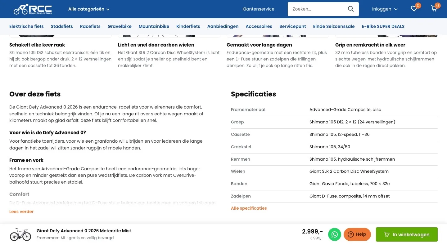
- 01Fixed buy barWhile you read, there was no fixed button in view. Now the bottom always shows the bike, your size, the price and the button.
- 02WhatsApp and Help in the barThe floating buttons sat over the page. Now they’re in the buy bar and the text stays clear.
- 03Your choice stays putThe chosen frame size is in the bar, so you see what you’re putting in your cart.
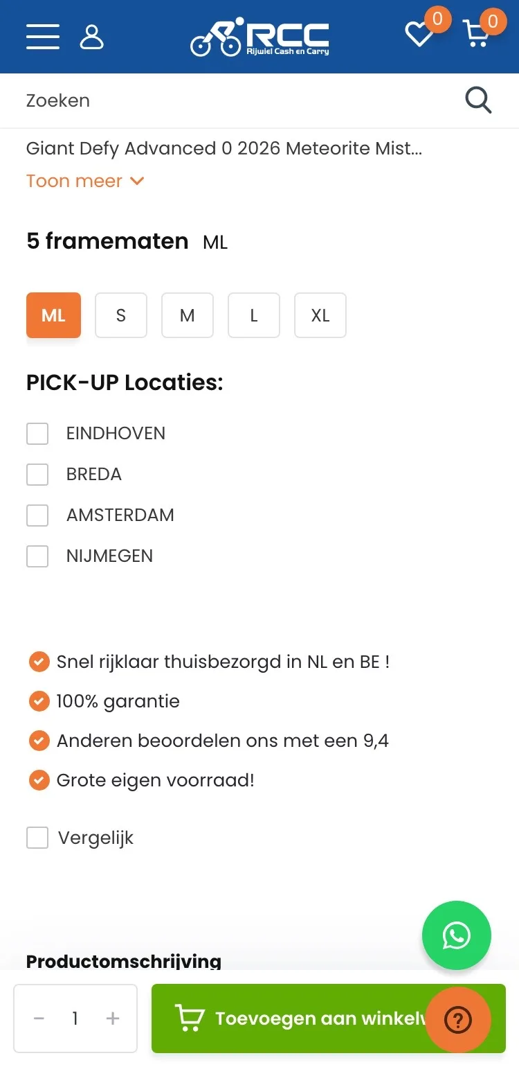
Product page.
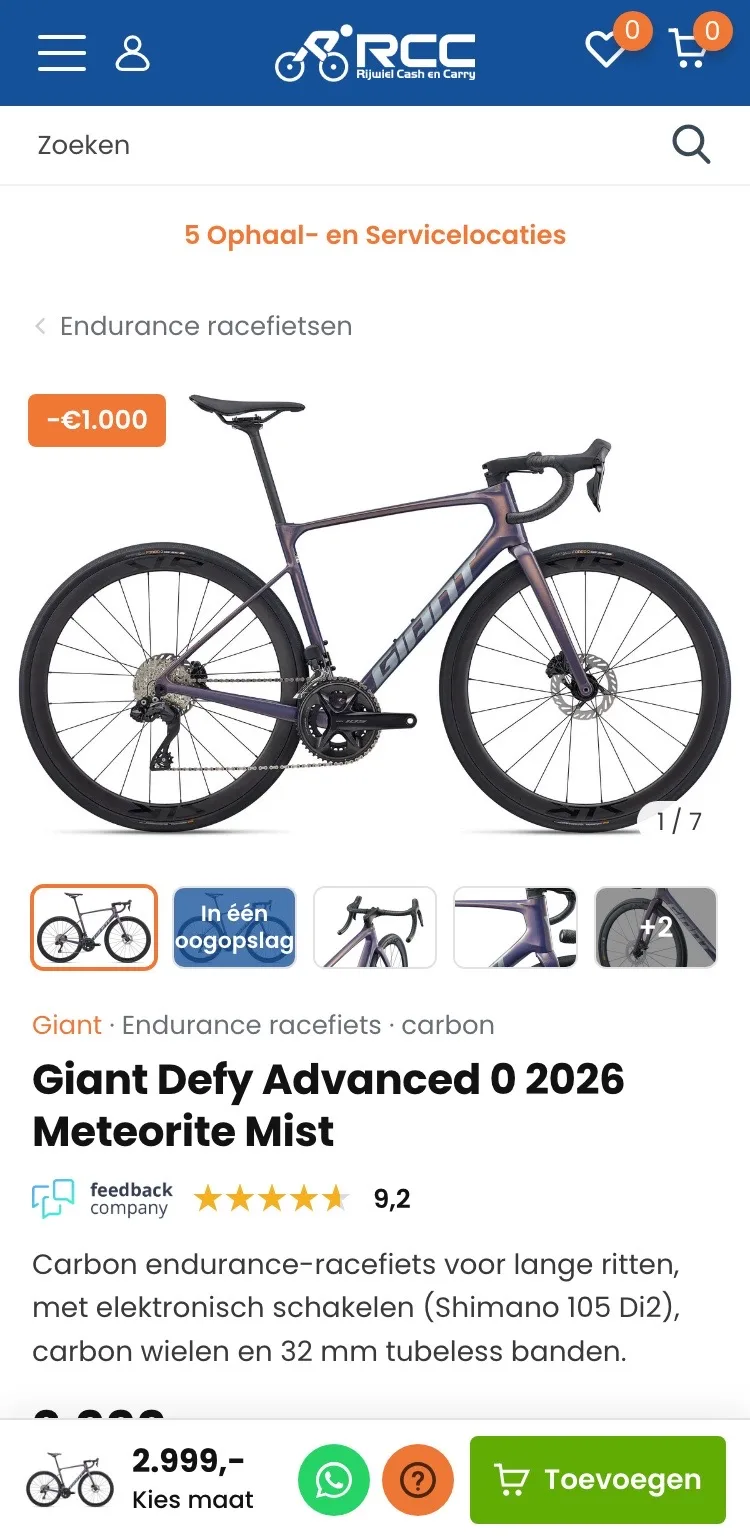
On mobile, the name, score and price right below the photo.
- 01Score by the titleThere was no score below the title. Now you see the 9.2 from Feedback Company, with its logo, right below the name.
- 02Thumbnails below the photoYou couldn’t see how many images there are. Now the thumbnails sit below the photo, with ‘In één oogopslag’ (At a glance).
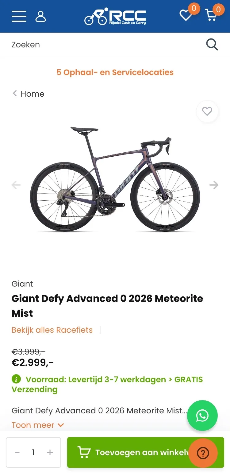
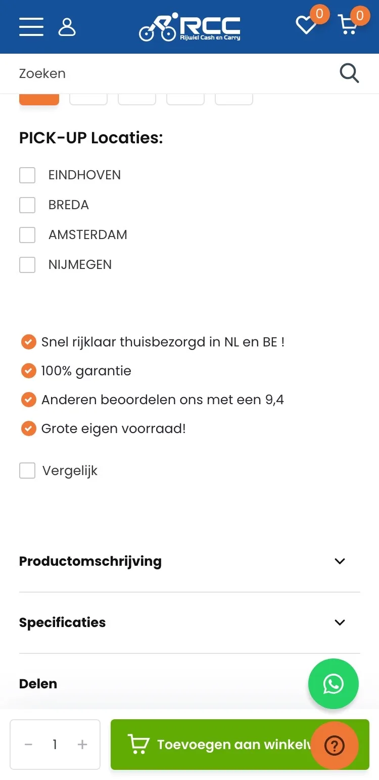
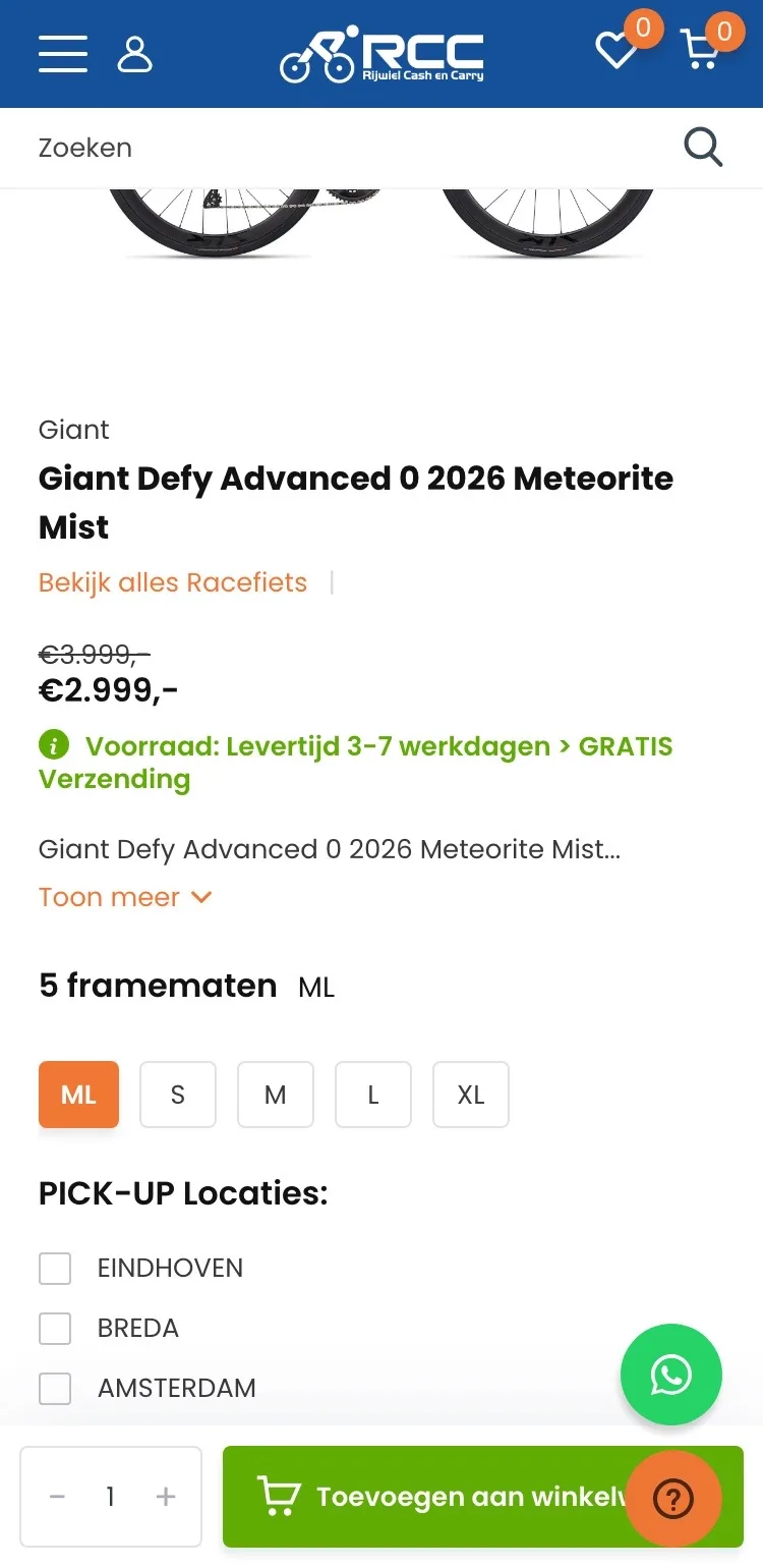
- 03Button no longer coveredThe Help button sat over ‘Toevoegen aan winkelwagen’ (Add to cart). Now WhatsApp and Help sit next to the button in the buy bar.
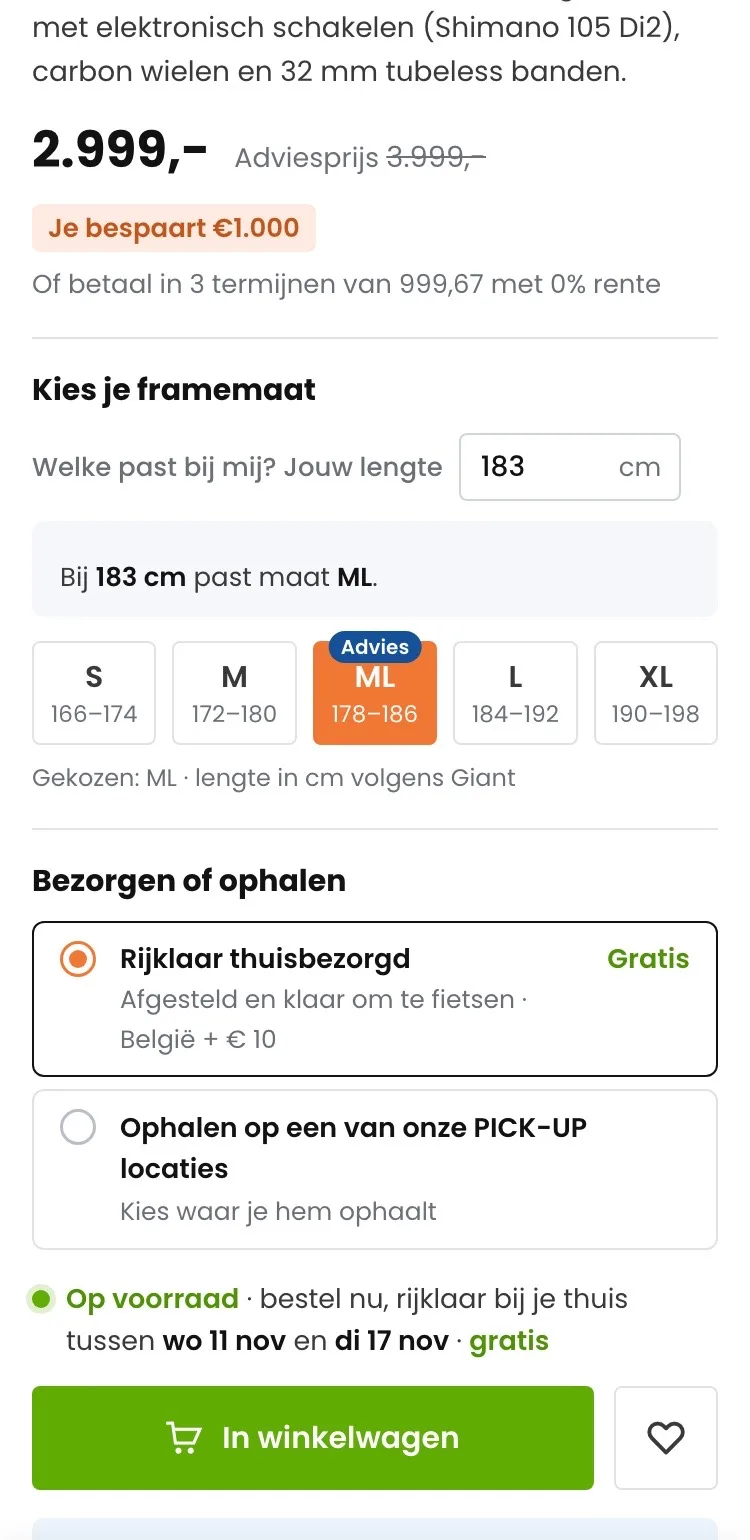
Choose your frame size.
Advice based on your height, even on a small screen.
- 01No size preselectedML was already selected. Now you choose yourself, and each size shows the body height according to Giant.
- 02Advice based on your heightEnter your height and the right size gets ‘Advies’ (Recommended). Less doubt, and fewer bikes coming back.
- 03Delivery or pickupFour ‘PICK-UP’ checkmarks became two clear choices: delivered to your home ready to ride, or pickup at a PICK-UP location.
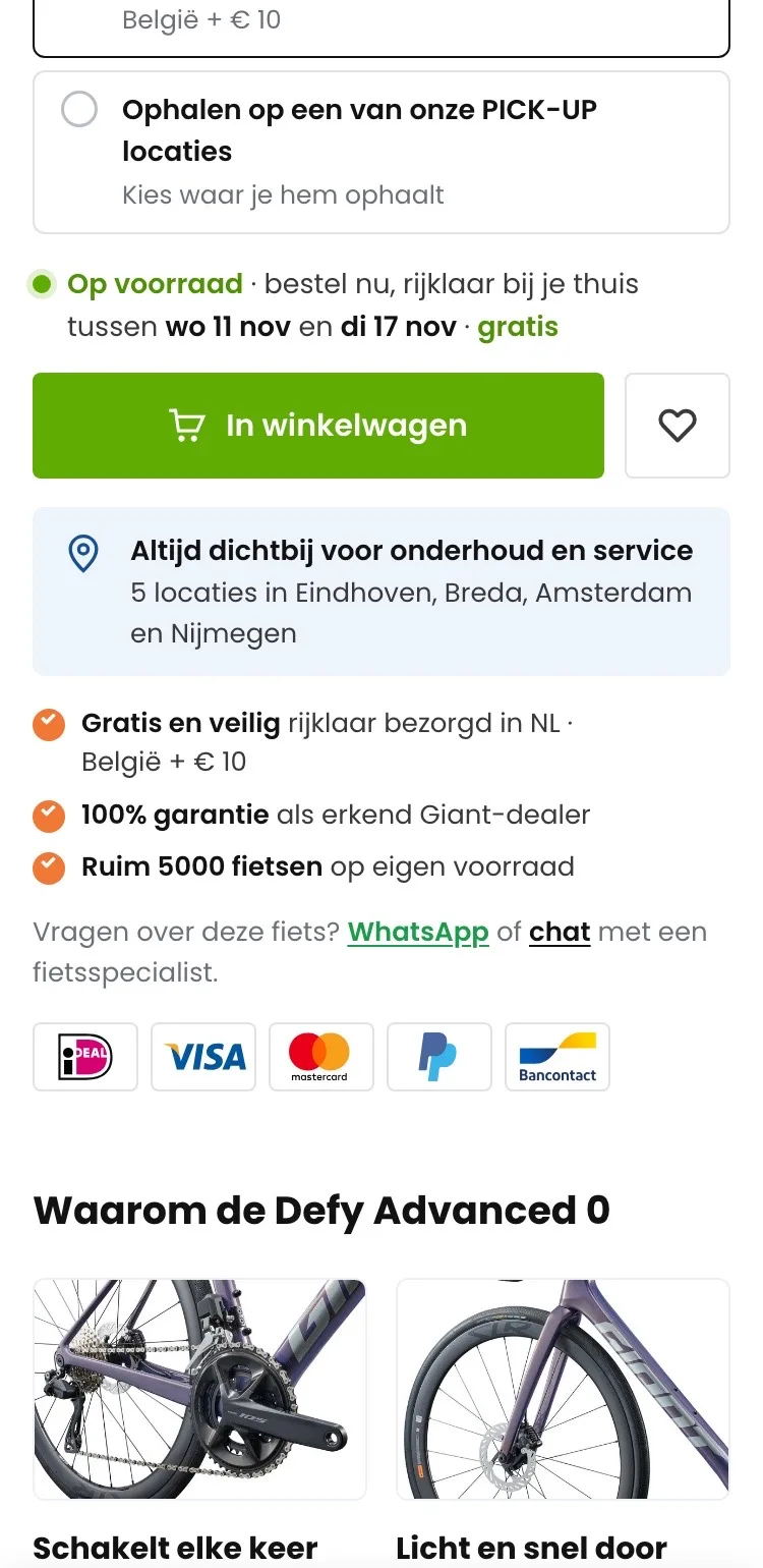
Around the button.
All the reassurances right below the button.
- 01Know when it arrivesIt said ‘3-7 werkdagen’ (3-7 working days). Now you see between which two dates the bike will be at your home, ready to ride.
- 02Close by for maintenanceRight below the button you see there are 5 locations where you can go for maintenance and service.
- 03Reassurances with logosFree and safe delivery, warranty and own stock are by the button, with the payment logos below.
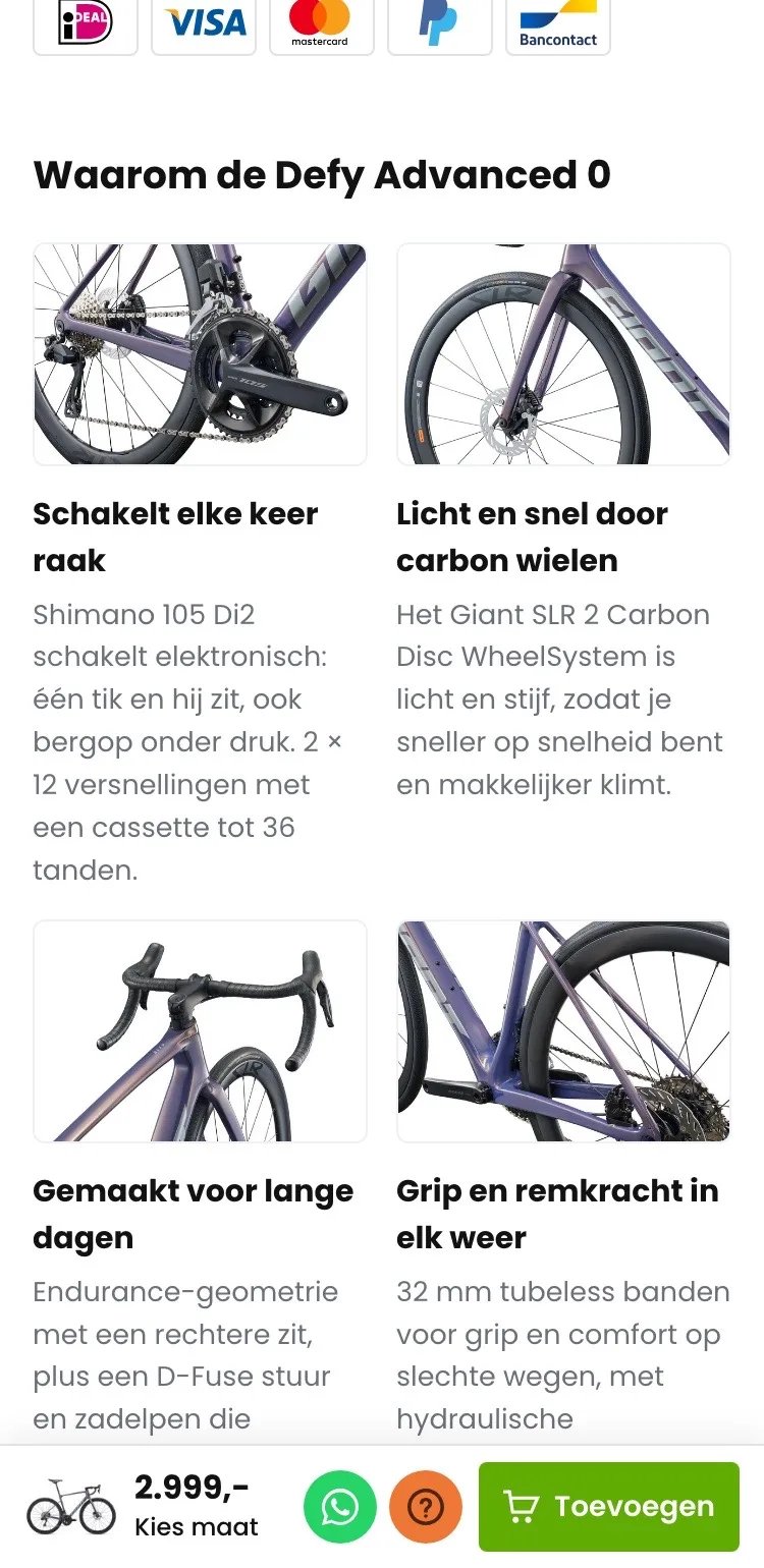
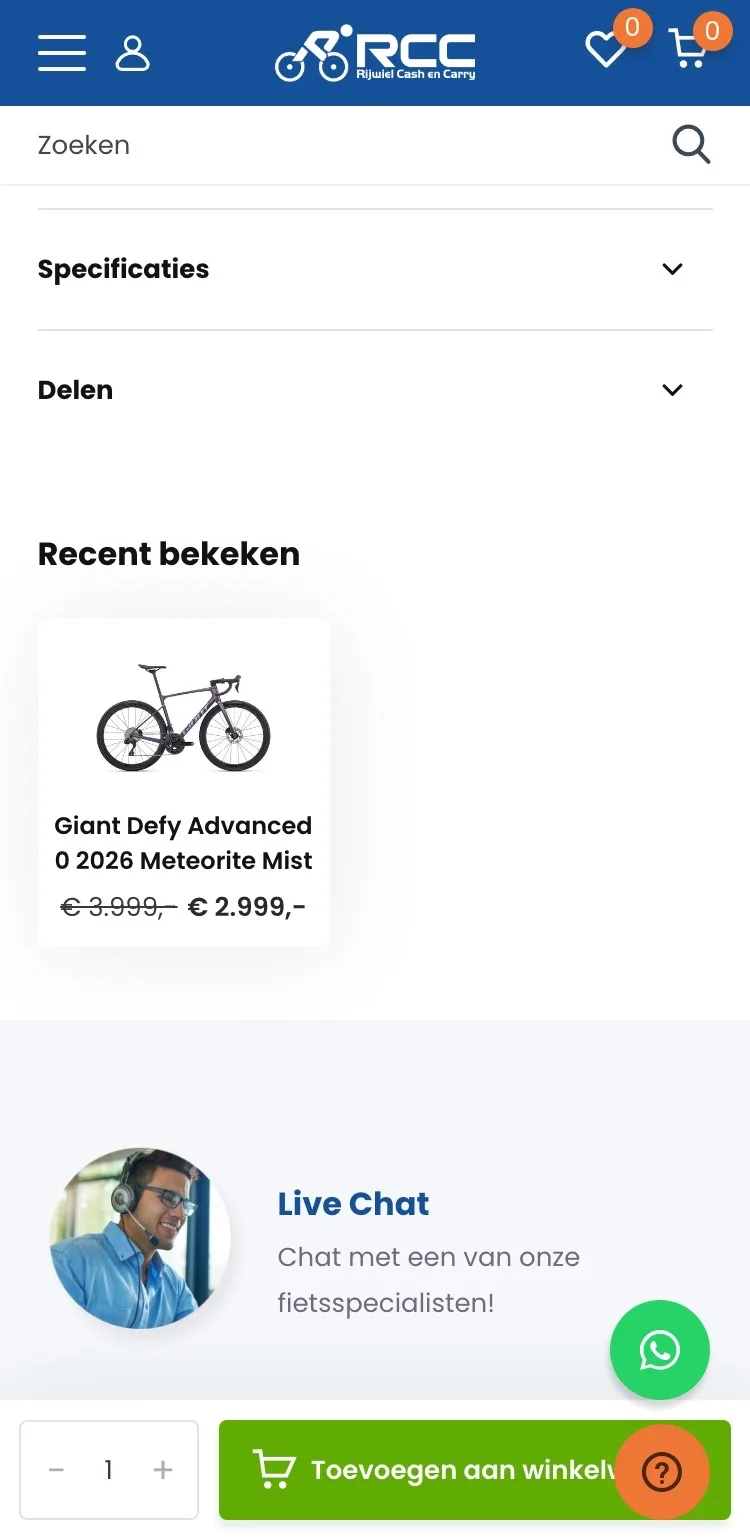
In short.
What makes the bike special, without opening tabs.
- 01No closed tabsDescription and specifications were behind closed tabs. Now the strong points are open on the page.
- 02An image with every reasonEach reason has a detail photo: shifting, wheels, comfort and brakes.
- 03Quick to readTwo sentences per point. On a small screen you know in a few seconds what you’re paying for.
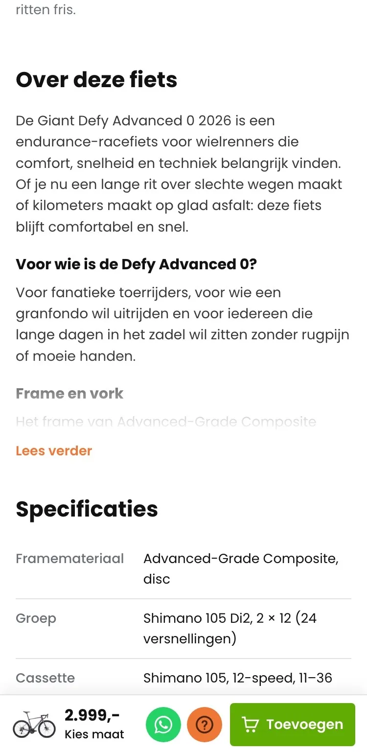
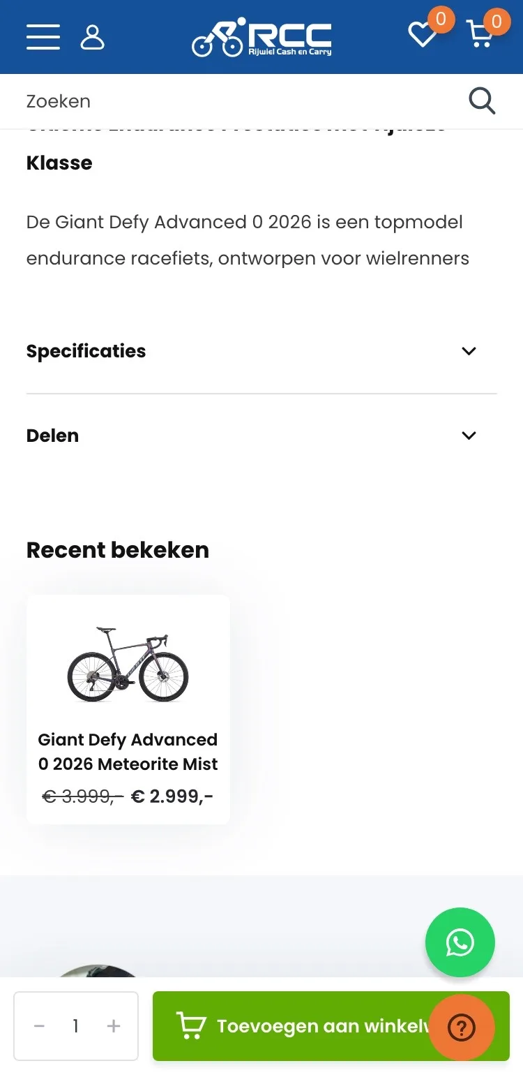
Description and specifications.
Quick to read, and only the details that count.
- 01Text with subheadingsThe description started with a long heading. Now short subheadings tell you who it’s for and how it rides.
- 02Specifications that countNot item number, SKU and EAN at the top, but what a cyclist compares: groupset, wheels, tires and brakes.
- 03Read on for moreThe text starts short. ‘Lees verder’ (Read more) and ‘Alle specificaties’ (All specifications) are there for anyone who wants to know everything.
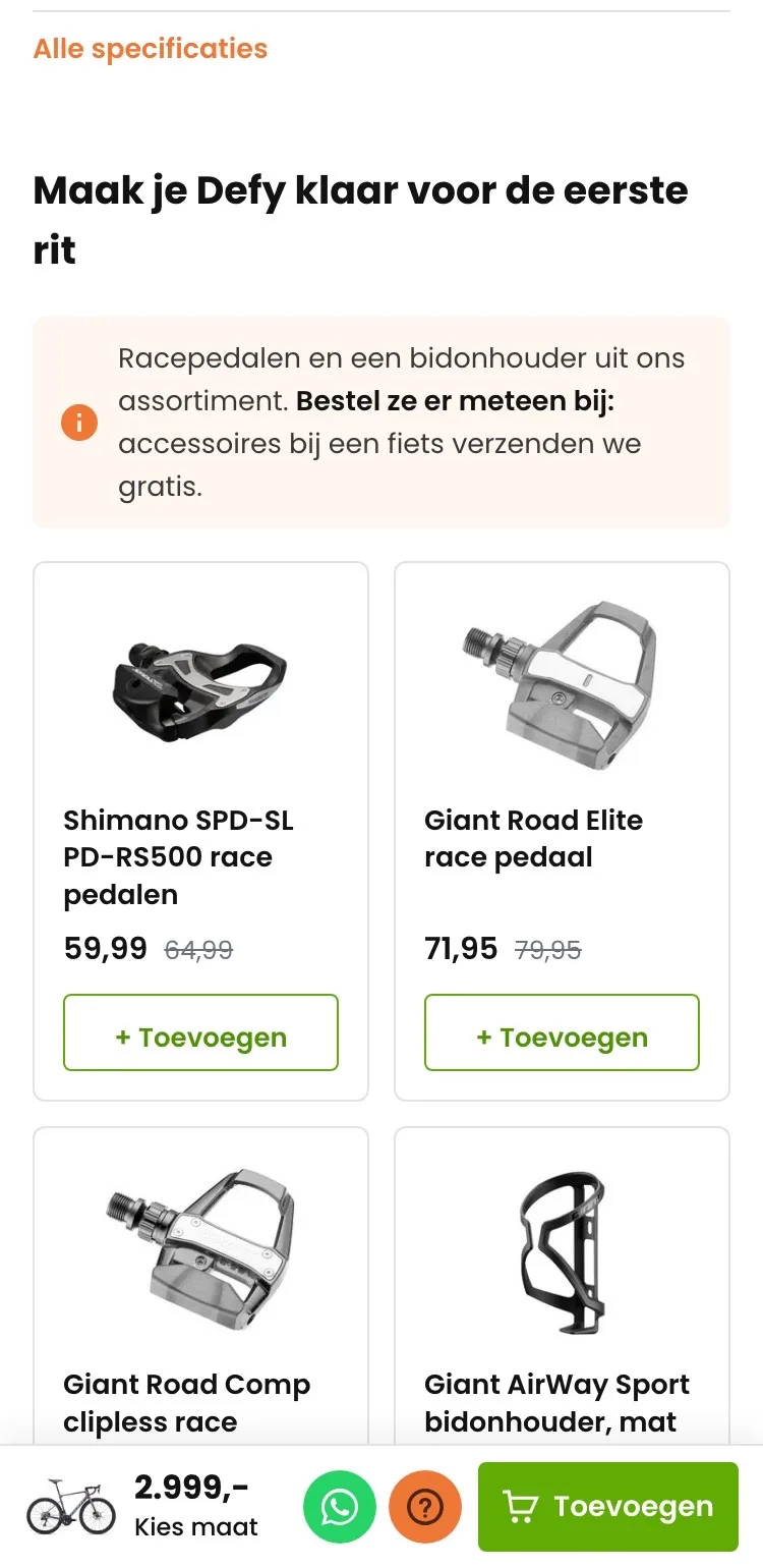
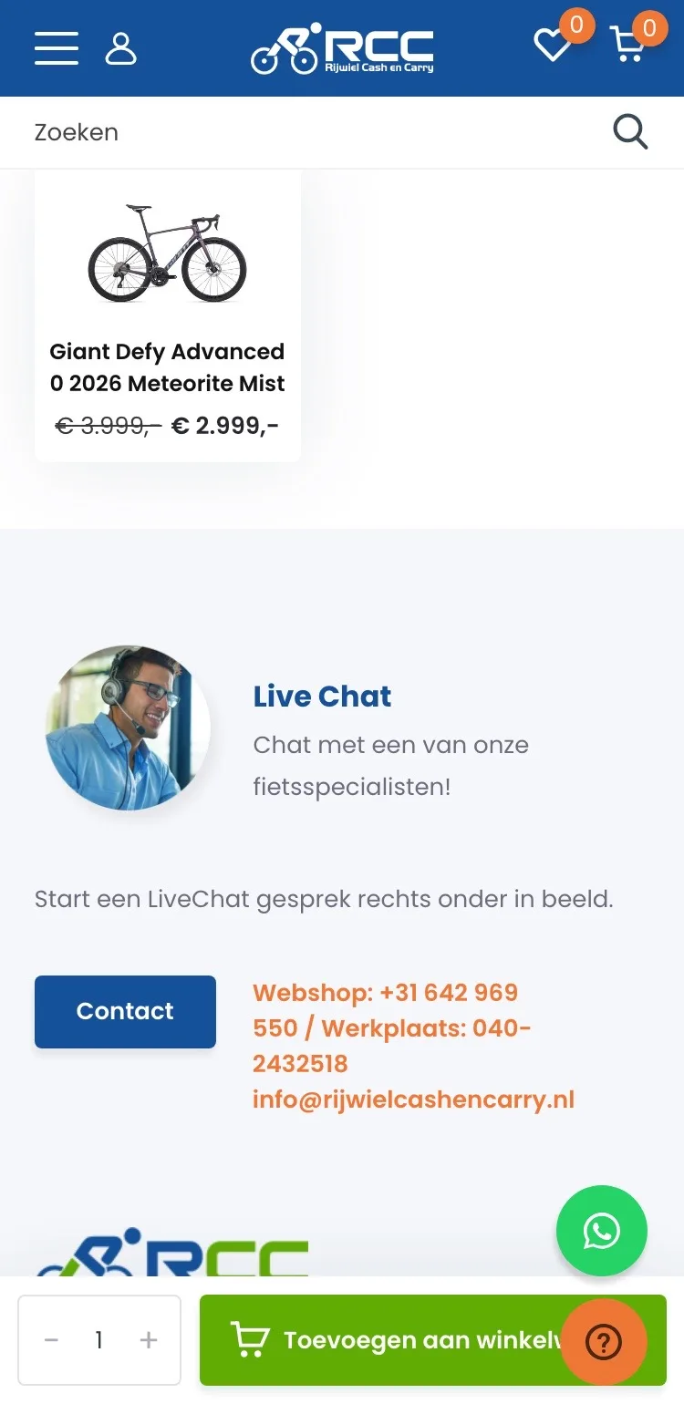
Ready for the first ride.
Pedals and a bottle cage, added with one tap.
- 01Shipped free with the bikeThat accessories ship free with a bike was only on the shipping page. Now it’s right above the pedals.
- 02Add right away‘Recent bekeken’ (Recently viewed) showed this same bike. Now there are four matching items with ‘+ Toevoegen’ (+ Add).
- 03From your own rangeOnly items you sell yourselves, with their own price and discount.
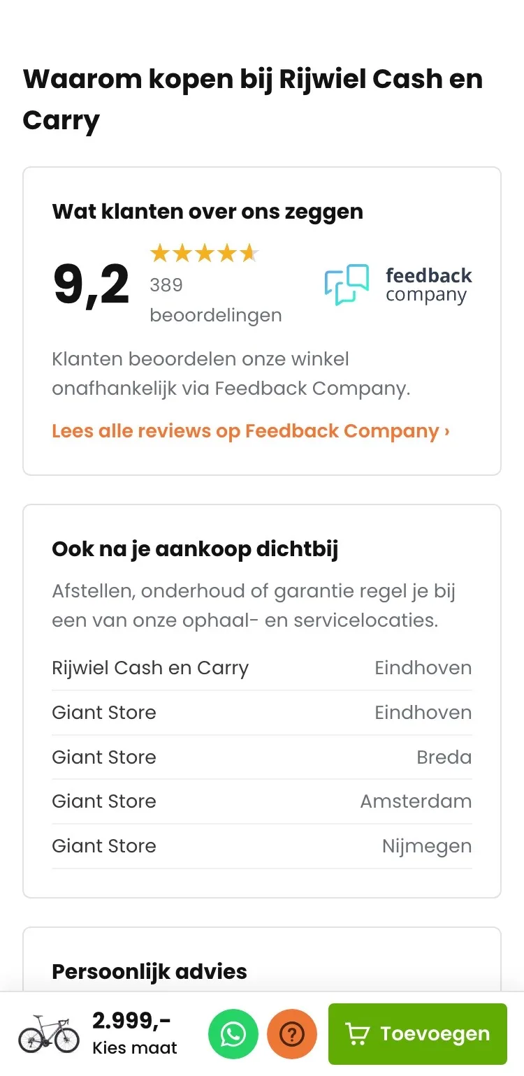
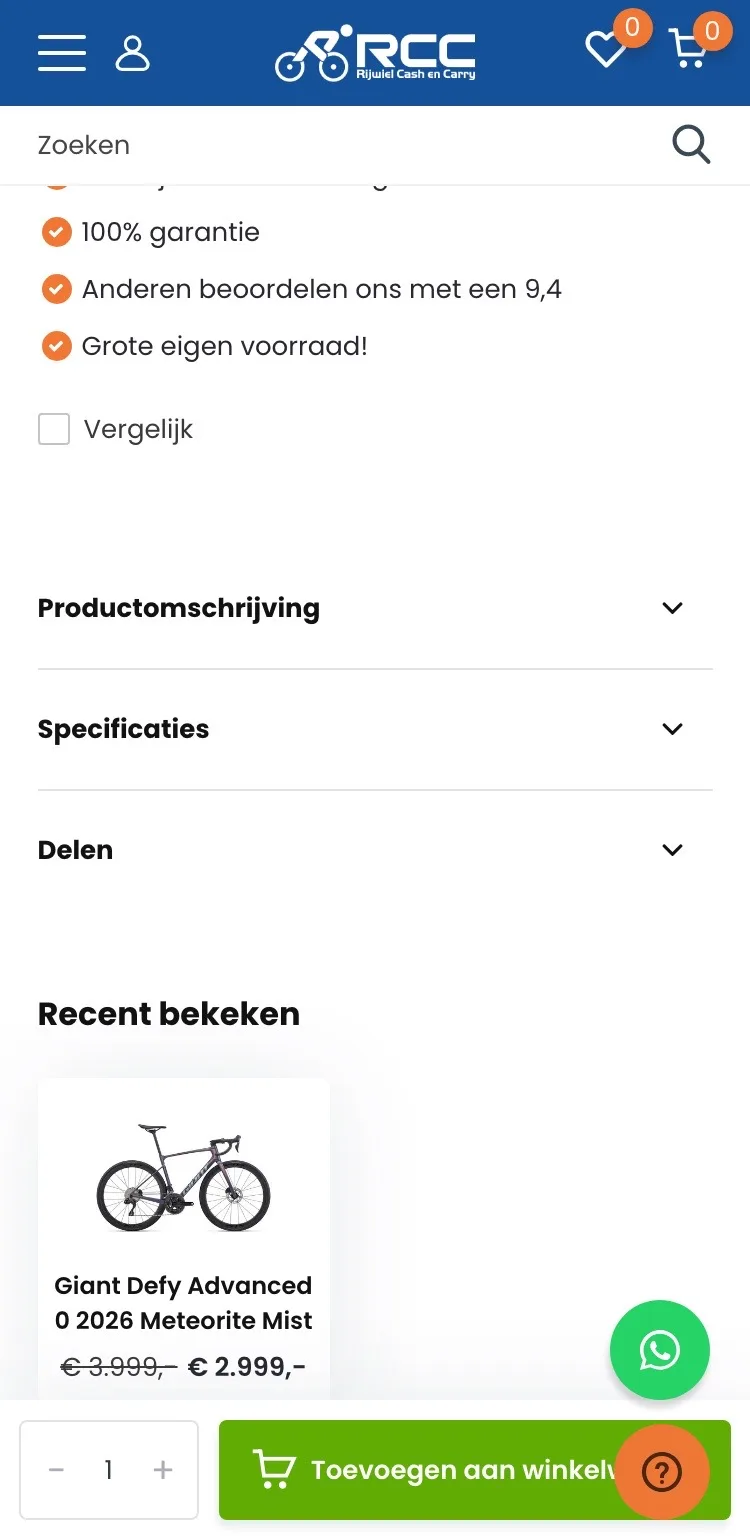
Why Rijwiel Cash en Carry.
The 9.2 and the stores, on mobile too.
- 019.2 with reviewsThe score was a small line by the button. Now the current 9.2 is shown large, with the Feedback Company logo.
- 02Close by after your purchase tooAll pickup and service locations are in a list, with the city for each.
- 03Personal adviceAnyone still in doubt can message or chat with a bike specialist, through the channels you already have.
Ordering.
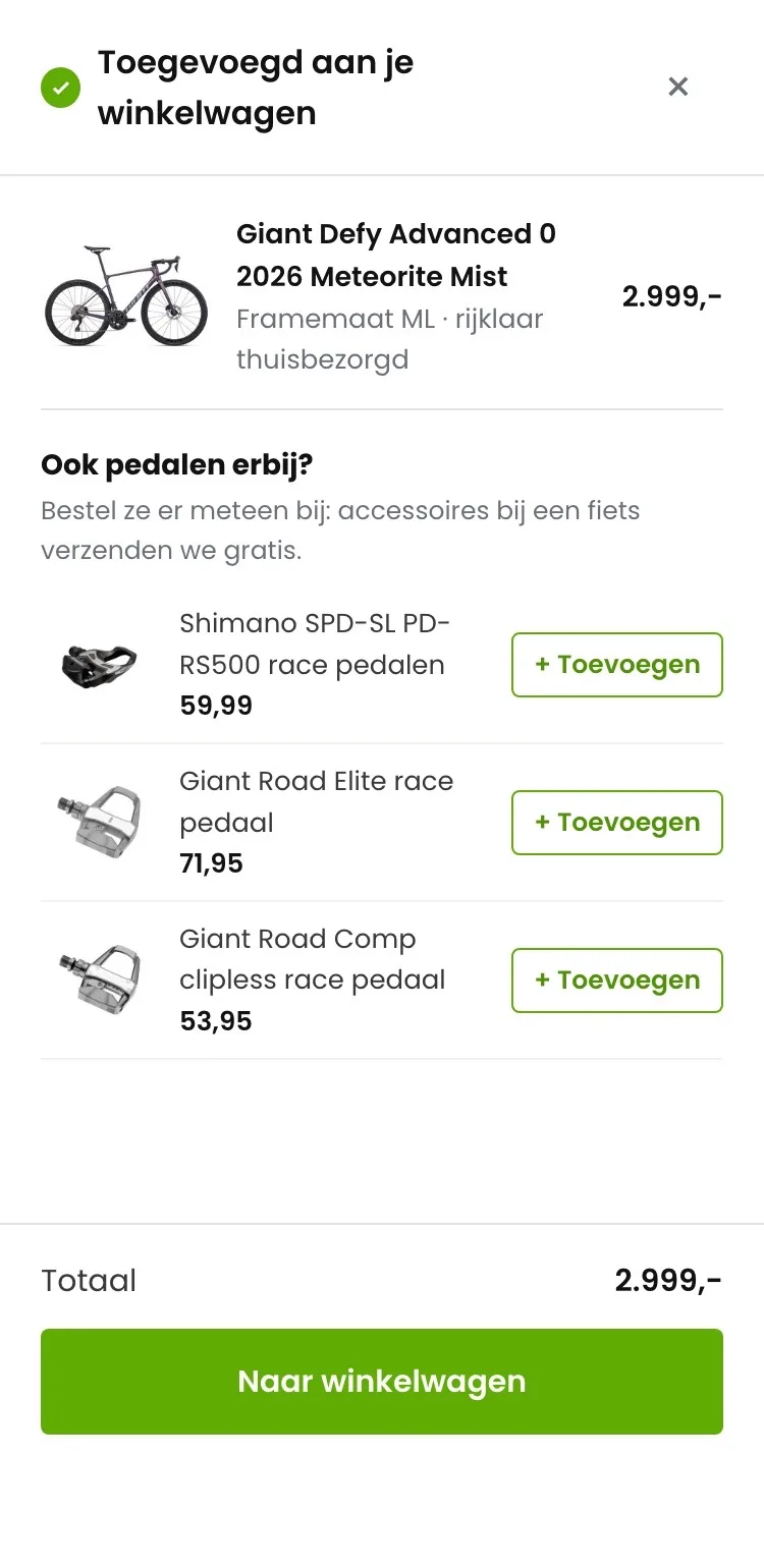
A button that’s never covered, and a clear confirmation.
- 01Button no longer coveredThe Help button sat over the button in the buy bar. Now photo, price, WhatsApp, Help and ‘Toevoegen’ (Add) fit in one row.
- 02Confirmation with your choiceAfter adding, you see the bike and your frame size, and read that it will be delivered to your home ready to ride.
- 03Pedals in the confirmationAfter adding, you immediately see three road bike pedals, each added with one tap.
Click through the new design yourself.
The design works like a real page, on desktop and on your phone. You just can’t place an order with it yet.
From design to more orders.
This is how we take the new design live, and measure what it delivers.
- 01Only the pageHeader, menu, USP bar and footer stay exactly as they are now. We only change the content of the product page.
- 02Test first, then go liveWe run the new design in an A/B test next to the current page and measure orders per visitor.
- 03Your own strengthsYour own photos, visuals, reviews and tone of voice: it all came from you already, just in a better place.
This design live
on your online store?
With the AI Design Agent, we put this design on your existing online store, and then keep improving it every month with CRO. Built by our specialists. Without spending thousands of euros a month on it.
- No rebuild, no migration
- Your back office stays the way you know it
- Only goes live after your approval
- 01Ongoing development for a fixed monthly feeNo separate quotes for every change. If we see an opportunity or you have an idea, we build it.
- 02CRO improvements, implemented right awayWe analyze your online store and implement improvements in days instead of months.
- 03Safe, and you see what changesWe build and test everything in a preview first. It only goes live after your approval, and every version is saved.