 Google Ads
 Meta Ads
 Email marketing
 Lightspeed eCom Toolkit
 Shopify Toolkit
Your product page,
redesigned.
A new design for the product page of renehoutman.nl: Rene Houtman Pieris Japonica artificial tree, 240 cm. Below you see every screen before and after, and what we improved.
- 19 before-and-afters
- 17 improvements
- renehoutman.nl
Every screen, compared.
Pick a screen and drag across the screenshot. On the left you see the current page of renehoutman.nl, on the right the new design.
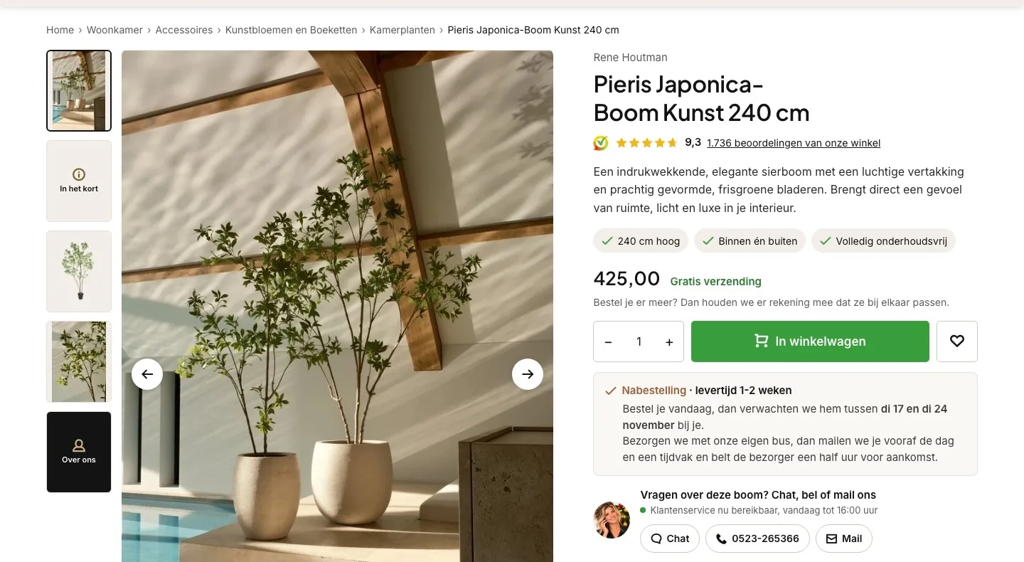
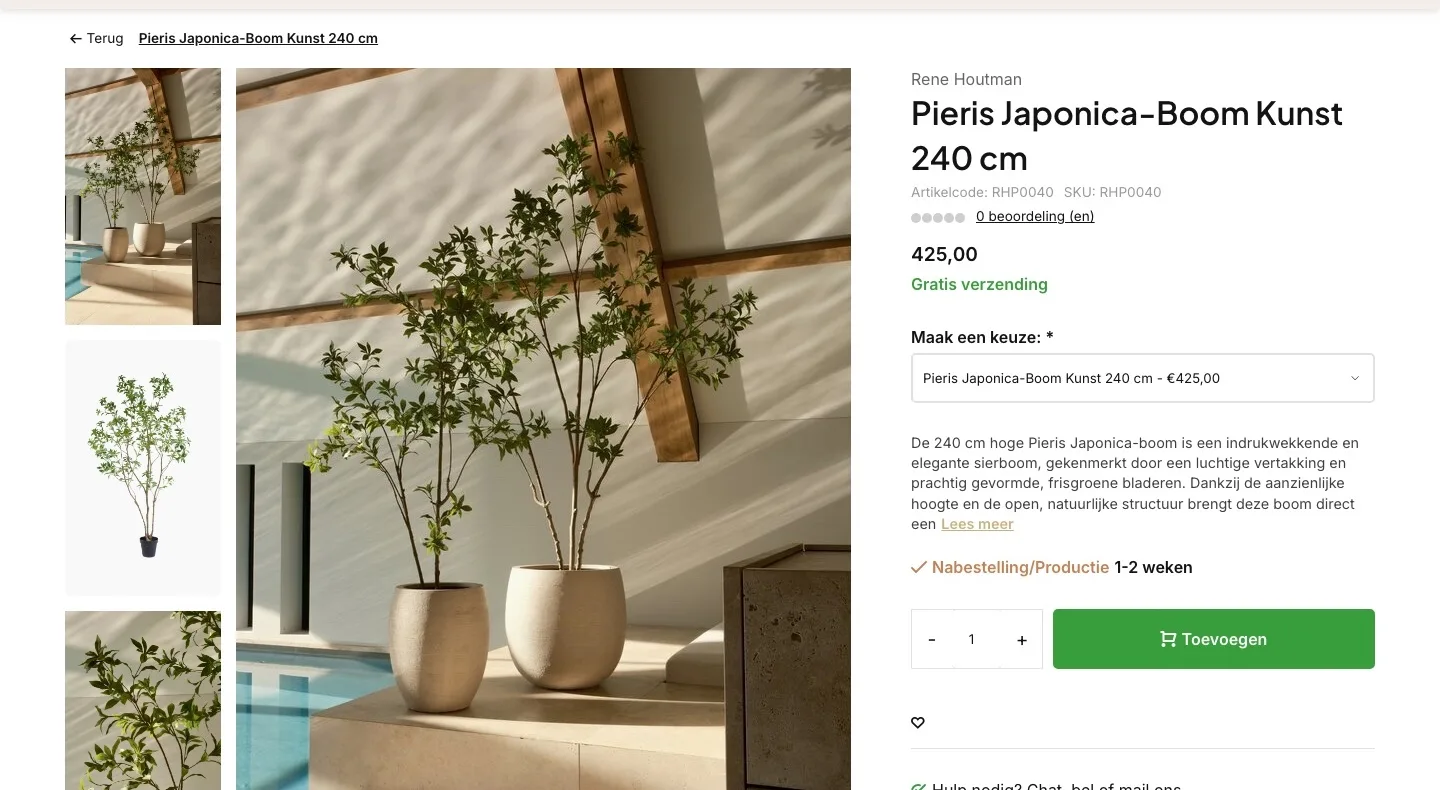
Product page.
The tree, the score and the price at a glance.
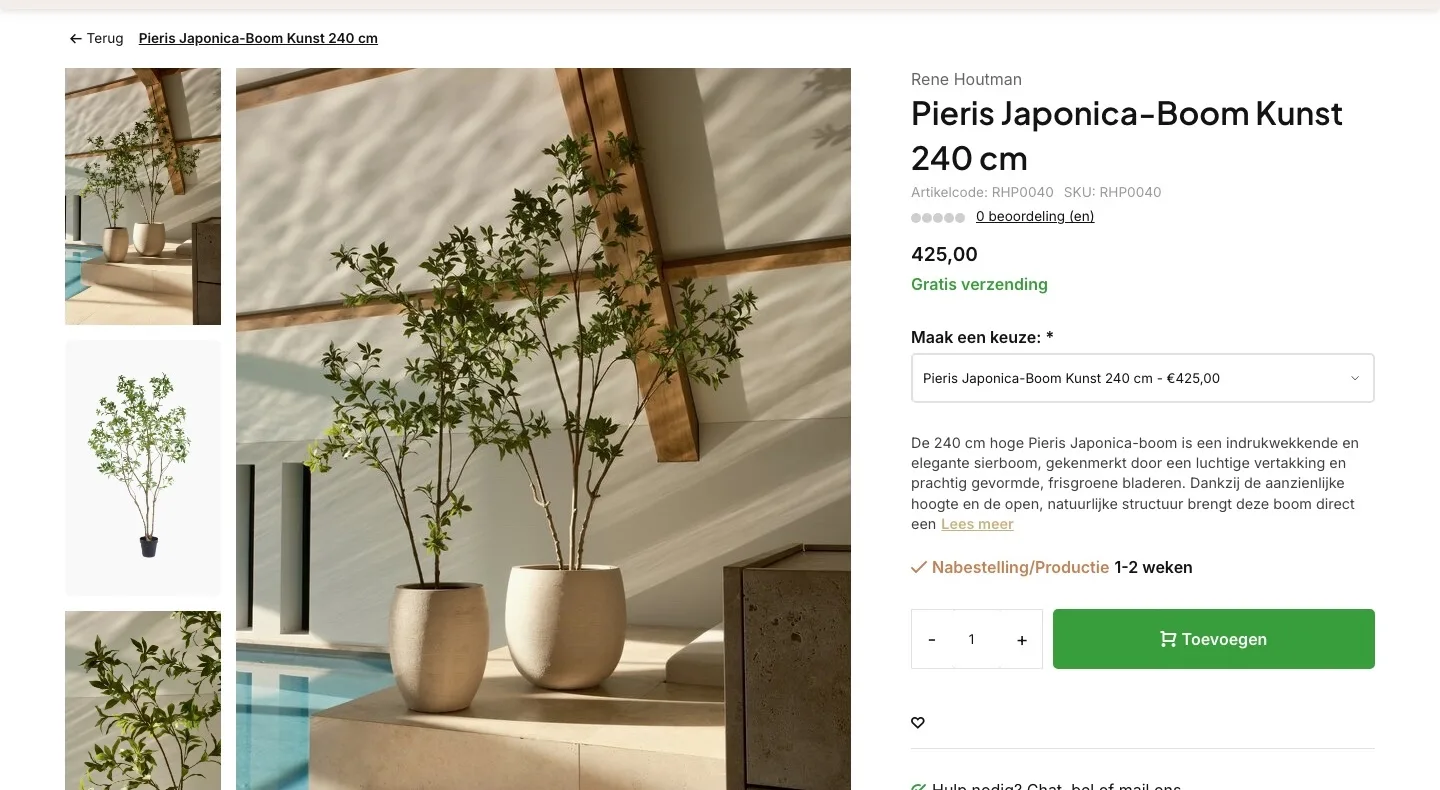
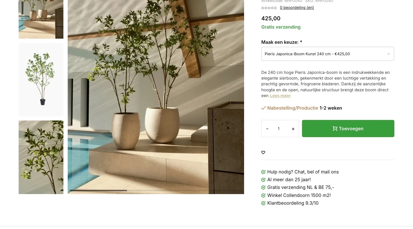
- 019.3 instead of 0 reviewsBelow the name it said ‘0 beoordeling (en)’ (0 review(s)) with empty dots. Now you immediately see the 9.3 from Kiyoh, based on 1,736 reviews.
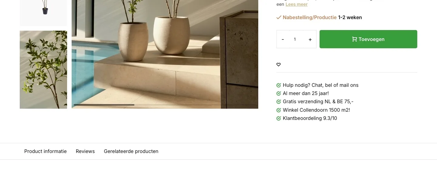
- 02No choice without a choice‘Maak een keuze’ (Make a choice) had only one option and felt like an extra step. It’s gone, so the buy button sits higher.
- 03A short, complete pitchThe description stopped mid-sentence. Now you read a short, complete pitch, with height, indoor or outdoor and maintenance as checkmarks.
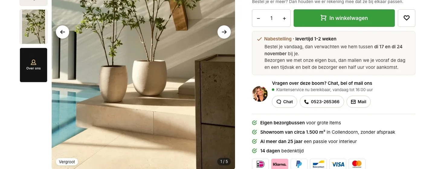
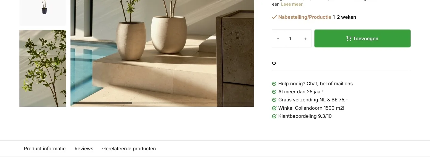
Around the button.
When it arrives and who you can ask, right below the button.
- 01When and how it arrivesNext to the button it said ‘Nabestelling/Productie 1-2 weken’ (Backorder/Production 1-2 weeks). Now you see the expected days and how delivery with the store’s own van works.
- 02Chat, call or email in one clickNext to the button, ‘Hulp nodig? Chat, bel of mail ons’ (Need help? Chat, call or email us) was plain text; calling and emailing were only possible at the bottom. Now they are buttons next to the button.
- 03Payment logos by the buttonThere were no payment logos by the button. Now you see iDEAL, Klarna, PayPal, Bancontact, Visa and Mastercard.
Photos.
What you need to know, right in the gallery.
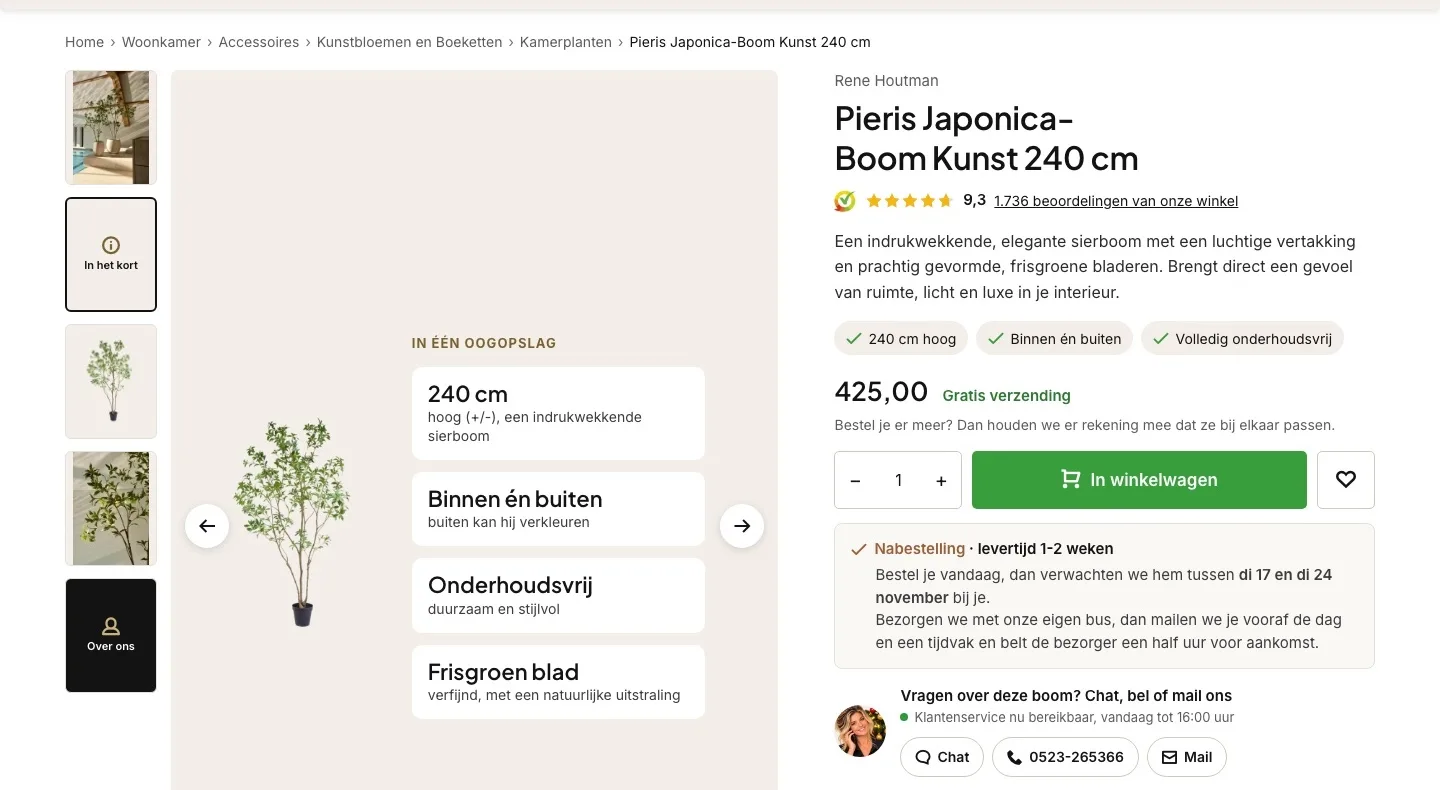
- 01At a glanceIndoor or outdoor and maintenance were only in the description at the bottom. Now they appear with the height as the second image, next to the tree.
- 02Arrows always visibleThe arrows only appeared when you hovered over the photo. Now they are always there, with a counter.
- 03Back to KamerplantenAt the top there was only ‘Terug’ (Back) and the product name. Now you see where the tree belongs and click straight through to the other houseplants.
Who you are.
Trust for a big purchase, as an image of its own.
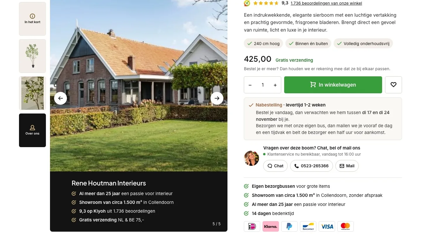
- 01Your story in the galleryThat you’ve been around for 25 years was a separate line below the button. Now it’s an image, with the showroom in it.
- 02Trust at €425With an amount like that, you want to know who you’re buying from. The 9.3 on Kiyoh and free shipping now also appear among the photos.
- 03Tiles that invite you in‘In het kort’ (In short) and ‘Over ons’ (About us) appear as tiles among the photos. That shows you there’s more to discover.
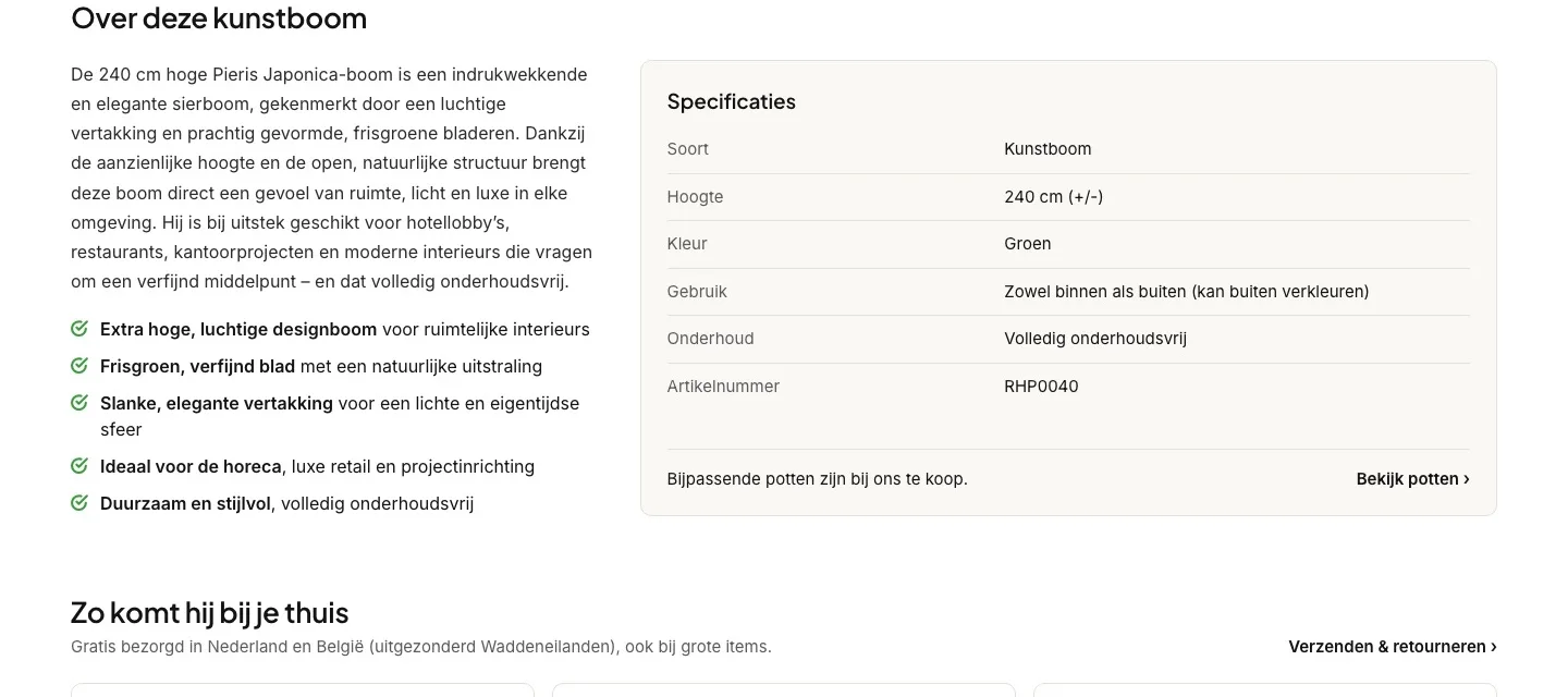
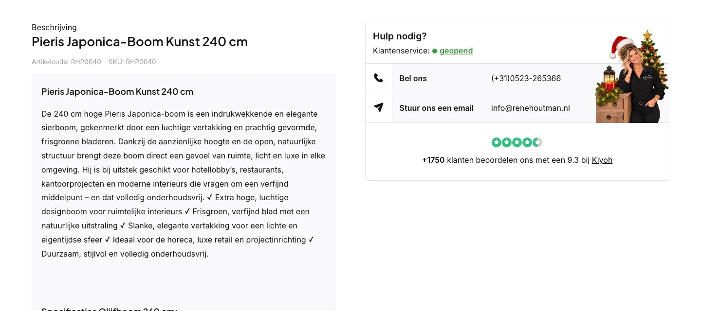
About this artificial tree.
Benefits and specifications you can read in a few seconds.
- 01Benefits in a listThe checkmarks ran together in one long paragraph. Now each benefit has its own line, with the key part in bold.
- 02Specifications that are correctThe heading said ‘Olijfboom 260 cm’ (Olive tree 260 cm). Now type, height, color, use and maintenance are in a clean table.
- 03Add a pot in one click‘Bijpassende potten zijn bij ons te koop’ (Matching pots are available from us) had no link. Now ‘Bekijk potten’ (View pots) takes you straight to the pots.
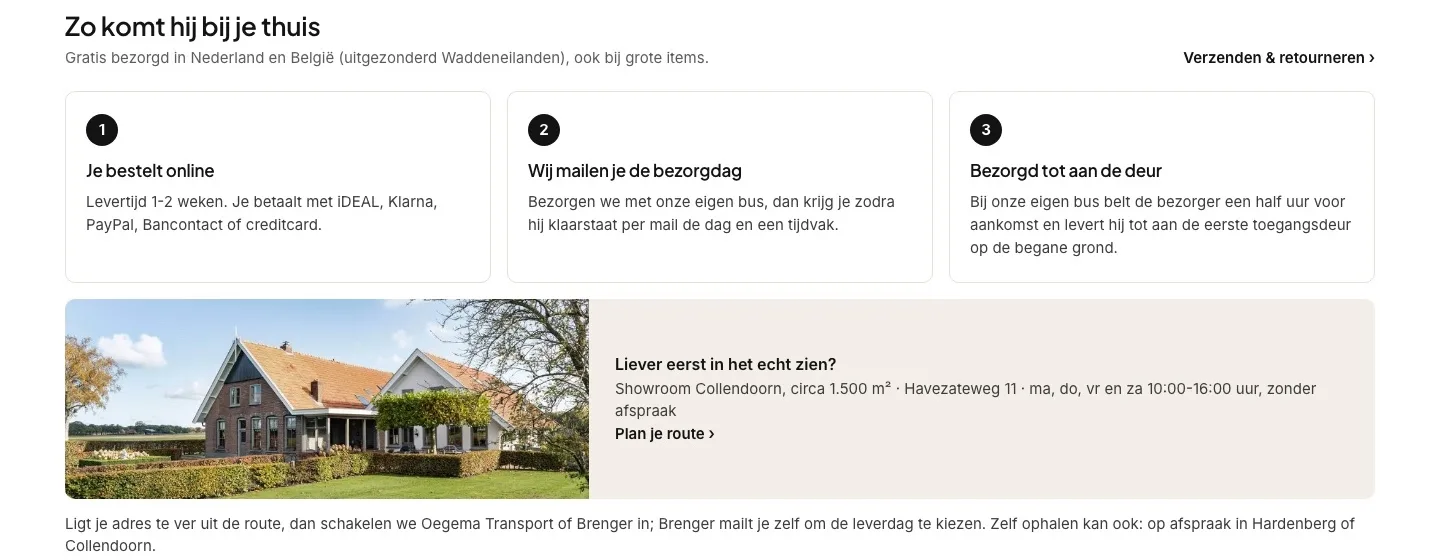
How it gets to your home.
Delivery of a big tree, explained right where the doubt comes in.
- 01Delivery in three stepsHow a 240 cm tree gets to you was only on the shipping page. Now you see the steps on the product page.
- 02No surprises at the doorWith delivery by the store’s own van, the driver calls half an hour ahead and delivers to the first door on the ground floor.
- 03See it in person first‘Winkel Collendoorn 1500 m2!’ (Store in Collendoorn, 1,500 m²!) was a separate line. Now the address, opening hours and a directions button are right there.
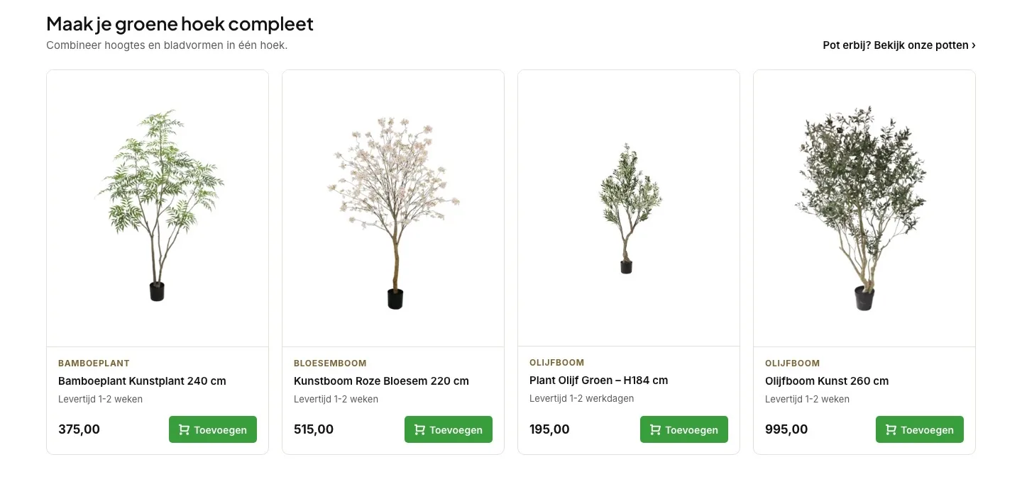
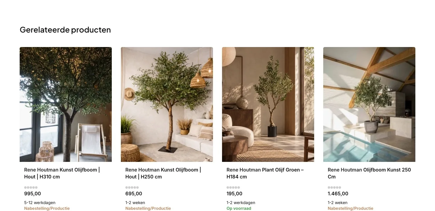
Complete your green corner.
A second tree or a pot, without searching.
- 01Add something, with one buttonWith the related products, you first had to click through. Now you add a second tree straight to your cart.
- 02You see what it isThe tiles showed lifestyle photos. Now you see the tree itself, with a label like ‘Bamboeplant’ (Bamboo plant) or ‘Olijfboom’ (Olive tree).
- 03Add a pot tooAt the top right it now says ‘Pot erbij? Bekijk onze potten’ (Need a pot? View our pots), for anyone who wants to complete the corner in one go.
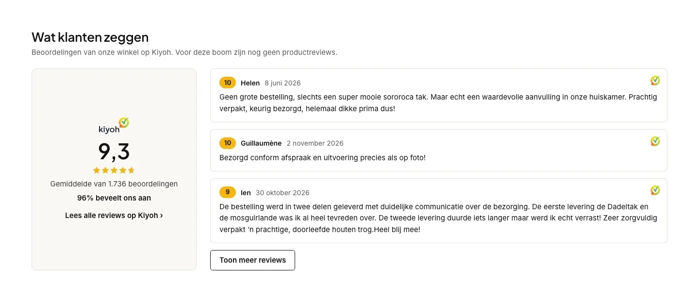
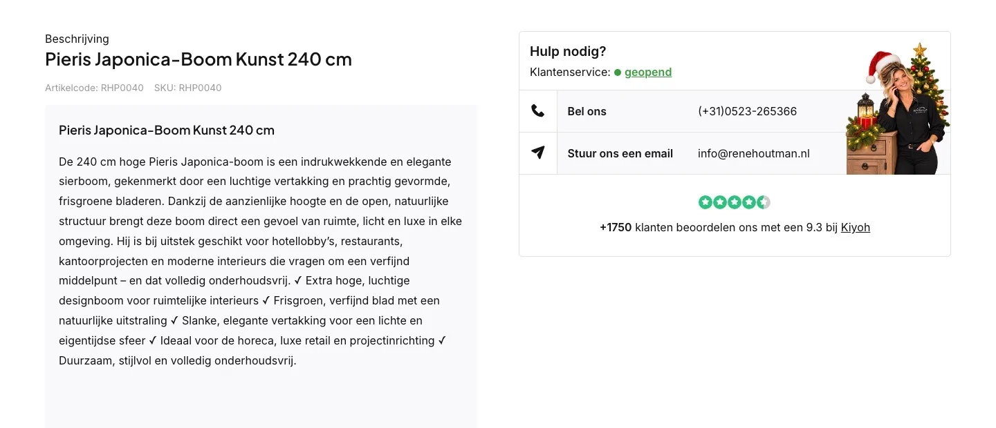
What customers say.
Your 9.3 as proof, presented honestly.
- 01The score with the logoThe 9.3 was in the top bar, below the button and small in the help block. Now it has its own block with 1,736 reviews and 96% recommendations.
- 02Real customers speakingNow you read reviews from Kiyoh, with name and date, about ordering, packaging and delivery.
- 03Honest about product reviewsIt says these are store reviews and that this tree doesn’t have reviews of its own yet. That builds trust.
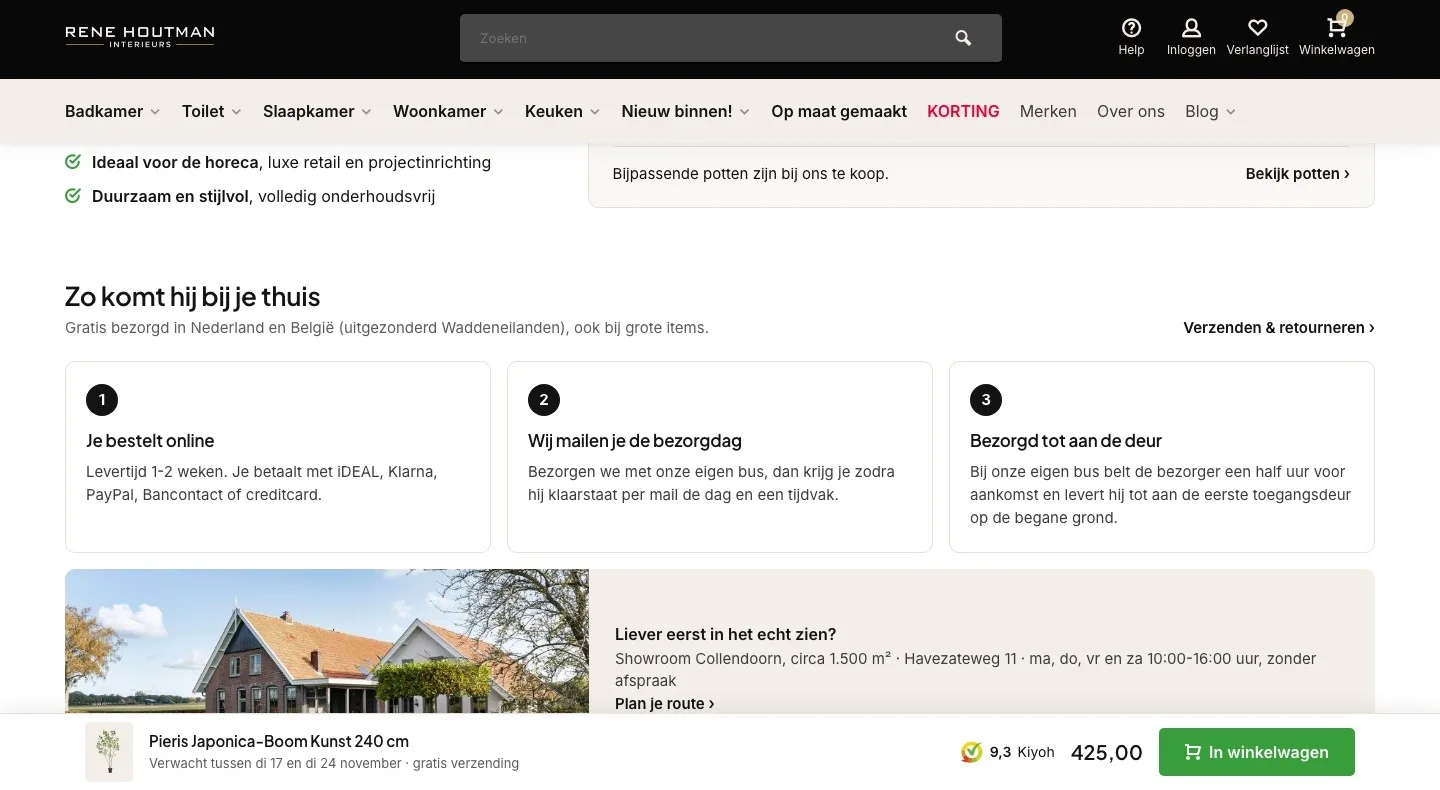
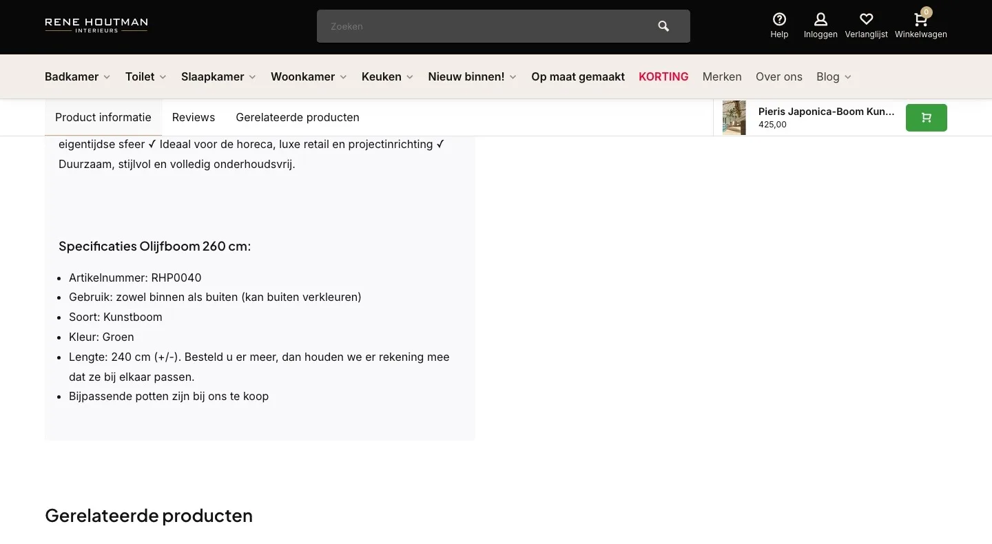
While scrolling.
The button stays within reach, with everything that matters.
- 01A button with text at the bottomAt the top there was a narrow bar with a photo, the price and only a cart icon. Now there’s a bar at the bottom with the ‘In winkelwagen’ (Add to cart) button.
- 02When it arrives, here tooThe bar shows the expected delivery period, so you don’t have to look it up again.
- 03The 9.3 stays in viewEven while scrolling, you see the Kiyoh score next to the price. That keeps the trust right by the button.
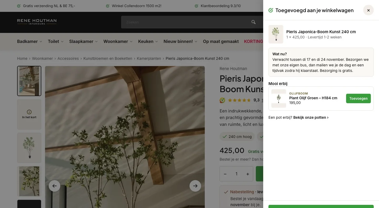
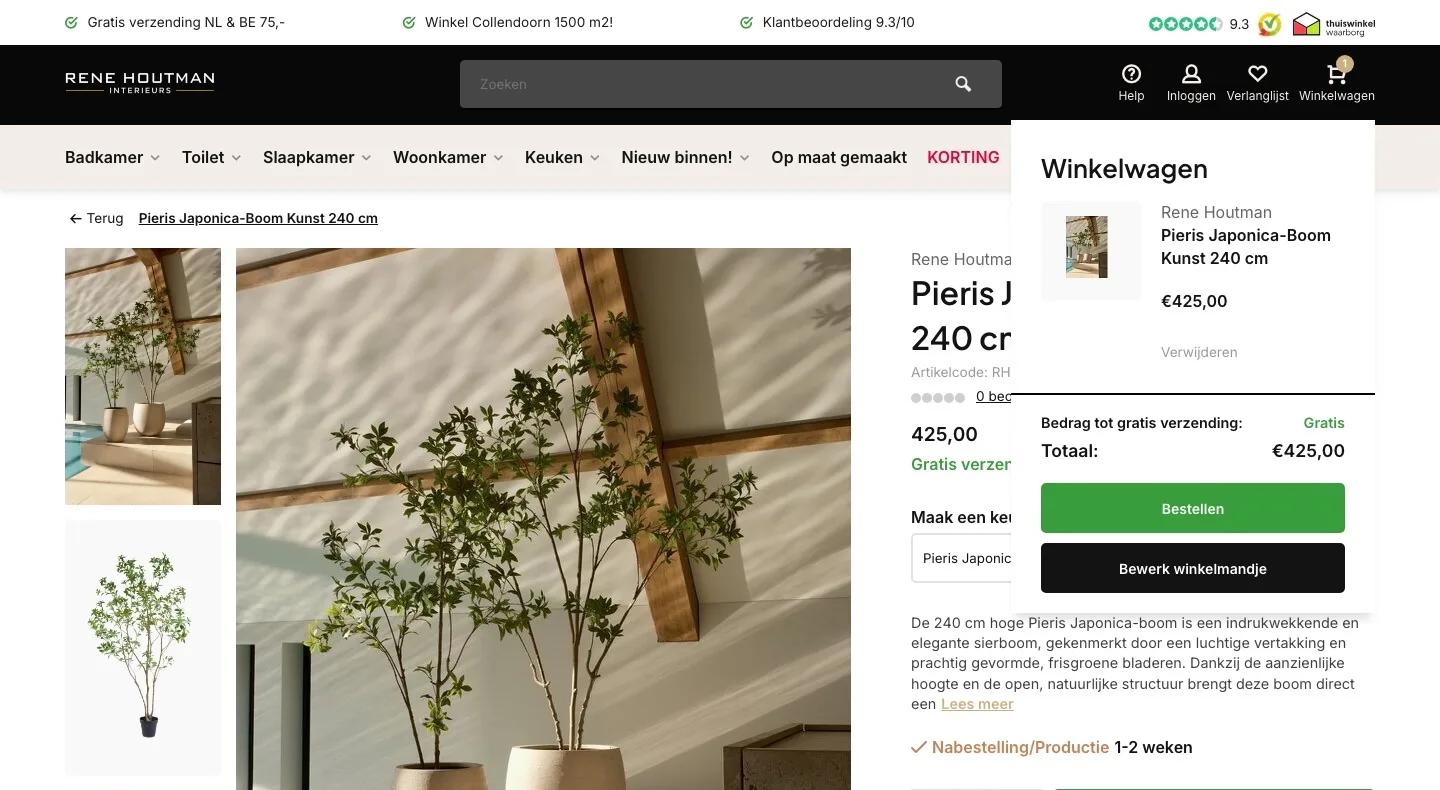
After adding to cart.
A clear next step after the click.
- 01Also when it arrivesThe live site showed your tree and the price in the mini cart; now you also see when it’s expected.
- 02A second treeThe pop-up shows an olive tree with its own button, for anyone who wants to complete the corner in one go.
- 03A pot tooWith ‘Bekijk onze potten’ (View our pots), you go straight from the pop-up to the pots. That raises the order value.
Product page.
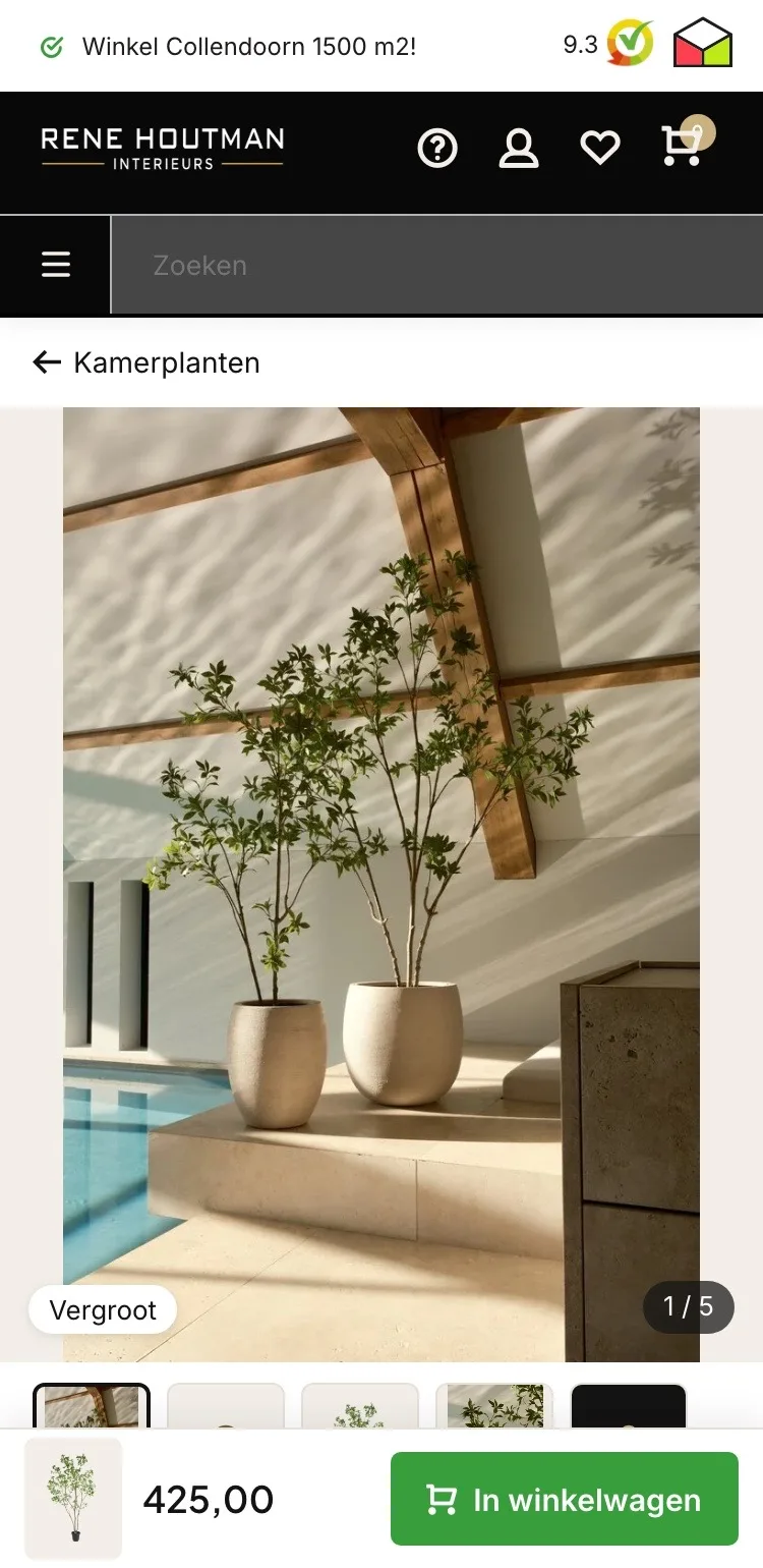
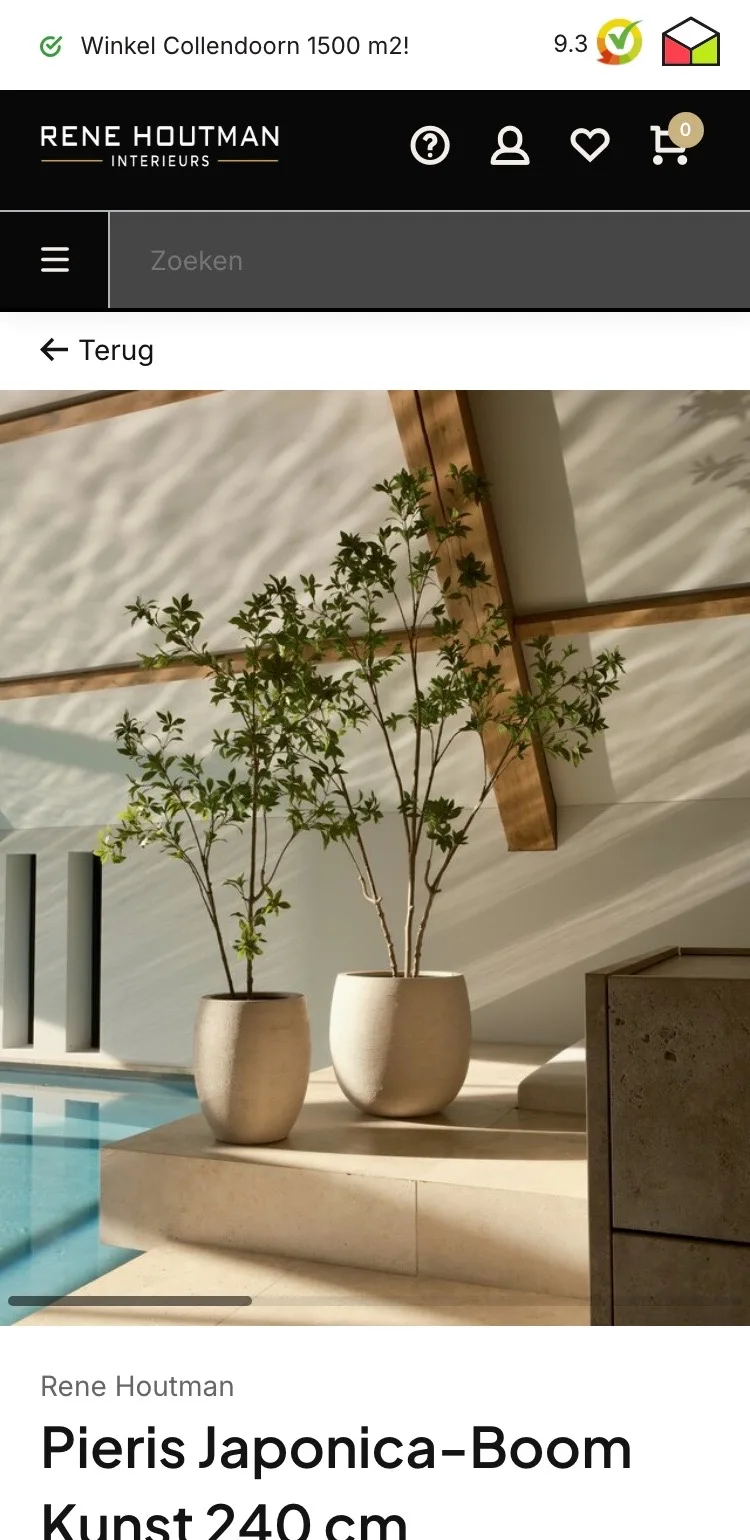
On your phone, it starts with the tree.
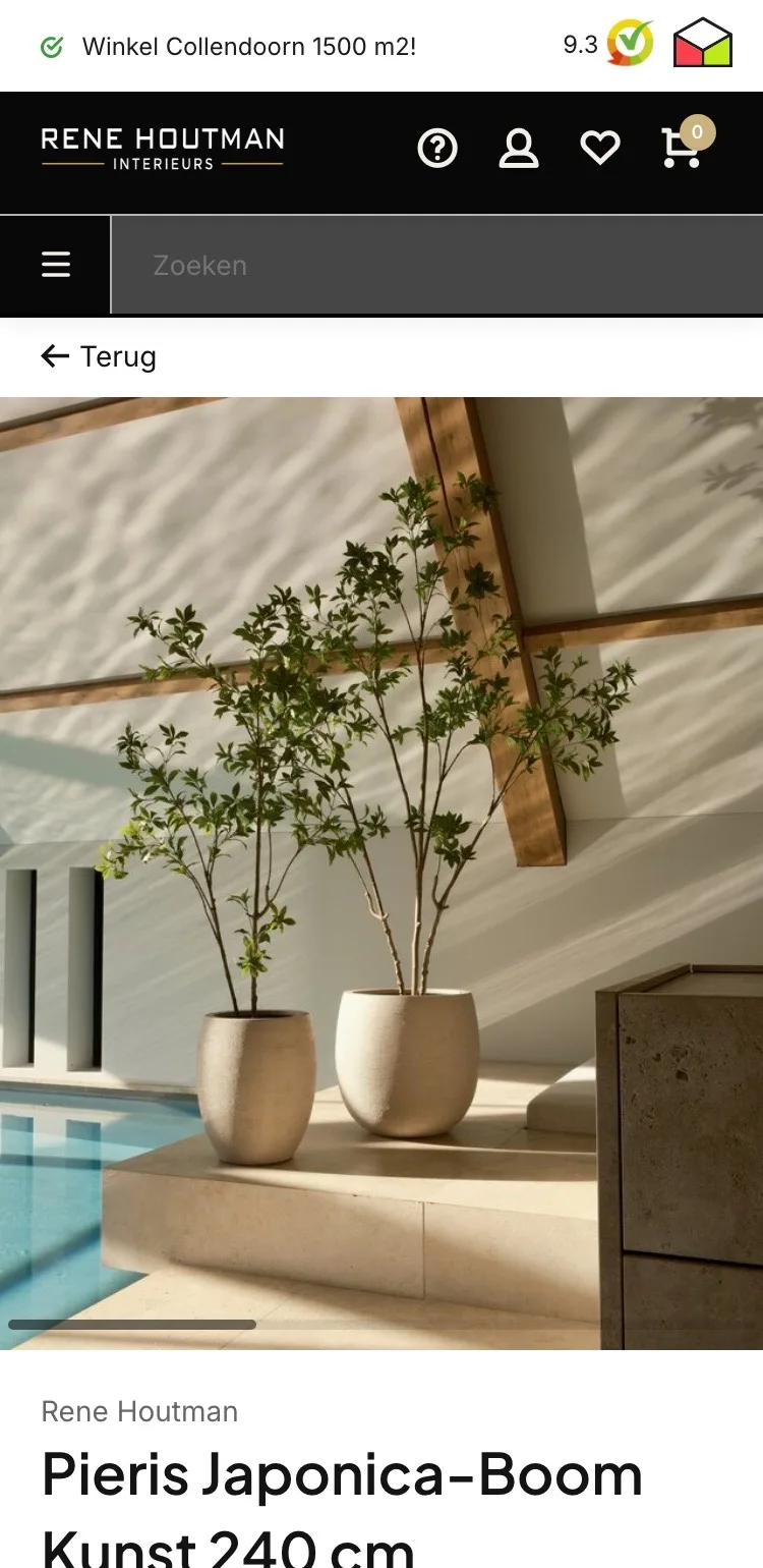
- 01Back to KamerplantenAt the top there was only ‘Terug’ (Back). Now one tap shows you the other houseplants.
- 02Thumbnails below the photoBelow the large photo there are now five tiles, so you see what else there is to see.
- 03Counter and fixed buttonAt the bottom right you now see how many images there are, and the ‘Vergroot’ (Zoom) button is always visible.
Choose and buy.
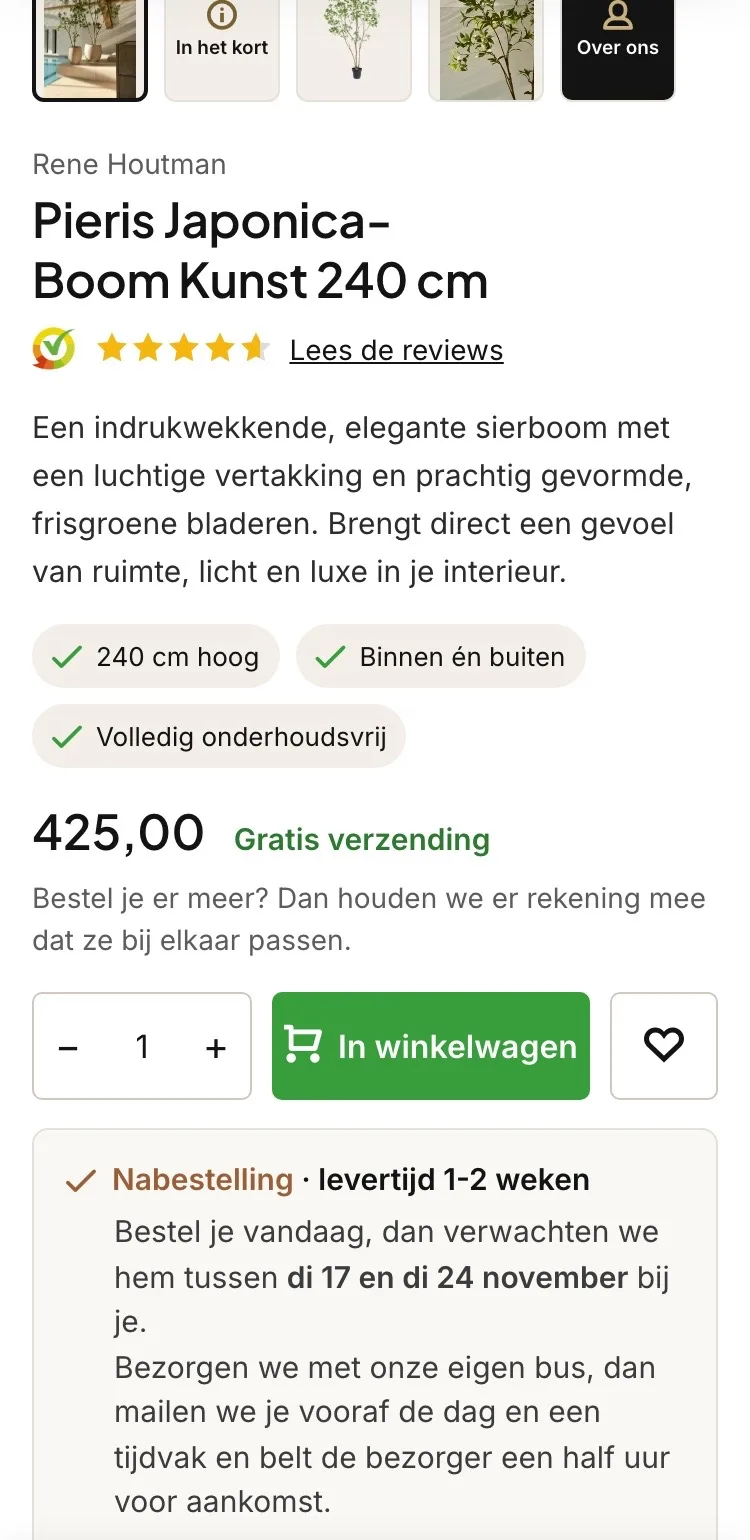
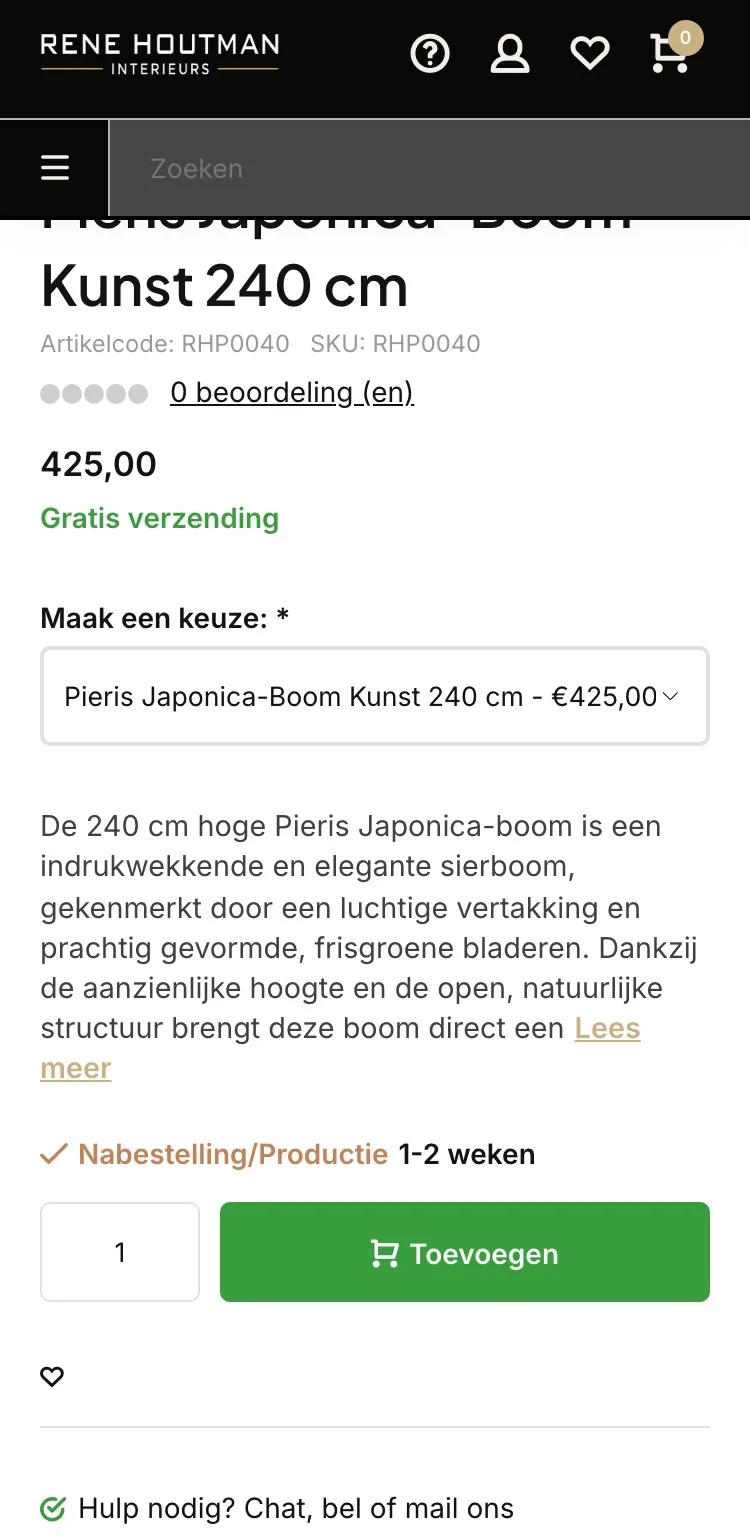
Score, price, button and delivery without searching.
- 019.3 instead of 0‘0 beoordeling (en)’ (0 review(s)) has been replaced by the Kiyoh stars, with a link to the reviews.
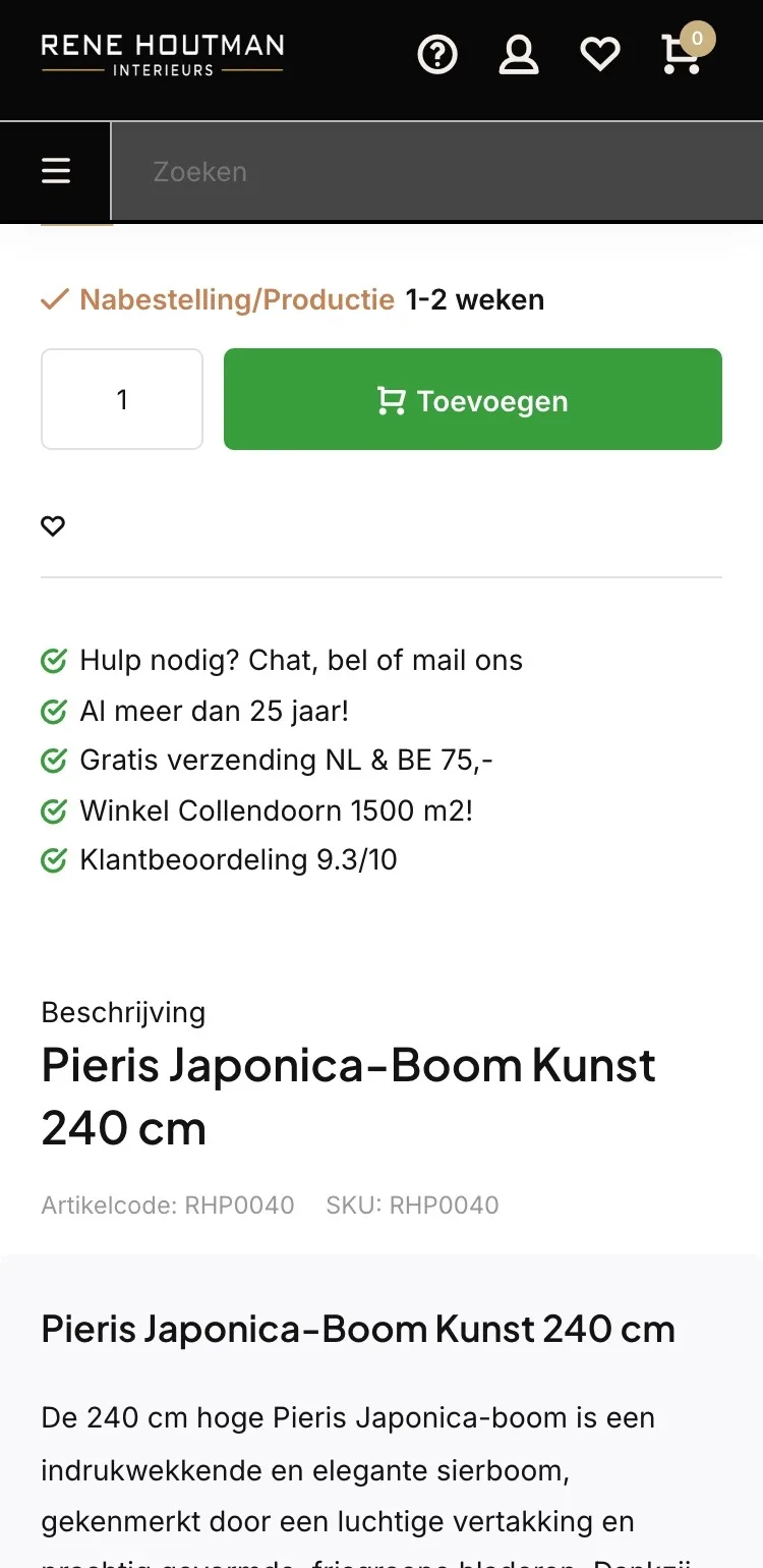
- 02No unnecessary choiceThe dropdown with one option is gone. You read a short, complete pitch with three key points.
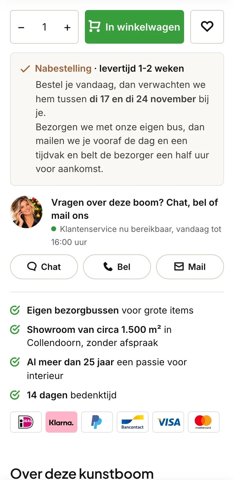
- 03When it arrivesBelow the button you see the expected days and how delivery with the store’s own van works.
Around the button.
Help and trust right below the button.
- 01Chat, call or emailNext to the button, ‘Hulp nodig? Chat, bel of mail ons’ (Need help? Chat, call or email us) was plain text. Now it’s three buttons that actually work.
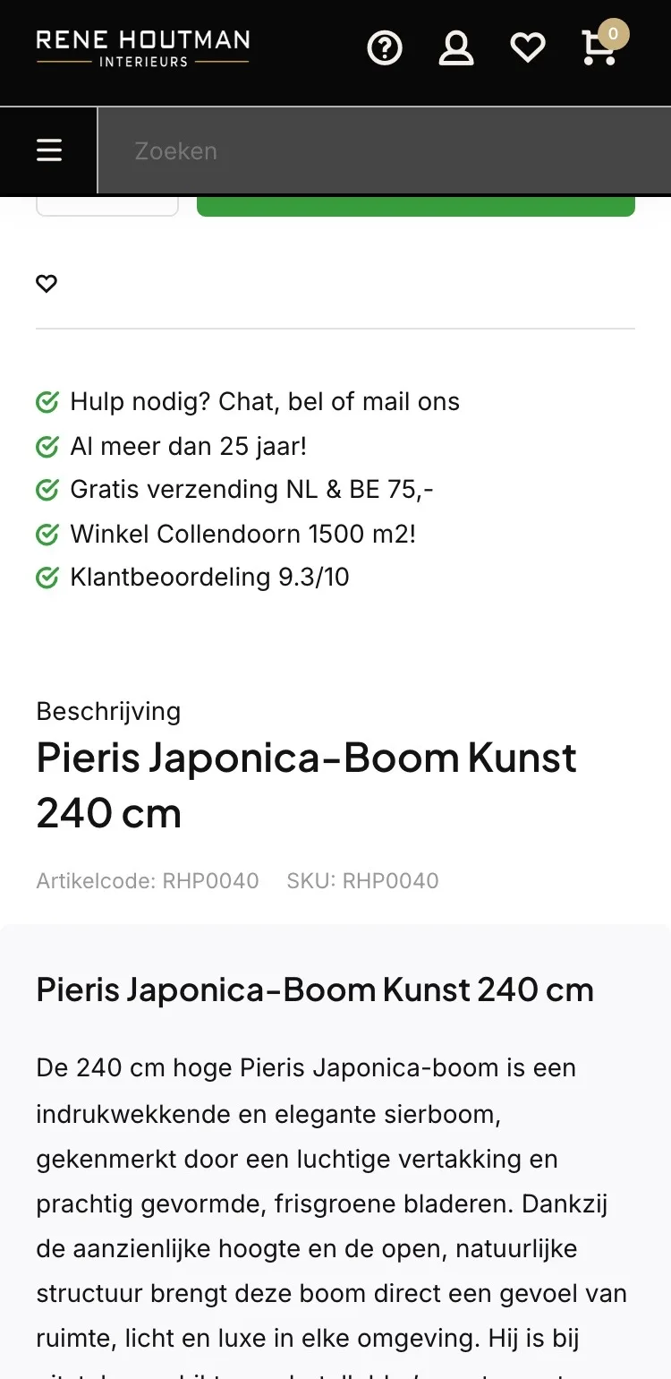
- 02Benefits in boldNew in the list: the store’s own delivery vans and a 14-day cooling-off period, with the key part in bold.
- 03Payment logos by the buttonThere were no payment logos by the button. Now you immediately see how you can pay.
Photos.
The key points as an image in the gallery.
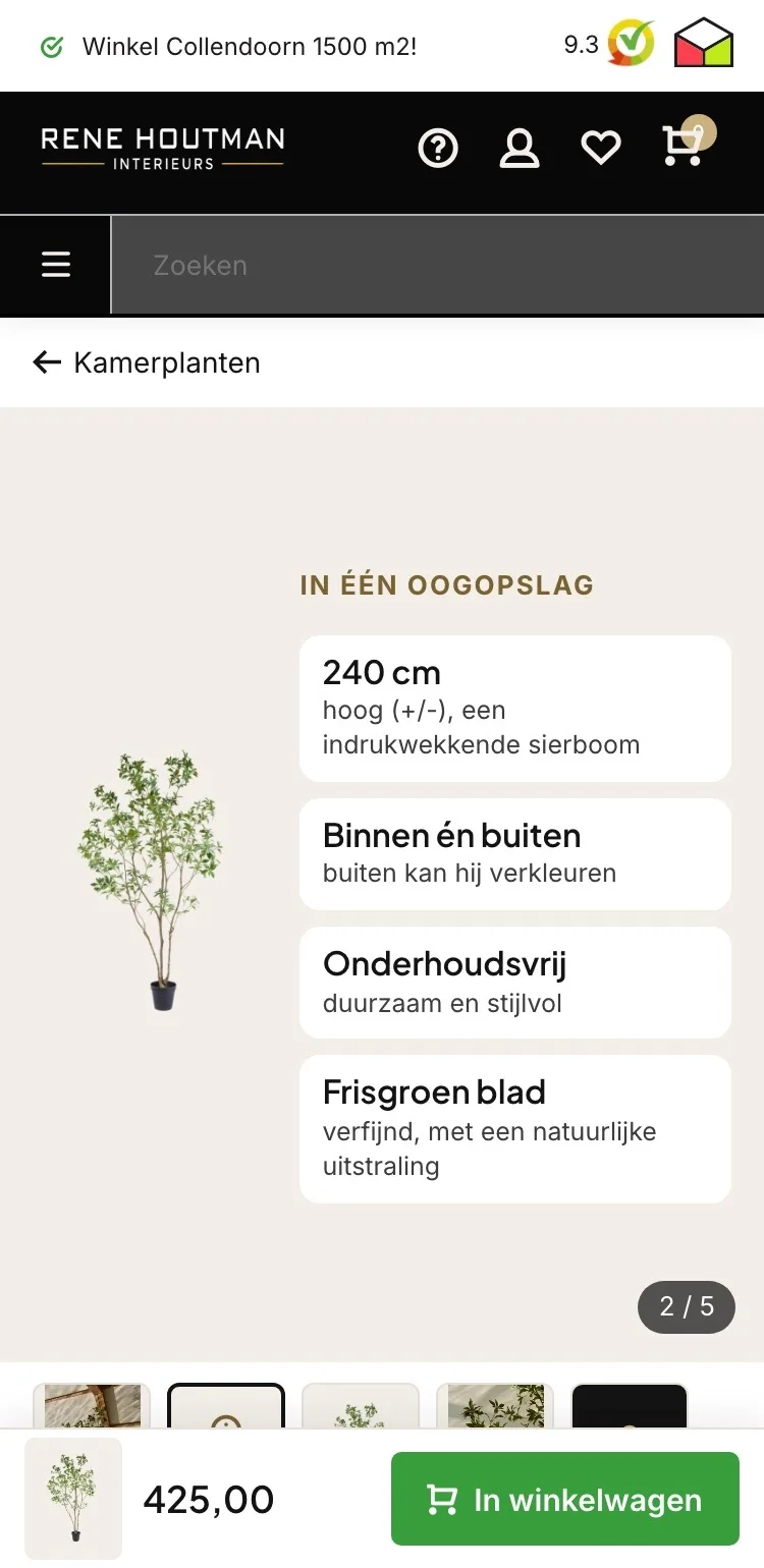
- 01At a glanceThe second image puts height, indoor or outdoor, maintenance and foliage right next to the tree itself.
- 02No digging at the bottomOn the live site, indoor or outdoor and maintenance were far below the button. Now you see them while swiping through the photos.
- 03Five tiles‘In het kort’ (In short) and ‘Over ons’ (About us) appear as tiles among the photos, so you don’t miss them.
About this artificial tree.
Reading without a wall of text.
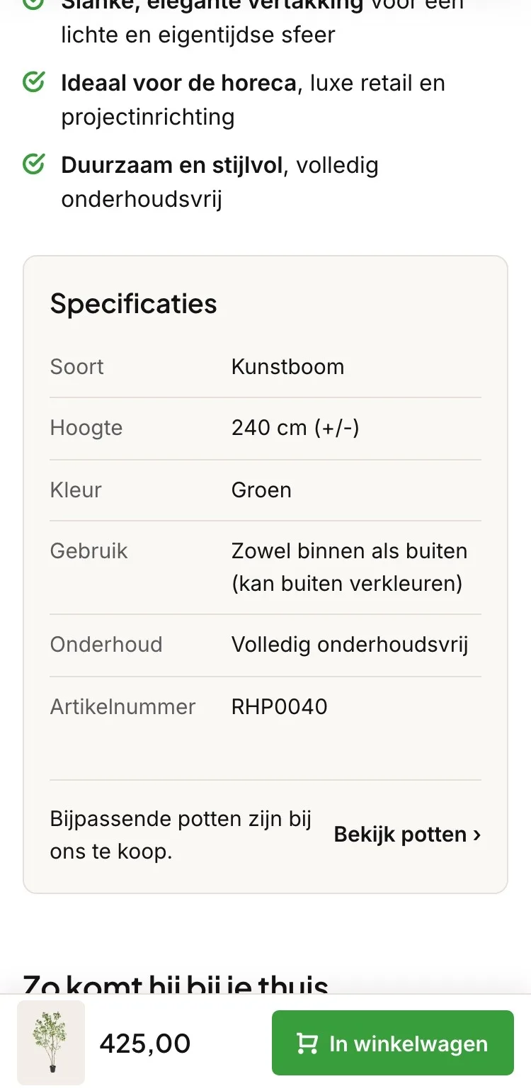
- 01Benefits in a listThe checkmarks were in one long paragraph. Now each benefit has its own line, with the key part in bold.
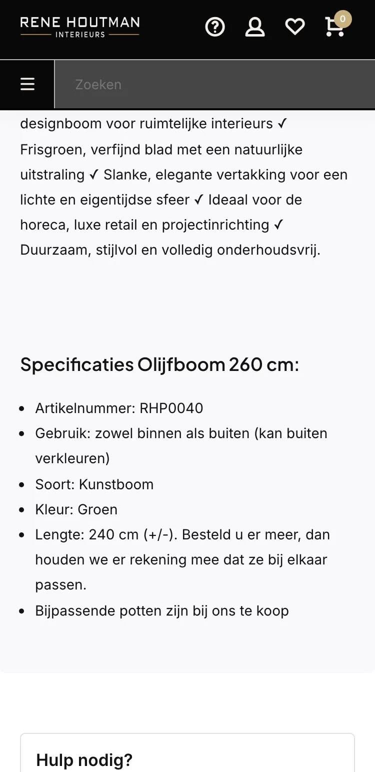
- 02Specifications that are correctThe heading said ‘Olijfboom 260 cm’ (Olive tree 260 cm). Now type, height, color and use are in a clean table.
- 03Add a pot in one tap‘Bijpassende potten zijn bij ons te koop’ (Matching pots are available from us) had no link. Now ‘Bekijk potten’ (View pots) takes you straight to the pots.
How it gets to your home.
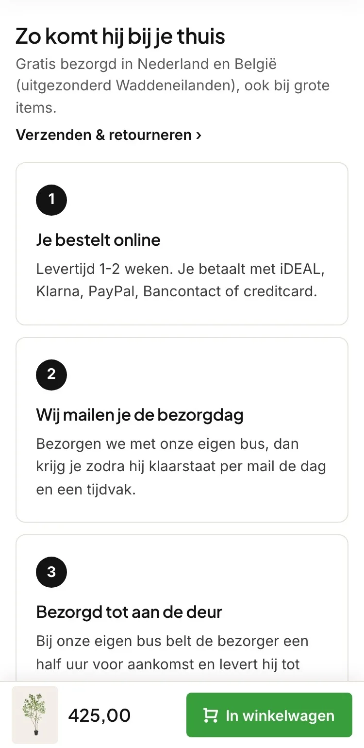
Delivery in three steps.
- 01Steps instead of one lineIt said ‘Gratis verzending NL & BE 75,-’ (Free shipping NL & BE €75). Now you see how a 240 cm tree gets to you.
- 02The driver calls aheadWith delivery by the store’s own van, you get the day and a time slot by email, and the driver calls half an hour ahead.
- 03Quick link to the shipping pageIf you want to know everything, ‘Verzenden & retourneren’ (Shipping & returns) is right above it.
Complete your green corner.
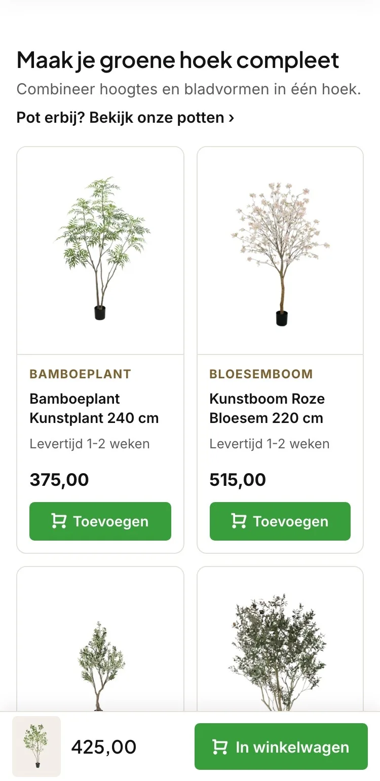
A second tree in one tap.
- 01Add from the tileWith the related products, you first had to click through. Now you add them directly.
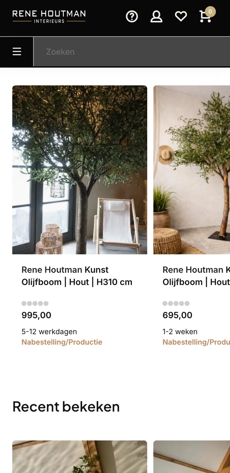
- 02The tree itself in viewThe tiles showed lifestyle photos. Now you see the tree itself, with a label and the price.
- 03Add a potAt the top there’s a link to the pots, for anyone who wants to complete the corner in one go.
What customers say.
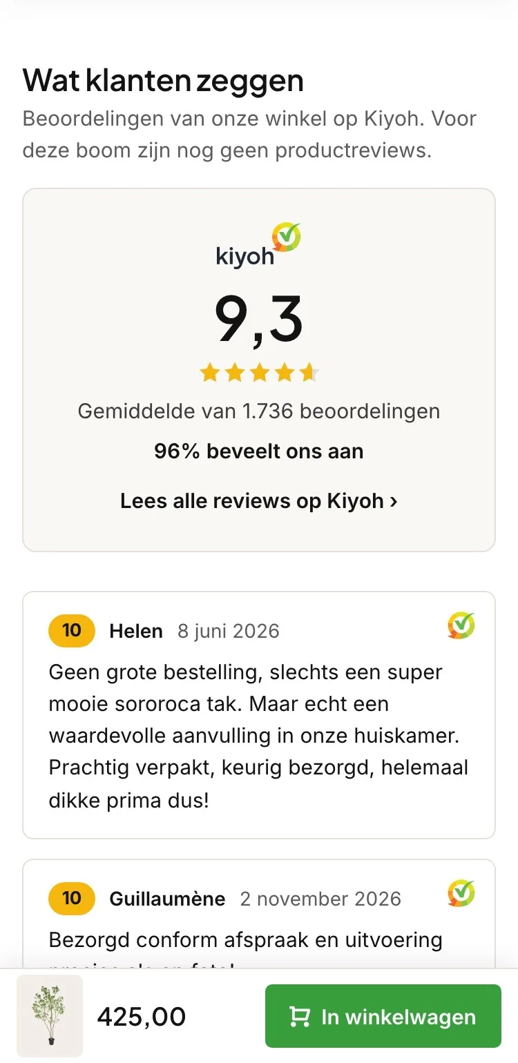
The 9.3, with proof.
- 01A review block of its ownThe 9.3 was in the top bar, below the button and small in the help block. Now the score has its own block.
- 0296% recommend youNext to the score you see how many customers recommend you, with a link to all reviews.
- 03Real reviewsBelow that you read Kiyoh reviews with name and date.
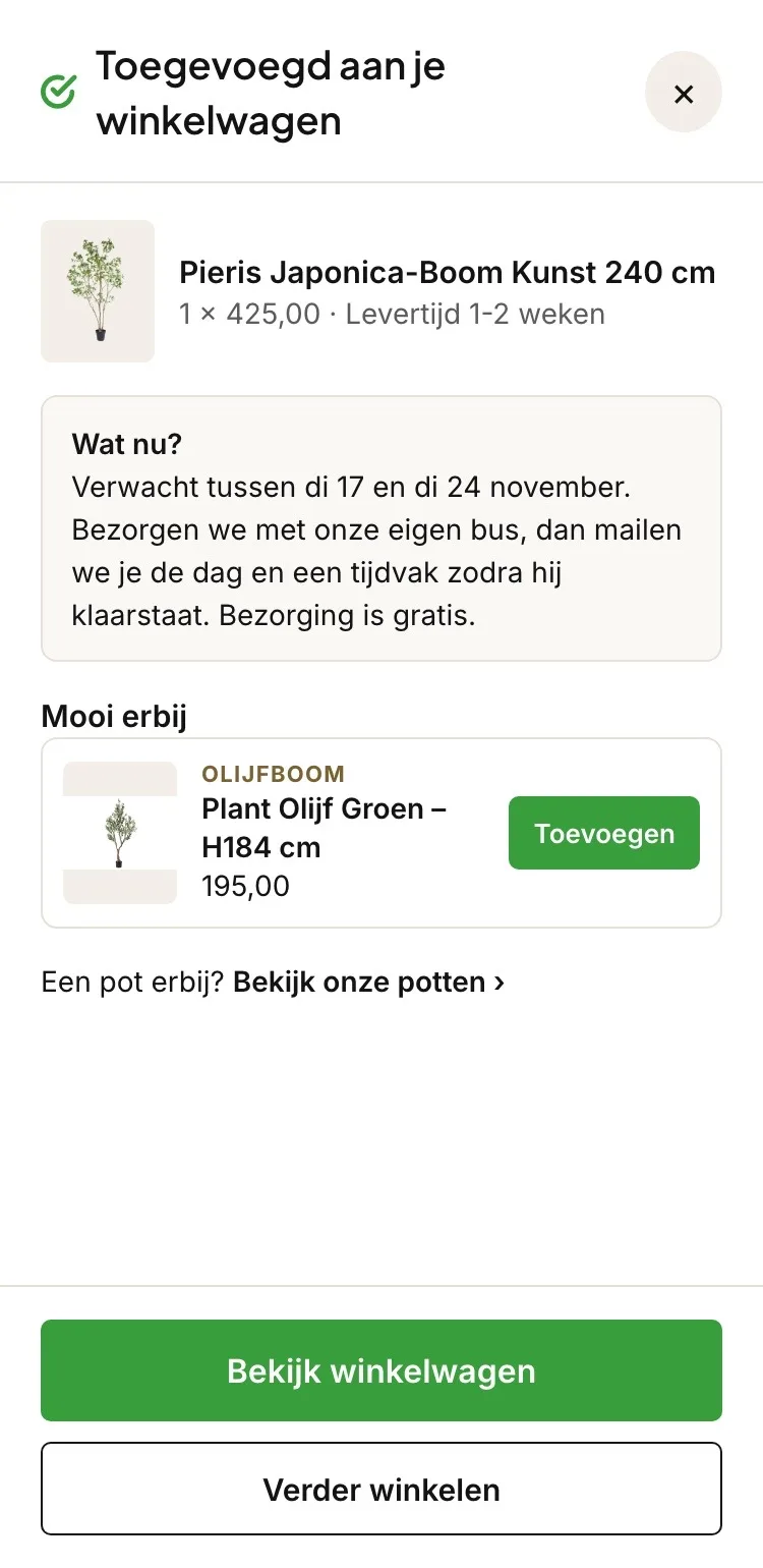
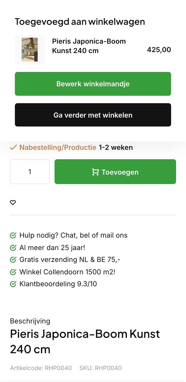
After adding to cart.
Clear what happens next.
- 01Also when it arrivesThe live site already showed your tree and the price; now you also see when it’s expected.
- 02Add an olive treeIn the pop-up, you add an olive tree with one tap.
- 03A pot tooOr go straight from the pop-up to the pots.
Click through the new design yourself.
The design works like a real page, on desktop and on your phone. You just can’t place an order with it yet.
From design to more orders.
This is how we take the new design live, and measure what it delivers.
- 01Only the pageHeader, menu, USP bar and footer stay exactly as they are now. We only change the content of the product page.
- 02Test first, then go liveWe run the new design in an A/B test next to the current page and measure orders per visitor.
- 03Your own strengthsYour own photos, visuals, reviews and tone of voice: it all came from you already, just in a better place.
This design live
on your online store?
With the AI Design Agent, we put this design on your existing online store, and then keep improving it every month with CRO. Built by our specialists. Without spending thousands of euros a month on it.
- No rebuild, no migration
- Your back office stays the way you know it
- Only goes live after your approval
- 01Ongoing development for a fixed monthly feeNo separate quotes for every change. If we see an opportunity or you have an idea, we build it.
- 02CRO improvements, implemented right awayWe analyze your online store and implement improvements in days instead of months.
- 03Safe, and you see what changesWe build and test everything in a preview first. It only goes live after your approval, and every version is saved.