 Google Ads
 Meta Ads
 Email marketing
 Lightspeed eCom Toolkit
 Shopify Toolkit
Your product page,
redesigned.
A new design for the product page of merelinwonderland.nl: Vintage indiase kast (vintage Indian cabinet). Below you see every screen before and after, and what we improved.
- 11 before-and-afters
- 18 improvements
- merelinwonderland.nl
Every screen, compared.
Pick a screen and drag across the screenshot. On the left you see the current page of merelinwonderland.nl, on the right the new design.
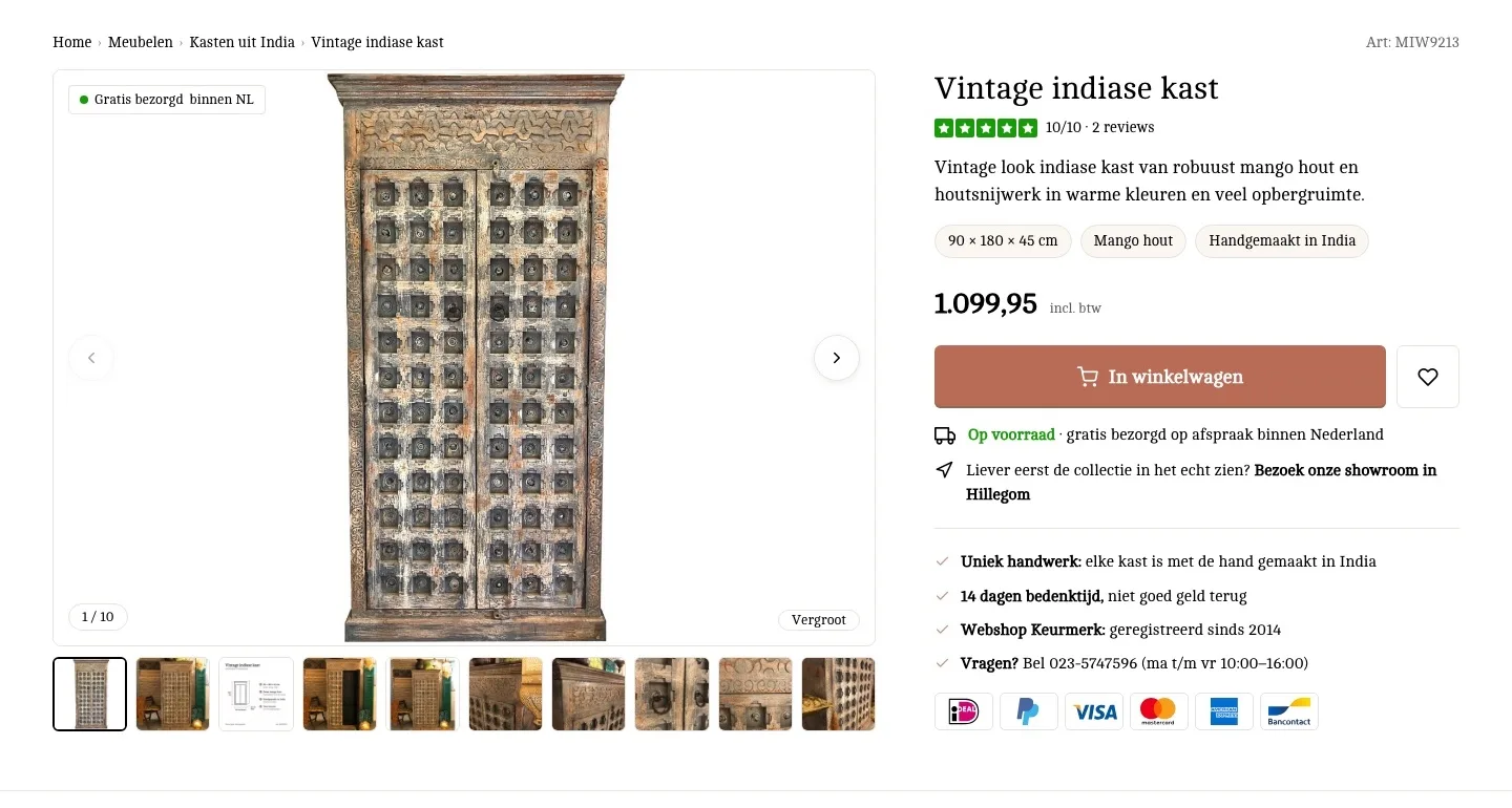
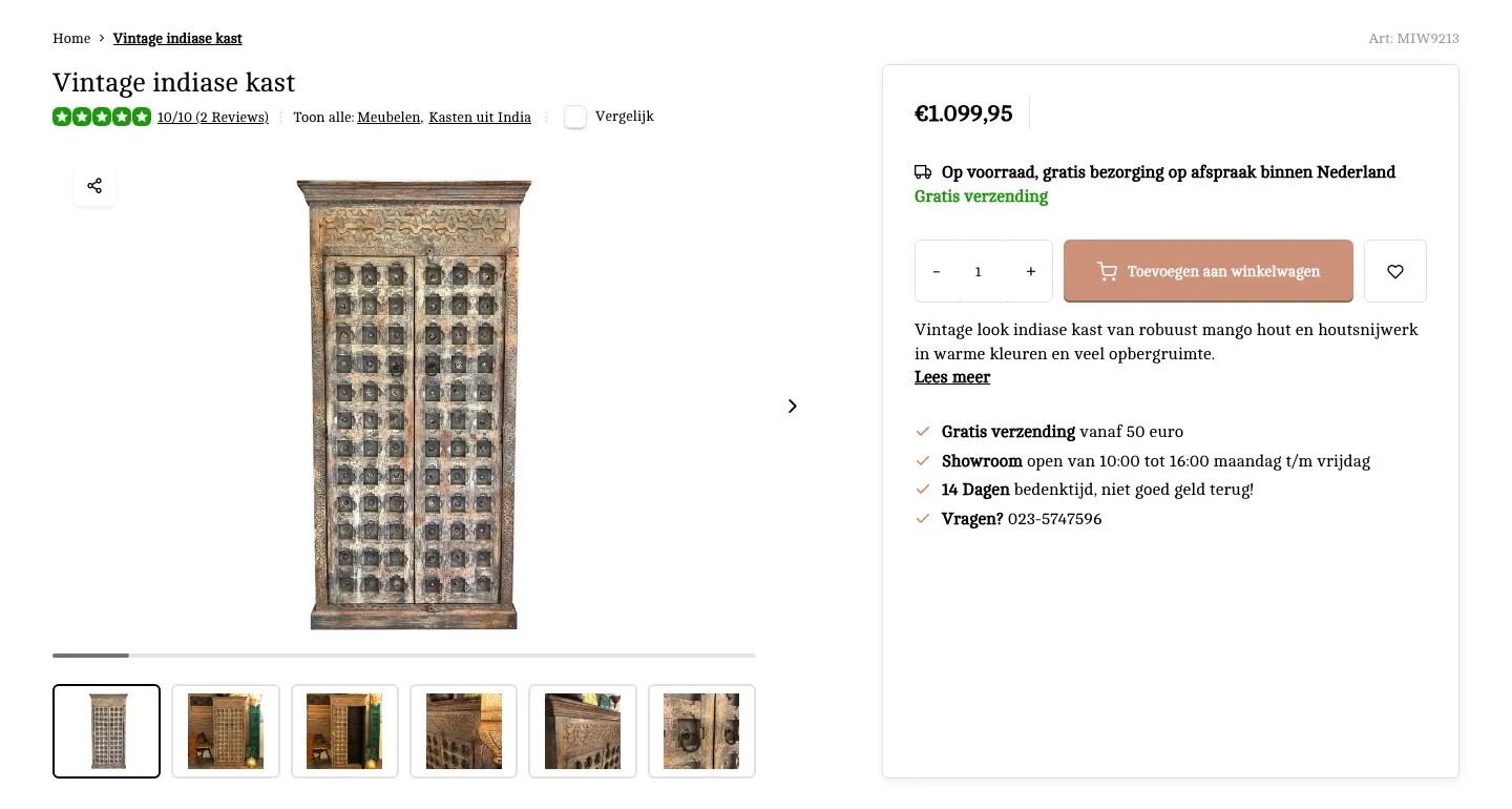
Product page.
The cabinet, the dimensions and the price at a glance.
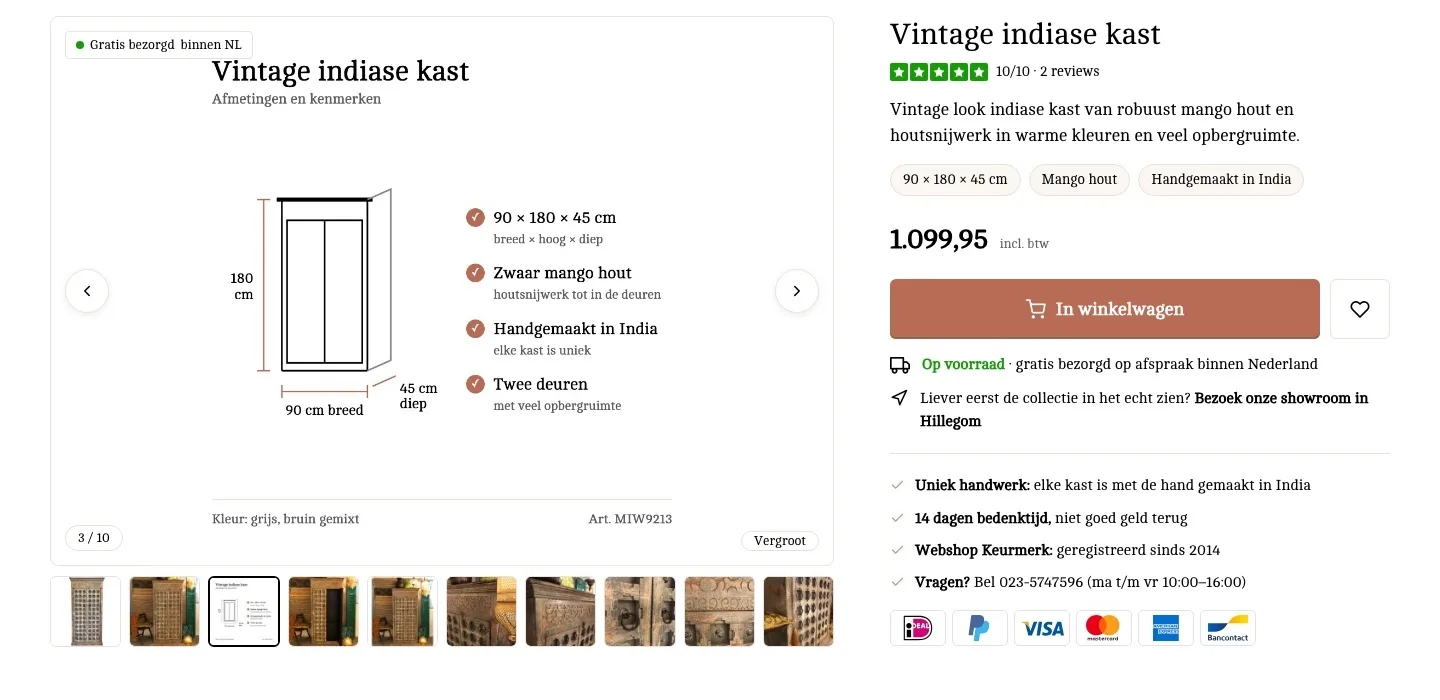
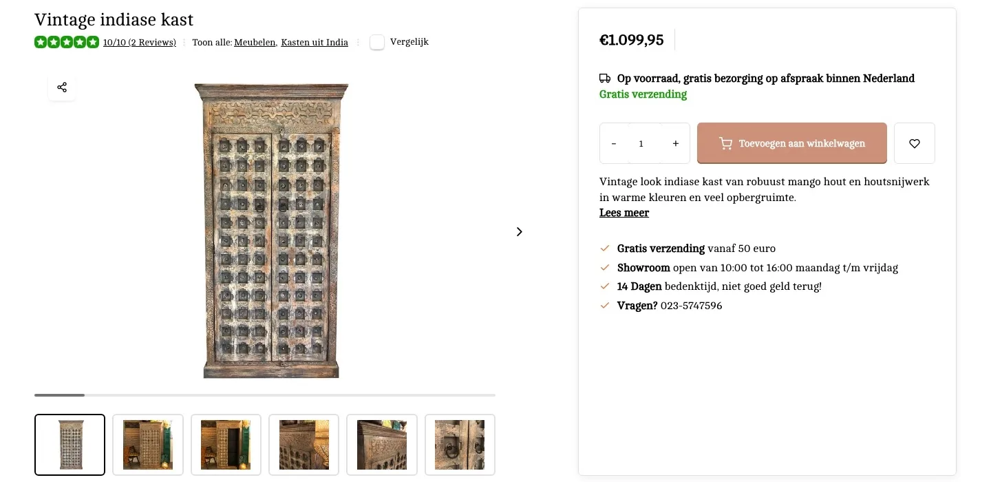
- 01All photos in viewYou could see 6 of the 9 photos, in a small frame. Now they all sit below one large photo, so you look at the cabinet from every side without searching.
- 02Dimensions right by the title90 × 180 × 45 cm was only at the bottom in the specifications. Now it sits by the title: ‘will it fit?’ is the first question with a cabinet.
- 03Category in the breadcrumbMeubelen (Furniture) and Kasten uit India (Cabinets from India) were ‘Toon alle’ (Show all) links next to the score. Now they are in the breadcrumb above the title, where you look to go back.
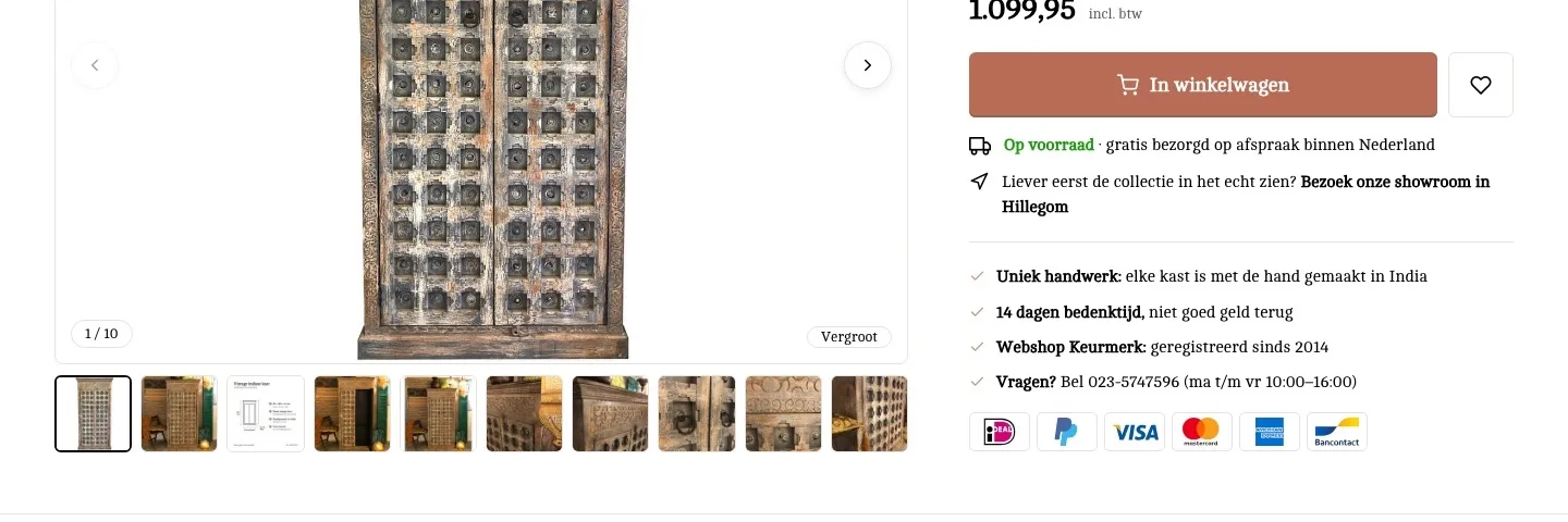
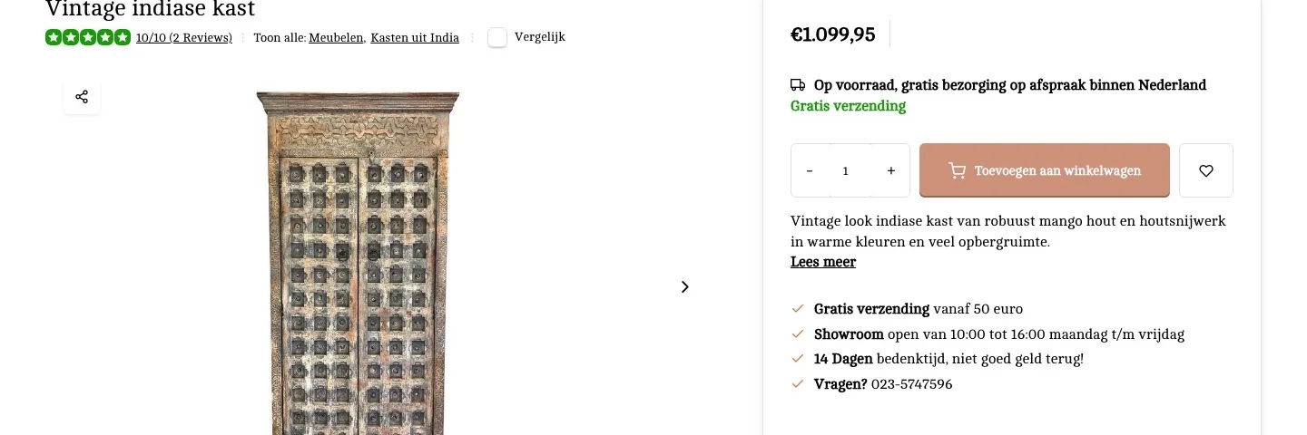
Around the button.
Delivery, showroom and payment close to the decision.
- 01Delivery below the button‘Gratis bezorging op afspraak’ (Free delivery by appointment) was above the button. Now it is right below it, at the moment you have doubts about delivery.
- 02Showroom as a second routeThe showroom was a separate USP line; the product had no address. Now a link by the button leads to the address, hours and directions.
- 03Payment logos and trust markThere were no payment logos by the button, only small in the footer. Now you see iDEAL, PayPal and the cards by the button, plus the Webshop Keurmerk.
Photos and first impression.
What you want to know, already in the gallery.
- 01Dimensions as an imageThe dimensions were only in a list. Now a drawing in the gallery shows how big the cabinet is. That reads faster and prevents returns.
- 02Free delivery on the photoFree delivery was in the text by the price and in the USPs, but not on the photo. Now it is on the photo too, where you look first.
- 03The story at the topThe short description was below the button. Now it is right below the title: with a statement piece, you first want to know what it is.
Reviews.
The reviews, right below the buy box.
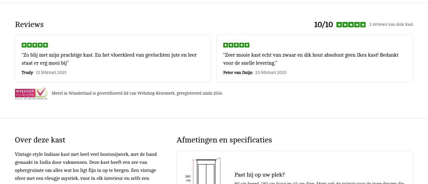
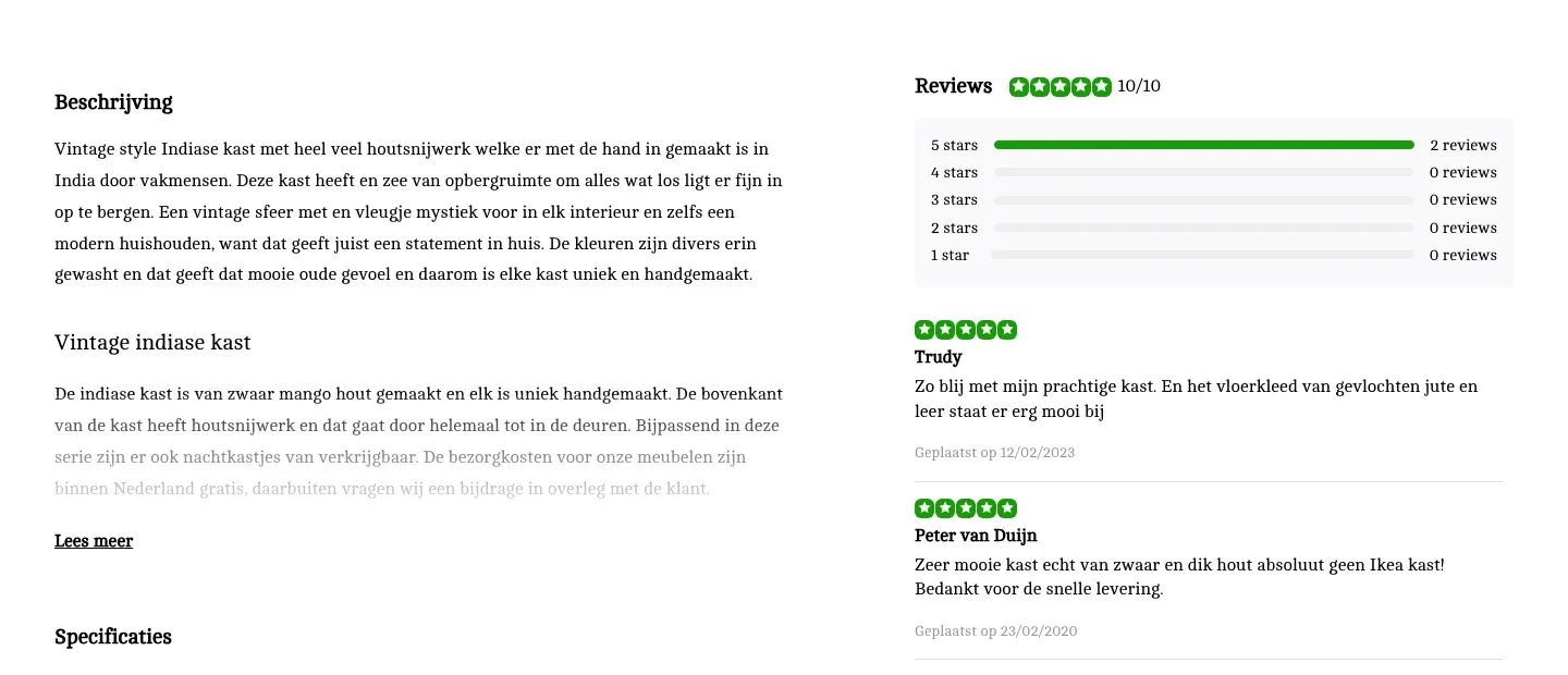
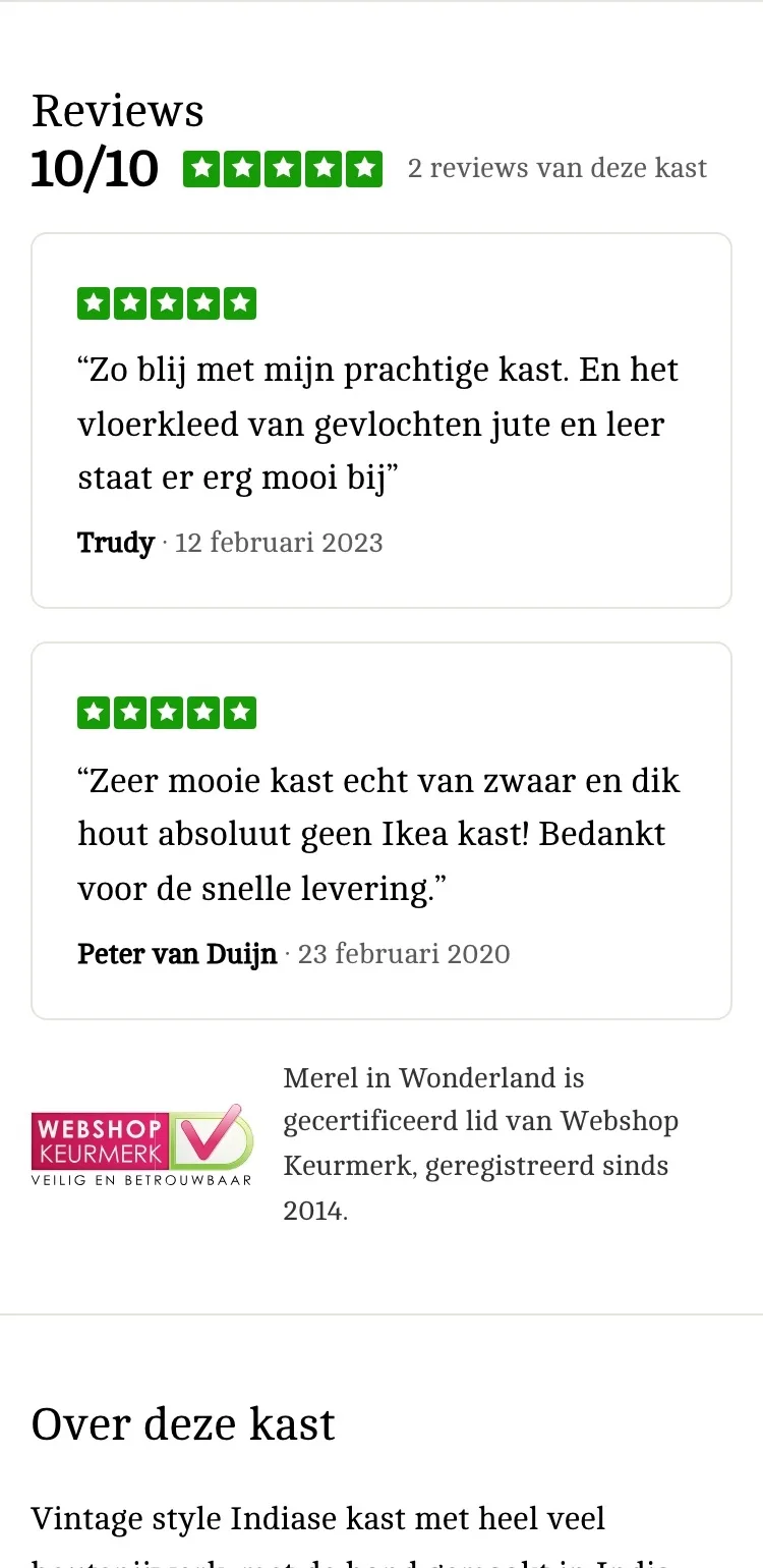
- 01Reviews as cardsThe two reviews were separate lines below a star overview. Now they are cards with a quote, name and date, across the full width.
- 02Trust mark by the reviewsThe Webshop Keurmerk was only in the footer. Now it sits by the reviews, registered since 2014. That reassures buyers of an expensive cabinet.
- 03No empty star barsFour of the five bars in the star overview said ‘0 reviews’. Now you see right away what counts: the 10/10 and two real reviews.
About the cabinet and its dimensions.
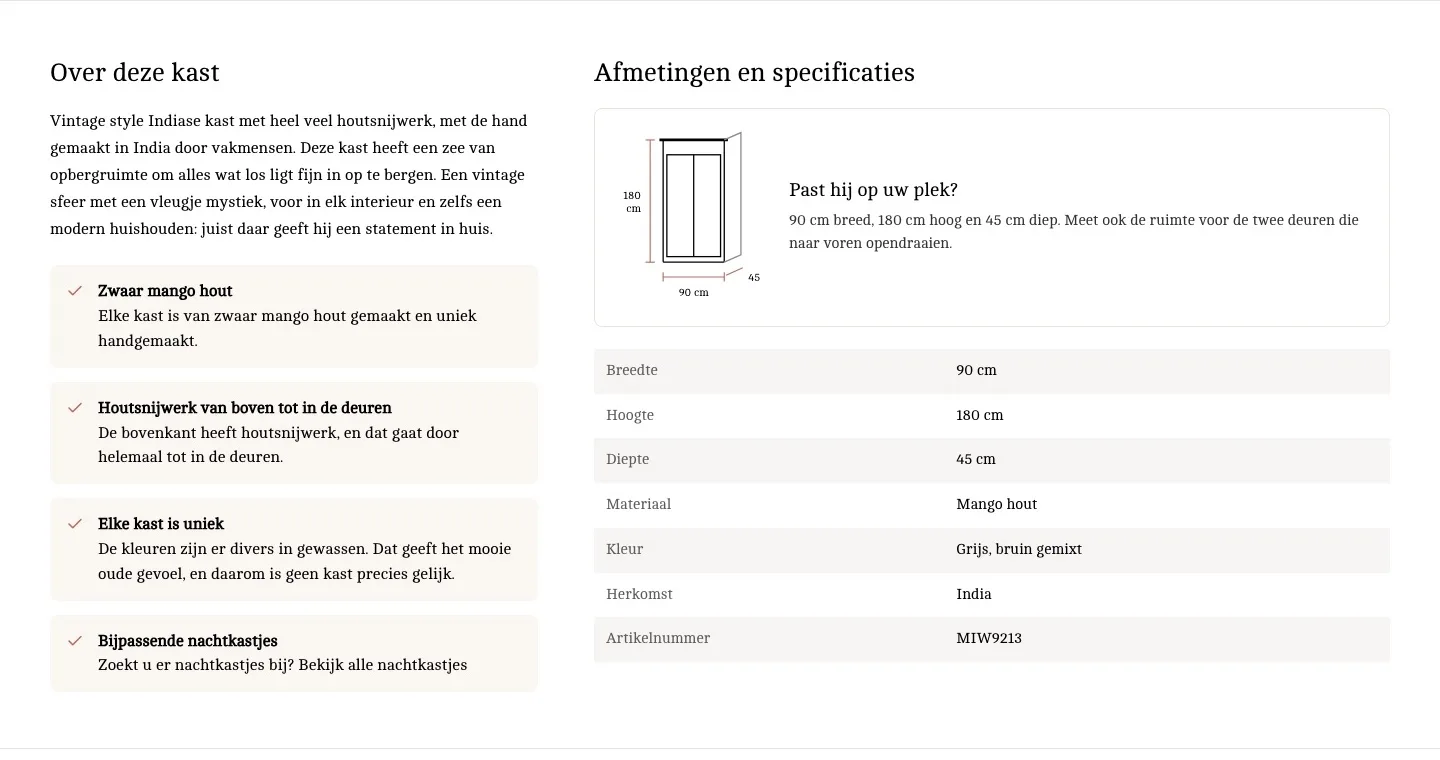
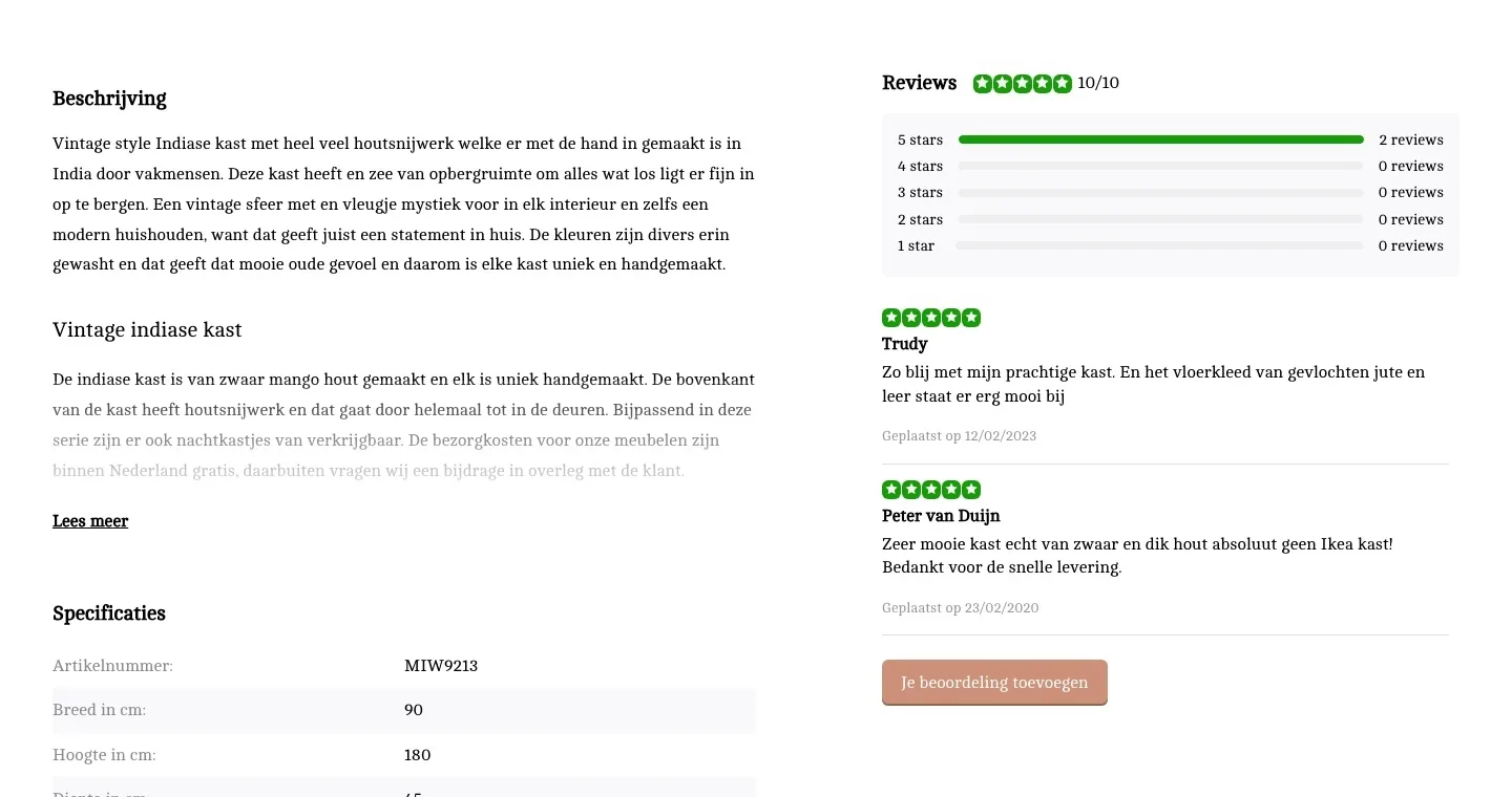
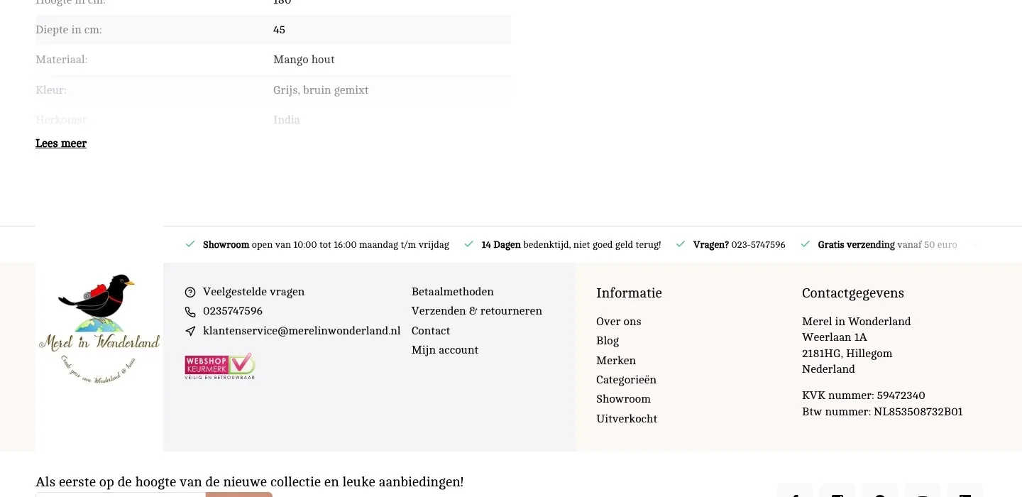
The story and the dimensions, without ‘Lees meer’ (Read more).
- 01The story in four pointsThe description was one long block of text, the last line faded behind ‘Lees meer’ (Read more). Now you read in four short points what makes the cabinet special.
- 02Will it fit your space?There was no help with measuring. Now a drawing shows width, height and depth, with a tip about the doors. Less doubt, fewer returns.
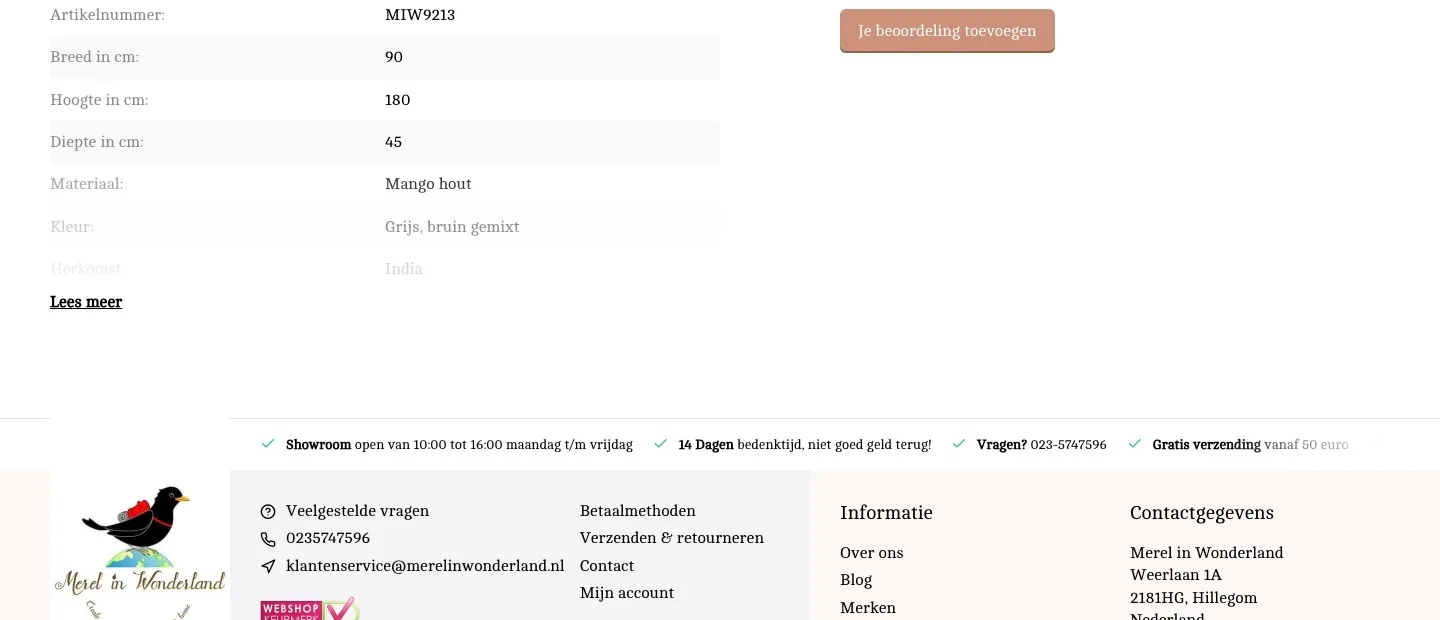
- 03All specifications openThe specifications were in a list with the last two lines faded behind ‘Lees meer’ (Read more). Now they are complete in a table next to the drawing.
Showroom and questions.
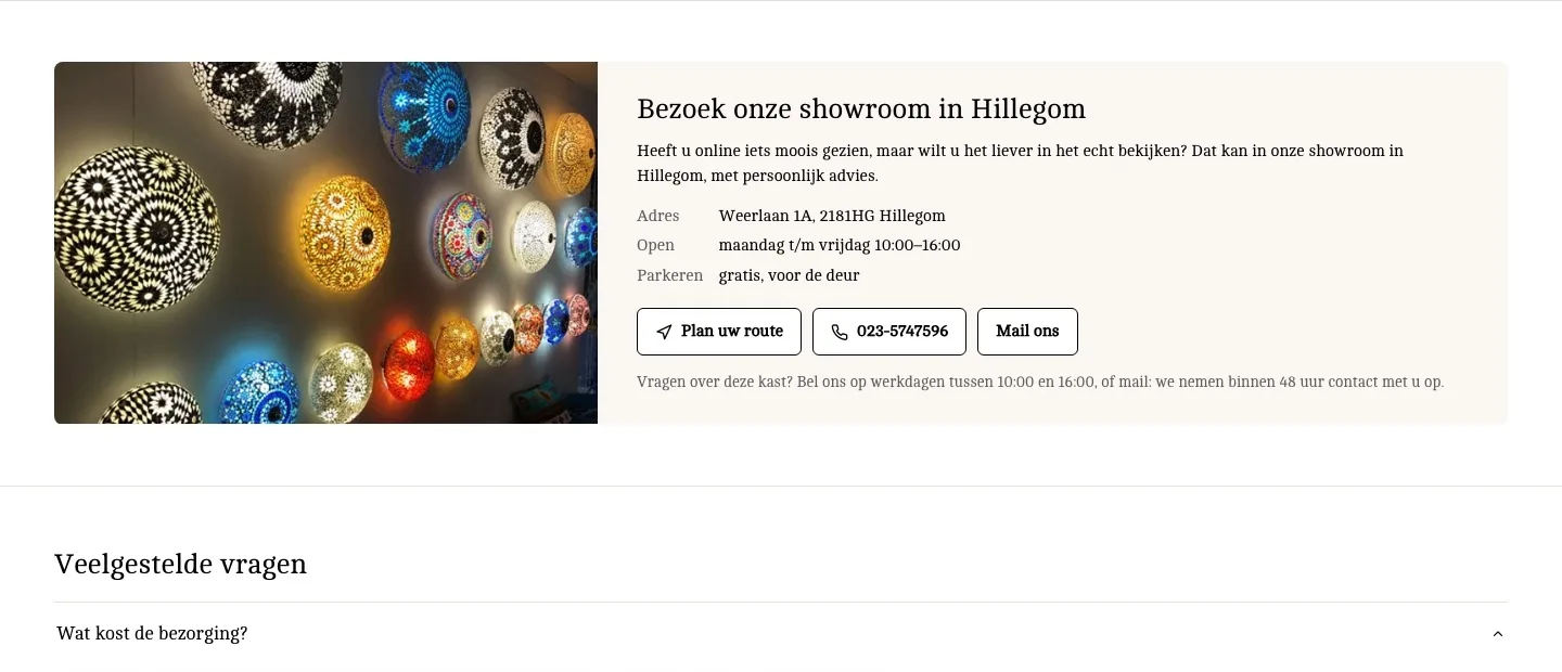
See it first or ask first: you can do both from the page.
- 01Showroom on the pageThe showroom was a USP line; the product had no address. Now address, hours and free parking are on the page, with a photo of the showroom.
- 02Directions, call and emailWith the product, the phone number was only plain text. Now you call or email with one click, and directions to the showroom are new.
- 03Answers on the pageDelivery, returns and payment were mostly on service pages. Now the answers are on the page, where the question comes up.
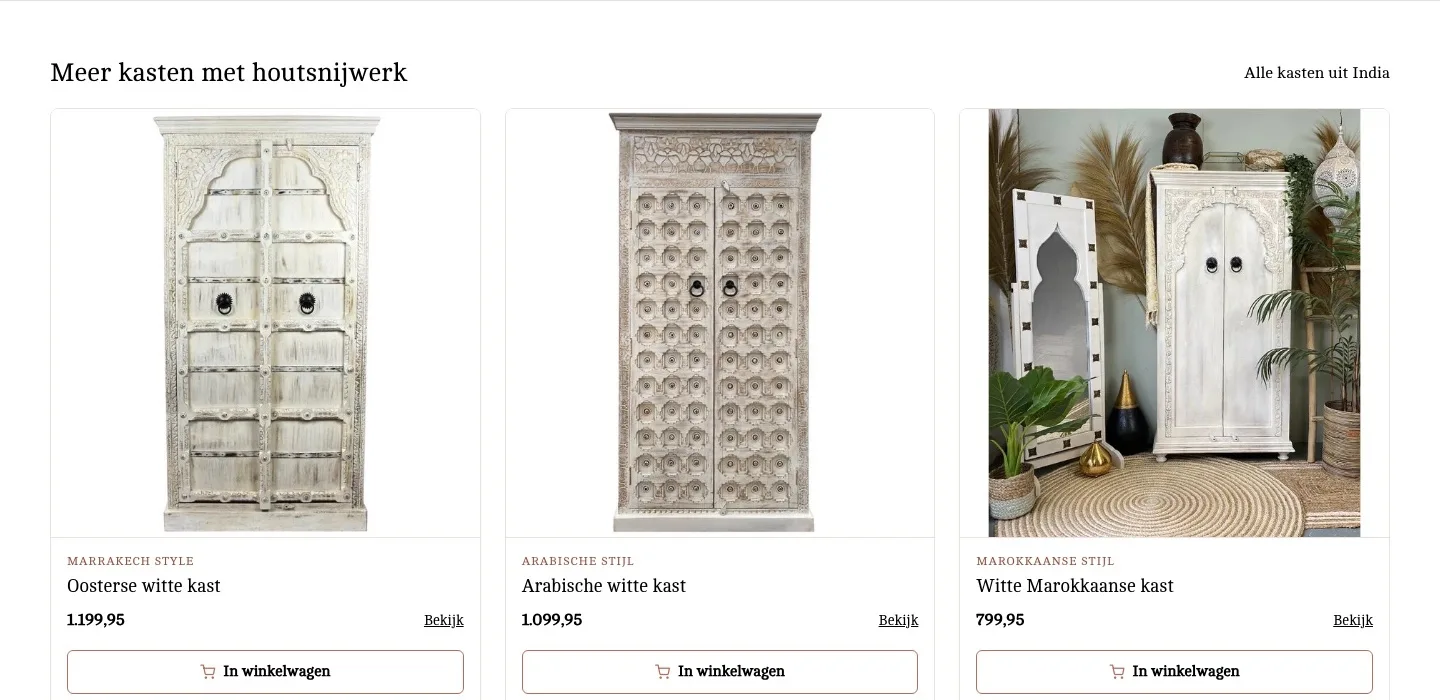
More cabinets.
An alternative if this cabinet just does not fit.
- 01Other cabinets with a photoAfter the specifications, the page just ended. Now you see three other cabinets with wood carving, with photo and price.
- 02With their own buttonEvery card has an ‘In winkelwagen’ (Add to cart) button. If you pick another cabinet, you can add it right away.
- 03See the difference right awayA label per card, such as ‘Marrakech style’, shows at a glance how the cabinets differ.
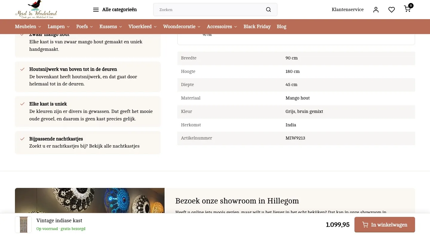
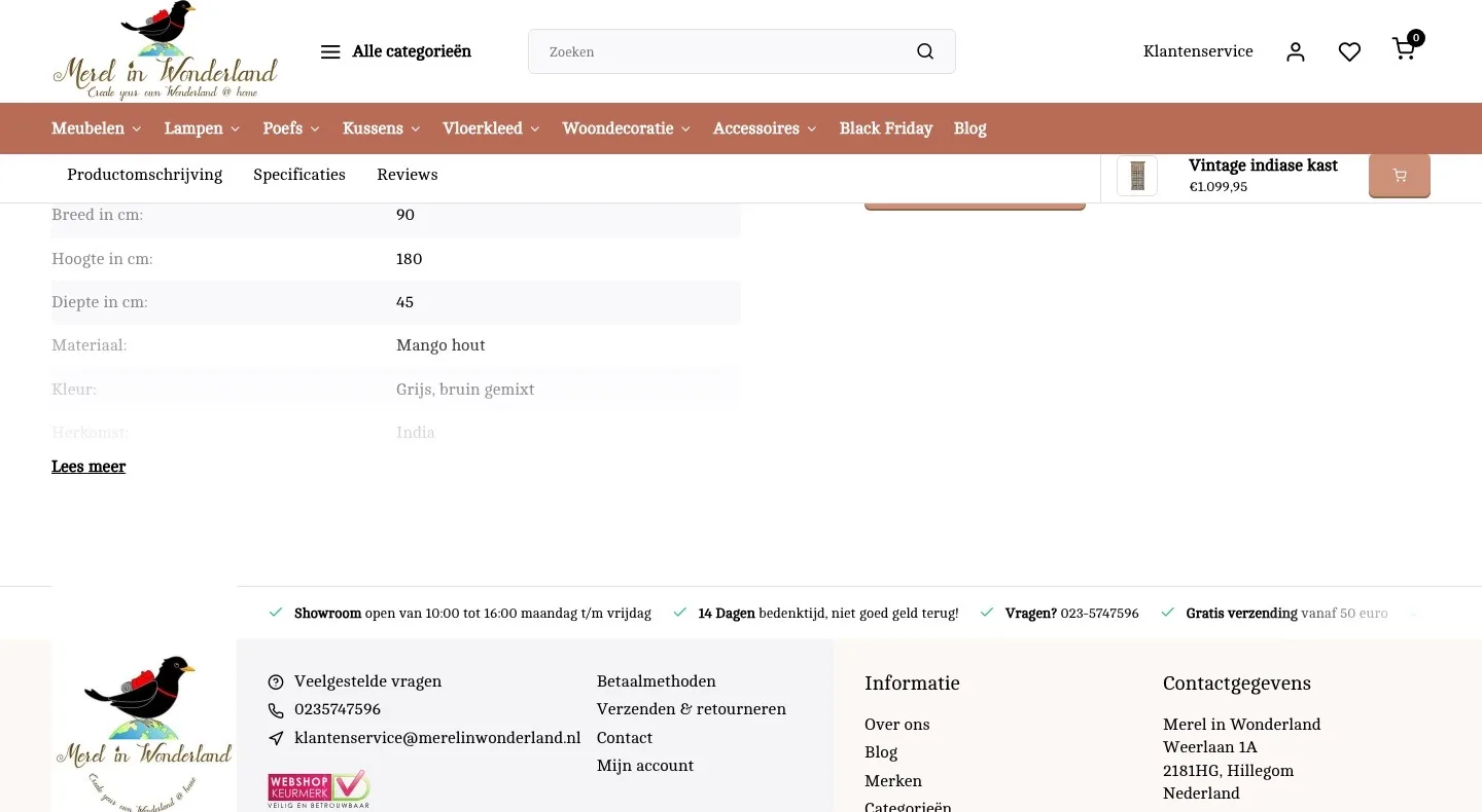
While scrolling.
The button stays in view, the header makes room.
- 01Button with text at the bottomThe bar at the top had a small cart icon as its button. Now a clear ‘In winkelwagen’ (Add to cart) button sits at the bottom, next to the price.
- 02Stock in the barThe bar only showed name and price. Now it also says ‘Op voorraad · gratis bezorgd’ (In stock · free delivery), so the promise stays with you.
- 03More room for the cabinetThe header stayed just as tall while scrolling. Now it becomes more compact, so you see more of the cabinet and the text.
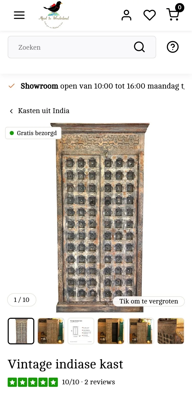
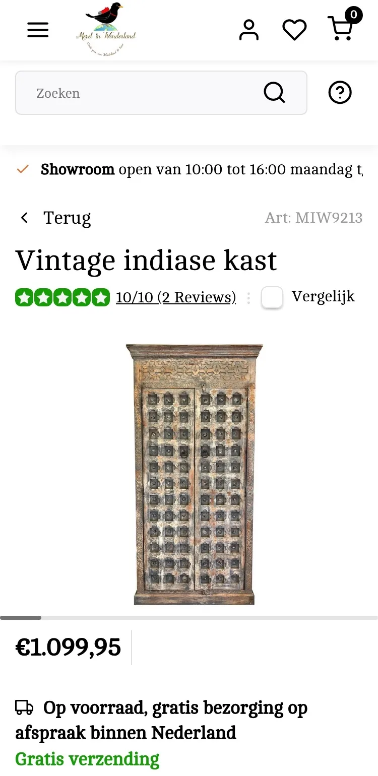
Product page.
Photos, dimensions and price on a phone.
- 01Thumbnails below the photoThere was only a thin bar below the photo. Now you see small photos, so you know there is more to see.
- 02Tap to enlargeNothing showed that you could view a photo large. Now it says so on the photo itself, and a tap opens it large.
- 03Calmer by the titleThe ‘Vergelijk’ (Compare) checkbox sat next to the score. It is gone, so attention goes to the cabinet and the button.
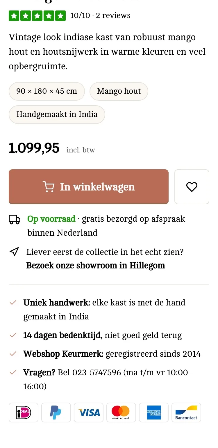
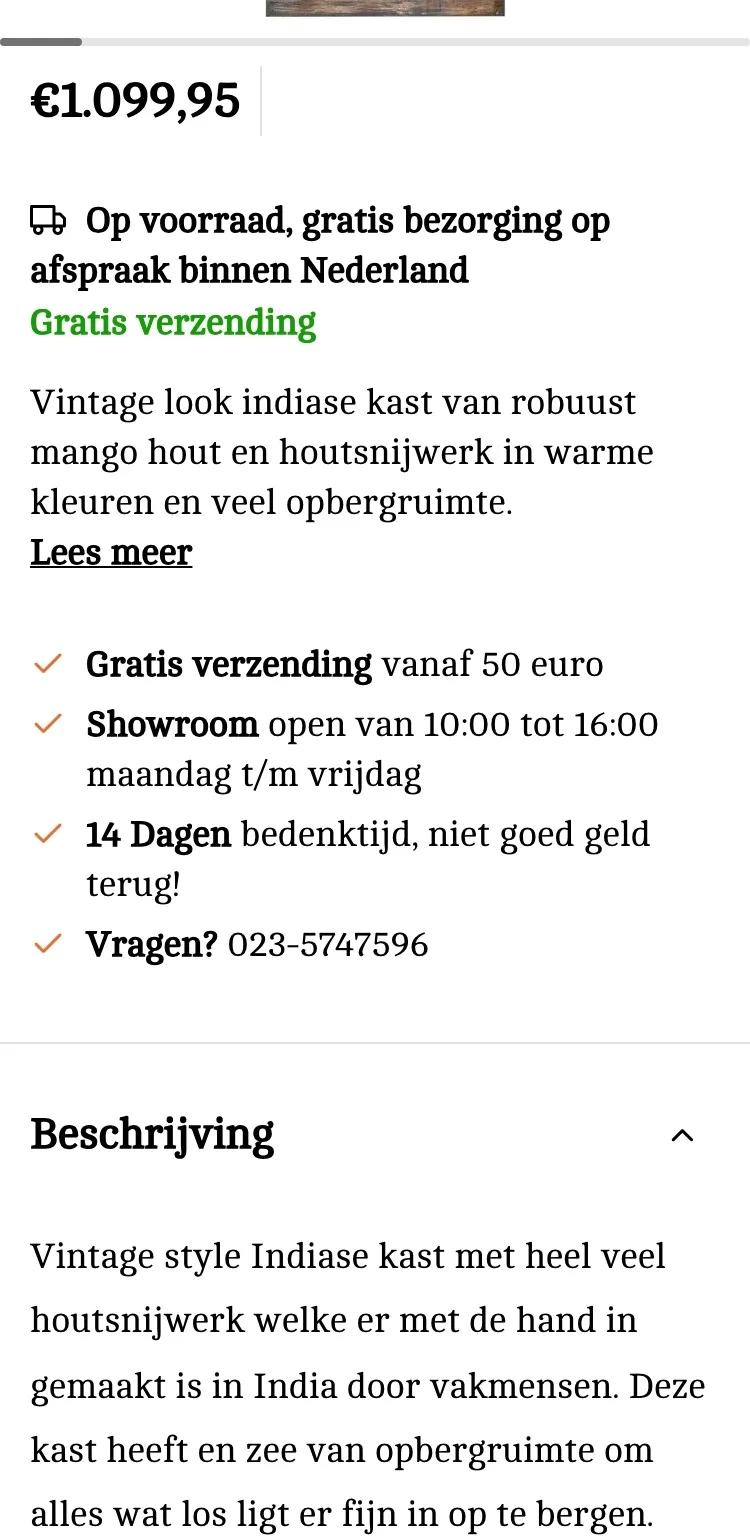
Choose and buy.
Everything you need to buy, on one screen.
- 01Button right below the priceThe buy button was only in the bar at the bottom, next to a quantity selector. Now it is also right below the price, without a quantity: you buy a unique cabinet one at a time.
- 02USPs that fit‘Gratis verzending vanaf 50 euro’ (Free shipping from 50 euros) says nothing at 1,099.95. Now you read: unique handcraft, 14-day cooling-off period and Webshop Keurmerk.
- 03Payment logos below the USPsThere were no payment logos by the button, only small in the footer. Now you see below the USPs how you can pay.
Further down the page.
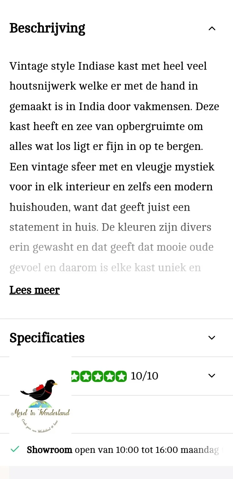
Reviews and information open instead of collapsed.
- 01Reviews open and higherThe reviews were in a collapsed block at the bottom. Now they are open, right below the buy box.
- 02Trust mark by the reviewsYou only saw the Webshop Keurmerk in the footer. Now it sits by the reviews, where trust matters.
- 03Nothing covers the textOn the live site, the logo from the footer covered the reviews. Now the page has room at the bottom and everything stays readable.
Click through the new design yourself.
The design works like a real page, on desktop and on your phone. You just can’t place an order with it yet.
From design to more orders.
This is how we take the new design live, and measure what it delivers.
- 01Only the pageHeader, menu, USP bar and footer stay exactly as they are now. We only change the content of the product page.
- 02Test first, then go liveWe run the new design in an A/B test next to the current page and measure orders per visitor.
- 03Your own strengthsYour own photos, visuals, reviews and tone of voice: it all came from you already, just in a better place.
This design live
on your online store?
With the AI Design Agent, we put this design on your existing online store, and then keep improving it every month with CRO. Built by our specialists. Without spending thousands of euros a month on it.
- No rebuild, no migration
- Your back office stays the way you know it
- Only goes live after your approval
- 01Ongoing development for a fixed monthly feeNo separate quotes for every change. If we see an opportunity or you have an idea, we build it.
- 02CRO improvements, implemented right awayWe analyze your online store and implement improvements in days instead of months.
- 03Safe, and you see what changesWe build and test everything in a preview first. It only goes live after your approval, and every version is saved.