 Google Ads
 Meta Ads
 Email marketing
 Lightspeed eCom Toolkit
 Shopify Toolkit
Your product page,
redesigned.
A new design for the product page of eddy-s.nl: Peuterey Aiptek NBE 03 Fur Jacket – Gargouile. Below you see every screen before and after, and what we improved.
- 14 before-and-afters
- 17 improvements
- eddy-s.nl
Every screen, compared.
Pick a screen and drag across the screenshot. On the left you see the current page of eddy-s.nl, on the right the new design.
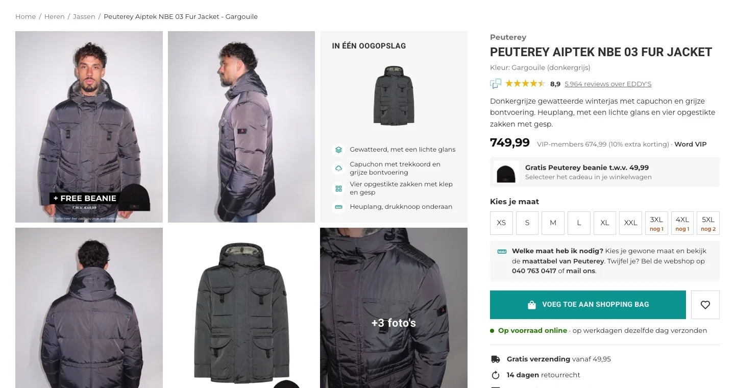
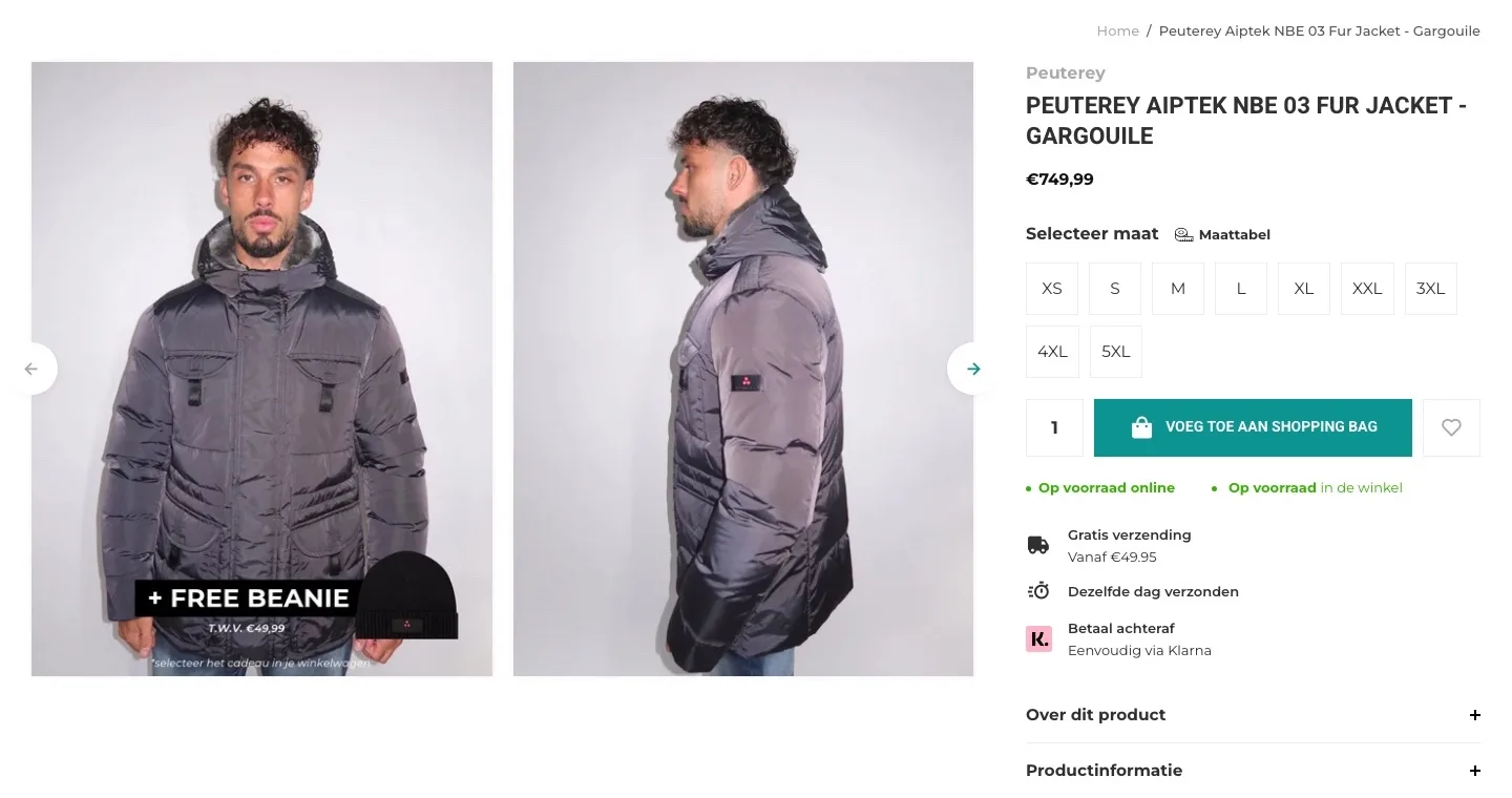
Product page.
The jacket, the score and the gift at a glance.
- 01Score right by the nameThe 8.9 from Feedback Company was in the header and the footer, far from the jacket. Now the score with 5,964 reviews sits below the name.
- 02The gift stands outNothing by the price and button mentioned the free beanie; only two product photos did. Now it has its own block by the price, with how you get it.
- 03More of the jacket in viewThere were two photos in a slider. Now you see six tiles at once, one of them with the jacket’s key features.
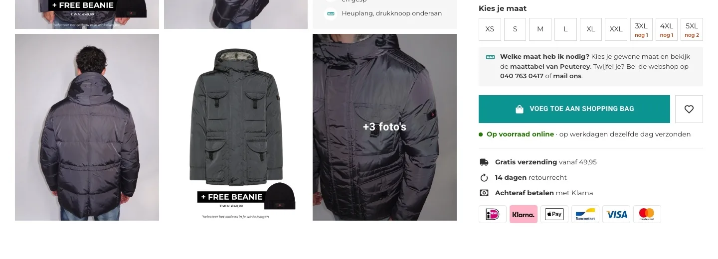
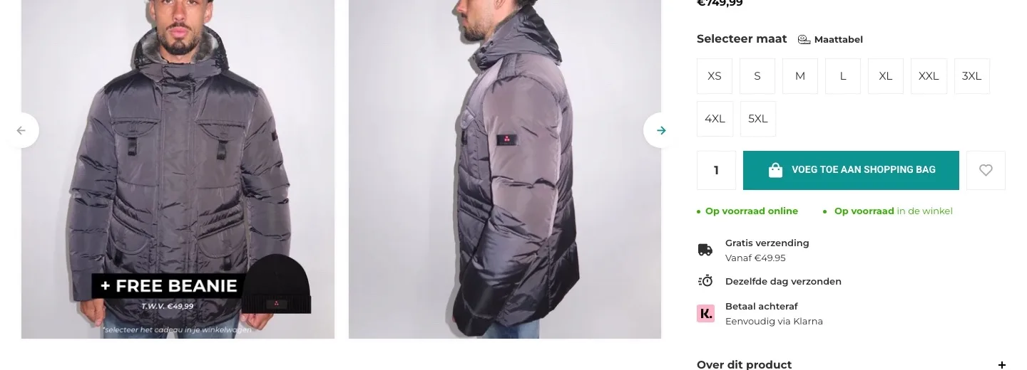
Choosing a size.
Less doubt about the size, right before the button.
- 01Help with your sizeBy the sizes there was only a link, ‘Maattabel’ (Size chart). Now you read right away what to do if you’re unsure: Peuterey’s size chart or call the online store.
- 02You see what’s leftBefore choosing, you couldn’t see which sizes were almost gone. Now the 3XL, 4XL and 5XL buttons already say there are 1 or 2 left.
- 03Payment as logosBy the button there was a small Klarna icon next to ‘Betaal achteraf’ (Pay later); iDEAL, PayPal and the rest were only in the footer. Now all the logos sit by the button.
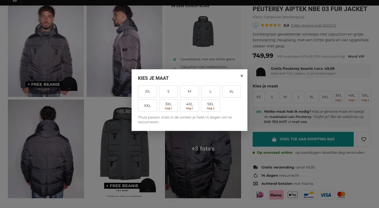
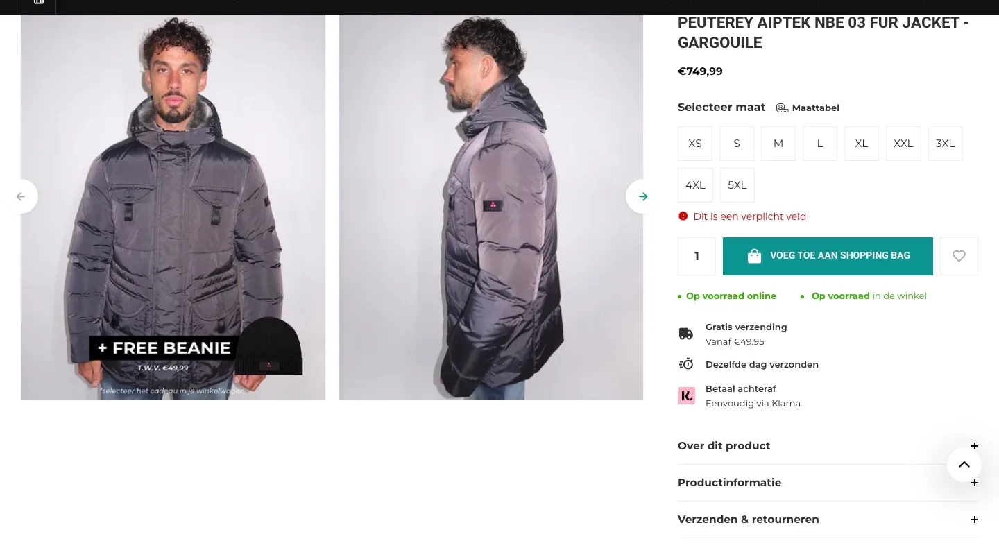
Adding without a size.
The button always works, even if you haven’t chosen a size yet.
- 01Choose your size in one clickWithout a size, the button only gave ‘Dit is een verplicht veld’ (This is a required field). Now a window opens with the sizes: one click and it’s in your bag.
- 02Calm around the buttonThe quantity field next to the button is gone. You buy one jacket in one size, so there’s one choice fewer.
- 03VIP benefit by the priceThe header only said ‘Word EDDY’S VIP MEMBER’ (Become an EDDY’S VIP MEMBER). Now you see by the price what the jacket costs with the 10% VIP discount.
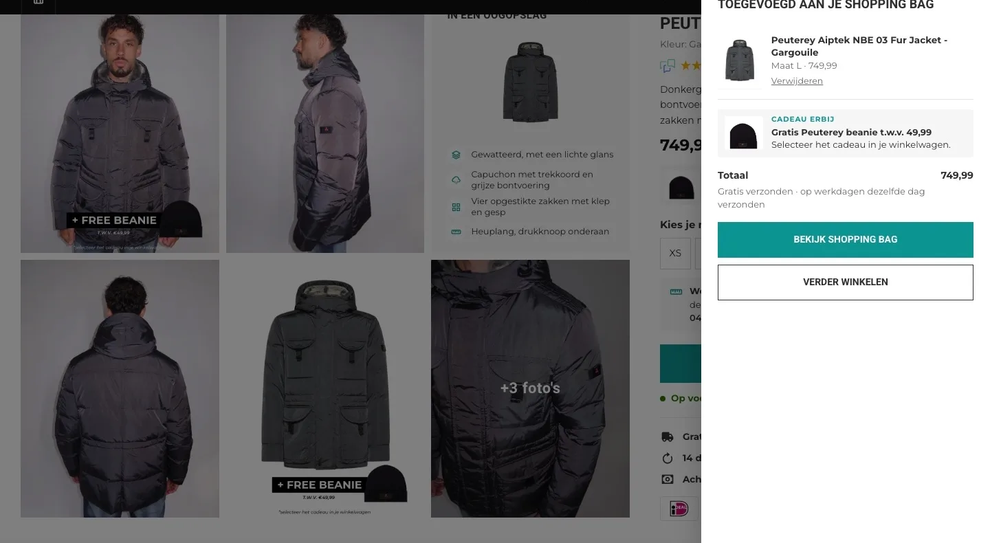
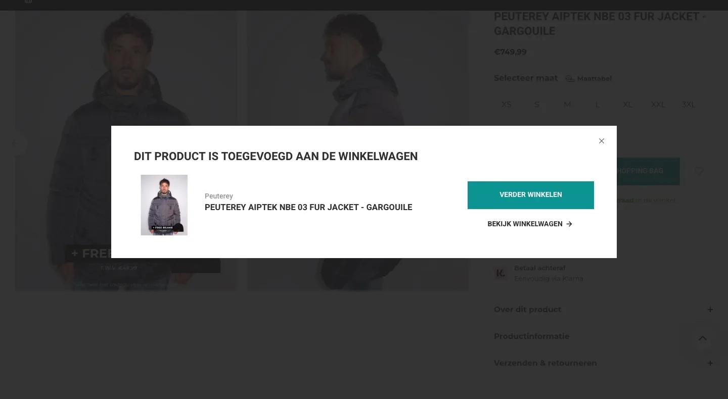
After adding to cart.
You see what you bought and don’t forget the gift.
- 01With the size you choseThe window only confirmed with a photo and name that the jacket was added. Now you also see the size you chose and the price.
- 02Don’t forget the giftYou have to pick the beanie yourself in your cart. The window didn’t mention it; now it does, so nobody misses out.
- 03Total and shippingThe window had no total. Now you see the amount and that the jacket ships for free, the same day on weekdays.
About this jacket.
Everything about the jacket, open and easy to read.
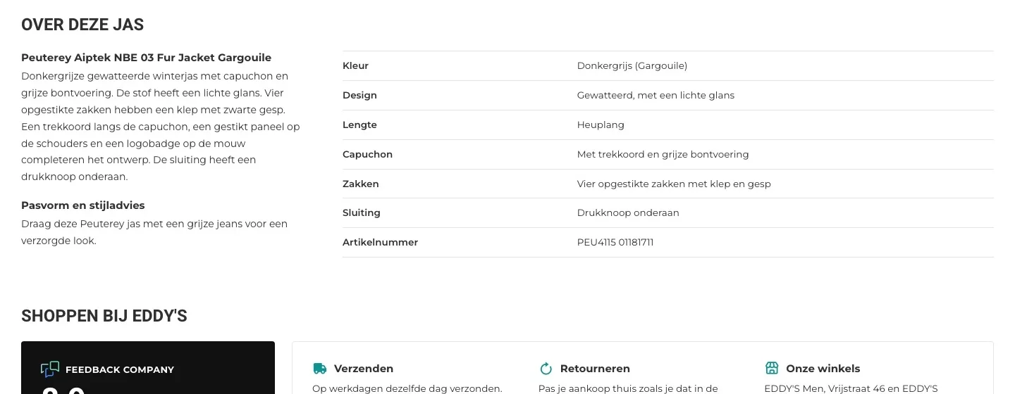
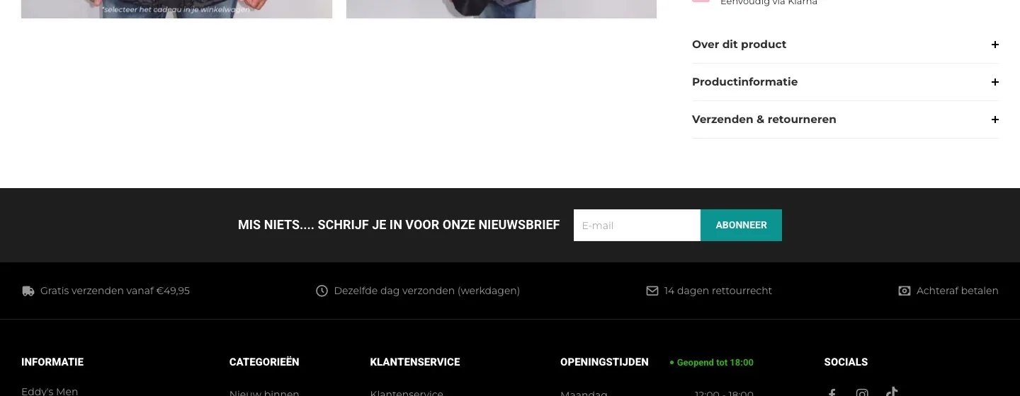
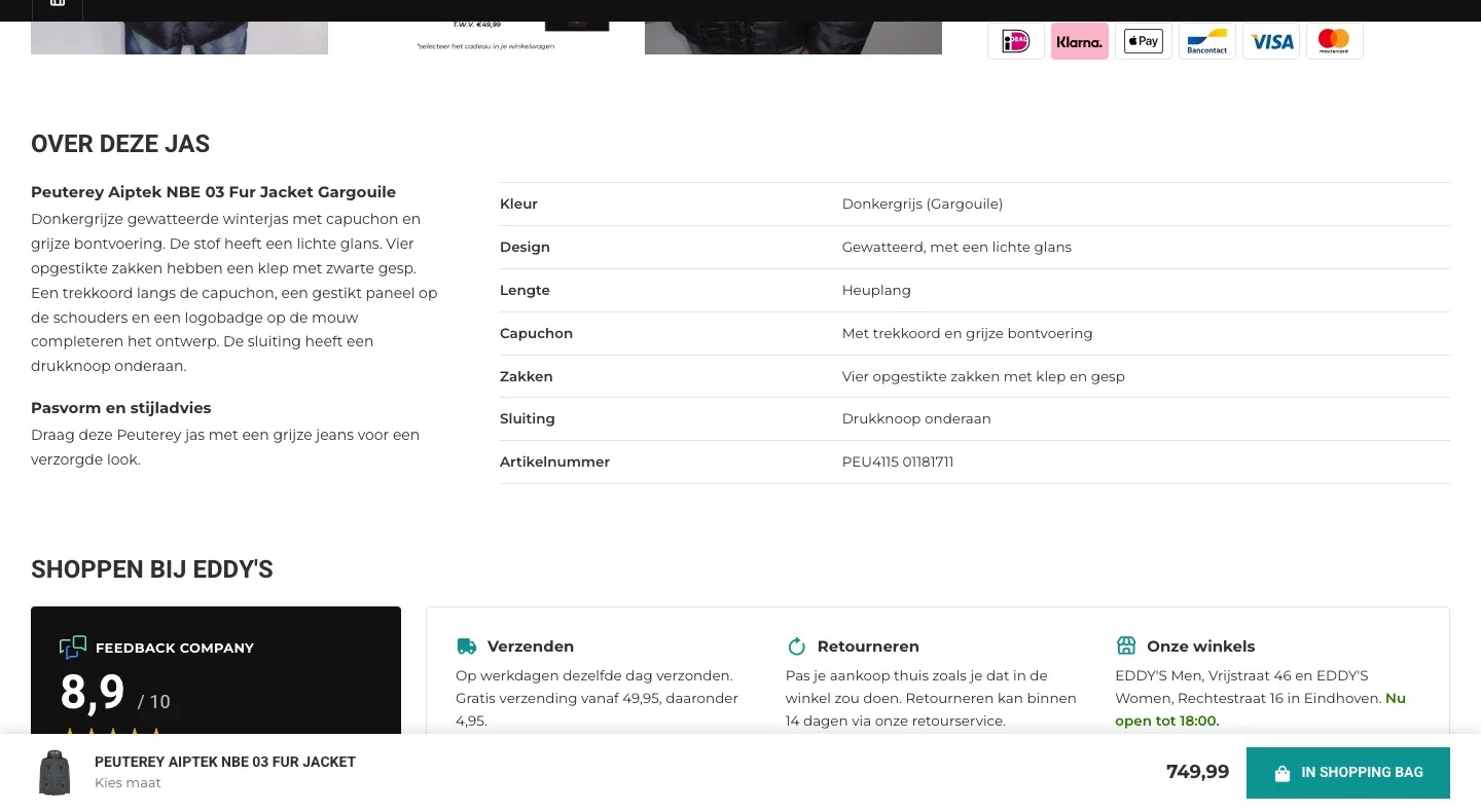
- 01Description openThe description was collapsed under ‘Over dit product’ (About this product). Now you read it right away, with the style advice.
- 02Features open in a tableThe features were separate lines in the collapsed list. Now they’re open in a table, with the hood included.
- 03Quick to compareIf you’re comparing two jackets, you now see length, hood and closure at a glance, without opening a list.
Shopping at EDDY’S.
Trust for a 750 euro jacket.
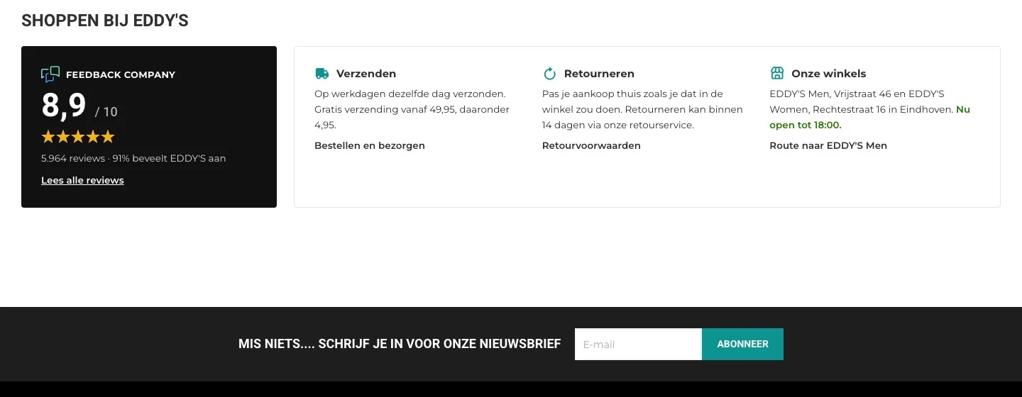
- 018.9 from 5,963 customersThe score was small in the header and the footer. Now it has its own block: 8.9, 5,964 reviews, 91% recommend it and a link.
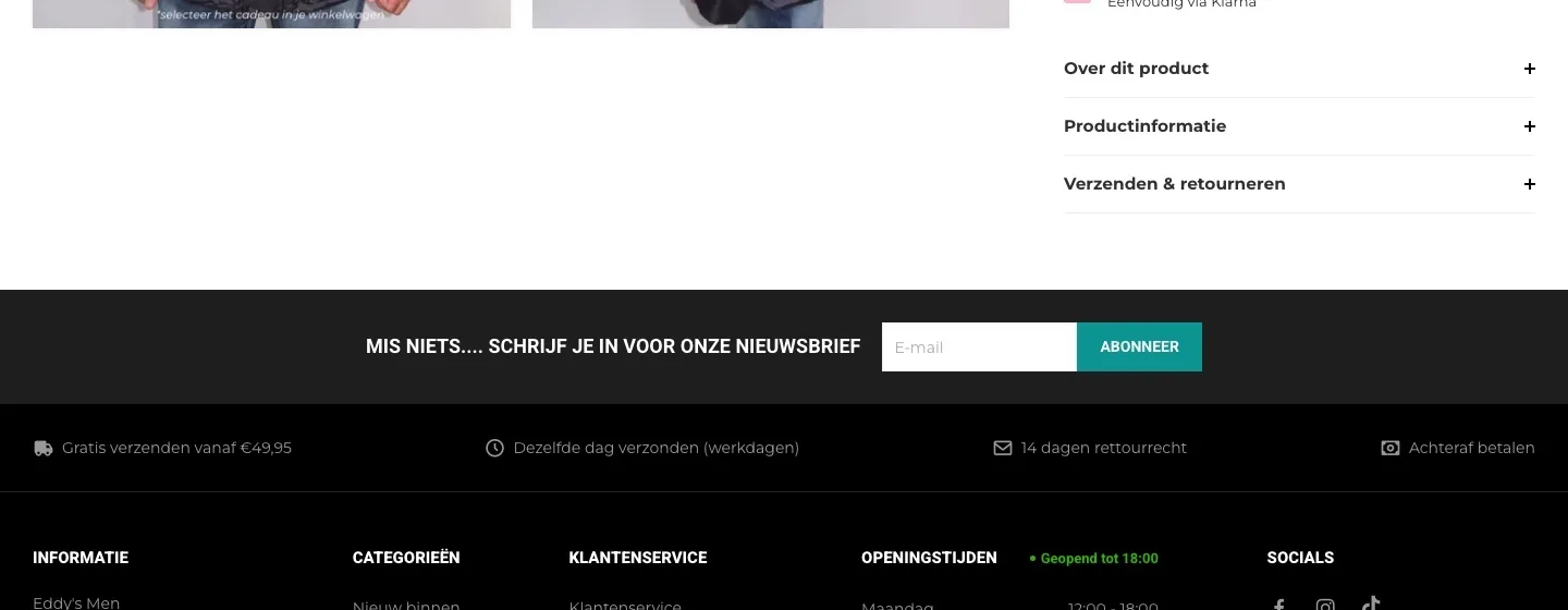
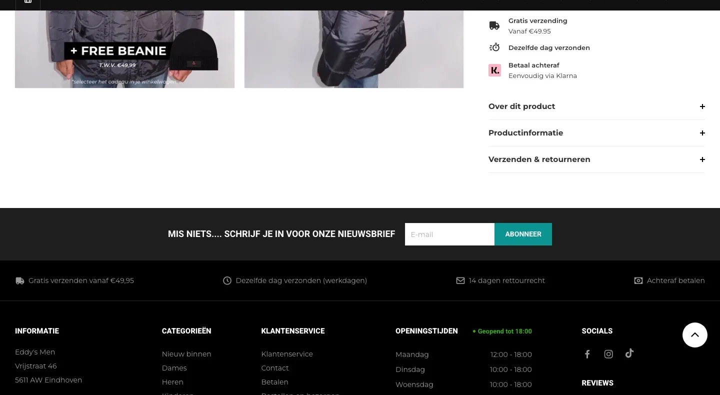
- 02Shipping and returns openShipping and returns were in a collapsed list. Now you read how it works without clicking, including that you can try it on at home.
- 03Your stores includedThe addresses of the stores in Eindhoven were only in the footer. Now you see them by the jacket, with directions.
While scrolling.
The button stays within reach.
- 01Buy bar at the bottomOnce you scrolled, the button was out of view. Now a bar appears at the bottom with the jacket, the price and the button.
- 02With the size you choseThe bar shows the size you chose. If you haven’t chosen one yet, the button first opens the size picker.
- 03Recognizable as your buttonThe bar uses the same teal button with the shopping bag icon, so you know right away what it does.
Product page.
The photos and the button right at hand.
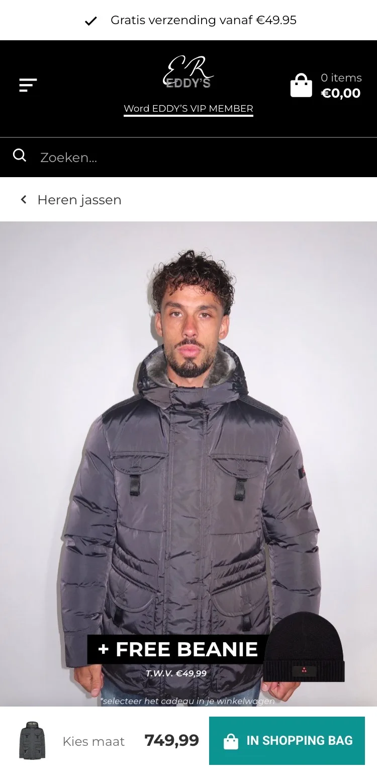
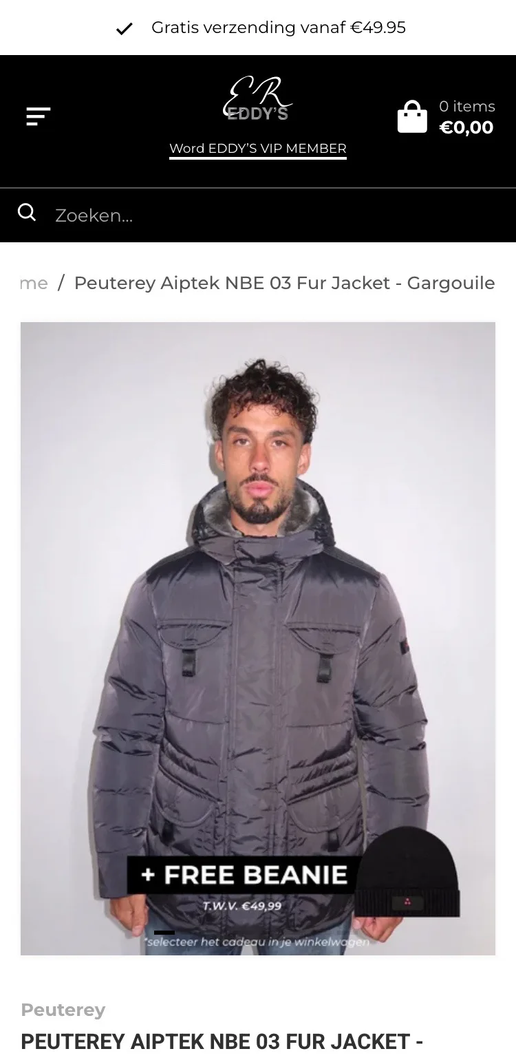
- 01All photos as thumbnailsBelow the photo you couldn’t see which images were still to come. Now all eight sit as small thumbnails below the photo.
- 02Back to the jacketsThere was only ‘Terug’ (Back) and ‘Home’. Now ‘Heren jassen’ (Men’s jackets) takes you to the other jackets in one tap.
- 03The button always in viewThe button was far below the photo. Now there’s a bar at the bottom with the price and ‘In shopping bag’.
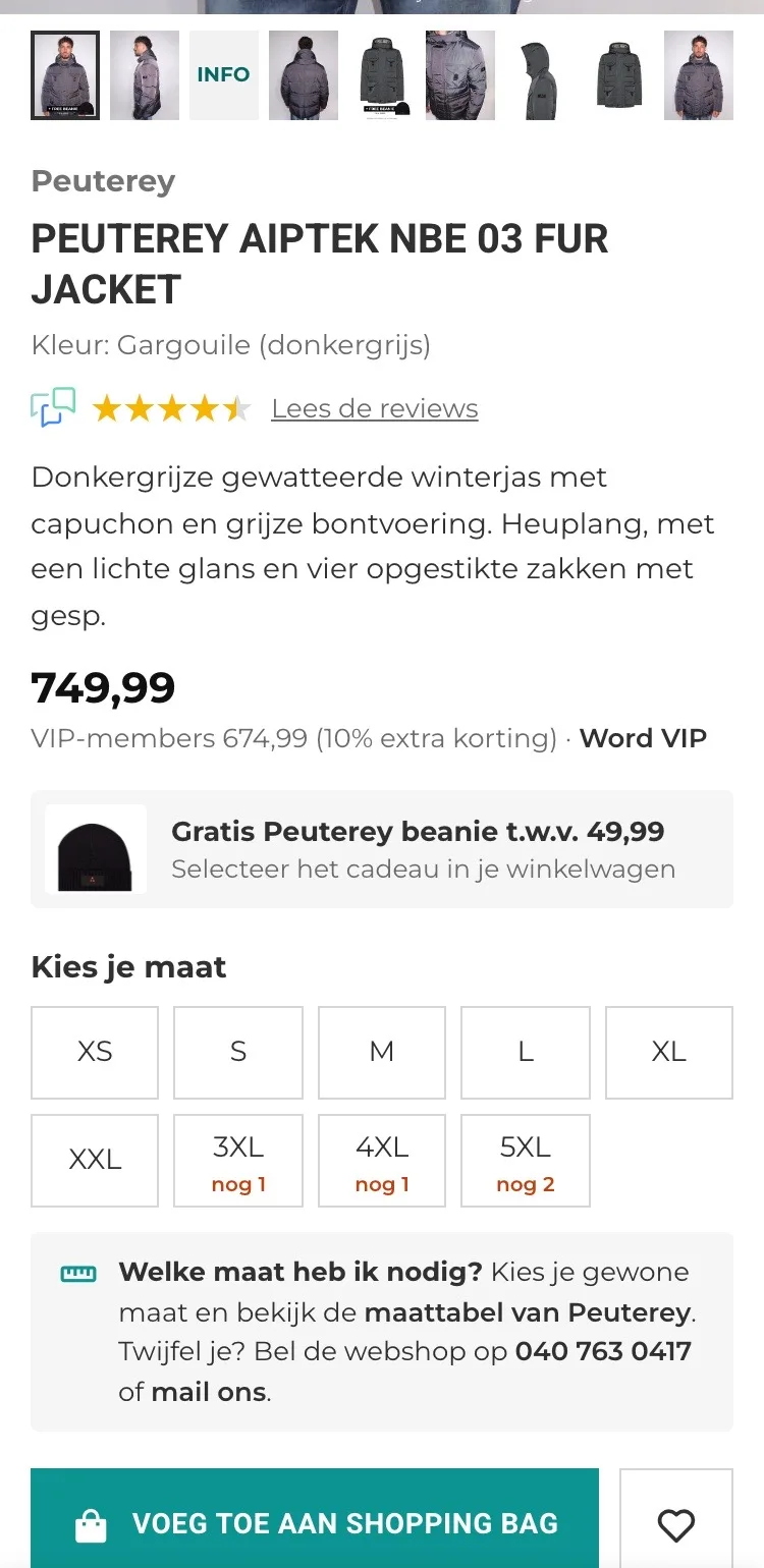
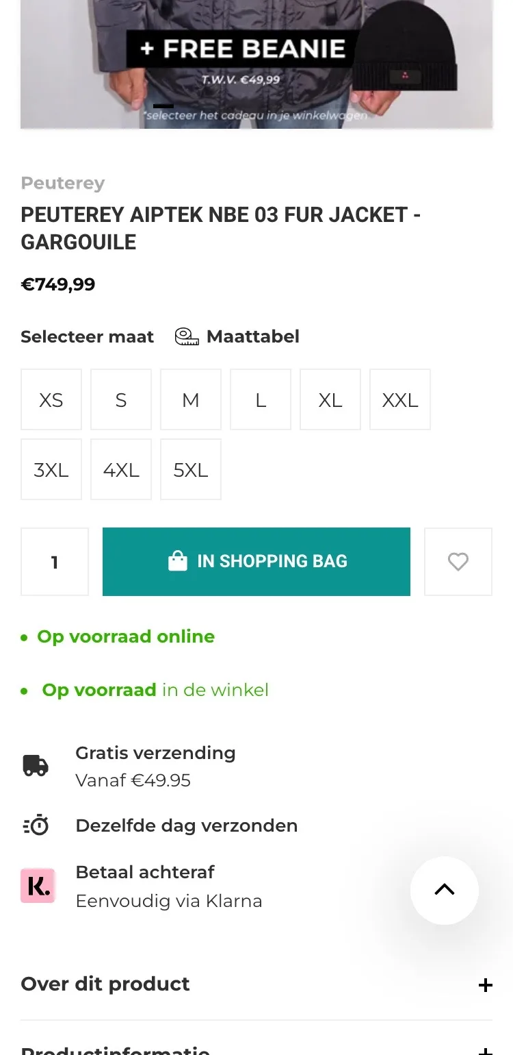
Name, price and gift.
What you want to know, right below the photo.
- 01Reviews by the nameOn mobile the score only appeared in the footer. Now you see the Feedback Company stars right below the name.
- 02Briefly what kind of jacket it isBelow the name there was only the price. Now you read in two lines: padded, fur-trimmed hood and hip length.
- 03Free beanie includedNothing by the price and button mentioned the gift; only two product photos did. Now it’s by the price, with what you need to do.
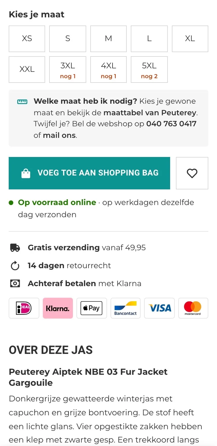
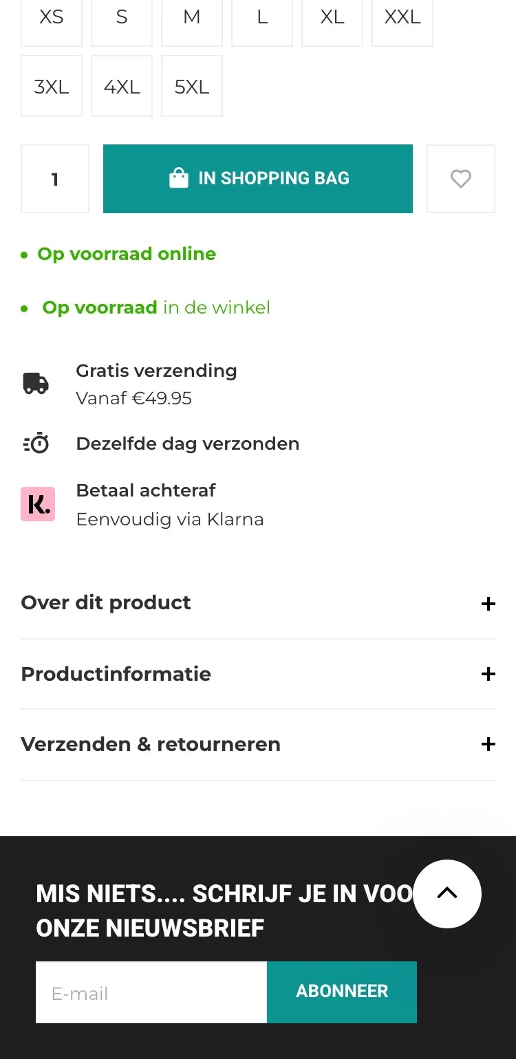
Size and button.
Less doubt, right before you order.
- 01Help with your sizeBy the sizes there was only ‘Maattabel’ (Size chart). Now you read what to do if you’re unsure, with the online store’s phone number.
- 02Almost sold outBefore choosing, you couldn’t see which sizes were almost gone. Now it’s already on the 3XL, 4XL and 5XL buttons.
- 03Logos below the benefitsBy the button, Klarna was the only payment method you saw. Now all the logos sit below the button, with the 14-day return policy.
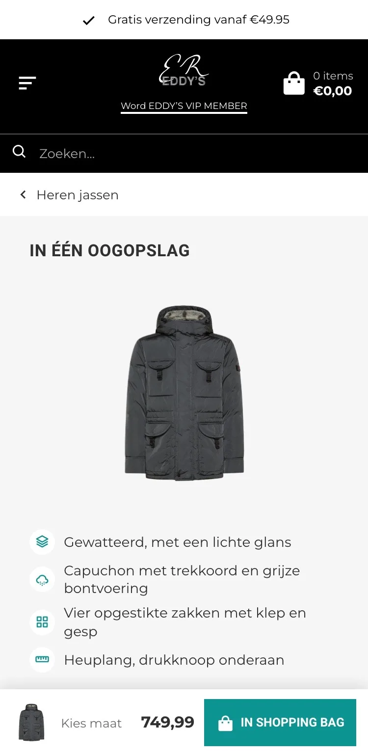
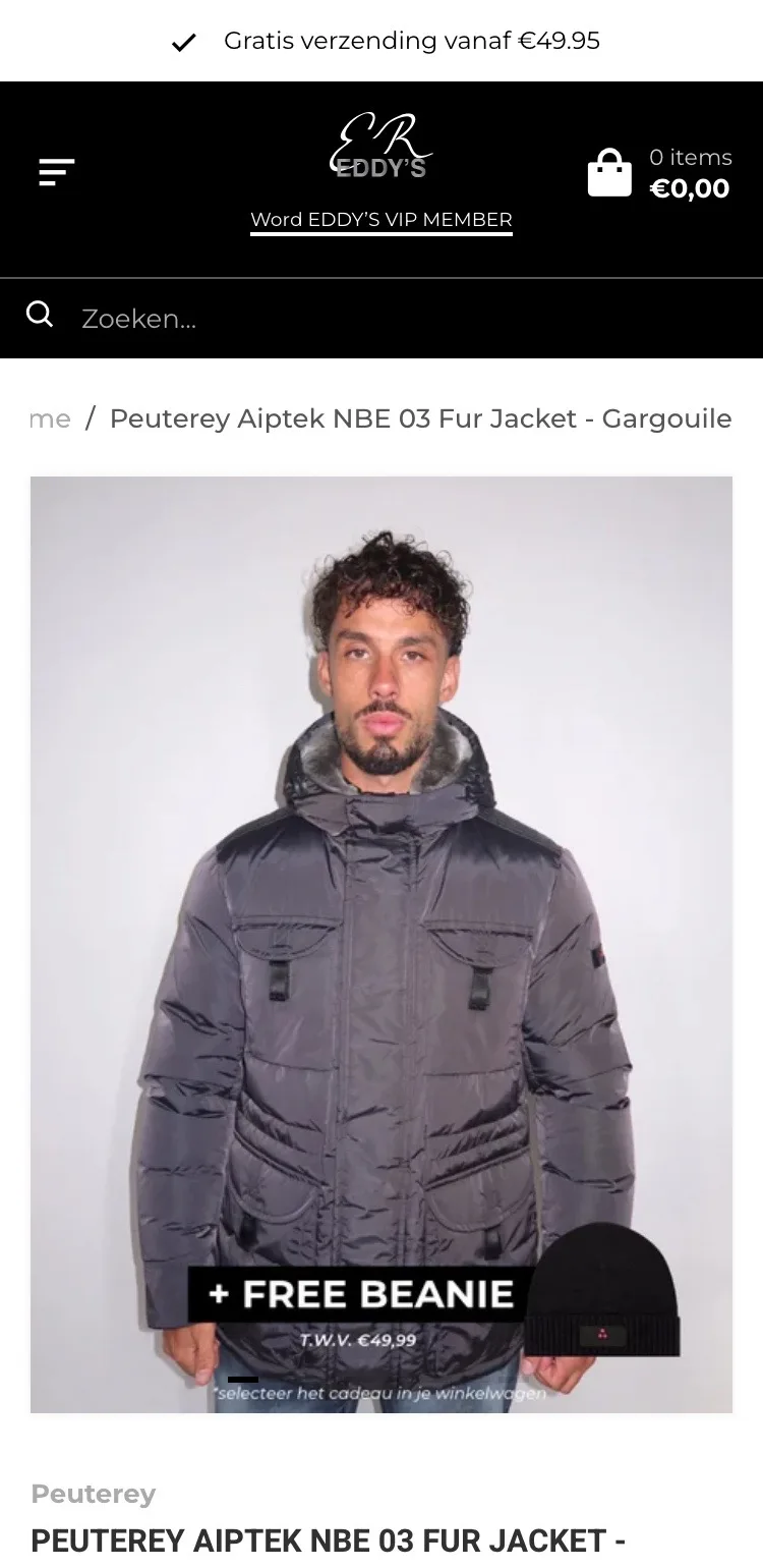
At a glance.
The features among the photos.
- 01Features in the galleryWhat makes the jacket special was hidden in a collapsed list. Now it’s the third image, among the photos you look at anyway.
- 02The whole jacket in viewAbove the features is the jacket itself, so you see where the pockets and the hood are.
- 03Get there in one tapThe ‘Info’ thumbnail takes you straight there.
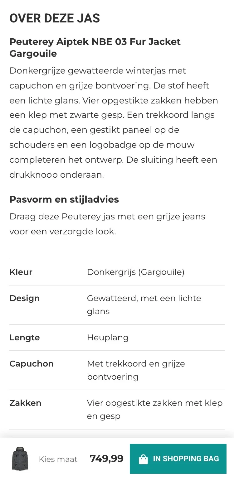
About this jacket.
Open and short, instead of collapsed lists.
- 01Description openYou first had to open ‘Over dit product’ (About this product). Now you read the description and the style advice right away.
- 02Features open in a tableThe features were separate lines in the collapsed list. Now they’re open in a table, with the hood included.
- 03Quick to compareYou now see length, hood and closure at a glance, without opening a list first.
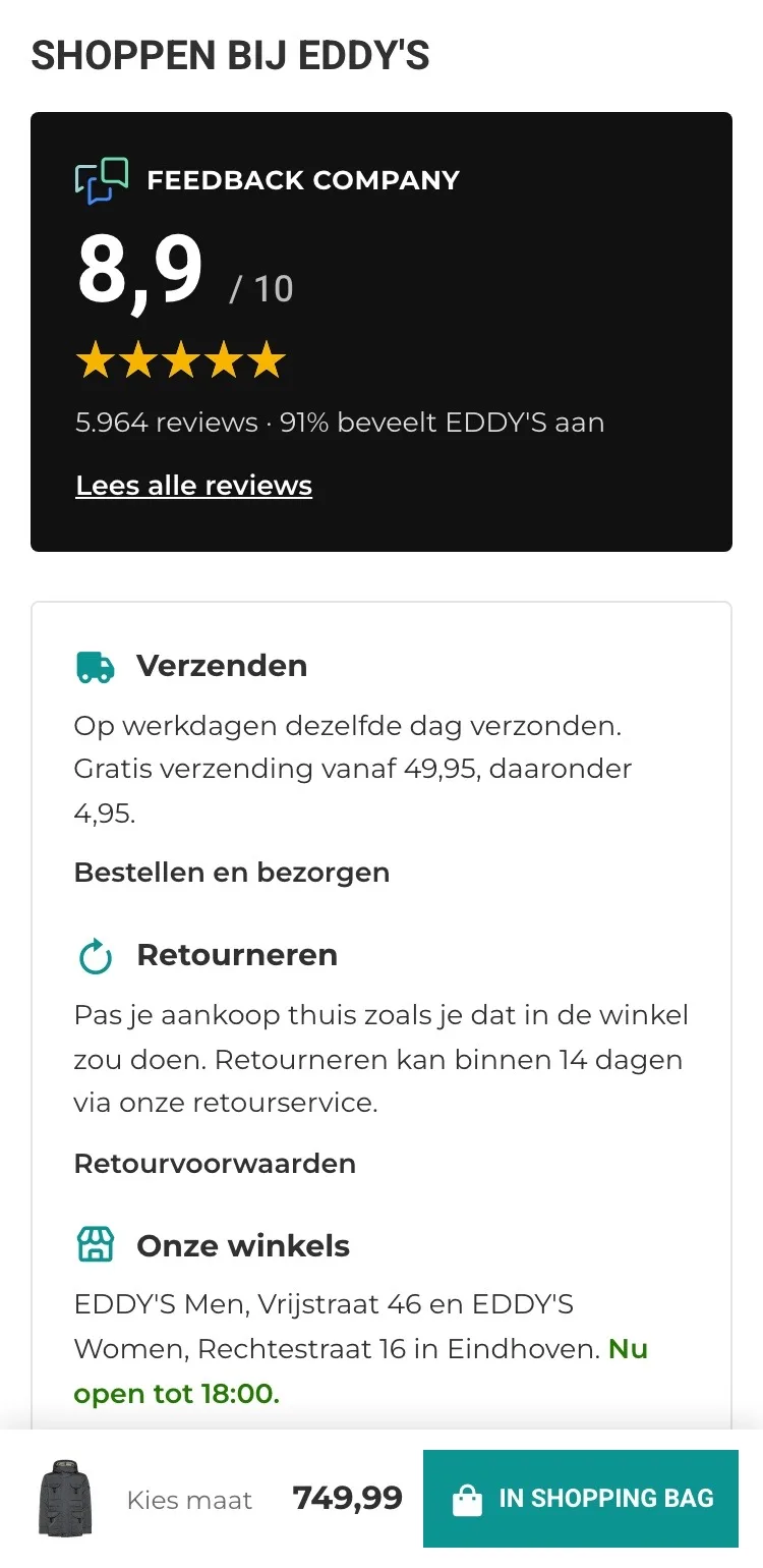
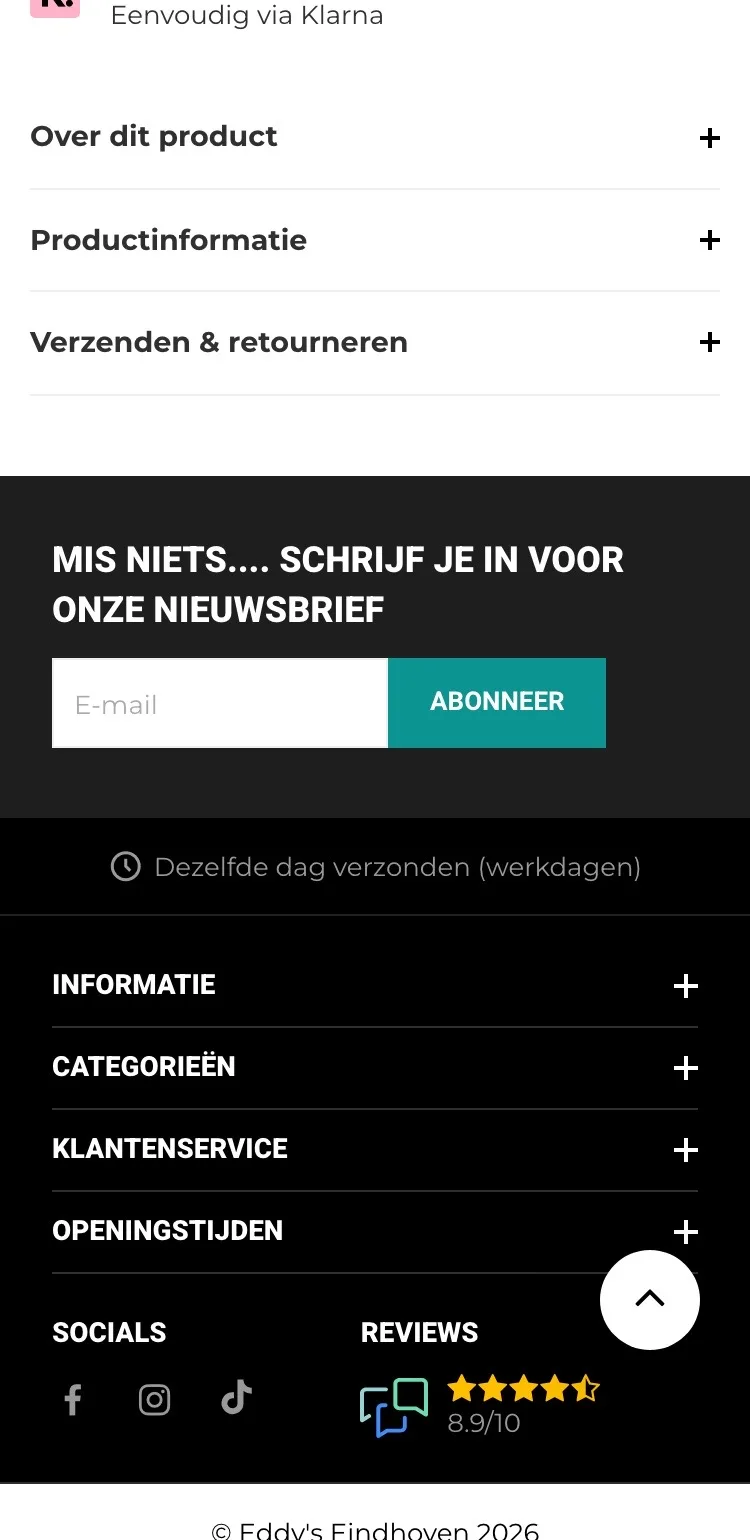
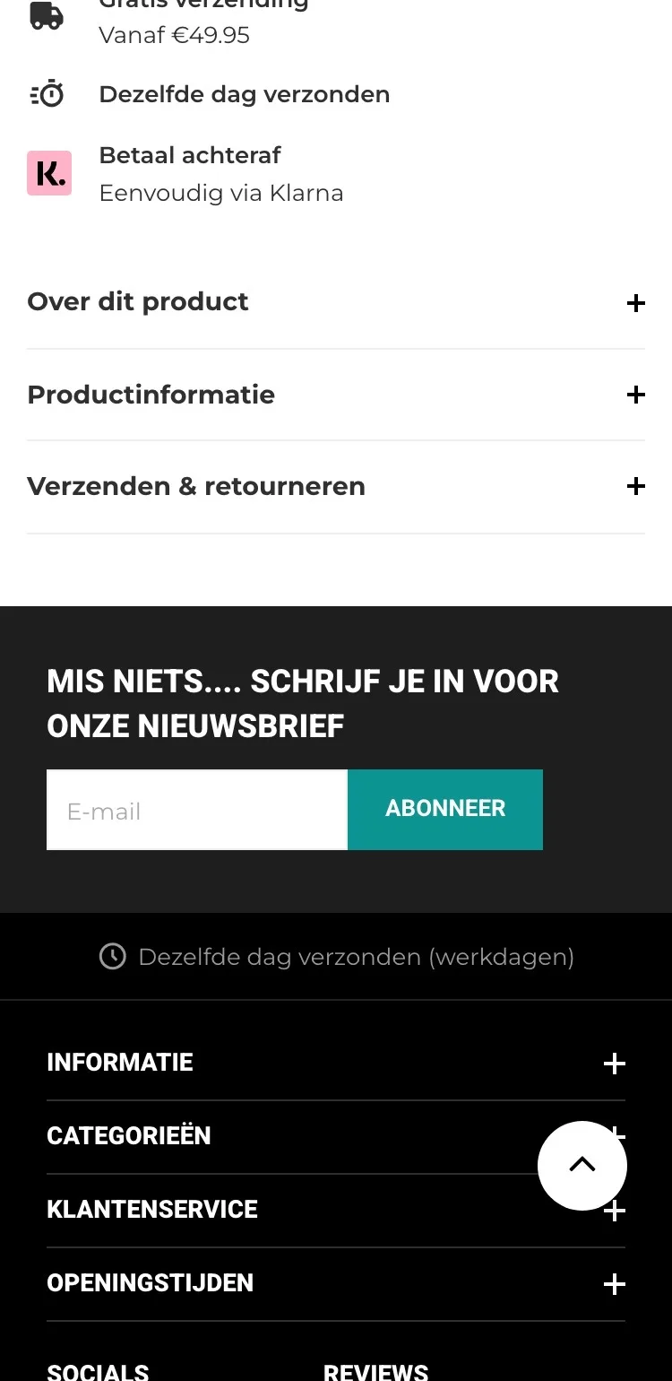
Shopping at EDDY’S.
Trust before you order.
- 018.9 from 5,963 customersThe score only appeared at the bottom in the footer. Now it has its own block with the score and a link to all reviews.
- 02Shipping and returnsThat was in a collapsed list. Now you read right away how fast it goes and that you can try it on at home.
- 03Your storesThe store addresses were only in the footer. Now you see them by the jacket, with directions.
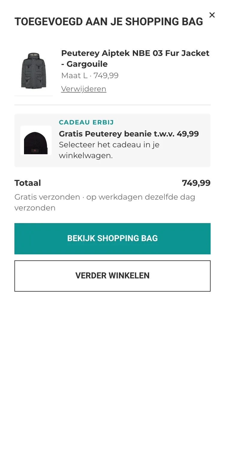
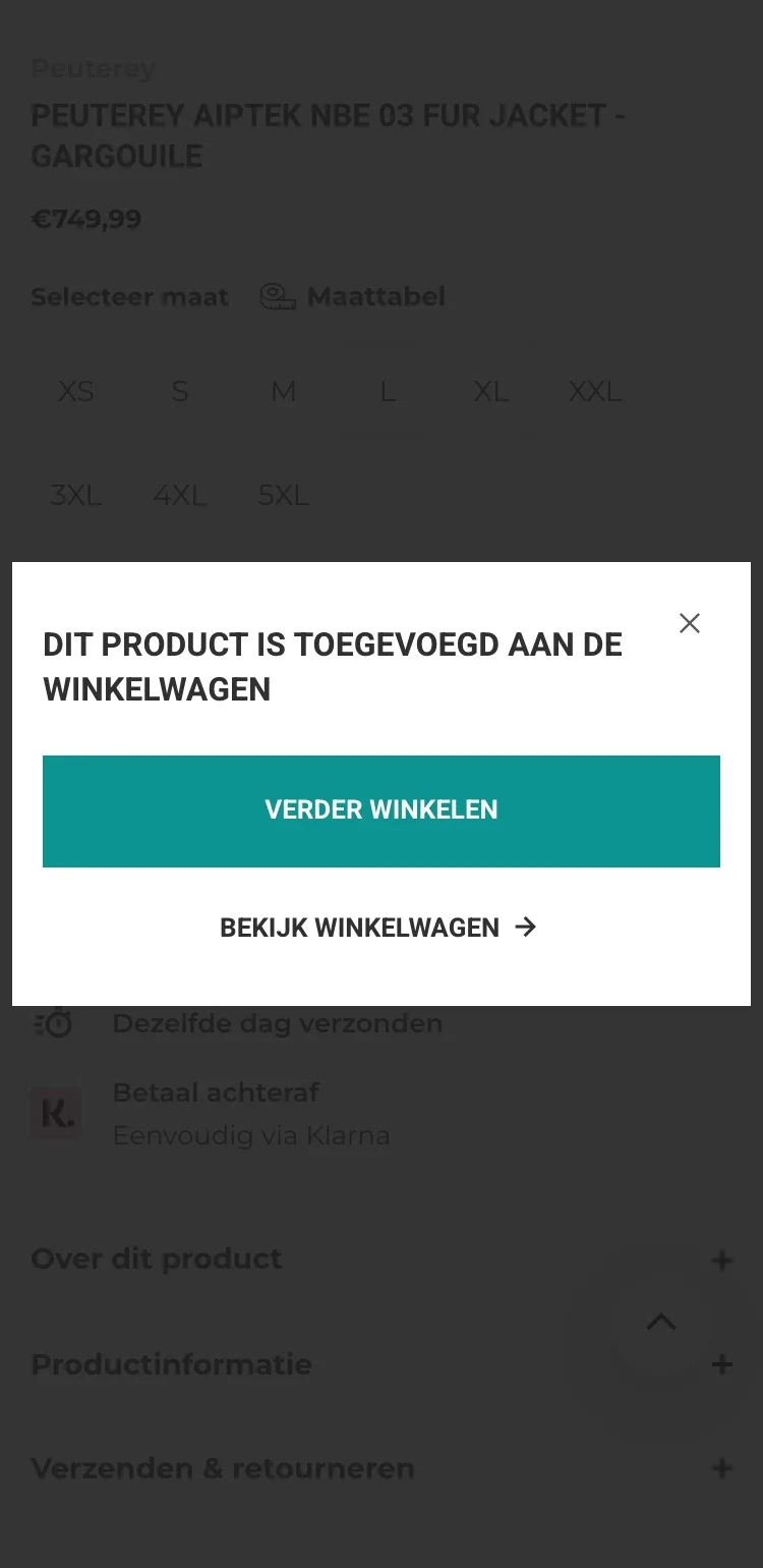
After adding to cart.
A clear next step.
- 01You see your sizeThe window only said something was added. Now you see the jacket in the size you chose, with the price.
- 02Don’t forget the giftThe confirmation reminds you to pick the free beanie in your cart.
- 03Total and shippingYou see the total right away and that it ships for free, without going to the cart first.
Click through the new design yourself.
The design works like a real page, on desktop and on your phone. You just can’t place an order with it yet.
From design to more orders.
This is how we take the new design live, and measure what it delivers.
- 01Only the pageHeader, menu, USP bar and footer stay exactly as they are now. We only change the content of the product page.
- 02Test first, then go liveWe run the new design in an A/B test next to the current page and measure orders per visitor.
- 03Your own strengthsYour own photos, visuals, reviews and tone of voice: it all came from you already, just in a better place.
This design live
on your online store?
With the AI Design Agent, we put this design on your existing online store, and then keep improving it every month with CRO. Built by our specialists. Without spending thousands of euros a month on it.
- No rebuild, no migration
- Your back office stays the way you know it
- Only goes live after your approval
- 01Ongoing development for a fixed monthly feeNo separate quotes for every change. If we see an opportunity or you have an idea, we build it.
- 02CRO improvements, implemented right awayWe analyze your online store and implement improvements in days instead of months.
- 03Safe, and you see what changesWe build and test everything in a preview first. It only goes live after your approval, and every version is saved.