 Google Ads
 Meta Ads
 Email marketing
 Lightspeed eCom Toolkit
 Shopify Toolkit
Your product page,
redesigned.
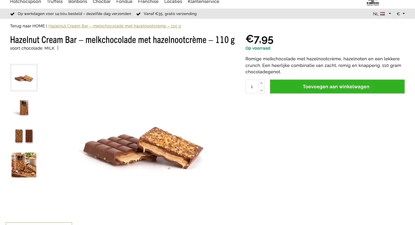
A new design for the product page of chocolatecompany.nl: Hazelnut Cream Bar – milk chocolate with hazelnut cream – 110 g. Below you see every screen before and after, and what we improved.
- 10 before-and-afters
- 18 improvements
- chocolatecompany.nl
Every screen, compared.
Pick a screen and drag across the screenshot. On the left you see the current page of chocolatecompany.nl, on the right the new design.
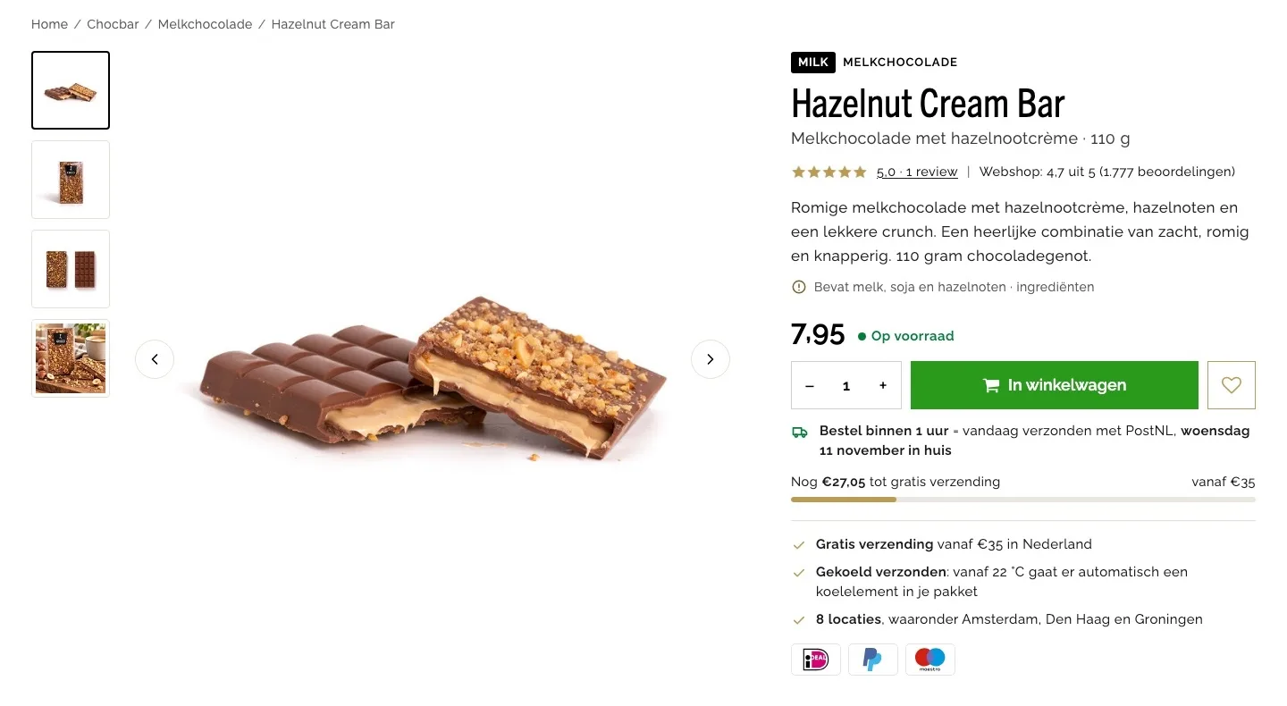
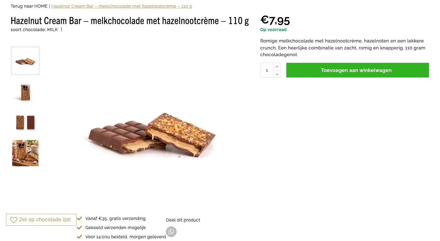
Product page.
The bar, the score and the buy button at a glance.
- 01Score right by the nameThe stars next to the title didn’t render, and the 4.7 from 1,777 reviews appeared nowhere. Now they sit right below the name.
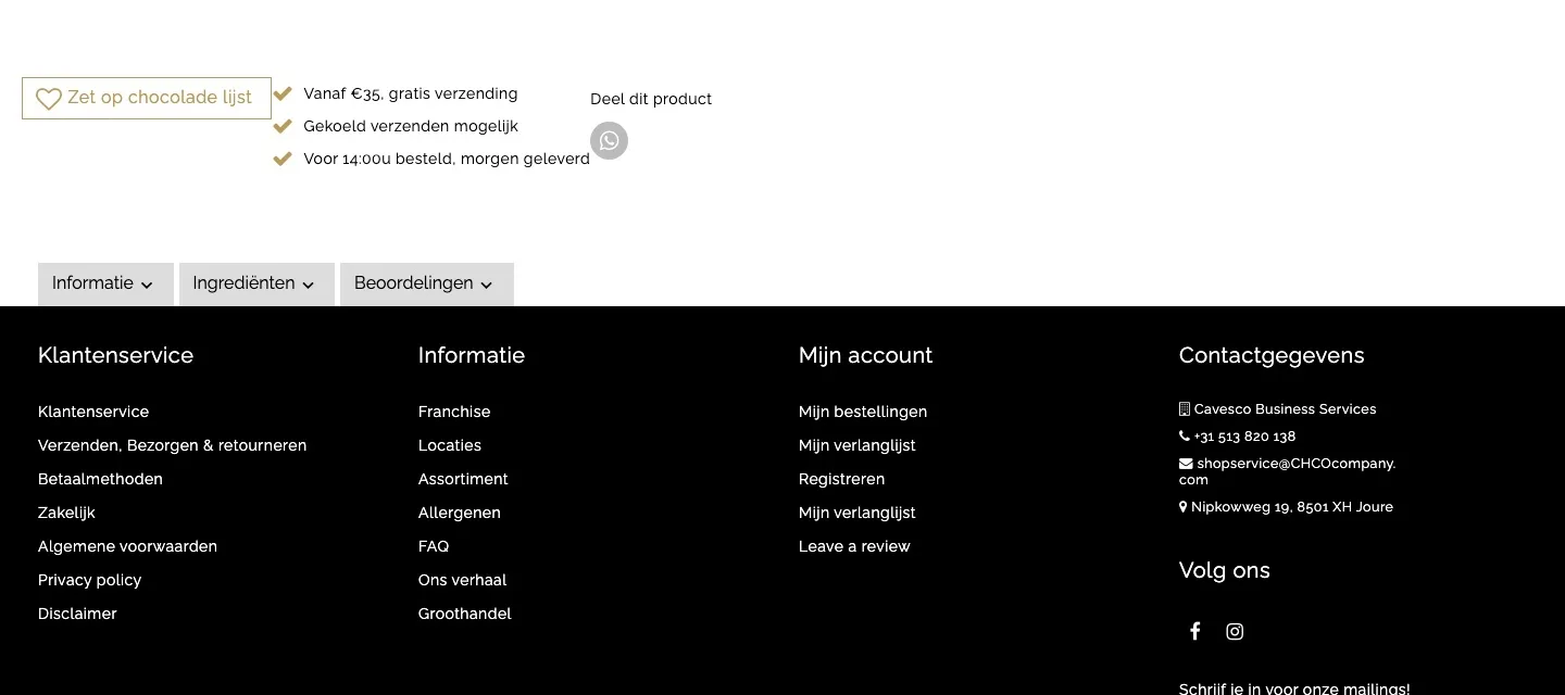
- 02The buy box, complete againWishlist and benefits dropped below the photo, leaving an empty space on the right. Now everything sits by the button, next to the photo.
- 03You see when it ships‘Voor 14:00u besteld, morgen geleverd’ (Order before 2 p.m., delivered tomorrow) stood on its own below the photo. Now you see by the button how much time you have left and when it ships.
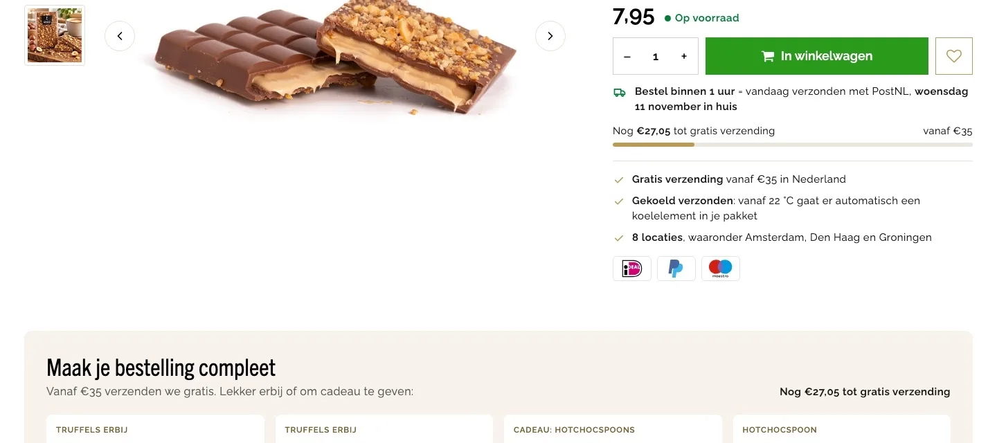
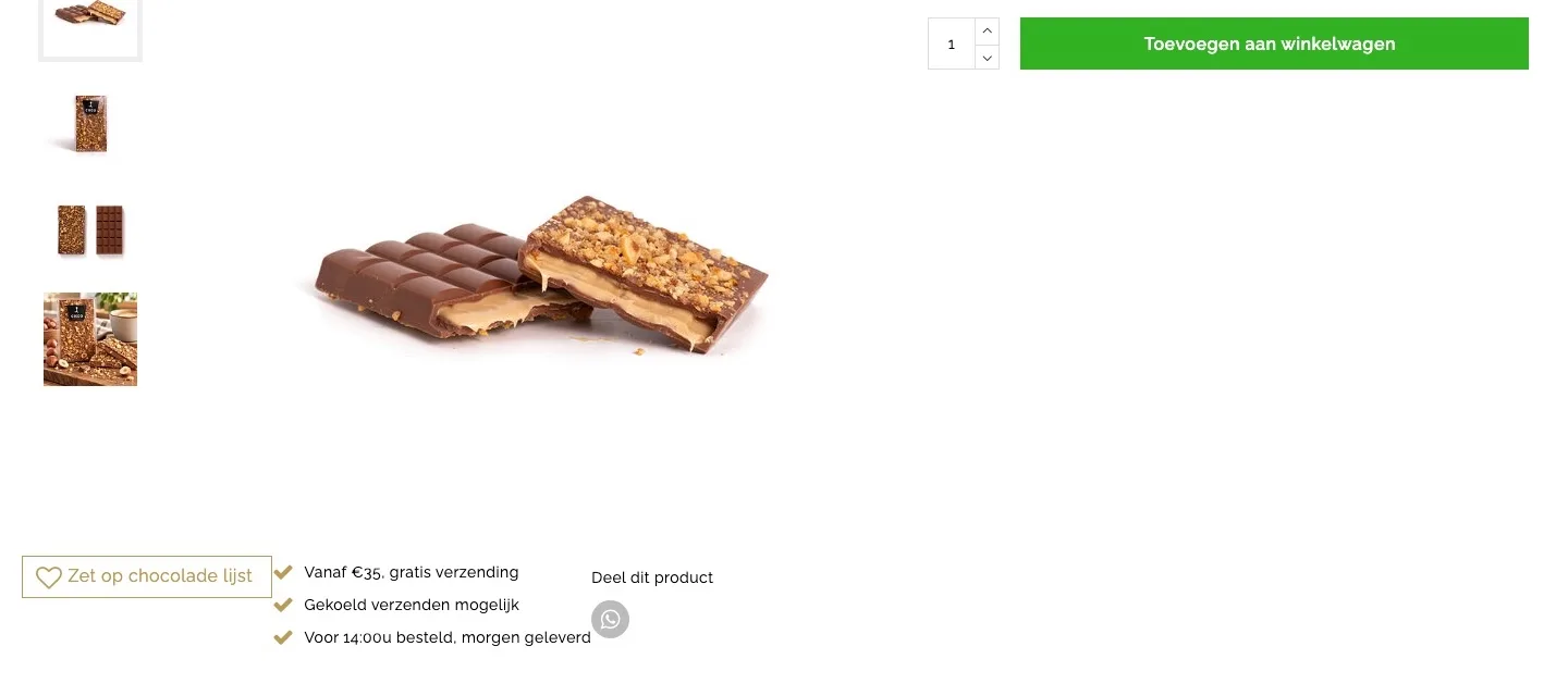
Around the button.
Shipping, cooling and payment, right below the button.
- 01Free shipping in sight‘Vanaf €35, gratis verzending’ (Free shipping from €35) didn’t say how much more you needed. Now a bar shows what you’re missing, and it updates as you go.
- 02Chocolate arrives in good shape‘Gekoeld verzenden mogelijk’ (Chilled shipping available) was vague. Now it says that from 22 °C, a cooling pack automatically goes into your package.
- 03Payment logos by the buttonThere were no payment logos by the button, just two small icons at the bottom of the footer. Now iDEAL, PayPal and Maestro appear below the benefits.
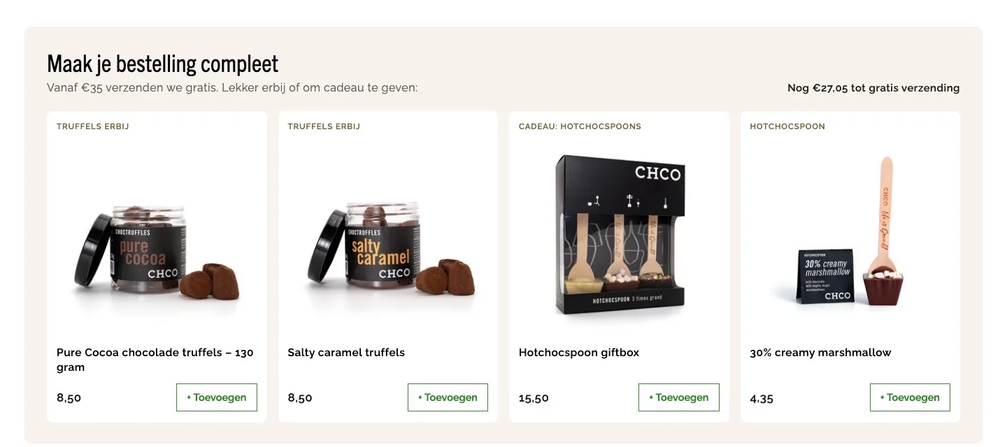
Complete your order.
Add items up to free shipping, right after the buy box.
- 01Top up to €35A €7.95 bar is far below €35, and there were no other products. Now you can add truffles or Hotchocspoons right away.
- 02Clear at a glanceEach product has a label, a photo and its own button. You see right away what it is and add it in one click.
- 03The counter keeps upAt the top right you see what you still need for free shipping. Every product you add makes that amount smaller.
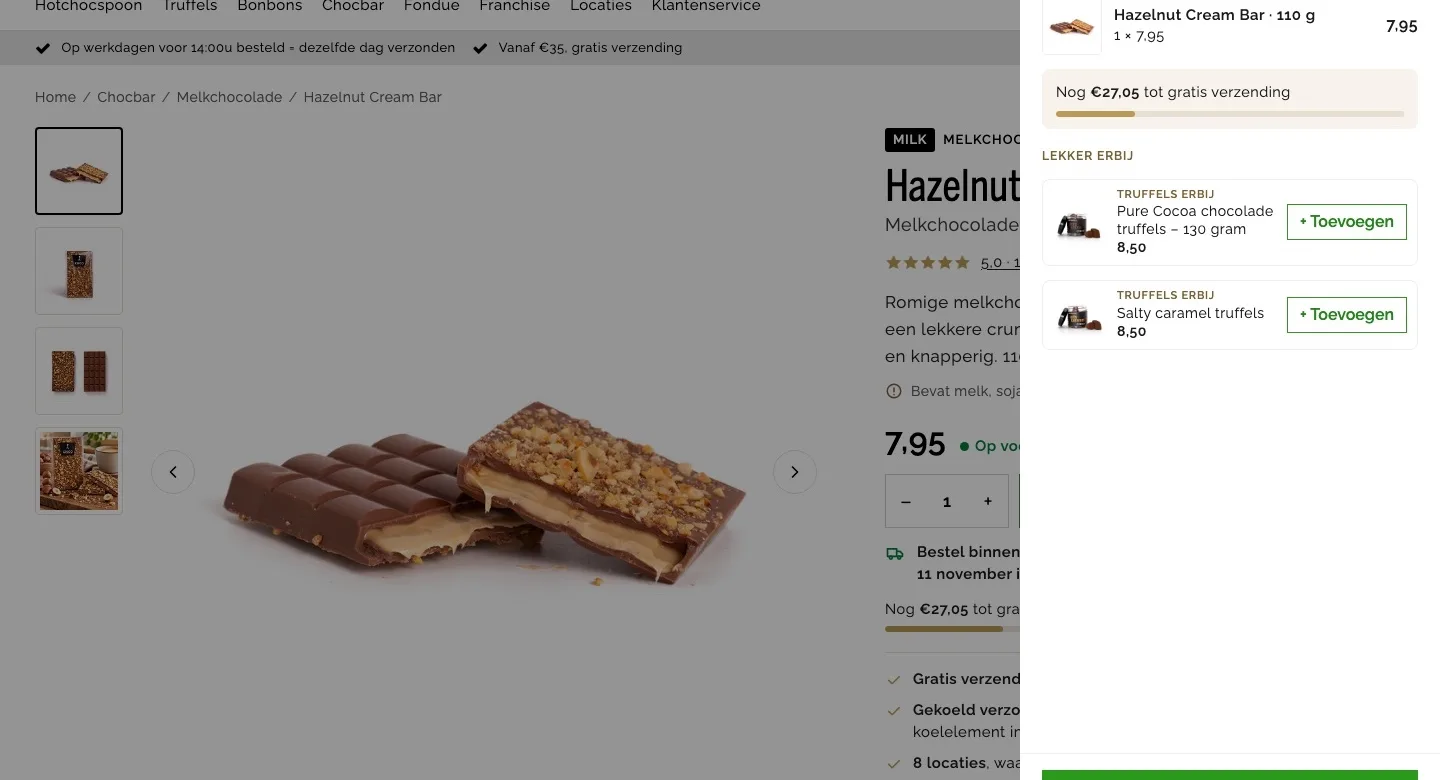
After adding to cart.
Confirmation with a good reason to add one more thing.
- 01Instant reassuranceAfter clicking the button, you immediately see your bar on the page, with photo, quantity and price.
- 02Something tasty to go with itThe confirmation shows two products you add in one click, right at the moment you’re ordering.
- 03Avoid shipping costsBelow €35 you pay €5.65 in shipping. The confirmation shows right away how much more you need for free shipping.
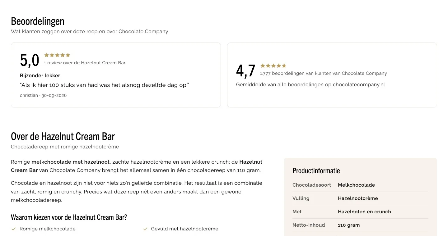
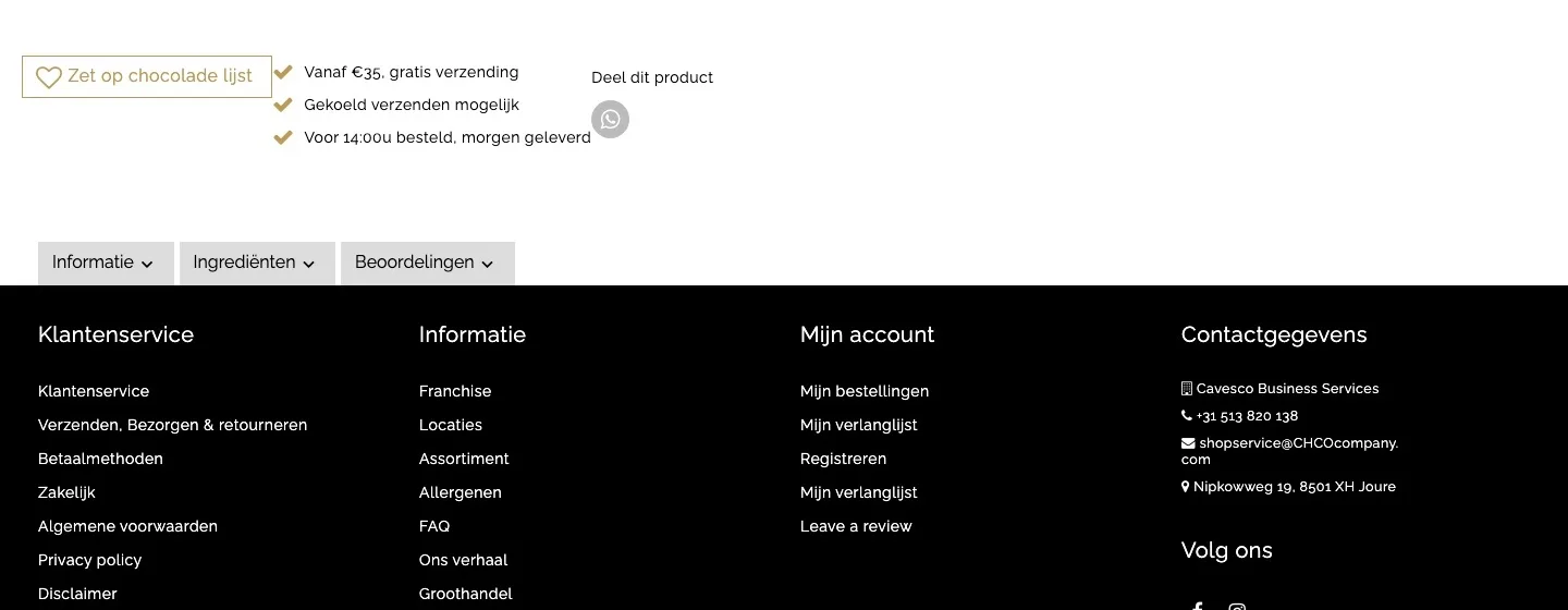
Reviews and product information.
What was hidden behind three closed tabs is now open.
- 01Reviews not behind a tabThe review ‘Bijzonder lekker’ (Exceptionally tasty) was hidden behind a closed tab. Now it’s open, next to the 4.7 from 1,777 reviews.
- 02Everything readable at onceDescription and ingredients were behind two tabs and appeared twice. Now everything is open, and only once.
- 03Product information in a tableChocolate type, filling, contents and storage advice were a list within the long text. Now they sit neatly next to the description.
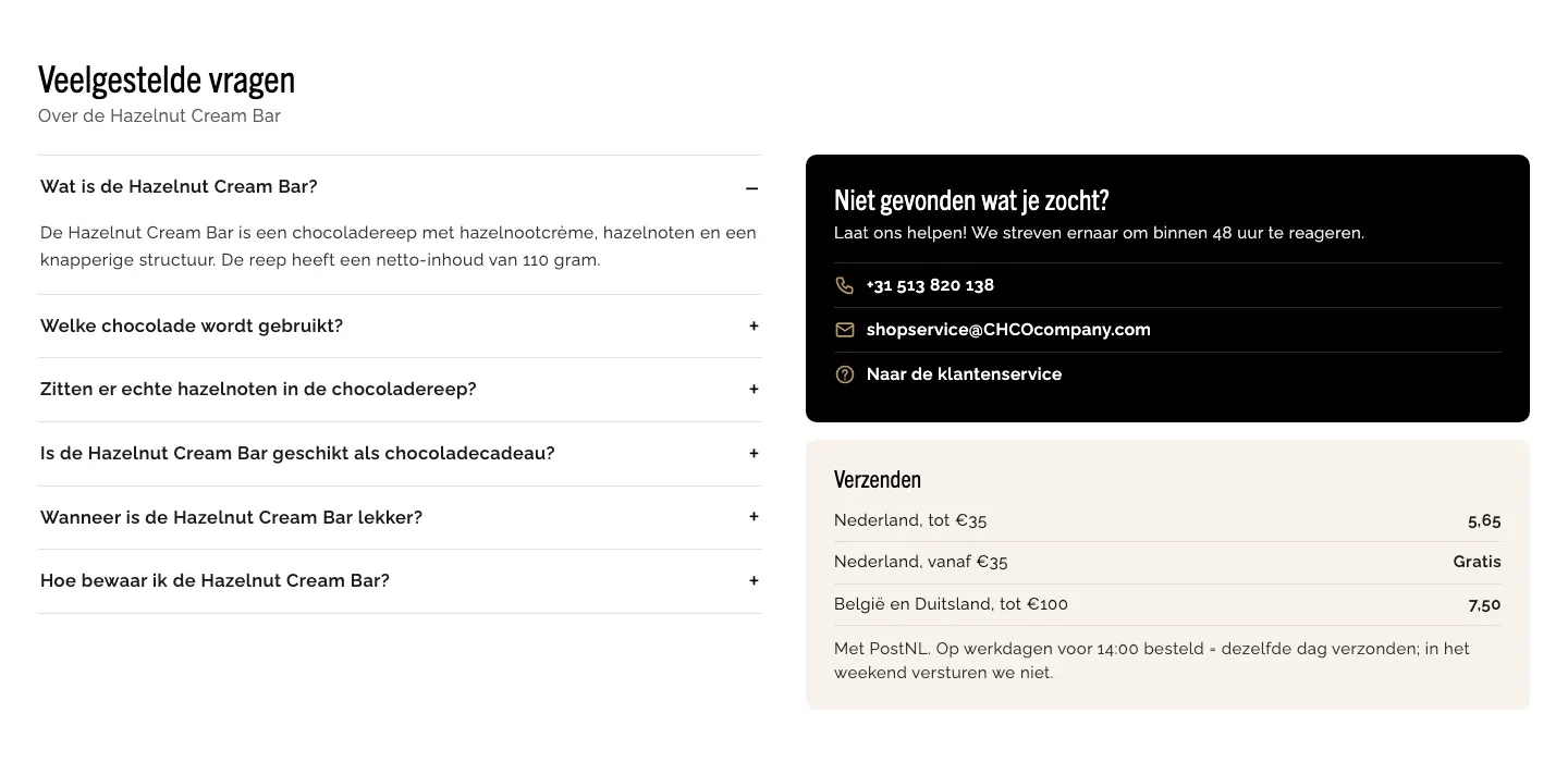
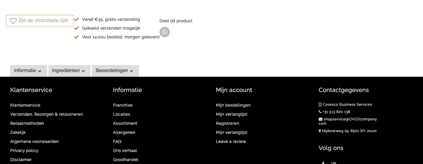
Questions and help.
Doubts answered on the page itself.
- 01Questions in the openThe six questions were at the bottom of the closed Informatie (Information) tab. Now they’re an expandable list, with the first one already open.
- 02Help in one click‘Laat ons helpen!’ (Let us help!) was a separate link. Now you call or email directly; you aim to reply within 48 hours.
- 03Shipping costs up frontWhat shipping costs was only on a service page. Now you see it next to the questions: below €35 it’s €5.65.
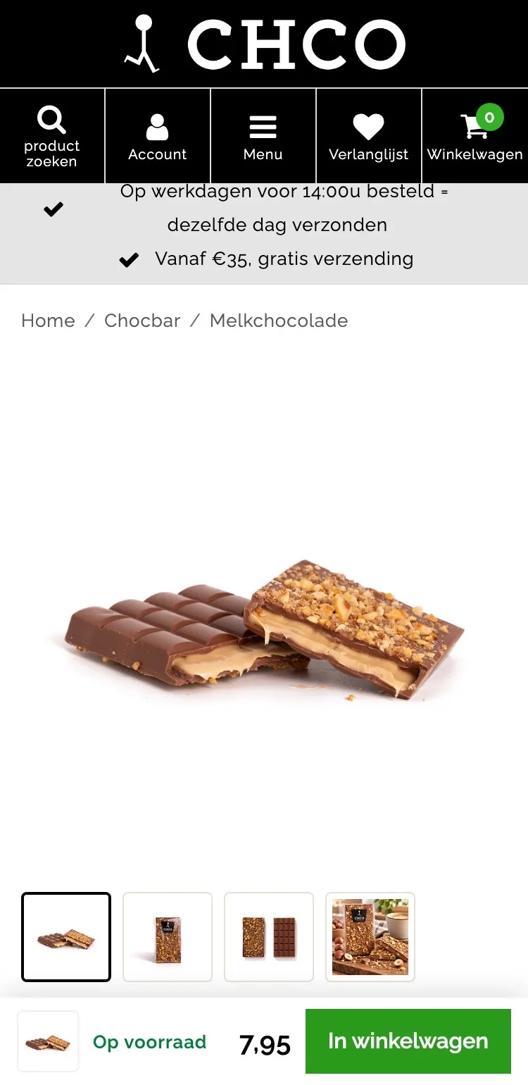
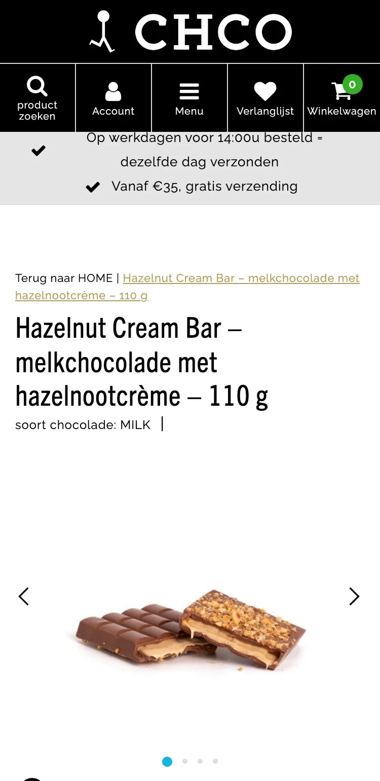
Product page.
On your phone, the photos and the button are in view right away.
- 01Photos with thumbnailsBelow the photo there were only dots. Now you see all four photos as small thumbnails and tap straight to the one you want.
- 02Always a buy buttonOn your phone, the buy button only came into view after scrolling. Now there’s a bar with price and button at the bottom right away.
- 03Room for the productAbove the title there was a two-line breadcrumb and a lot of white space. Now there’s a short breadcrumb on one line, with the photo below it.
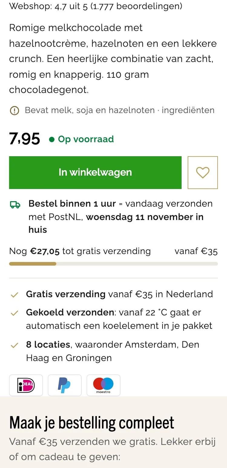
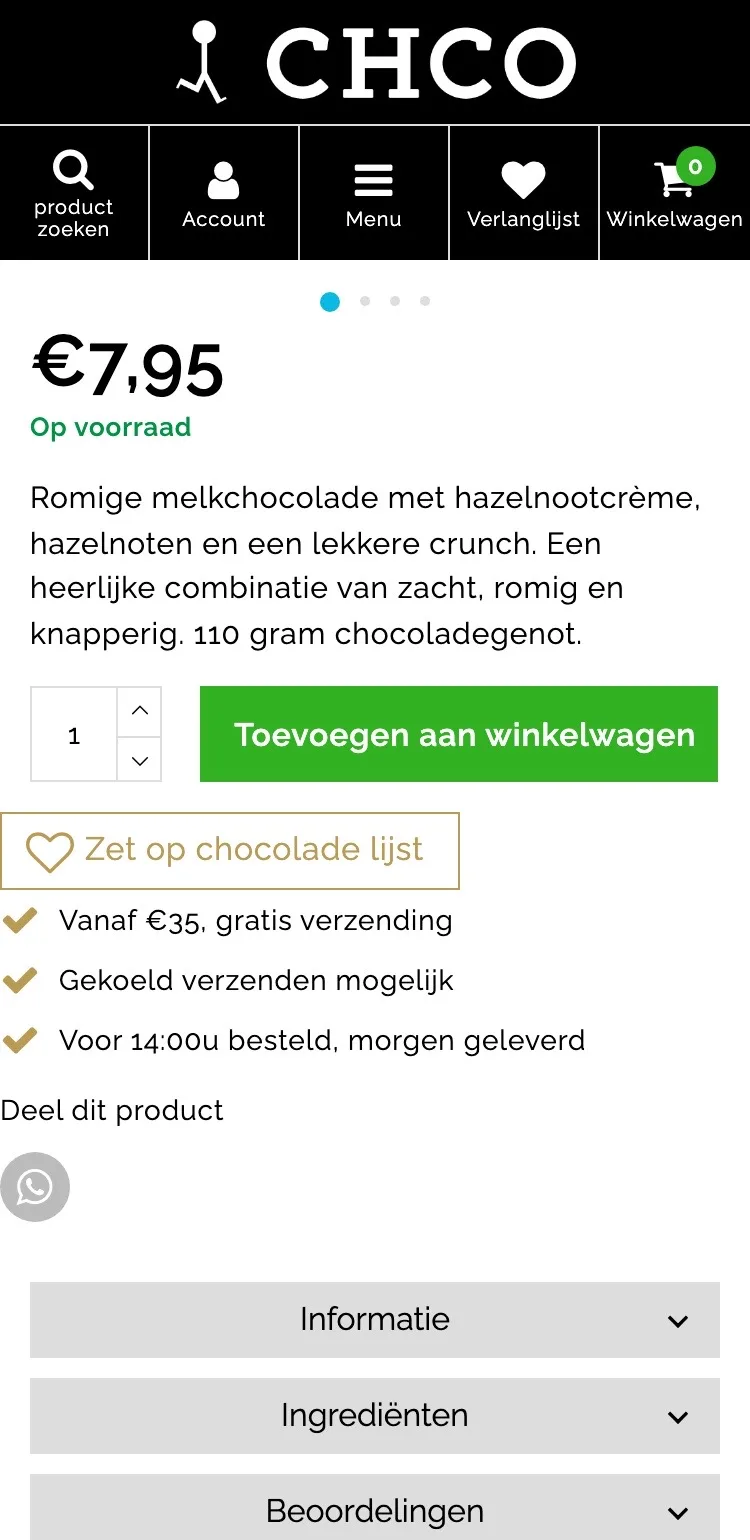
The buy button.
One clear button with the delivery day below it.
- 01One big buttonNext to the button there was a quantity selector. Now there’s only the button with the heart; you change the quantity in the cart.
- 02How much time you have left‘Voor 14:00u besteld, morgen geleverd’ (Order before 2 p.m., delivered tomorrow) was below the wishlist. Now you see, right below the button, the time you have left and the delivery day.
- 03Benefits neatly alignedThe benefits and the wishlist ran up against the edge of the screen. Now they’re in one calm block with payment logos.
Add-ons and reviews.
Adding more and building trust, without tabs.
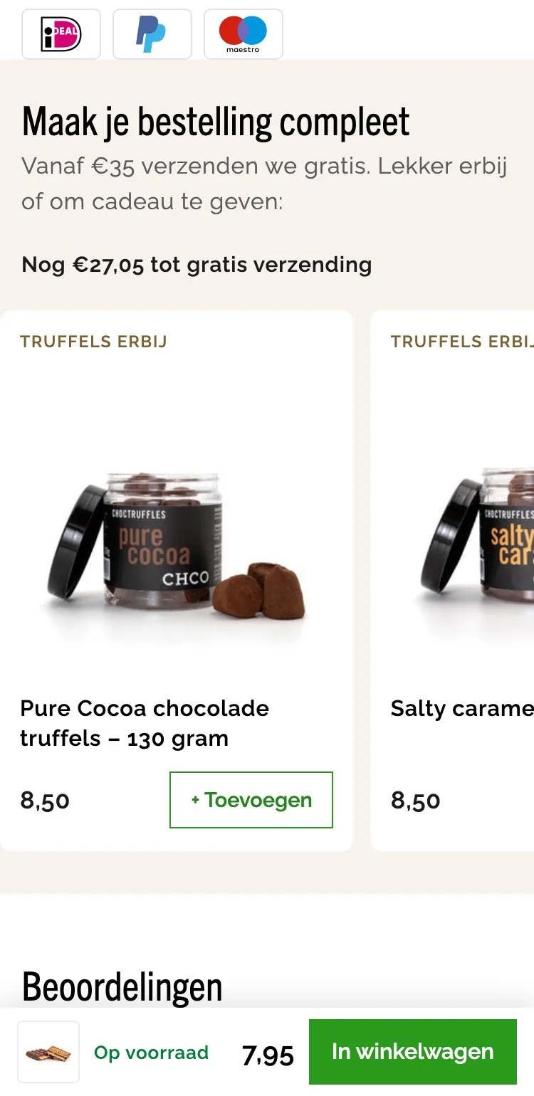
- 01Swipe through productsThere were no other products. Now you swipe through truffles and Hotchocspoons, each with its own button.
- 02Top up to €35Above the products you see how much more you need for free shipping, so you know why you’re adding something.
- 03Reviews right belowThe review was hidden behind a closed tab. Now it follows right after the products, with the 4.7 from 1,777 reviews.
Questions and help.
Answers without hunting for buttons.
- 01No more gray tabsInformatie, Ingrediënten and Beoordelingen (Information, Ingredients and Reviews) were three gray buttons. Now you read everything by scrolling, with clear headings.
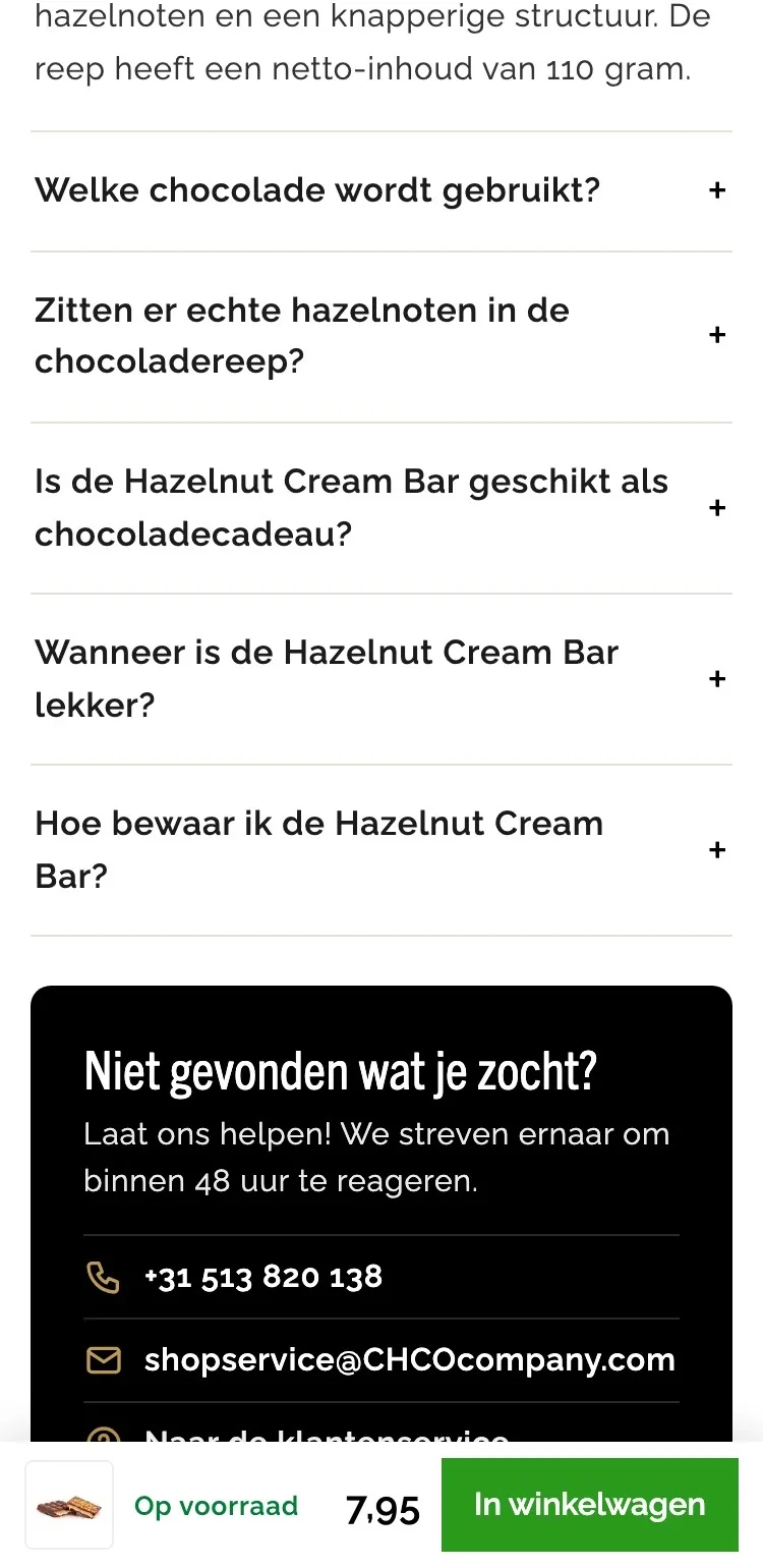
- 02Questions in the openThe six questions were in the Informatie (Information) tab. Now they’re an expandable list, with the first one open right away.
- 03Help in one tapPhone and email were at the bottom of the footer. Now you tap the number or email address right by the questions.
Click through the new design yourself.
The design works like a real page, on desktop and on your phone. You just can’t place an order with it yet.
From design to more orders.
This is how we take the new design live, and measure what it delivers.
- 01Only the pageHeader, menu, USP bar and footer stay exactly as they are now. We only change the content of the product page.
- 02Test first, then go liveWe run the new design in an A/B test next to the current page and measure orders per visitor.
- 03Your own strengthsYour own photos, visuals, reviews and tone of voice: it all came from you already, just in a better place.
This design live
on your online store?
With the AI Design Agent, we put this design on your existing online store, and then keep improving it every month with CRO. Built by our specialists. Without spending thousands of euros a month on it.
- No rebuild, no migration
- Your back office stays the way you know it
- Only goes live after your approval
- 01Ongoing development for a fixed monthly feeNo separate quotes for every change. If we see an opportunity or you have an idea, we build it.
- 02CRO improvements, implemented right awayWe analyze your online store and implement improvements in days instead of months.
- 03Safe, and you see what changesWe build and test everything in a preview first. It only goes live after your approval, and every version is saved.