 Google Ads
 Meta Ads
 Email marketing
 Lightspeed eCom Toolkit
 Shopify Toolkit
Your product page,
redesigned.
A new design for the product page of boonstrawijnen.nl: Solenne Negroamaro – Primitivo 2025. Below you see every screen before and after, and what we improved.
- 16 before-and-afters
- 23 improvements
- boonstrawijnen.nl
Every screen, compared.
Pick a screen and drag across the screenshot. On the left you see the current page of boonstrawijnen.nl, on the right the new design.
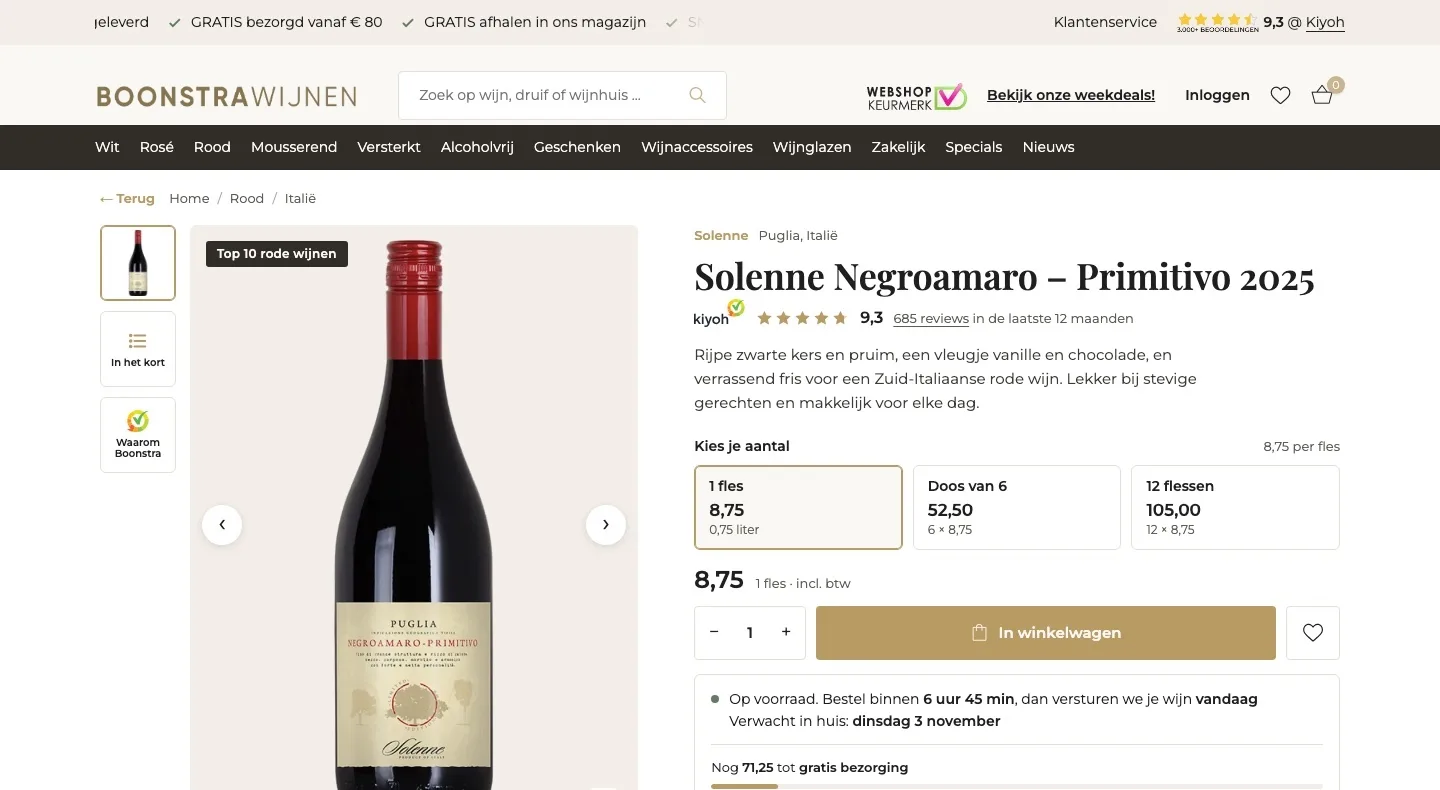
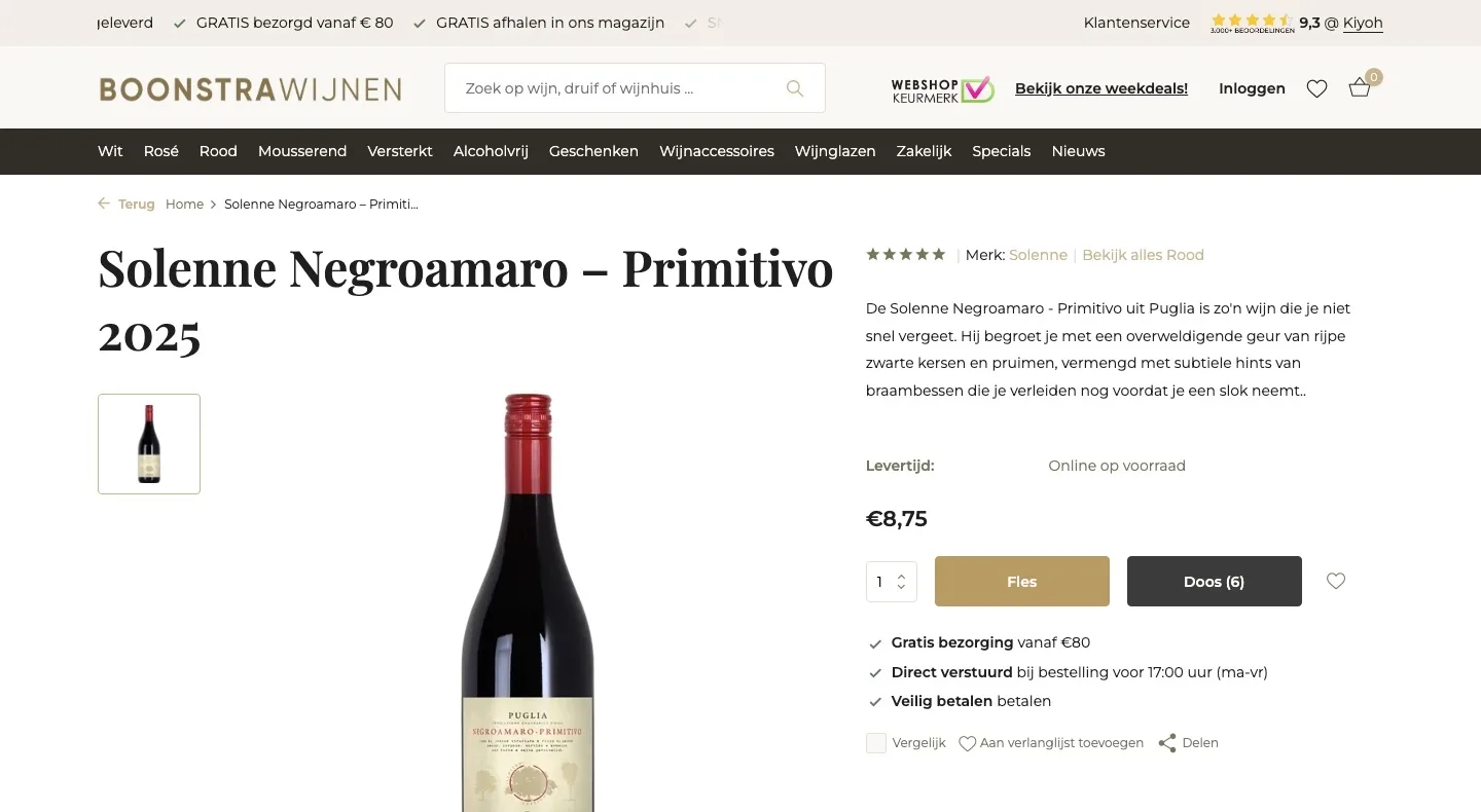
Product page.
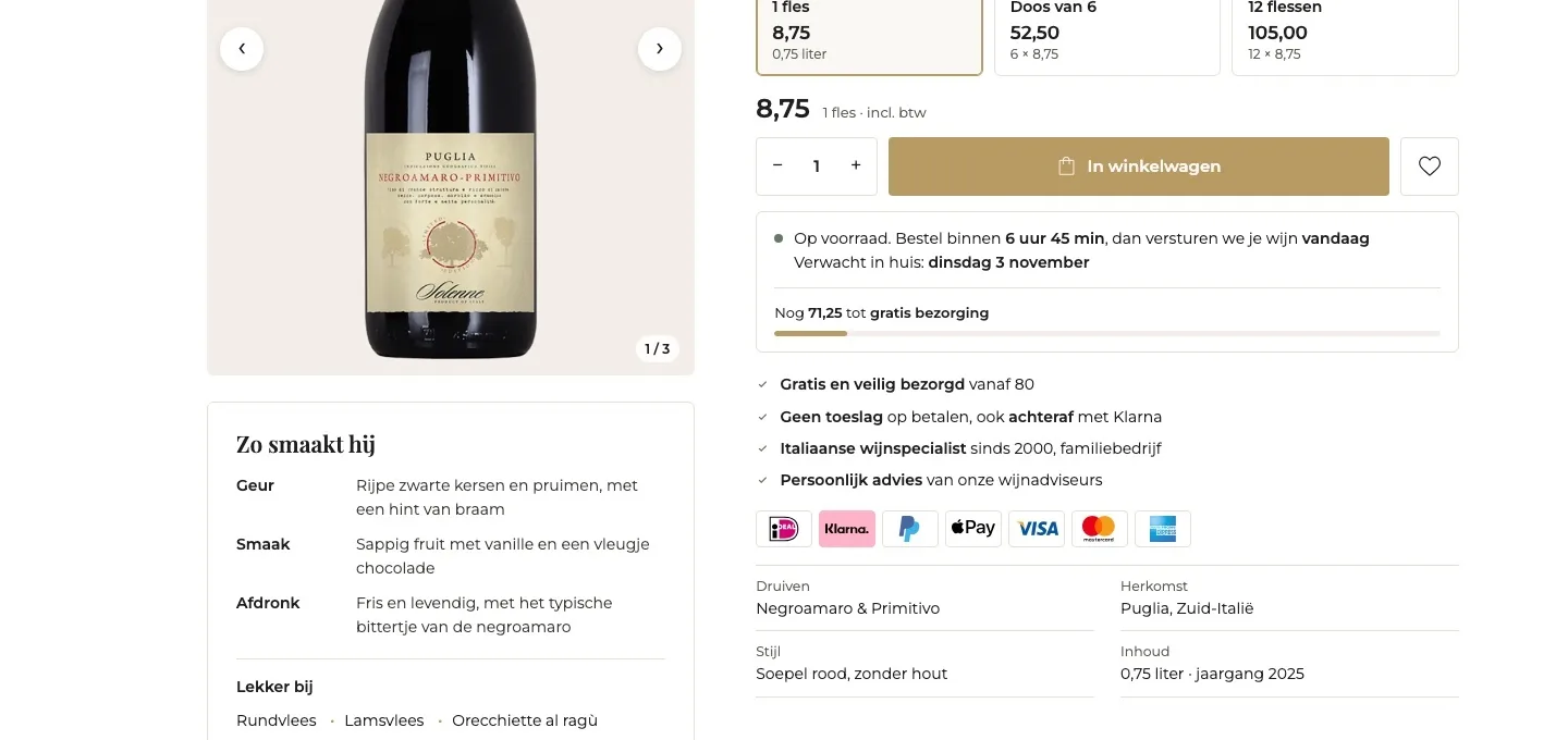
Taste, choice, price and button right under the title.
- 01Kiyoh score by the titleUnder the title were five gray stars without reviews. Now the 9.3 from Kiyoh sits there, where you decide.
- 02Bottle or case with price‘Doos (6)’ (Case of 6) was a button without a price. Now you choose 1 bottle, a case or 12 bottles and see straight away what it costs.
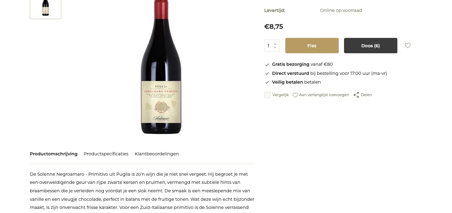
- 03One clear button‘Fles’ (Bottle) and ‘Doos (6)’ (Case of 6) were two identical buttons. Now you choose first, and there’s one button: ‘In winkelwagen’ (Add to cart).
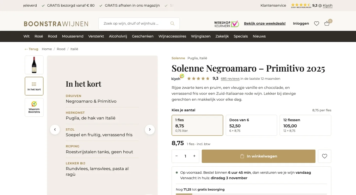
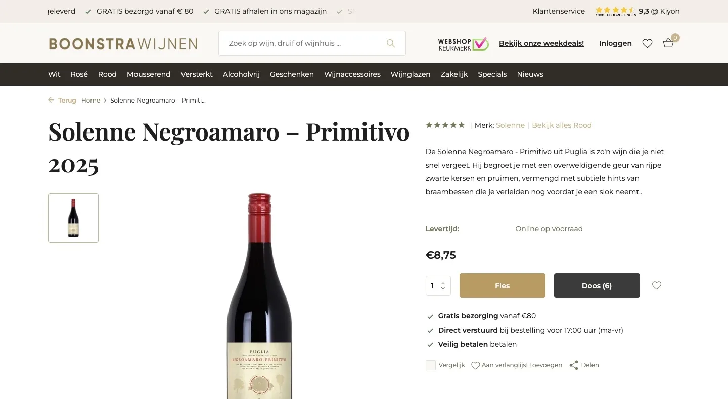
Gallery.
From one photo to three images that sell.
- 01In short, next to the bottleGrapes, origin, style and ‘lekker bij’ (goes well with) were buried in long text. Now they’re in one image in the gallery.
- 02Why Boonstra?Specialist since 2000, the 9.3 and free delivery from €80 get their own image. That shows why you order here.
- 03Arrows and thumbnailsThere was one photo with one thumbnail. Now you browse three images with arrows, with the thumbnails beside them.
Around the button.
All the reassurance right where the visitor decides.
- 01Delivery day and free deliveryAll it said was ‘vóór 17:00 verstuurd’ (shipped before 17:00). Now you see when the wine arrives and how much more you need for free delivery.
- 02Guarantees with logos‘Veilig betalen’ (Secure payment) was just text. Now no surcharge, pay later and recognizable payment logos sit by the button.
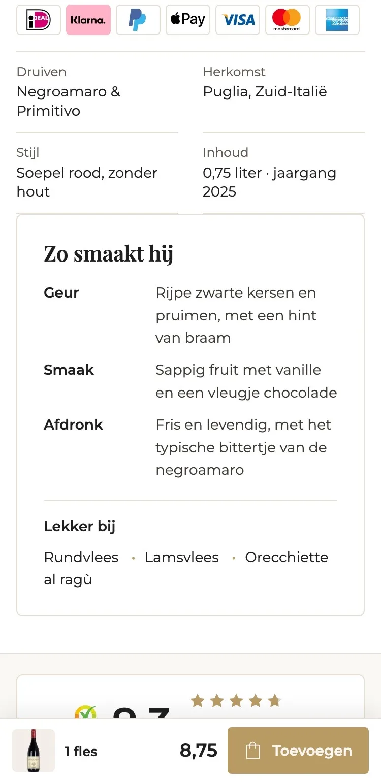
- 03How it tastesTaste and food pairing were spread over three long paragraphs. Now you read aroma, taste, finish and ‘lekker bij’ (goes well with) in a few seconds.
Reviews.
The trust that was already there, now on the product page too.
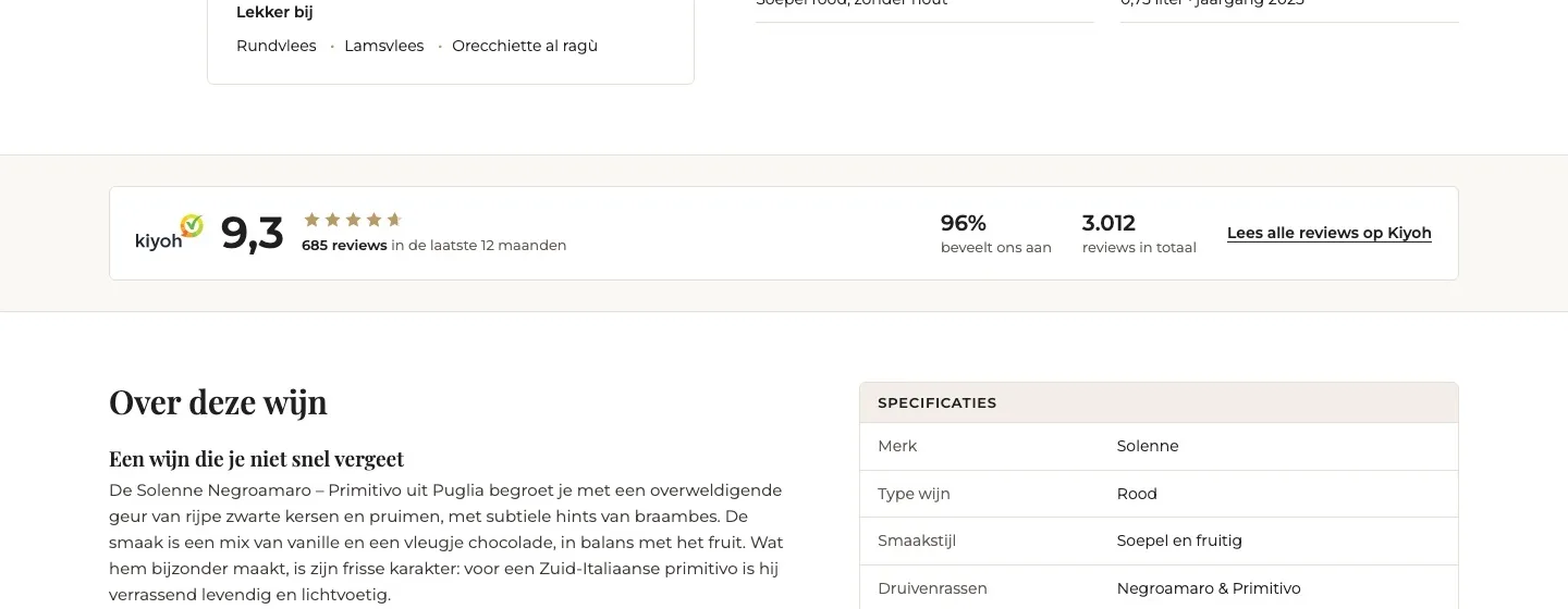
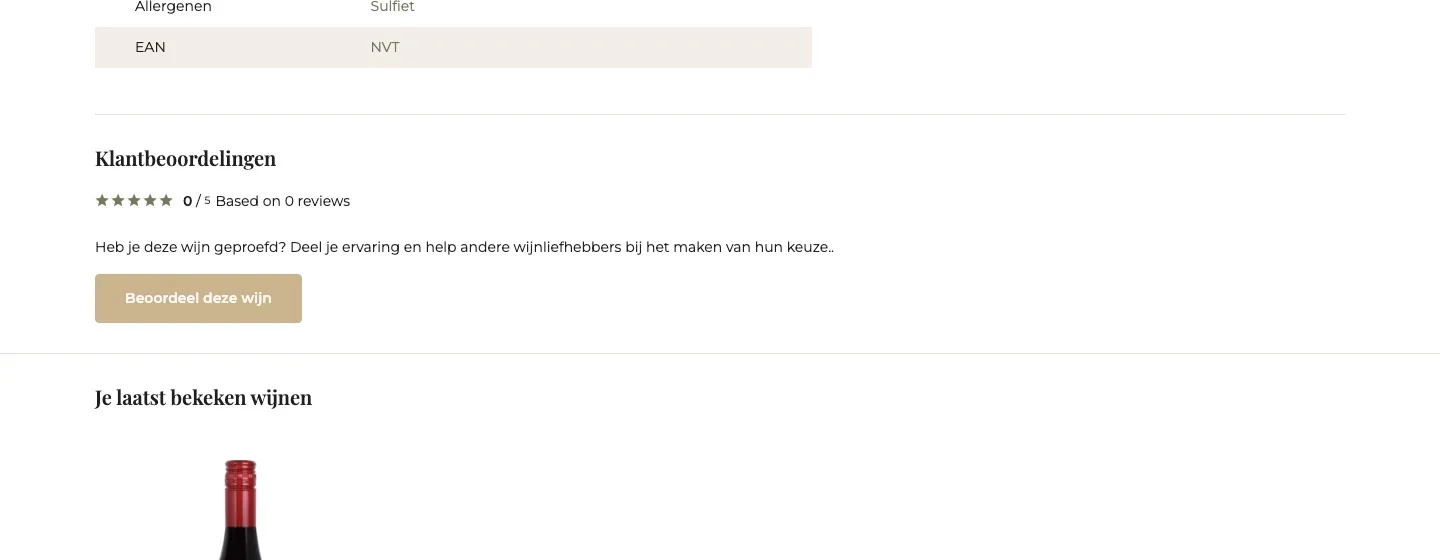
- 019.3 instead of 0 reviews‘0 / 5, based on 0 reviews’ raises doubt. Now the 9.3 from Kiyoh is there, with 685 reviews in the past year.
- 02Right under the buy boxThe ratings were at the bottom, after the long table. Now they sit right under the button, where the doubt is.
- 03One click to all reviewsIf you want to read more, one click takes you to all reviews on Kiyoh, the independent platform.
Description and specifications.
Quick to read, and only details that are correct.
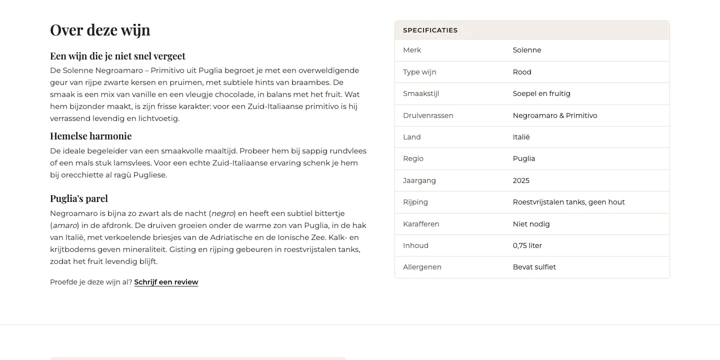
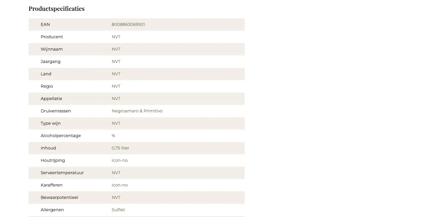
- 01No more ‘NVT’Producer, country, region and vintage were set to ‘NVT’ (N/A). Now it only shows what’s correct, like Puglia, 2025 and the ageing.
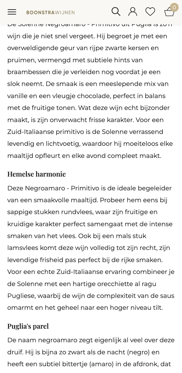
- 02Text with subheadingsThe description was long paragraphs. Short headings show in a few seconds what it’s about.
- 03Table next to the textThe table was below the text, with EAN listed twice. Now it sits beside it, calm and without duplicate lines.
Questions and trust.
Answers on the page, and the story behind Boonstra.
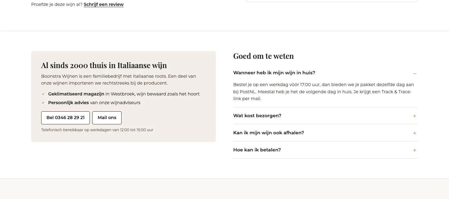
- 01Frequently asked questionsThere were no questions on the page. Now delivery, delivery costs, pickup and payment are right there.
- 02Specialist since 2000The family story was only on ‘Ons verhaal’ (Our story). Now you read next to the wine why you buy from Boonstra.
- 03Call or emailIf you’re in doubt, you see the phone number and the email button straight away, with the times you can be reached.
More from Puglia.
A logical next bottle, without leaving the page.
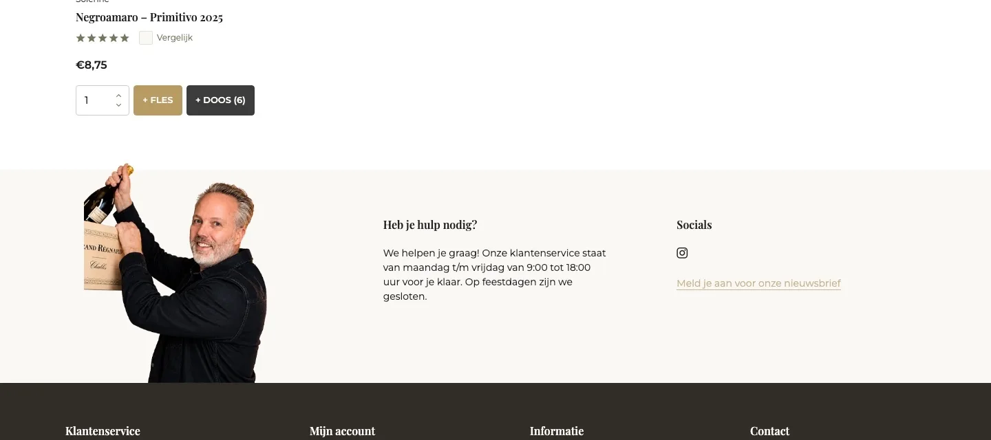
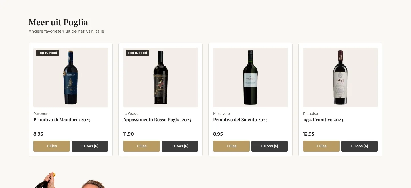
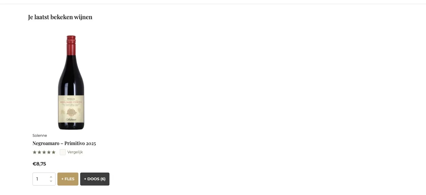
- 01Wines from the same region‘Je laatst bekeken wijnen’ (Your recently viewed wines) showed this very wine. Now you see four other favorites from Puglia.
- 02Add right awayWith ‘+ Fles’ (+ Bottle) or ‘+ Doos (6)’ (+ Case of 6) you add a second wine, without leaving the page.
- 03On the way to free deliveryA second wine brings you closer to €80. That makes adding more feel logical, not pushy.
While scrolling.
The button stays within reach, without it getting busy.
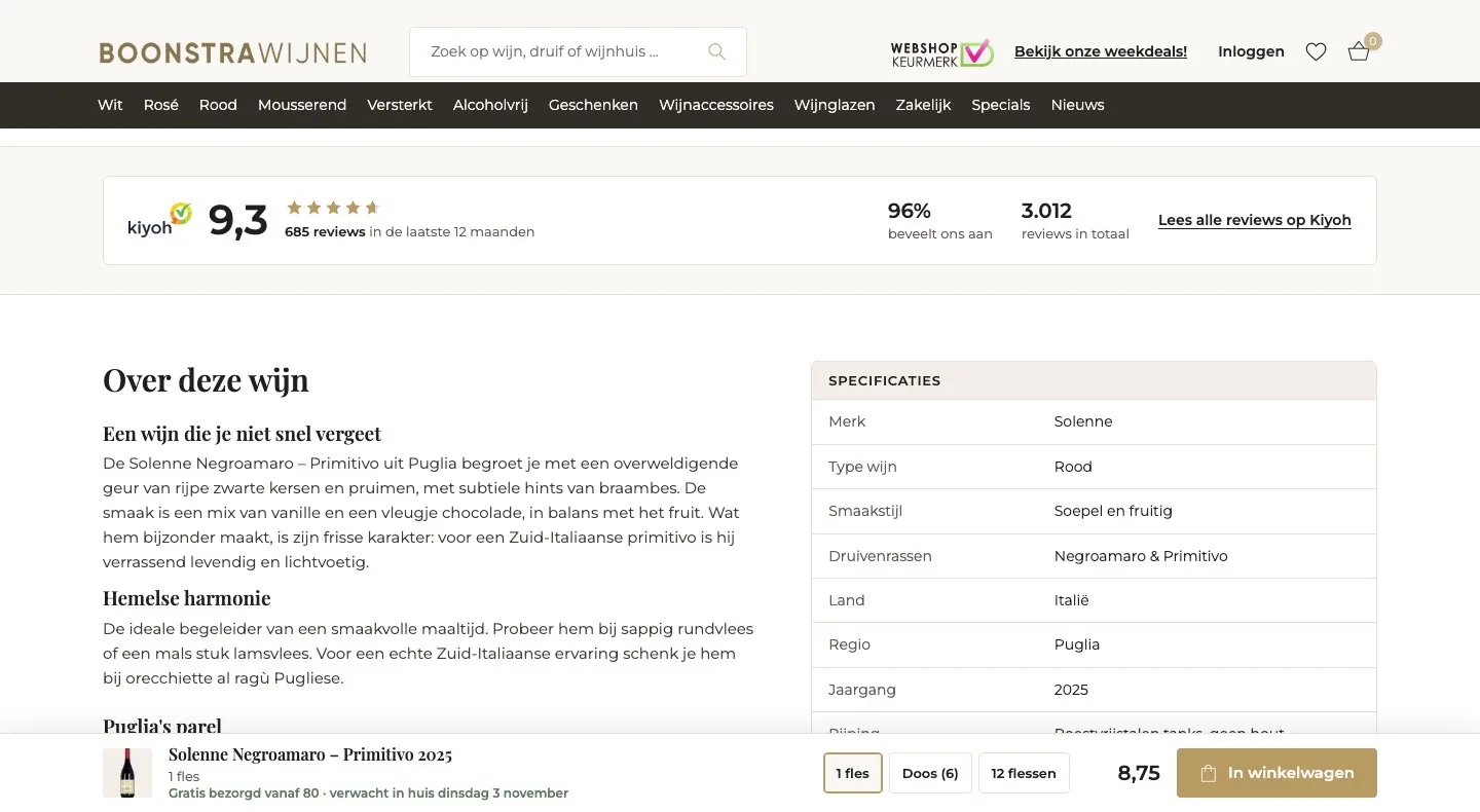
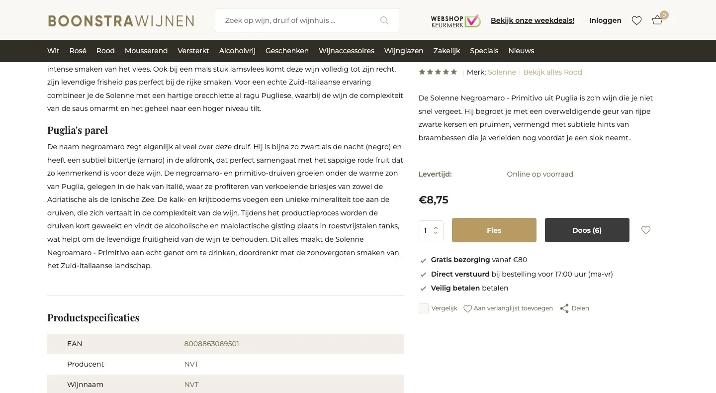
- 01Full width for the contentThe buy box scrolled along and took up half the page. Now the content gets the full width and the button sits compactly at the bottom.
- 02Choice and price on one lineIn the bar you see what you’re choosing and what it costs, and you switch between bottle, case or 12 bottles with one click.
- 03Delivery day stays in view‘Gratis bezorgd vanaf 80 · verwacht in huis’ (Free delivery from 80 · expected at your door) is also in the bar, even while you read.
Product page.
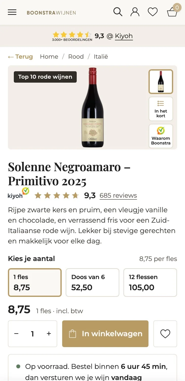
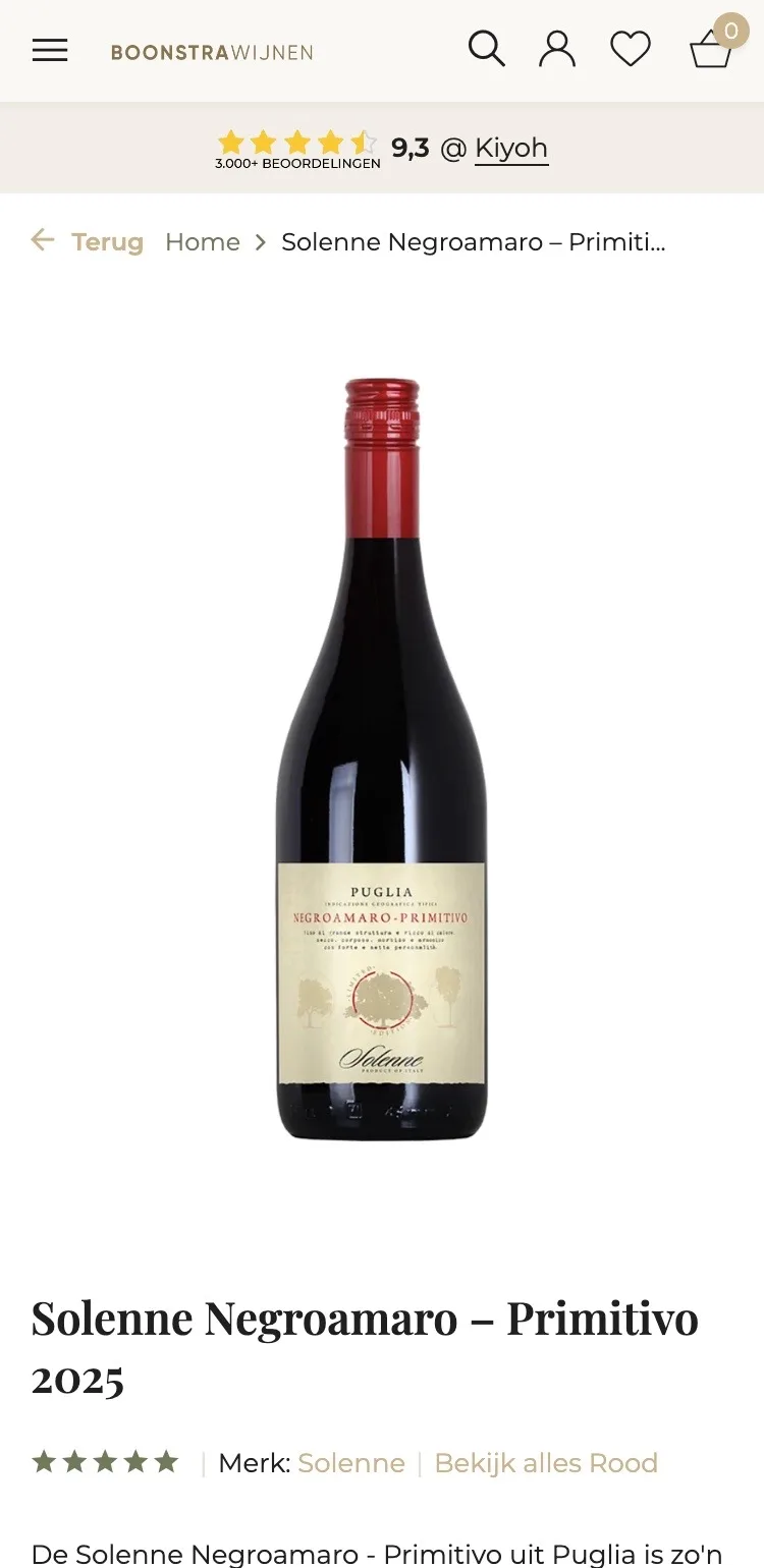
On mobile, choice, price and button right in view.
- 01Button above the foldThe button only appeared after well over 1,000 px. Now the short description, choice, price and ‘In winkelwagen’ (Add to cart) are right in view.
- 02Kiyoh by the titleGray stars without reviews make you unsure. Now the 9.3 from Kiyoh sits right under the name of the wine.
- 03Gallery with explanationNext to the photo, one tap opens ‘In het kort’ (In short) and ‘Waarom Boonstra’ (Why Boonstra).
Around the button.
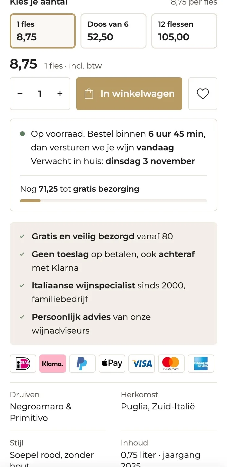
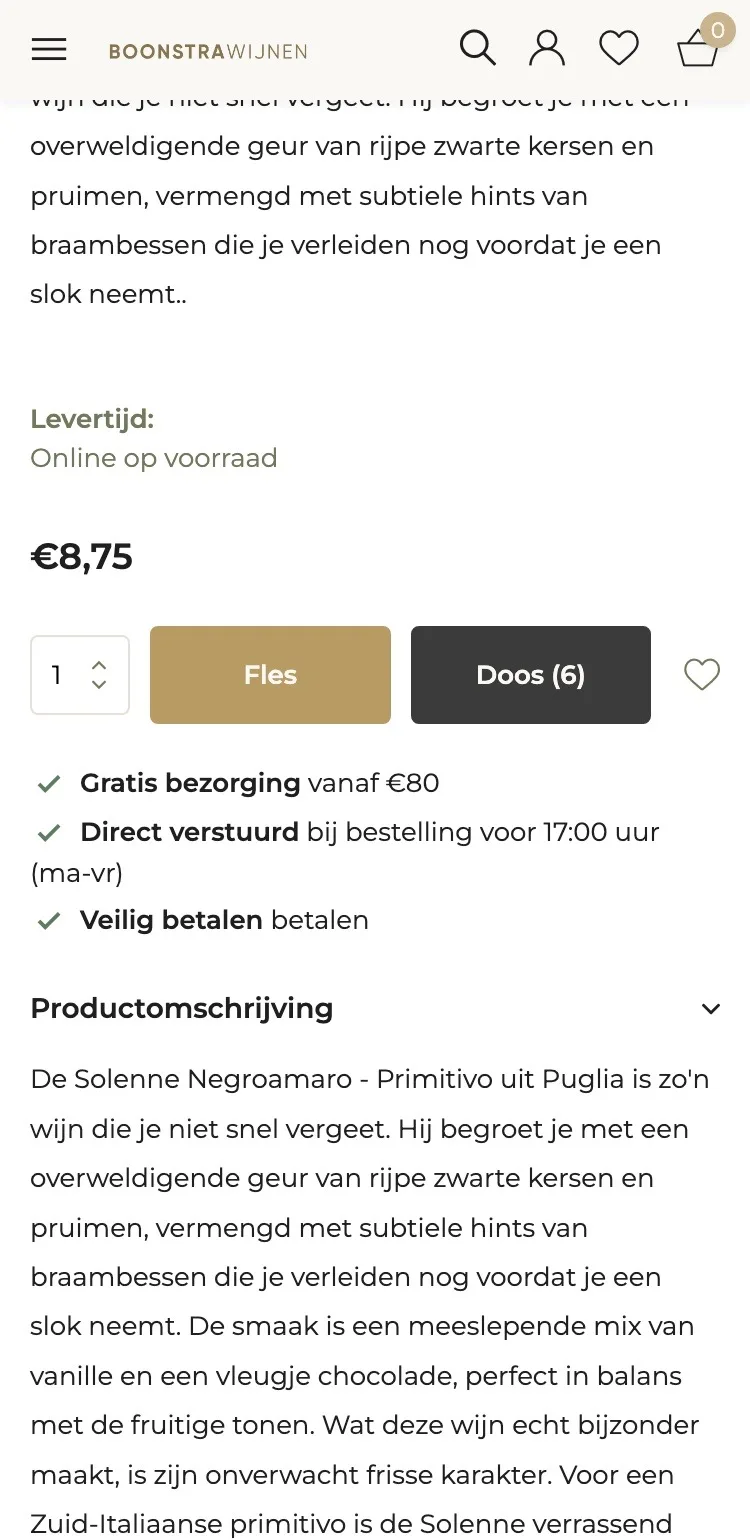
All the guarantees in one place, right under the button.
- 01Delivery day by the buttonAll it said was ‘vóór 17:00 verstuurd’ (shipped before 17:00). Now you also read when the wine will be at your door.
- 02On the way to free deliveryA bar shows how much more you need to reach €80. That makes a second bottle or a case a logical step.
- 03Guarantees on a panelFree delivery, no surcharge and specialist since 2000 sit together on a light panel, with the payment logos below.
How it tastes.
From three long paragraphs to what you want to know.
- 01Key facts at a glanceGrapes, origin, style and volume were scattered or set to ‘NVT’ (N/A). Now they sit together in four boxes.
- 02Aroma, taste and finishThree short lines instead of a long text. In a few seconds you know what you’ll get in your glass.
- 03Goes well withBeef, lamb and orecchiette al ragù: you see straight away which dish to pour it with.
Reviews.
The trust of customers, right after the button.
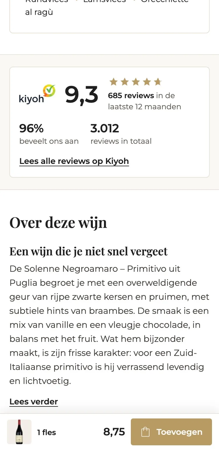
- 019.3 instead of 0 reviews‘0 / 5, based on 0 reviews’ raises doubt. Now the 9.3 from Kiyoh is there, with 685 reviews in the past year.
- 02Higher up the pageThe ratings were far down the page. Now they come right after the button and the tasting note.
- 03Shorter descriptionThe description starts short, with ‘Lees verder’ (Read more) for anyone who wants to know more.
Specifications.
Only details that are correct, and a shorter page.
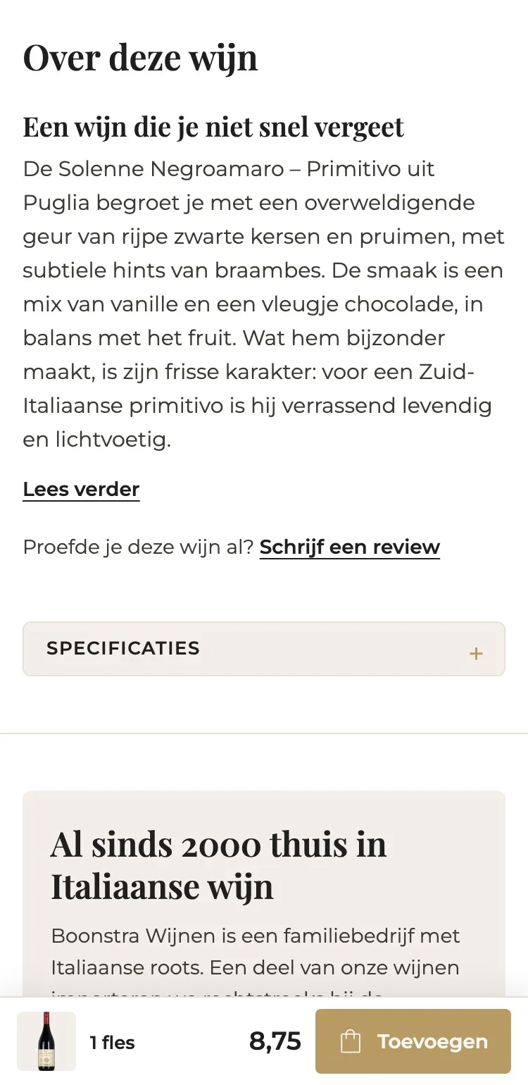
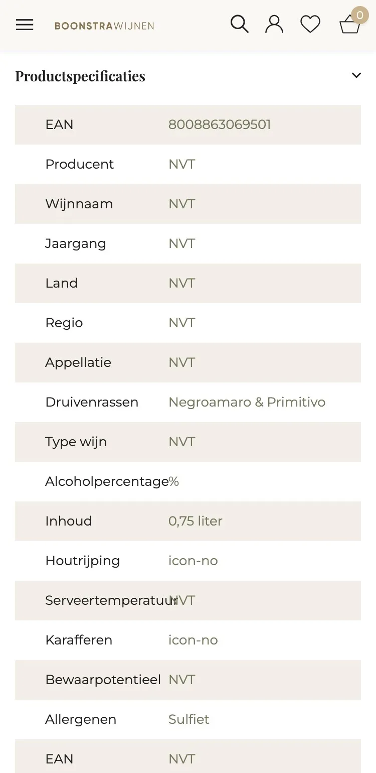
- 01No more ‘NVT’Producer, country, region and vintage were set to ‘NVT’ (N/A). Now it only shows what’s correct, like Puglia and 2025.
- 02Specifications collapsedThe long table sits behind one tap, so the page stays short for anyone who wants to choose and order quickly.
- 03Text with subheadingsShort headings above the description show what it’s about, even on a small screen.
Questions and trust.
Answers on the page, and the story behind Boonstra.
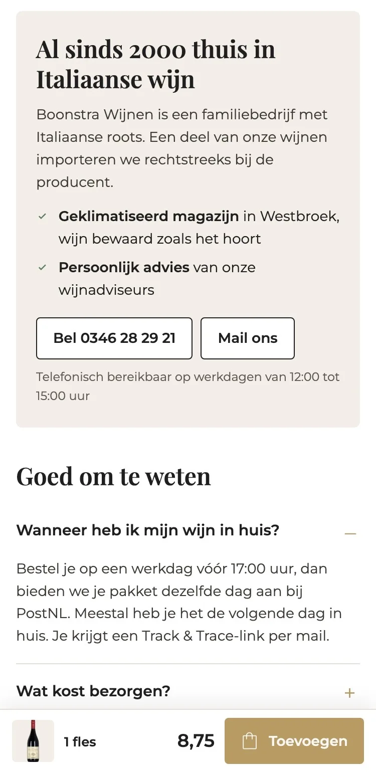
- 01Frequently asked questionsThere were no questions on the page. Delivery, delivery costs, pickup and payment are now one tap away.
- 02Specialist since 2000The family story was only on ‘Ons verhaal’ (Our story). Now you read next to the wine why you buy from Boonstra.
- 03Call or emailThe phone number and the email button are right there, with the times you can be reached.
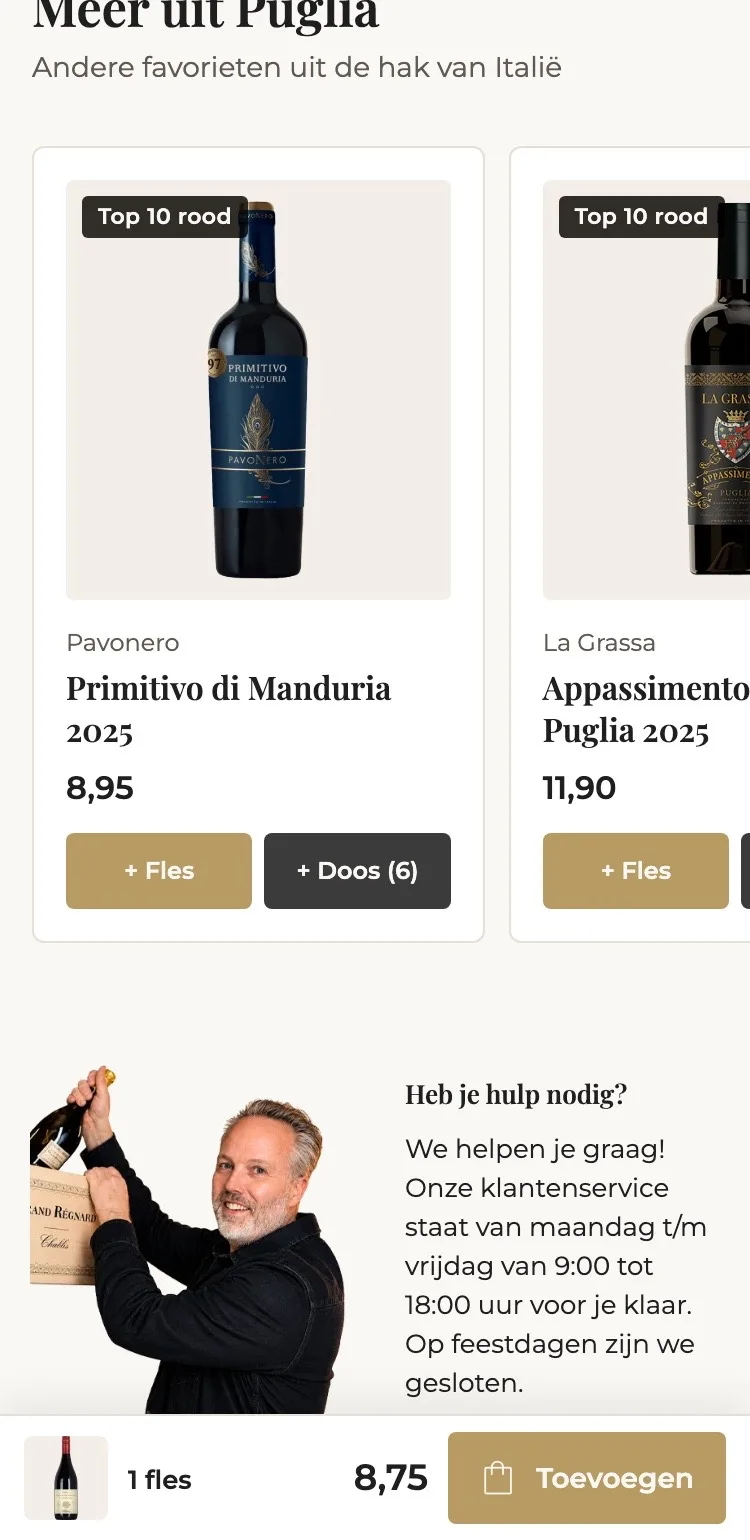
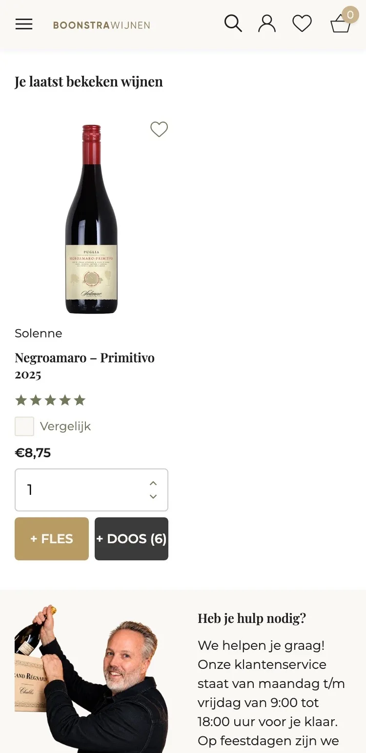
More from Puglia.
A logical next bottle, added with one tap.
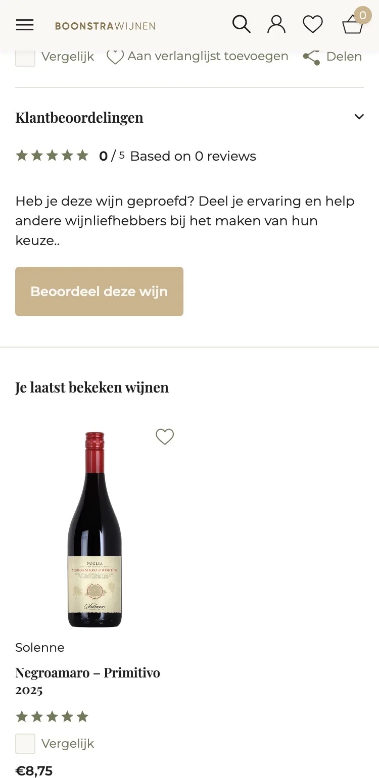
- 01Wines from the same region‘Je laatst bekeken wijnen’ (Your recently viewed wines) showed this very wine. Now you see four other favorites from Puglia.
- 02Swipe and addOn mobile you swipe through the wines. Every card has ‘+ Fles’ (+ Bottle) and ‘+ Doos (6)’ (+ Case of 6).
- 03On the way to free deliveryA second wine brings you closer to free delivery. That makes adding more feel logical and never pushy.
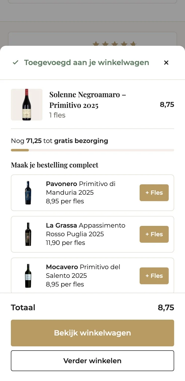
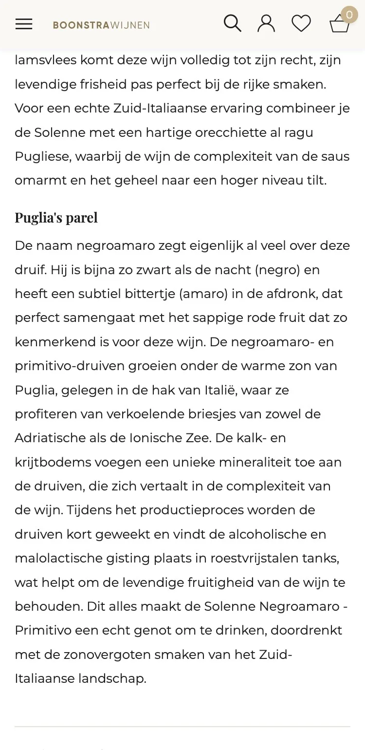
Ordering.
Always a button within reach, and a clear confirmation.
- 01Sticky buy barWhile reading there was no button in view. Now the bottom always shows your choice, the price and ‘Toevoegen’ (Add).
- 02Confirmation with progressAfter adding you see what’s in your cart and how much more you need for free delivery.
- 03Complete your orderThree other wines from Puglia are offered, to add with one tap.
Click through the new design yourself.
The design works like a real page, on desktop and on your phone. You just can’t place an order with it yet.
From design to more orders.
This is how we take the new design live, and measure what it delivers.
- 01Only the pageHeader, menu, USP bar and footer stay exactly as they are now. We only change the content of the product page.
- 02Test first, then go liveWe run the new design in an A/B test next to the current page and measure orders per visitor.
- 03Your own strengthsYour own photos, visuals, reviews and tone of voice: it all came from you already, just in a better place.
This design live
on your online store?
With the AI Design Agent, we put this design on your existing online store, and then keep improving it every month with CRO. Built by our specialists. Without spending thousands of euros a month on it.
- No rebuild, no migration
- Your back office stays the way you know it
- Only goes live after your approval
- 01Ongoing development for a fixed monthly feeNo separate quotes for every change. If we see an opportunity or you have an idea, we build it.
- 02CRO improvements, implemented right awayWe analyze your online store and implement improvements in days instead of months.
- 03Safe, and you see what changesWe build and test everything in a preview first. It only goes live after your approval, and every version is saved.