 Google Ads
 Meta Ads
 Email marketing
 Lightspeed eCom Toolkit
 Shopify Toolkit
Your product page,
redesigned.
A new design for the product page of bomenkopen.nl: Lei-laurier | Groenblijvende leiprunus (evergreen espalier cherry laurel). Below you see every screen before and after, and what we improved.
- 17 before-and-afters
- 23 improvements
- bomenkopen.nl
Every screen, compared.
Pick a screen and drag across the screenshot. On the left you see the current page of bomenkopen.nl, on the right the new design.
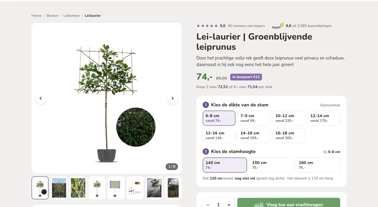
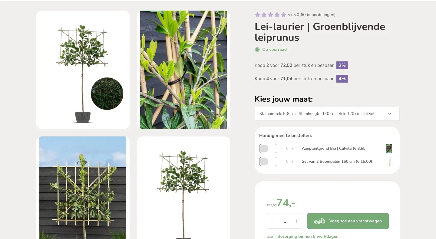
Product page.
The tree, the price and the size at a glance.
- 01One large photo, every imageEight large photos sat in a two-column grid, with a lot of empty space next to them. Now you see one large photo and all images in a single row.
- 02Reviews by the nameThe 60 reviews were a small line above the title. Now they sit there with the 9.6 from Kiyoh, so you feel trust right away.
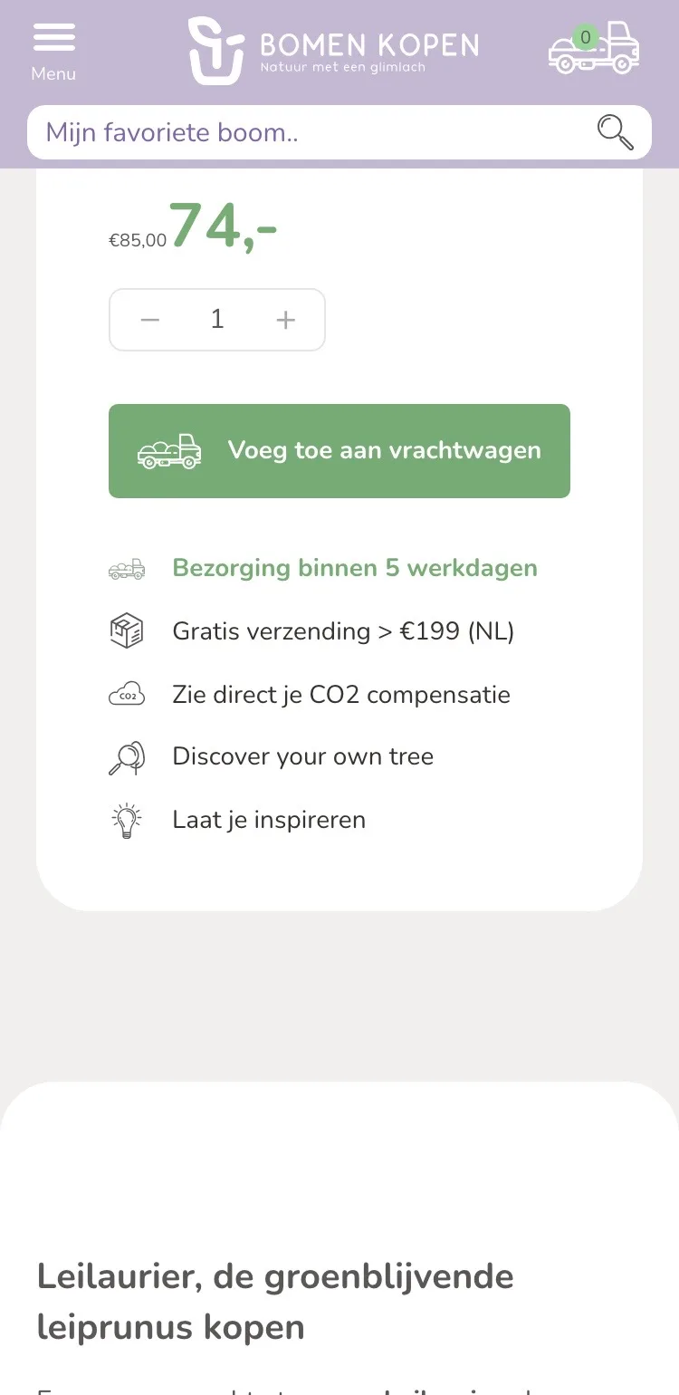
- 03Savings next to the priceThe old price of 85.00 was small, in front of the price, with no amount saved. Now ‘Je bespaart €11’ (You save €11) sits next to it, with the volume pricing in one line.
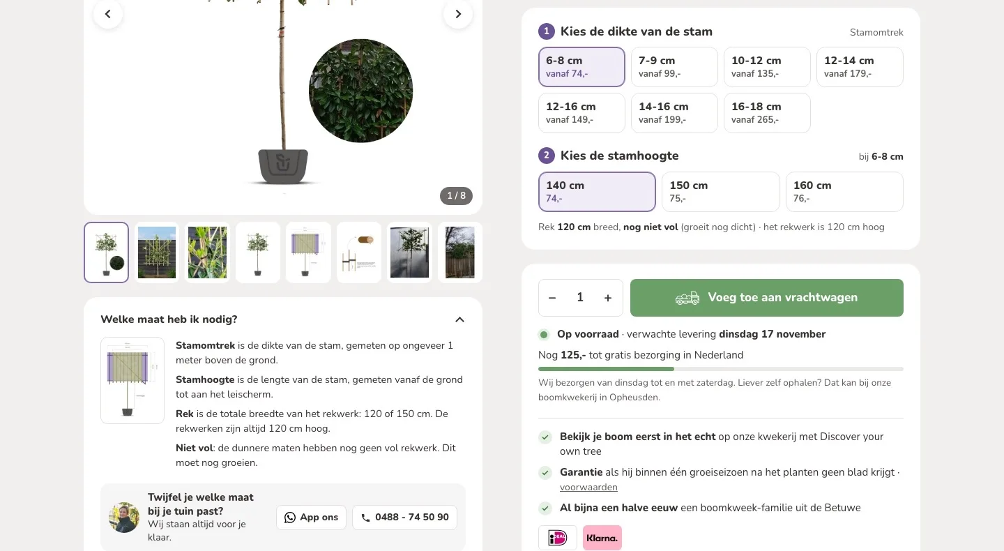
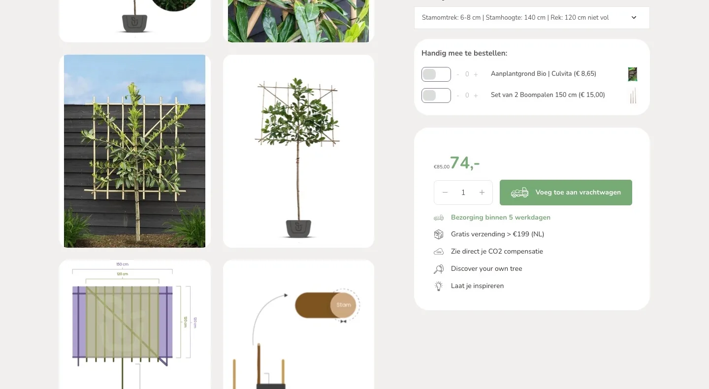
Choosing the size.
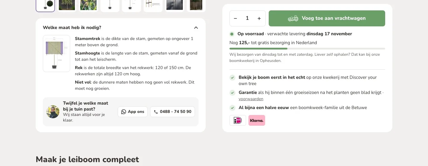
From 24 long lines to two clear choices.
- 01Choose the size in two stepsAll 24 sizes were in one long dropdown. Now you choose the trunk thickness first, then the height, with the price.
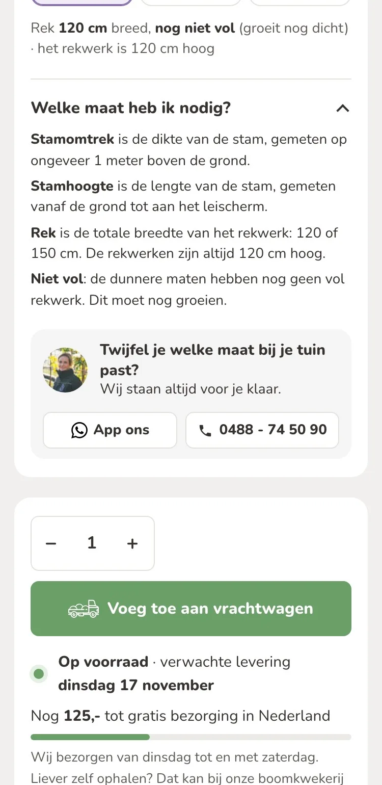
- 02Which size do I need?What trunk height, frame and ‘niet vol’ (not full) mean was far away in the text. Now it is open right by your choice.
- 03Not sure? Text or call usCalling and WhatsApp were only in the header and the footer. Now they are also by the size choice, with a photo of your team member.
By the button.
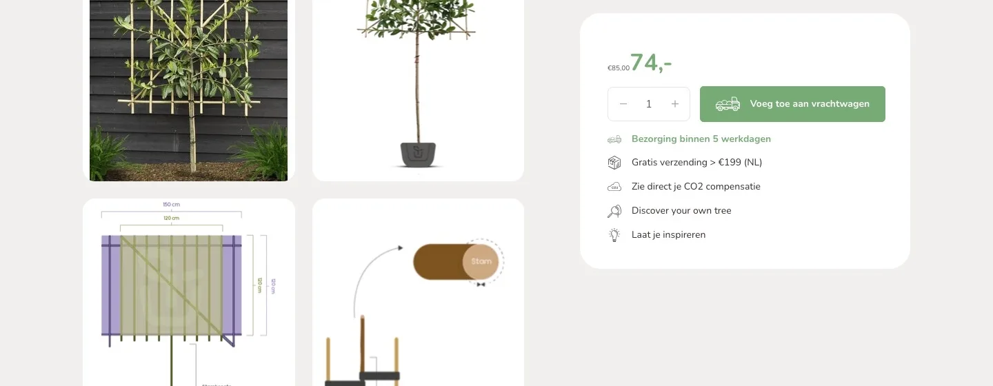
Everything you want to know before you order.
- 01When it arrives‘Bezorging binnen 5 werkdagen’ (Delivery within 5 business days) did not say when. Now you read the expected delivery date of your tree by the button.
- 02Free delivery made concrete‘Gratis verzending > €199’ (Free shipping > €199) was a separate line. Now you see how much more you need, and the bar updates as you go.
- 03Real benefitsVague lines like ‘Laat je inspireren’ (Get inspired) are gone. New by the button: the guarantee, and iDEAL and Klarna as logos.
Complete your espalier tree.
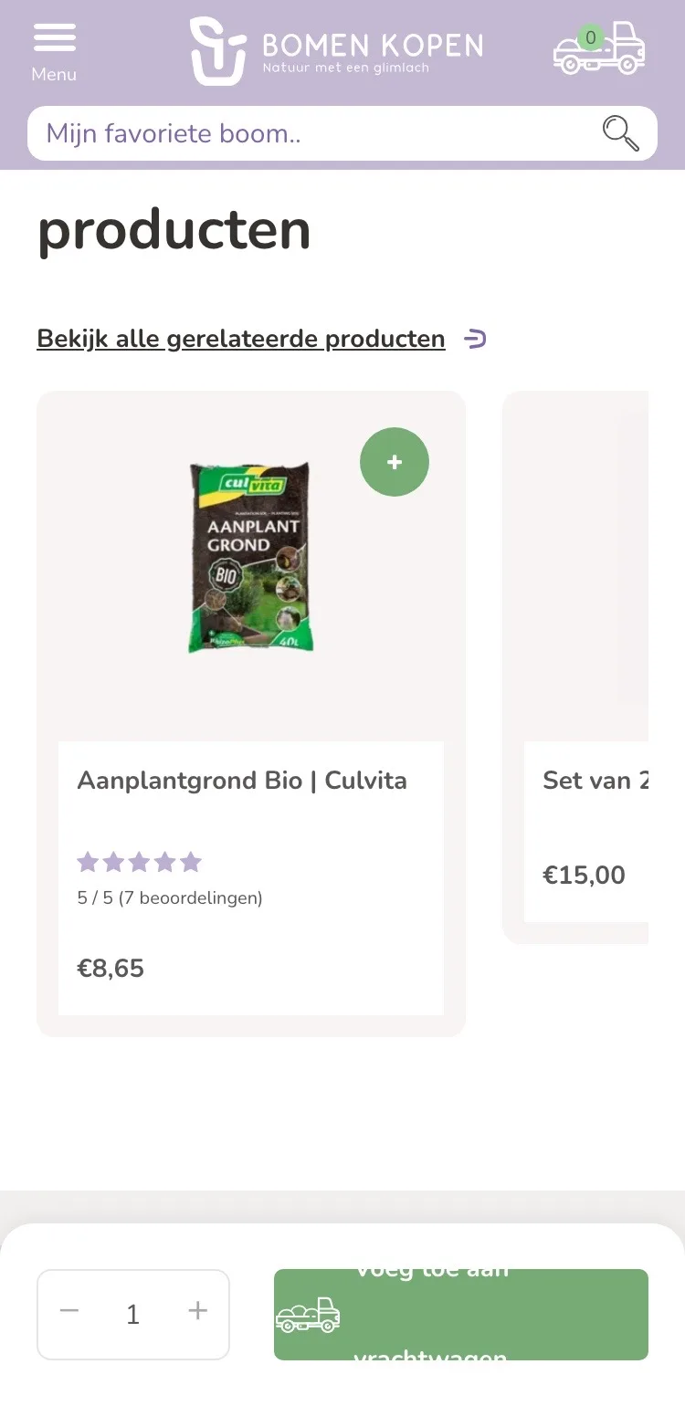
Soil and stakes, with the reason why.
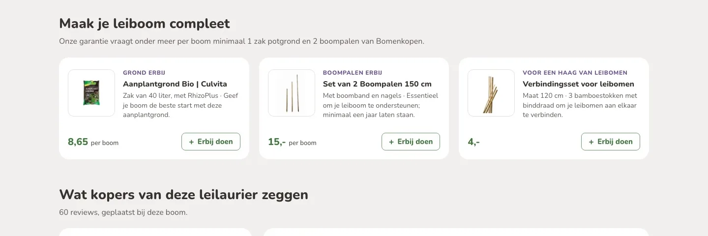
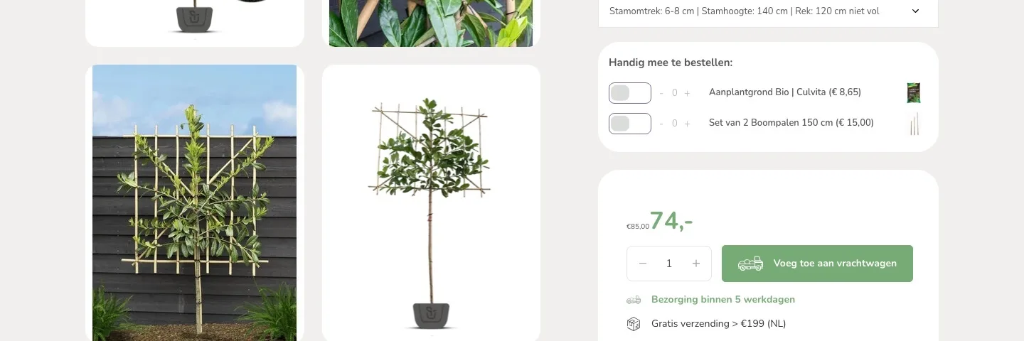
- 01A calm buy boxSoil and stakes sat above the price with toggle switches. Now the button stands on its own and the extras follow right below it.
- 02With the reason whyThat the guarantee requires, among other things, soil and two stakes per tree was only on a service page. Now it is right above.
- 03For a hedge, tooThe connection kit was only at the bottom with related products. Now it is right here, in the width of your frame: 120 or 150 cm.
Reviews.
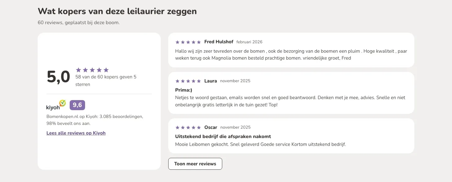
60 happy buyers, finally visible.
- 01The reviews themselves in viewThe 60 reviews of this tree were nowhere on the page. Now you read the newest ones right away, and ‘Toon meer’ (Show more) shows more.
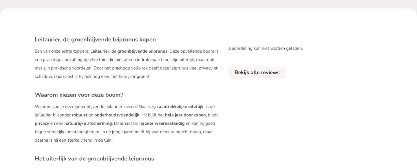
- 02Kiyoh as extra proofNext to the text it said ‘Beoordeling kon niet worden geladen’ (Rating could not be loaded). Now you see the 9.6 from Kiyoh, 3,085 ratings and 98% who recommend it.
- 03Higher on the pageThe reviews now come after the buy box, before the long text. So you read them even if you do not scroll far.
About the cherry laurel.
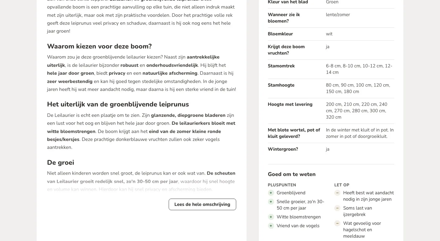
Long text made short, knowledge base next to it.
- 01Readable instead of a wall of textThe description was fully open, more than 3,000 pixels long. Now you read the beginning and expand the rest.
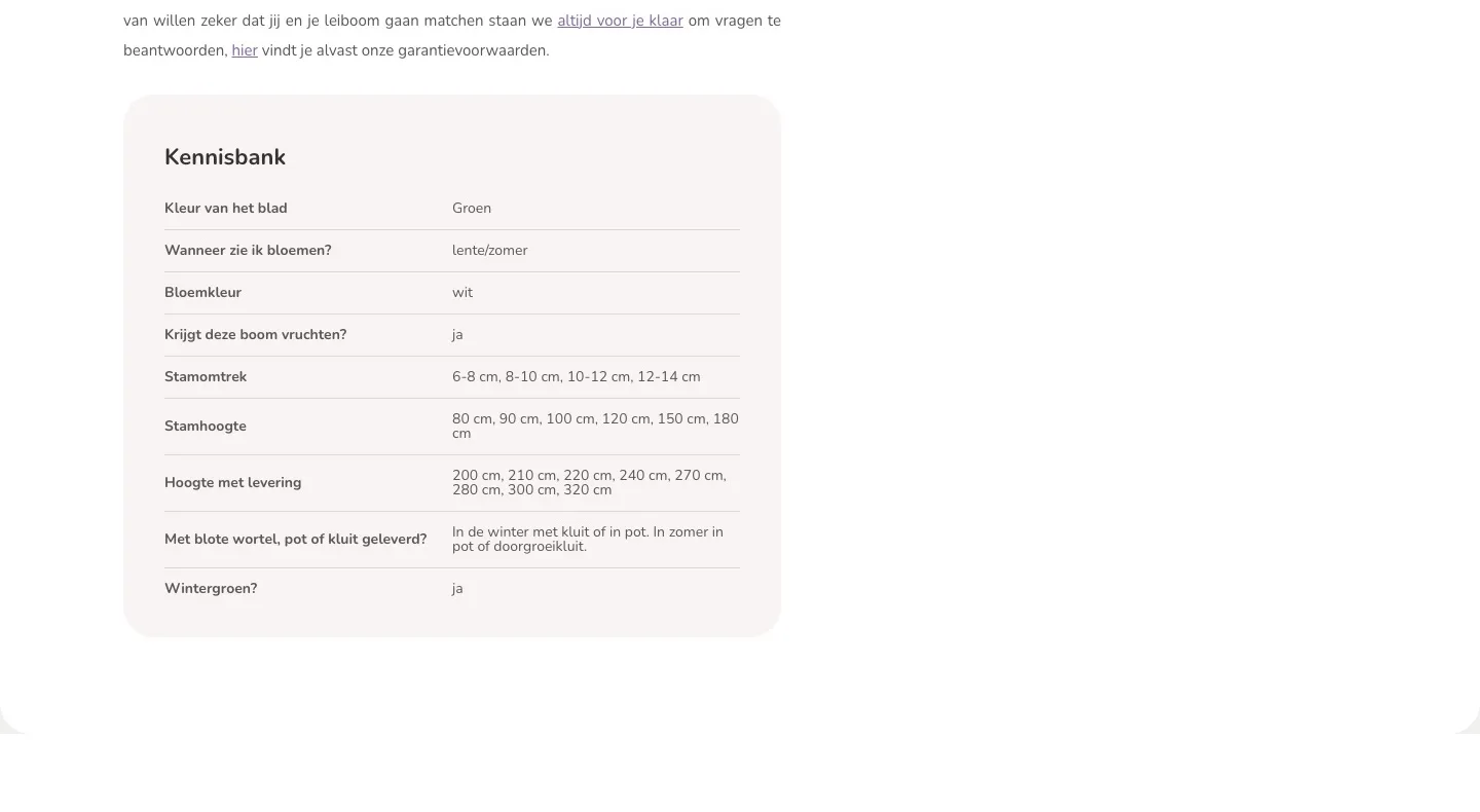
- 02Knowledge base next to itThe knowledge base only came after the long description. Now it sits next to it, so you find the features quickly.
- 03Pros and things to watch togetherMost pros and things to watch were scattered through the long text; iron deficiency was not mentioned. Now they are short and together.
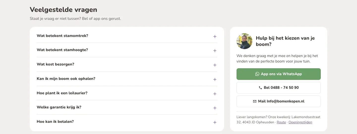
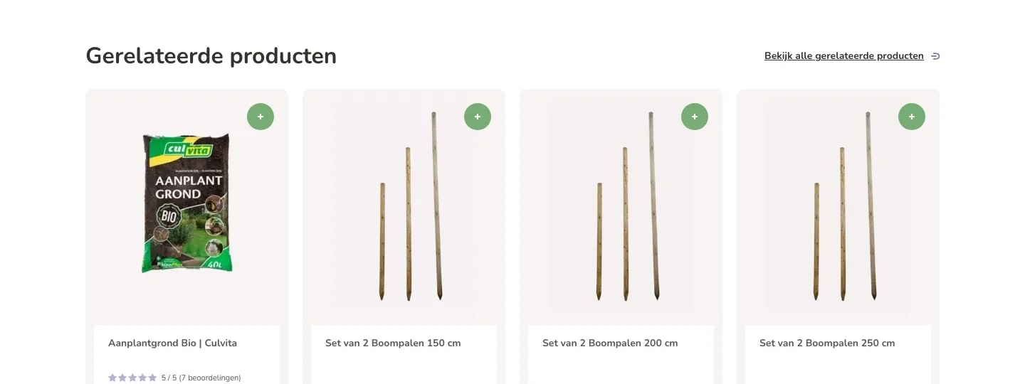
Questions and contact.
Removing doubts on the page itself.
- 01Answers on the pageDelivery, pickup and guarantee were on separate service pages, planting deep in the long text. Now the answers are here.
- 02Contact with one tapNew next to the content: a WhatsApp link, directions to the nursery and a photo of your team member, together in one place.
- 03Stopping by works tooWant to see the tree first? Address, directions and opening hours are right below the contact buttons.
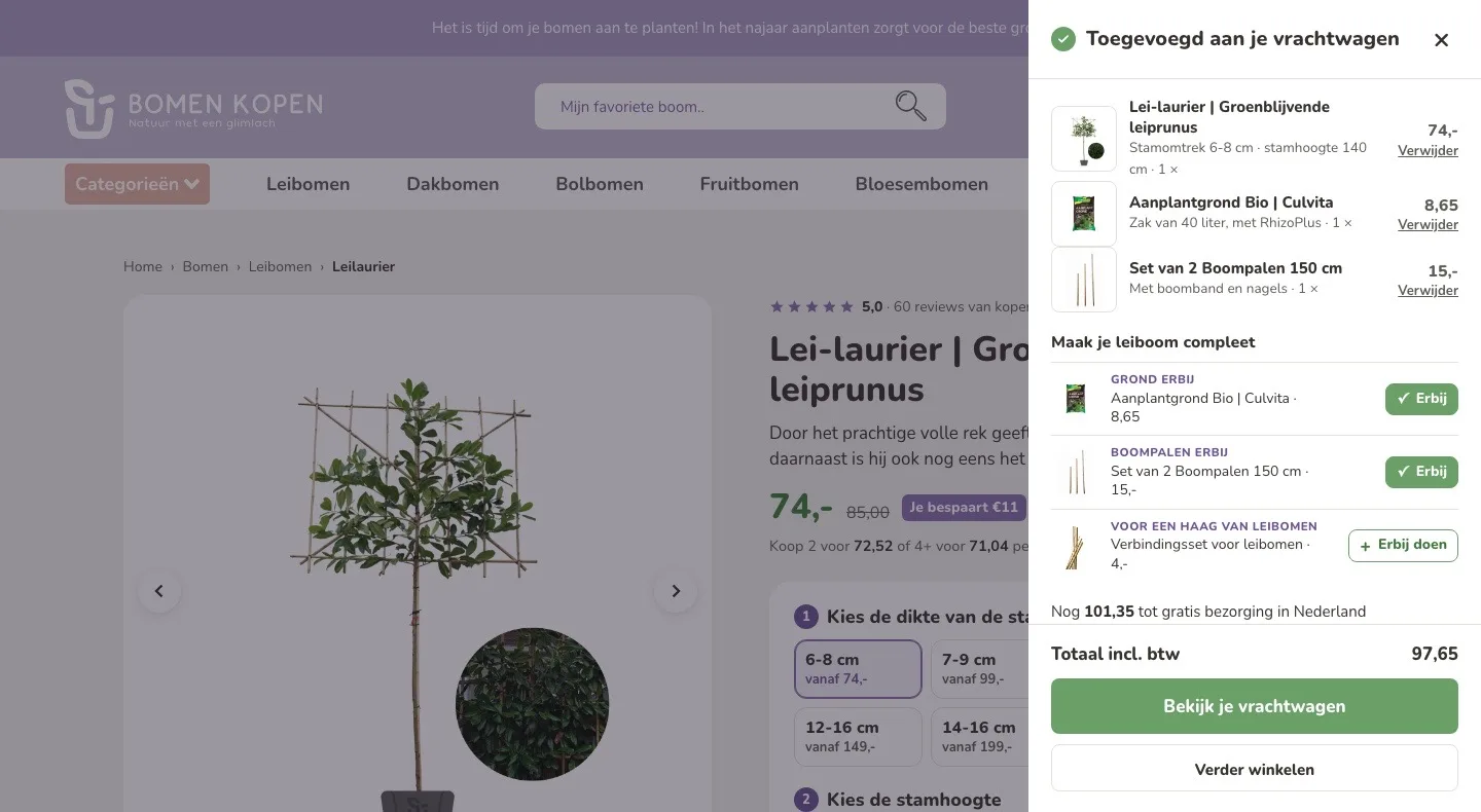
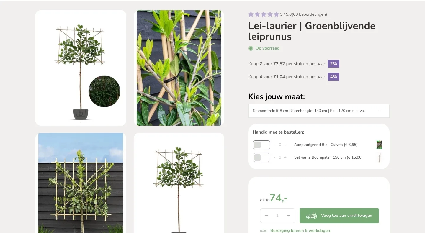
After adding to cart.
A clear next step.
- 01Your choice in viewIn the panel you immediately see which size and how many trees are in your truck (the cart), with a photo.
- 02Complete it in the panelYou add soil, stakes or a connection kit in the panel with one click, with a label saying what it is.
- 03View or keep goingTwo clear buttons: view your truck or keep shopping.
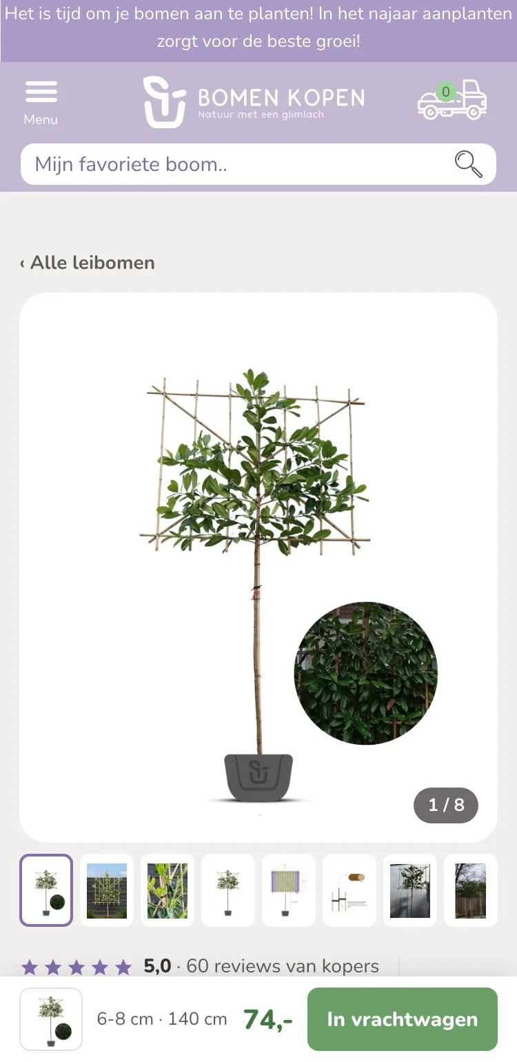
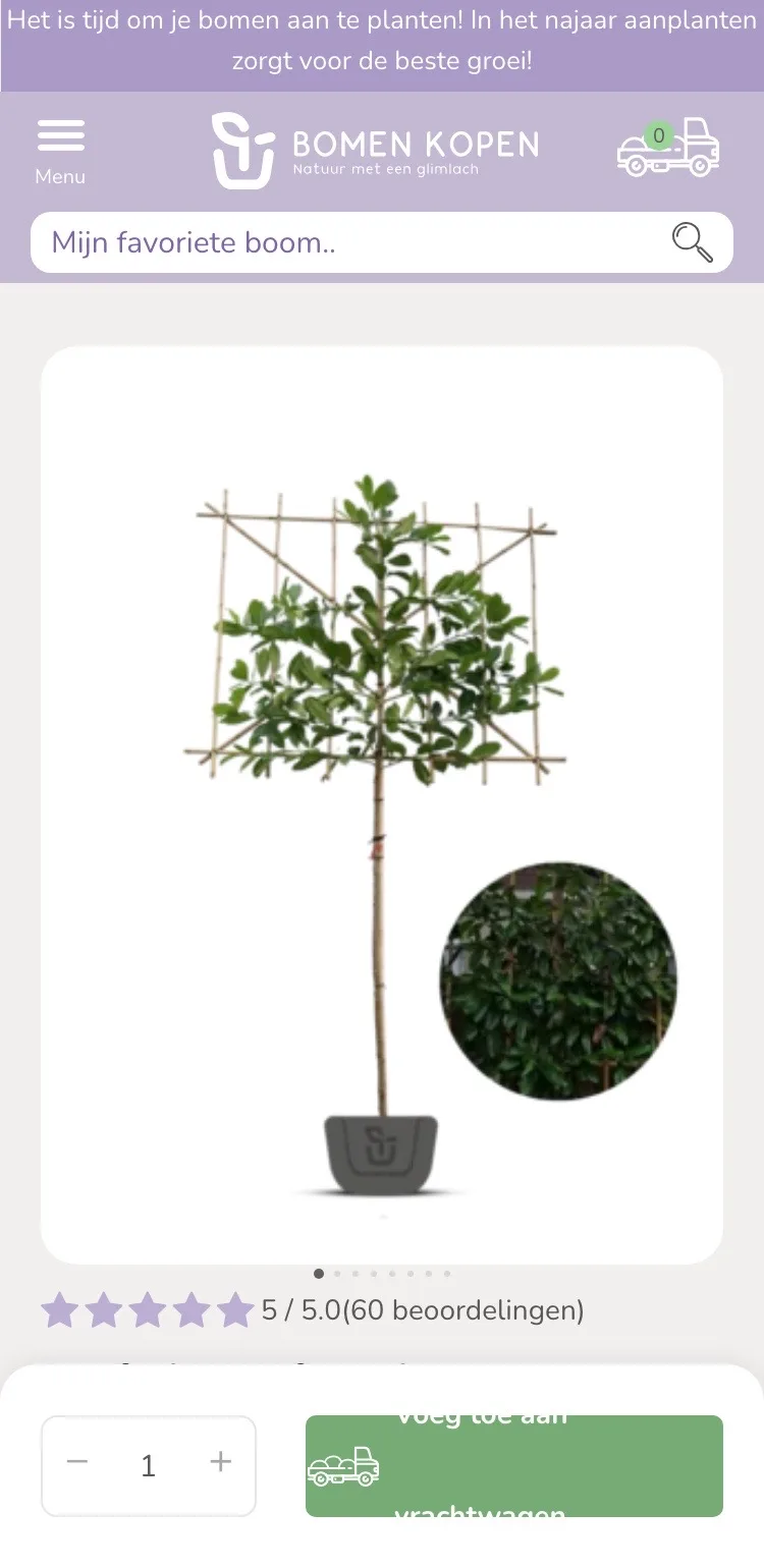
At the top.
Photo, reviews and price in view right away.
- 01Small photos below the photoDots did not show which other images there are. Now you see all photos as thumbnails below the large photo.
- 02Back to all espalier treesThere was no breadcrumb. Now ‘‹ Alle leibomen’ (‹ All espalier trees) sits at the top.
- 03Buy bar at the bottomThe bar at the bottom only had a quantity and a button. Now you also see the photo, your size and the price.
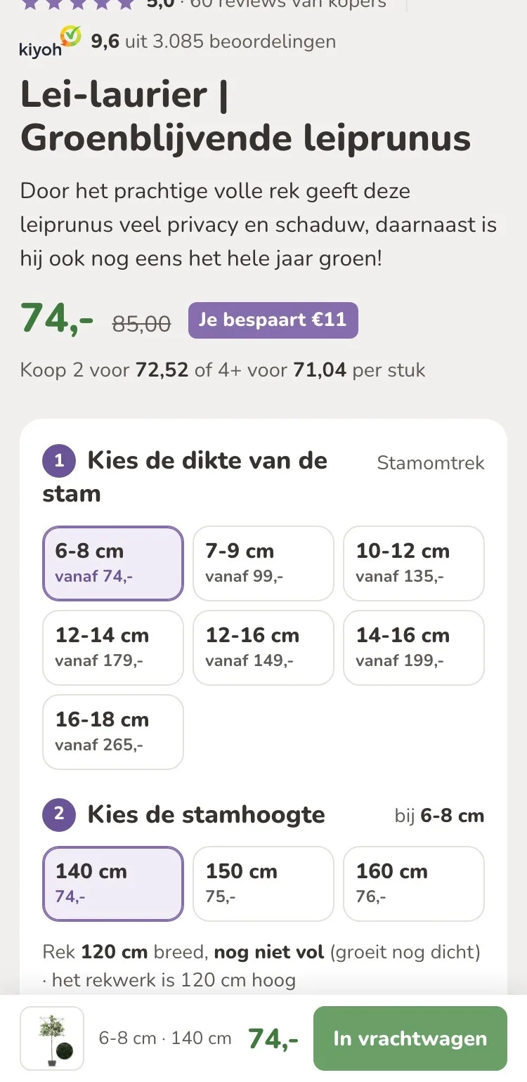
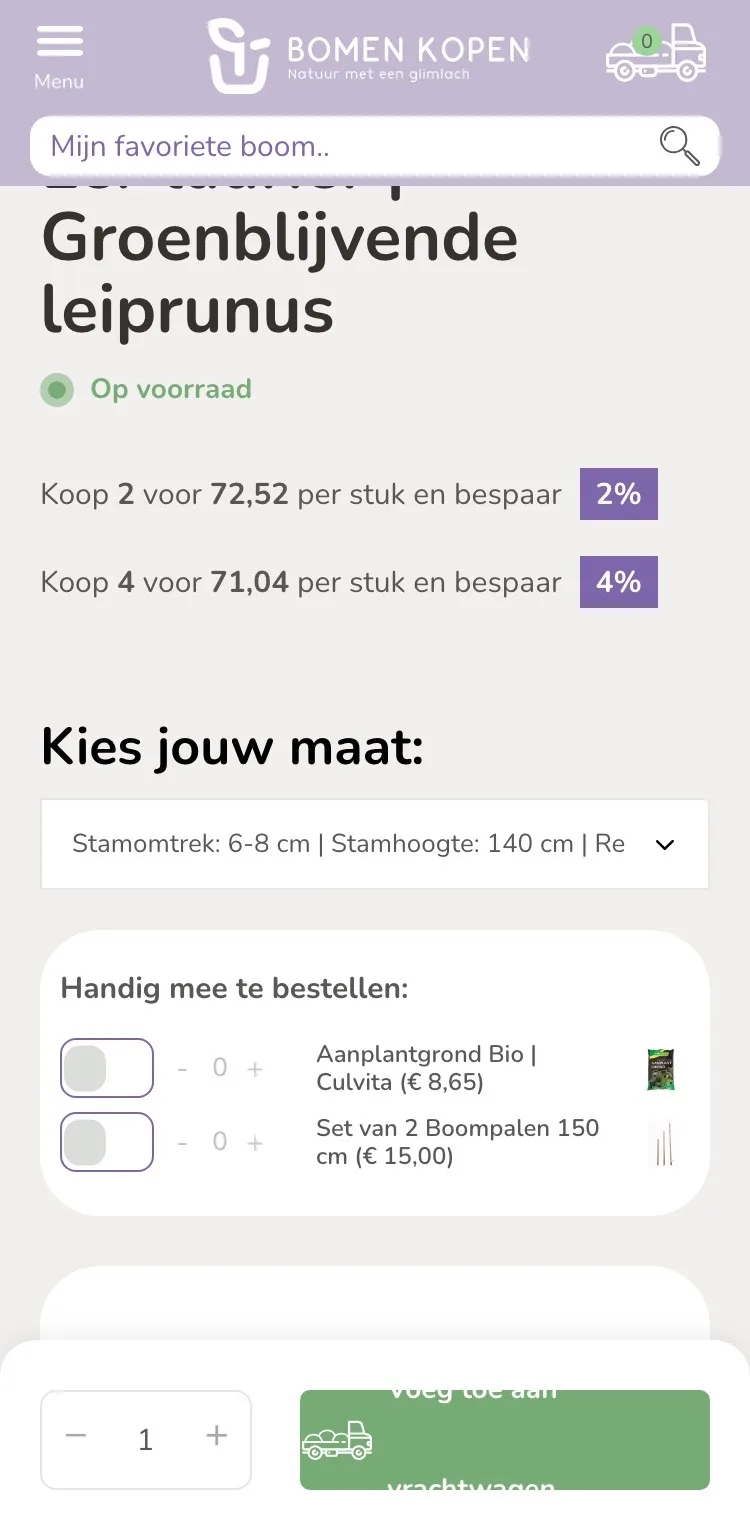
Price and size.
Two choices instead of a long list.
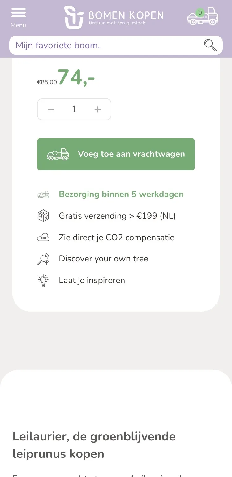
- 01You save €11The old price was small, below the size choice and the extras. Now price and savings sit right below the name.
- 02Size as buttonsThe dropdown cut off the size (‘Stamhoogte: 140 cm | Rek…’ (Trunk height: 140 cm | Frame…)). Now you choose trunk and height with one tap.
- 03Price per sizeYou only saw what a size costs after choosing it. Now every size shows its price.
Help with the size.
Explanation and contact by your choice.
- 01Which size do I need?What trunk height, frame and ‘niet vol’ (not full) mean was far away in the text. Now it is open right by your choice.
- 02Text or call usNot sure? Text or call with one tap, with the photo of your team member next to it.
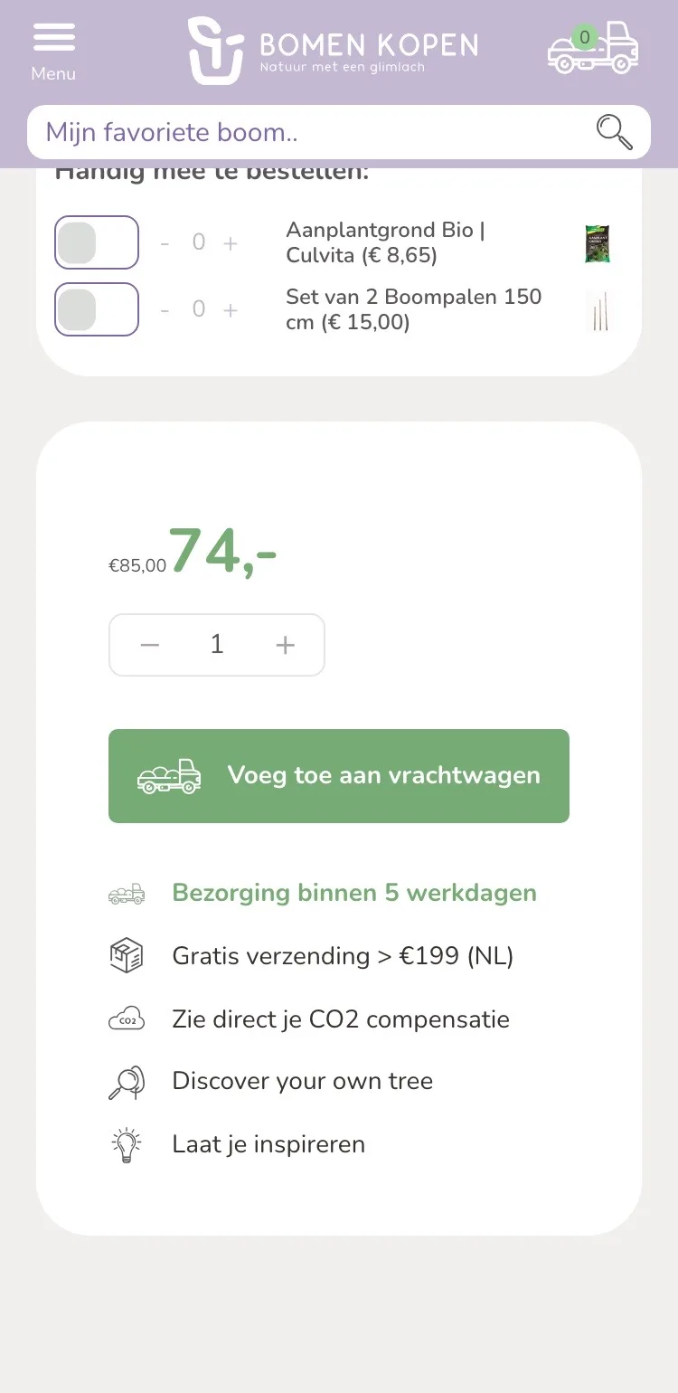
- 03Calm above the buttonThe toggle switches for soil and stakes were above the price. They are now below the buy box.
By the button.
Delivery, guarantee and payment.
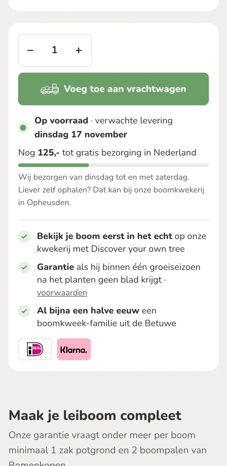
- 01Expected delivery dateYou read on which day your tree is expected, instead of ‘binnen 5 werkdagen’ (within 5 business days) with no date.
- 02… to go until free deliveryYou see how much more you need for free delivery, and the bar updates right away.
- 03Real benefits and logosNew by the button: the guarantee, and iDEAL and Klarna as clear logos.
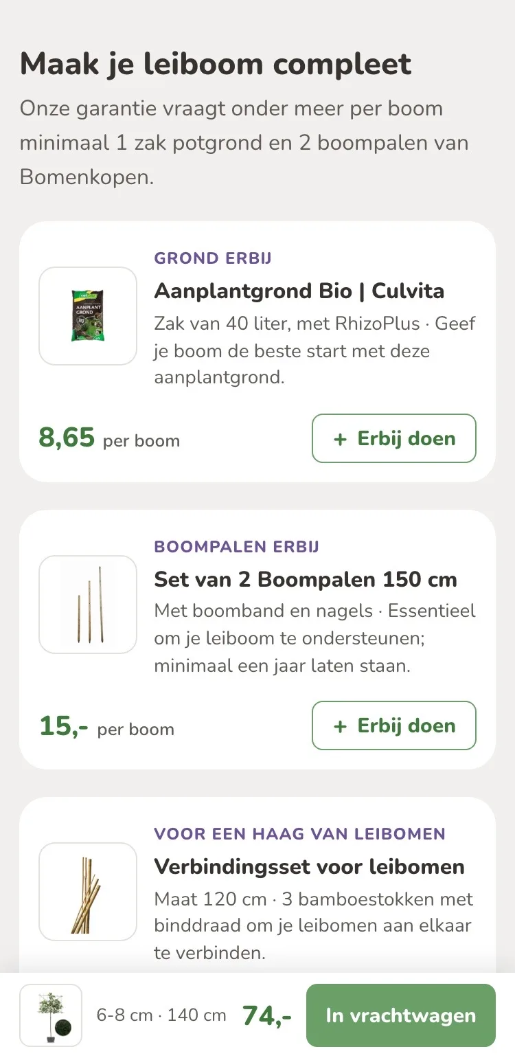
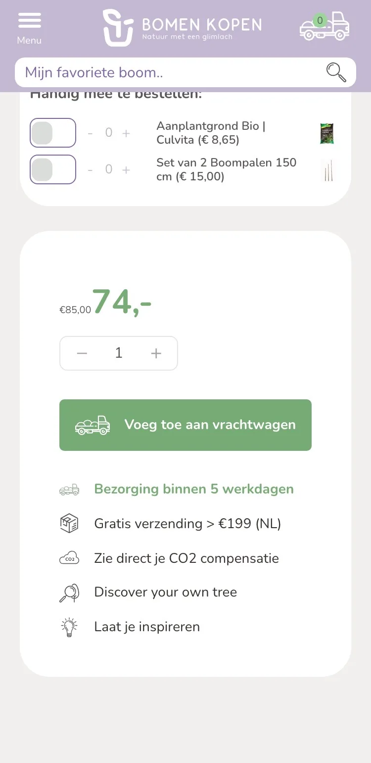
Complete your espalier tree.
Soil, stakes and connection kit.
- 01With the reason whyThat the guarantee requires, among other things, soil and two stakes per tree was only on a service page. Now it is right above.
- 02Clear what it isEvery product has a label, such as ‘Grond erbij’ (Add soil), and its own button.
- 03Fits your frameThe connection kit follows the width of the frame you choose: 120 or 150 cm.
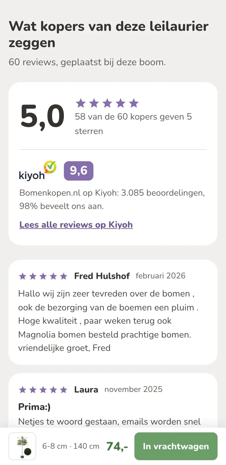
Reviews.
60 reviews, now visible.
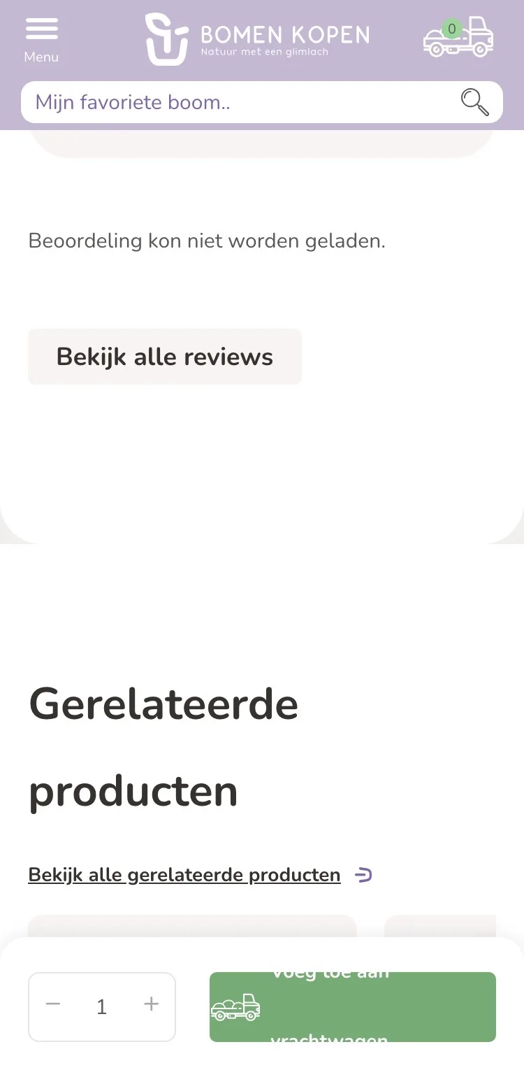
- 01Reviews instead of an error messageThe review block showed ‘Beoordeling kon niet worden geladen’ (Rating could not be loaded). Now you read the newest reviews of this tree.
- 02Kiyoh includedThe 9.6 from 3,085 ratings sits with the Kiyoh logo as extra proof.
- 03Newest firstYou read the newest reviews of this tree right away, with name and month.
Knowledge base.
Features at a glance.
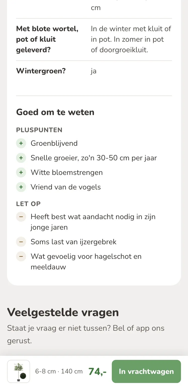
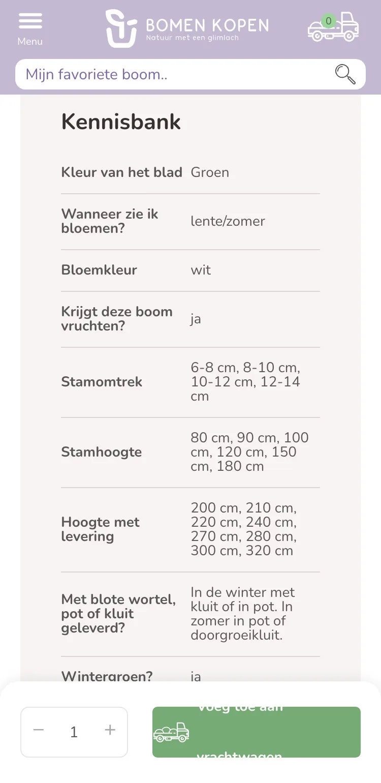
- 01Pros and things to watchMost pros and things to watch were scattered through the long text; iron deficiency was not mentioned. Now they are short and together.
- 02What needs attention, tooBesides what is good, you read honestly what to watch for, such as extra care in the early years.
- 03A calm overviewThe features sit in a clean table, with the pros and things to watch right below.
Questions and contact.
Answers without searching.
- 01Frequently asked questionsDelivery, pickup and guarantee were on separate service pages, planting deep in the text. Now they are here.
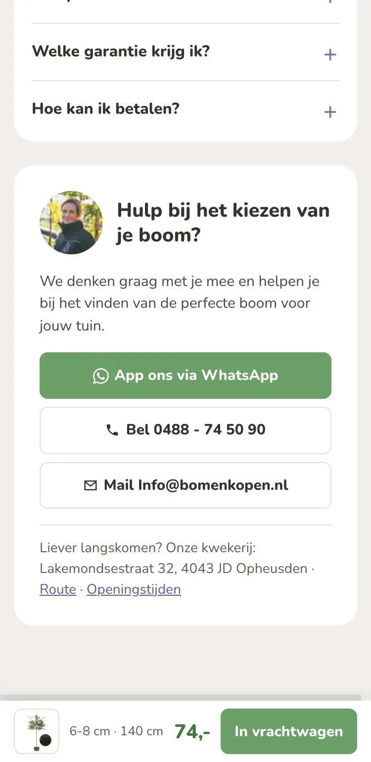
- 02WhatsApp, call, emailNew next to the content: a WhatsApp link and a photo of your team member, alongside calling and emailing.
- 03Directions to the nurseryWant to see the tree in person first? With one tap you find the directions and opening hours of the nursery.
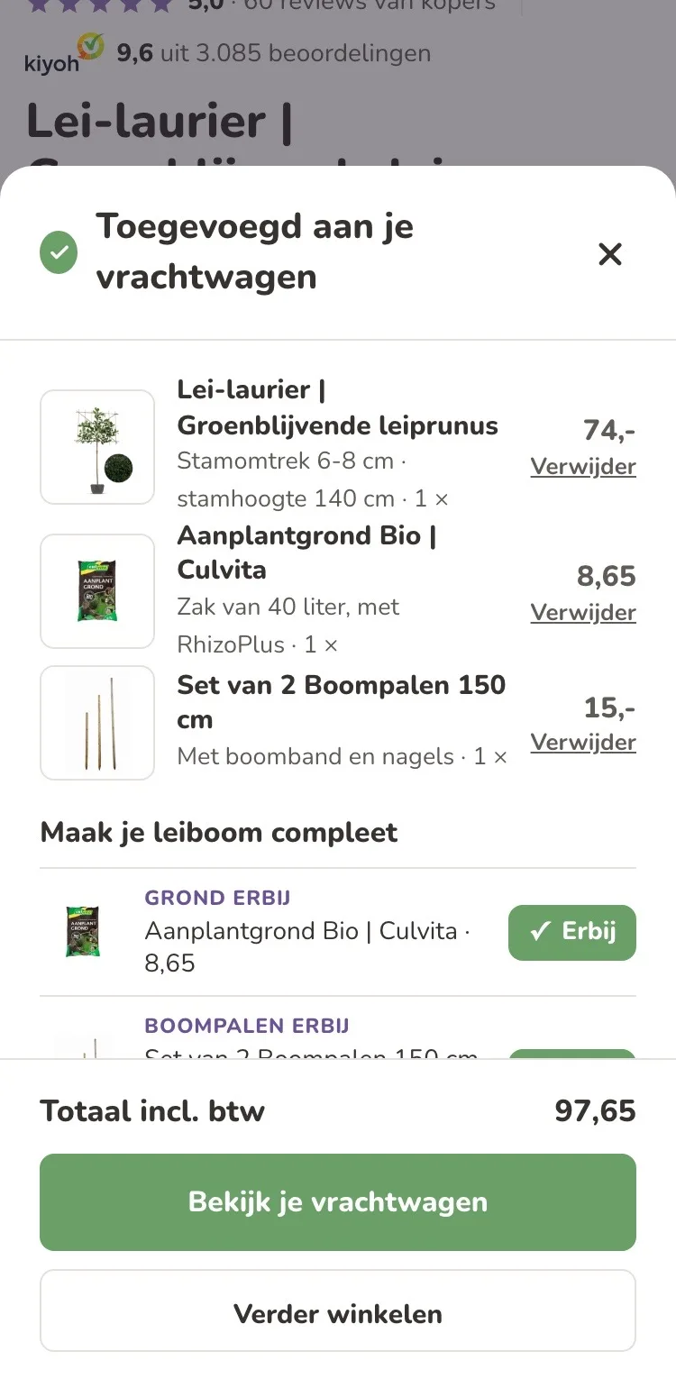
After adding to cart.
A clear next step.
- 01Your choice in viewYou immediately see which size and how many trees are in your truck (the cart), with a photo.
- 02Complete it quicklyYou add soil, stakes or a connection kit here with one tap.
- 03View or keep goingTwo clear buttons: view your truck or keep shopping.
Click through the new design yourself.
The design works like a real page, on desktop and on your phone. You just can’t place an order with it yet.
From design to more orders.
This is how we take the new design live, and measure what it delivers.
- 01Only the pageHeader, menu, USP bar and footer stay exactly as they are now. We only change the content of the product page.
- 02Test first, then go liveWe run the new design in an A/B test next to the current page and measure orders per visitor.
- 03Your own strengthsYour own photos, visuals, reviews and tone of voice: it all came from you already, just in a better place.
This design live
on your online store?
With the AI Design Agent, we put this design on your existing online store, and then keep improving it every month with CRO. Built by our specialists. Without spending thousands of euros a month on it.
- No rebuild, no migration
- Your back office stays the way you know it
- Only goes live after your approval
- 01Ongoing development for a fixed monthly feeNo separate quotes for every change. If we see an opportunity or you have an idea, we build it.
- 02CRO improvements, implemented right awayWe analyze your online store and implement improvements in days instead of months.
- 03Safe, and you see what changesWe build and test everything in a preview first. It only goes live after your approval, and every version is saved.