 Google Ads
 Meta Ads
 Email marketing
 Lightspeed eCom Toolkit
 Shopify Toolkit
Your product page,
redesigned.
A new design for the product page of bikeroutfit.nl: REV'IT Afterburn H2O (motorcycle jacket). Below you see every screen before and after, and what we improved.
- 15 before-and-afters
- 24 improvements
- bikeroutfit.nl
Every screen, compared.
Pick a screen and drag across the screenshot. On the left you see the current page of bikeroutfit.nl, on the right the new design.
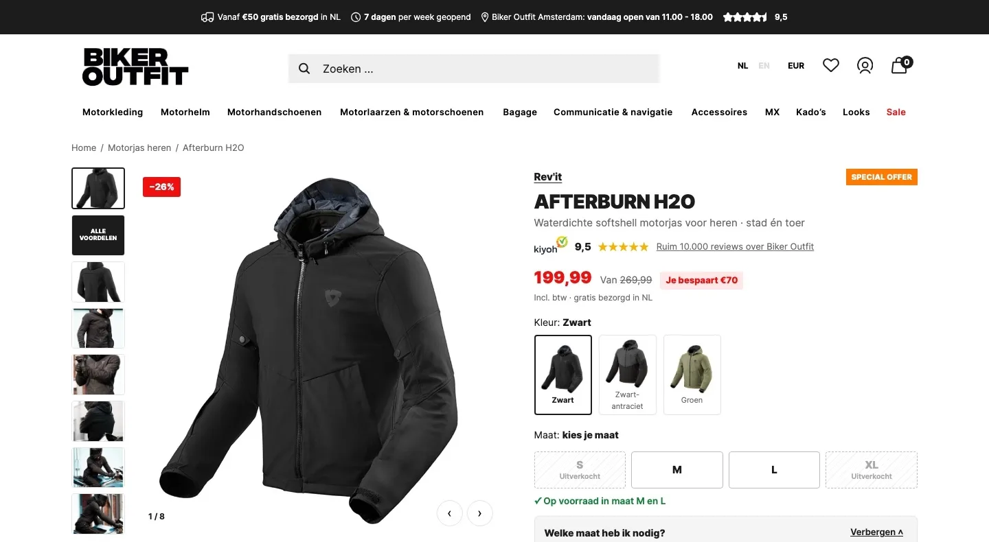
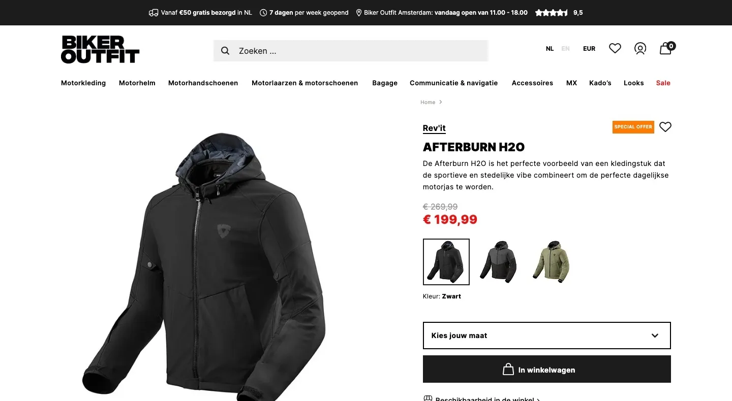
Product page.
Trust, price and choice at a glance next to the photo.
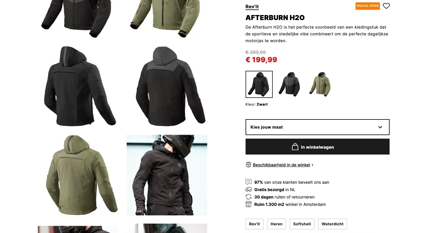
- 01Kiyoh score under the titleWith a €200 jacket, trust is what decides. The 9.5 was small in the top bar; now it sits right under the product name.
- 02Price with the savingAn amount says more than a struck-through price. ‘Je bespaart €70’ (You save €70) makes the discount clear at a glance.
- 03All photos in viewBuyers want to see the jacket from every side. Thumbnails show everything straight away, plus one image with the benefits.
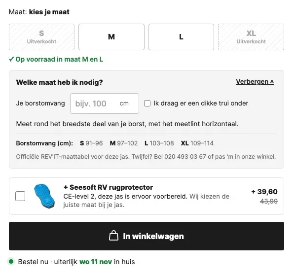
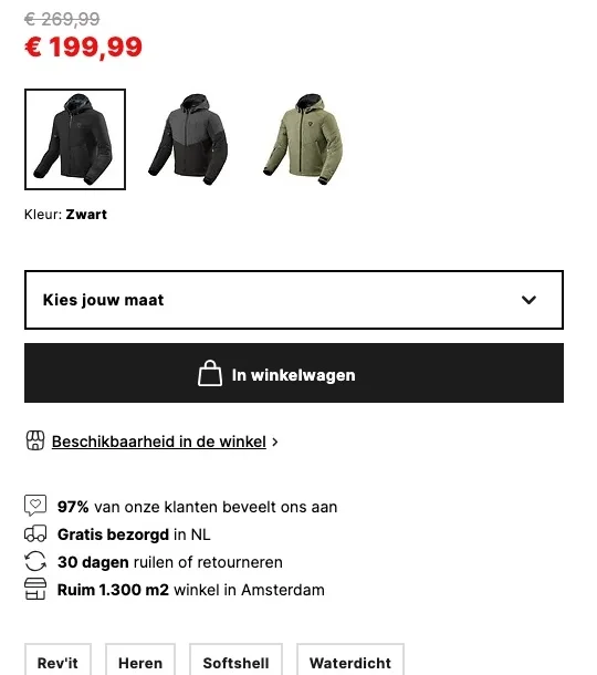
Choosing a size.
The biggest doubt with a jacket, taken away right where you choose.
- 01Sizes as buttonsFirst you had to open a dropdown to see what was available. Now you see straight away which size is in stock.
- 02Size advice that’s already openDoubt about the size is the biggest reason to drop out or return. Enter your chest size and you get advice right away.
- 03Back protector with one tickThe jacket is prepared for a back protector, but it doesn’t come with one. Now you add it with one tick, in the right size.
Around the button.
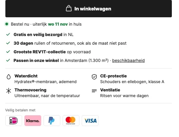
All the reassurance right where the visitor decides.
- 01Delivery date by the buttonFirst you only saw the shipping time after choosing a size. Now the button shows the latest day the jacket will arrive, so you know where you stand.
- 02Guarantees as a checklistFree delivery, 30 days to exchange and trying it on in the shop take away doubt, exactly where you choose.
- 03Benefits and payment logosLoose labels tell a buyer little. Now it says what the jacket does, with recognizable payment logos below.
What the jacket can do.
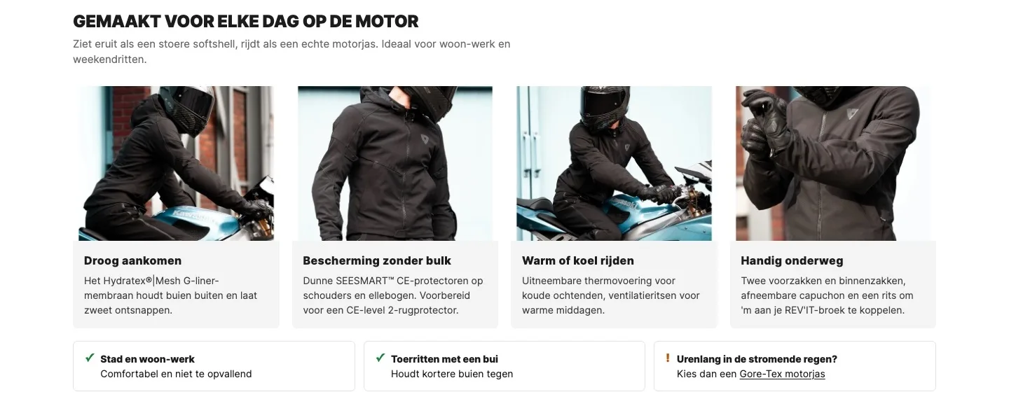
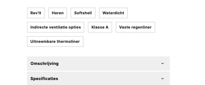
From loose labels and closed blocks to benefits you see at a glance.
- 01Benefits with imagesFirst this was hidden in closed blocks and loose labels. Now the visitor sees at a glance what the jacket does for them.
- 02Honest about useKnowing what the jacket is good for prevents returns. For hours of rain we honestly point to Gore-Tex.
- 03Labels in plain language‘Indirecte ventilatie opties’ (Indirect ventilation options) says little, ‘ritsen voor warme dagen’ (zips for warm days) says a lot. Benefits in plain language convince.
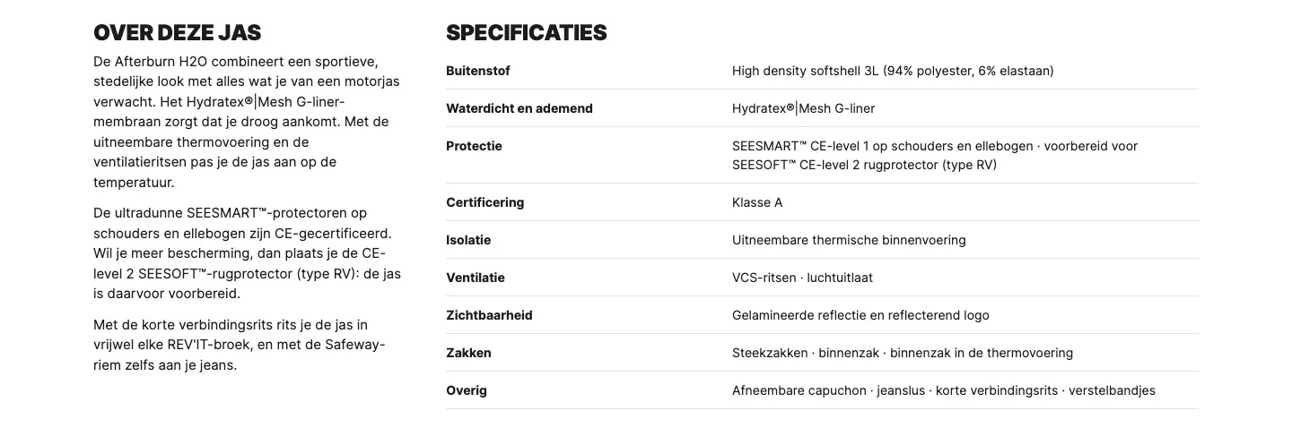
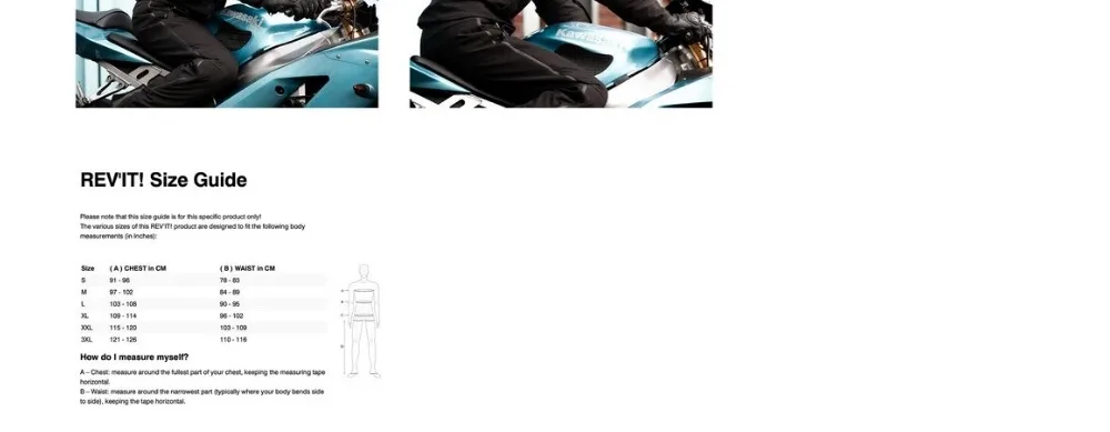
Description and specifications.
All information open on the page, without searching.
- 01Description readable right awayBehind a closed button, hardly anyone reads on. Open text answers questions before they come up.
- 02Specifications in a tableAnyone in doubt compares details. A calm table makes fabric, protection and ventilation quick to compare.
- 03Size chart by the sizesAs the last photo, hardly anyone found the English size chart. Now it’s in Dutch next to the size choice.
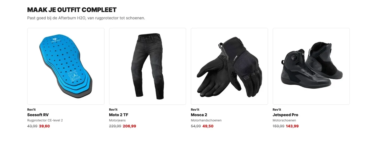
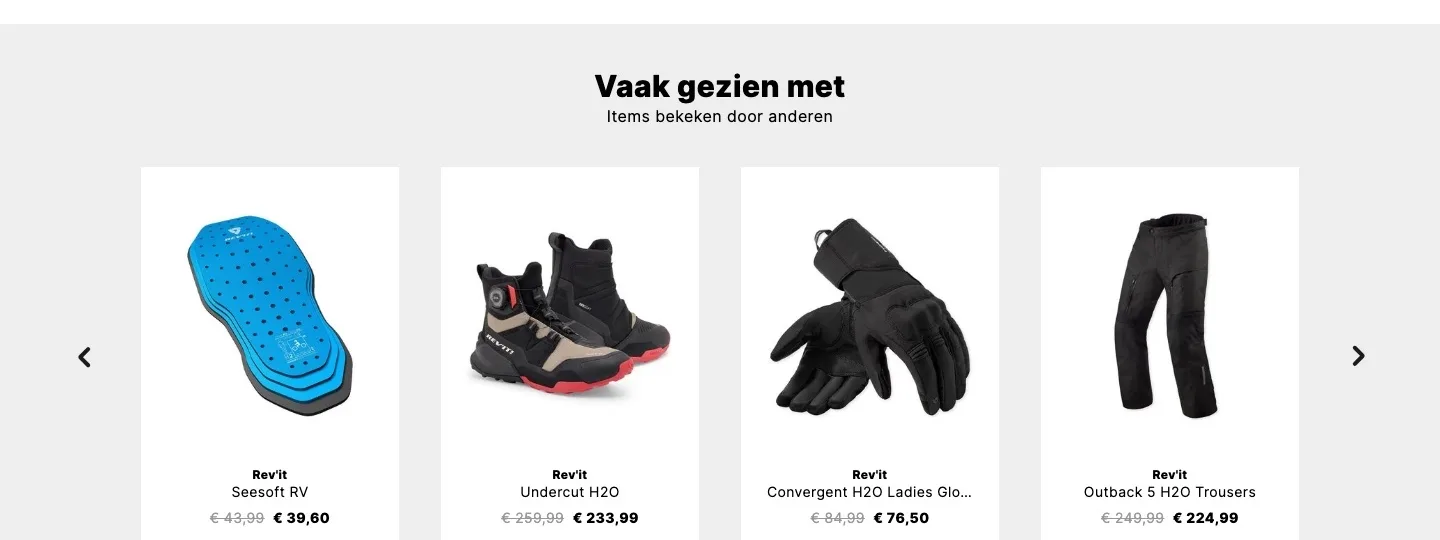
Complete your outfit.
Add-ons that really go with the jacket, in one calm row.
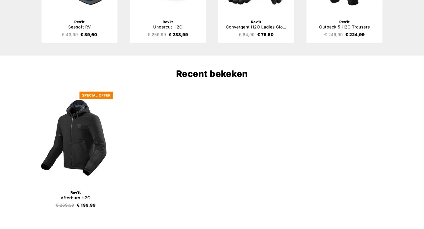
- 01What goes with the jacket‘Vaak gezien met’ (Often seen with) also showed women’s products. Now it only shows what a buyer of this jacket really needs with it.
- 02One calm rowA carousel with arrows hides half of it. Four products side by side you see at a glance.
- 03Back protector by the button tooThe back protector was already first in line, but far below the fold. Now it’s also by the button, where the choice is made.
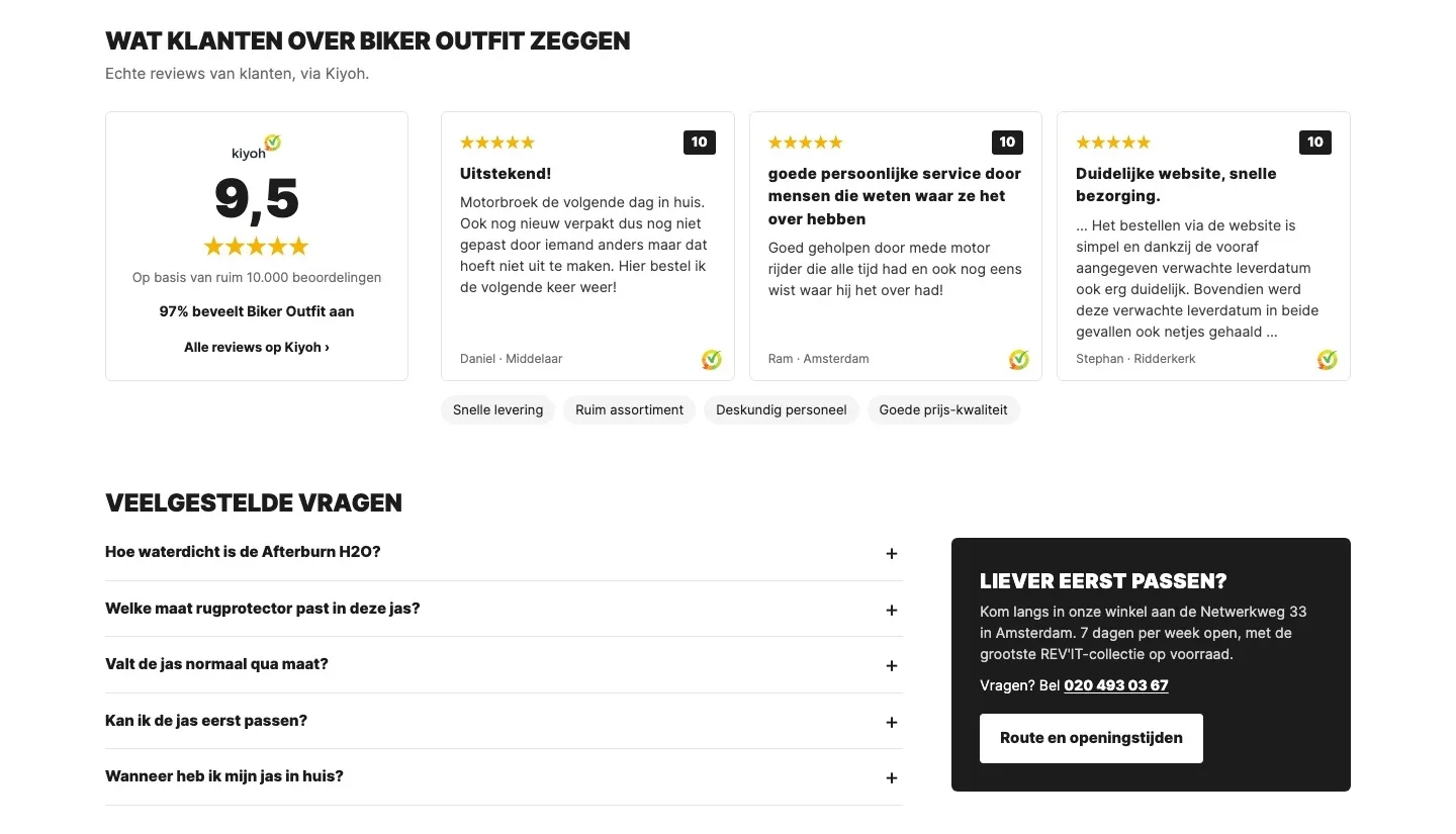
Reviews and questions.
Proof from customers and the answers on the page itself.
- 01Kiyoh reviews on the pageThere were no reviews on the page. Now three real Kiyoh reviews show what customers experience.
- 02Frequently asked questionsQuestions about waterproofing, size and trying on are now answered on the page, so nobody has to email.
- 03Rather try it on first?The 1,300 m² shop is a strong asset for people in doubt, now as a clear option next to the questions.
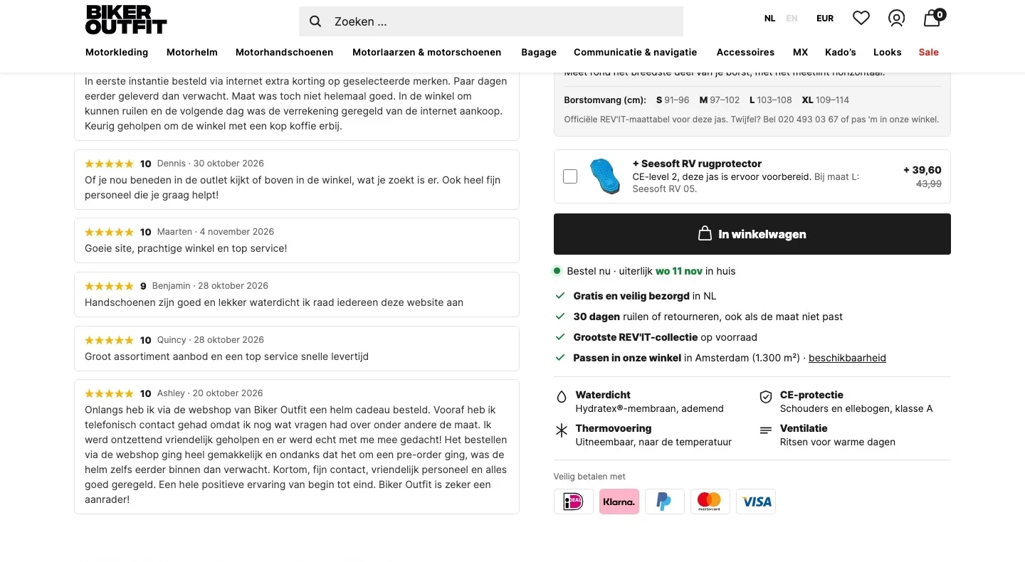
While scrolling.
Navigation, button and reviews stay within reach, without it getting busy.
- 01Compact headerThe black bar slides away as you scroll, giving the jacket more room. Search and menu stay within reach.
- 02Reviews next to the choiceUnder the photo you read recent Kiyoh reviews about fit, exchanges and delivery. That builds trust while you choose your size.
- 03Everything within reachButton, latest delivery date and payment logos sit next to the photo, so the decision is never far away.
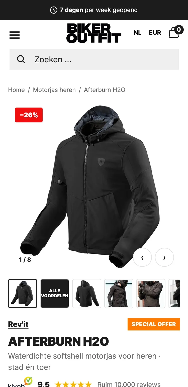
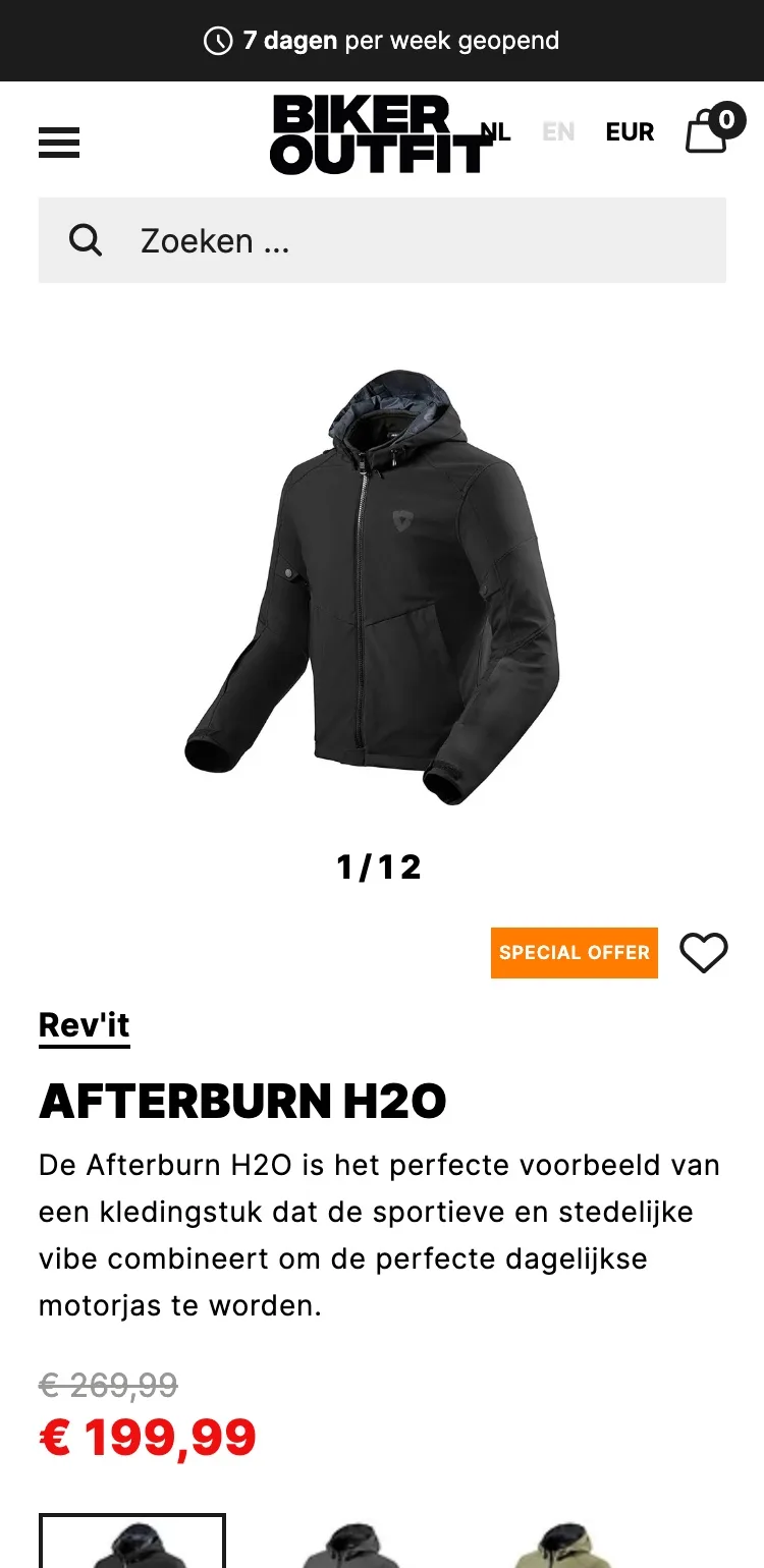
Product page.
On mobile, the jacket, the proof and the price right in view.
- 01Breadcrumb and thumbnailsOn mobile you saw ‘1/12’ without knowing what was coming. Thumbnails show all photos straight away, including the overview of the benefits.
- 02Score under the titleOn mobile the 9.5 from Kiyoh wasn’t near the product. Now it’s under the product name, where trust counts.
- 03Price with the saving‘Je bespaart €70’ (You save €70) makes the discount clear at a glance, even on a small screen.
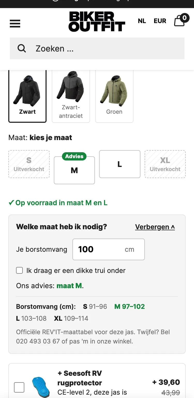
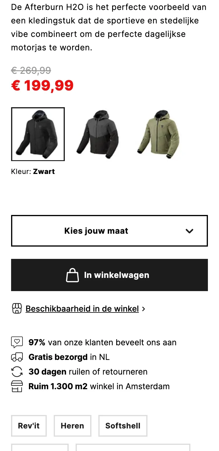
Choosing a size.
From a closed dropdown to advice that’s right straight away.
- 01Sizes at a glanceThe dropdown hid which sizes are in stock. Buttons show it right away, without an extra tap.
- 02Tailored adviceDoubt about the size is the biggest reason to drop out. Enter your chest size and you get the right advice right away.
- 03Stock by the sizesA green line shows which sizes are available right away, so nobody picks a size that’s sold out.
Around the button.
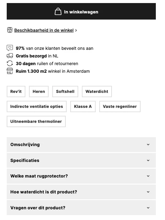
All the guarantees in one place, right under the button.
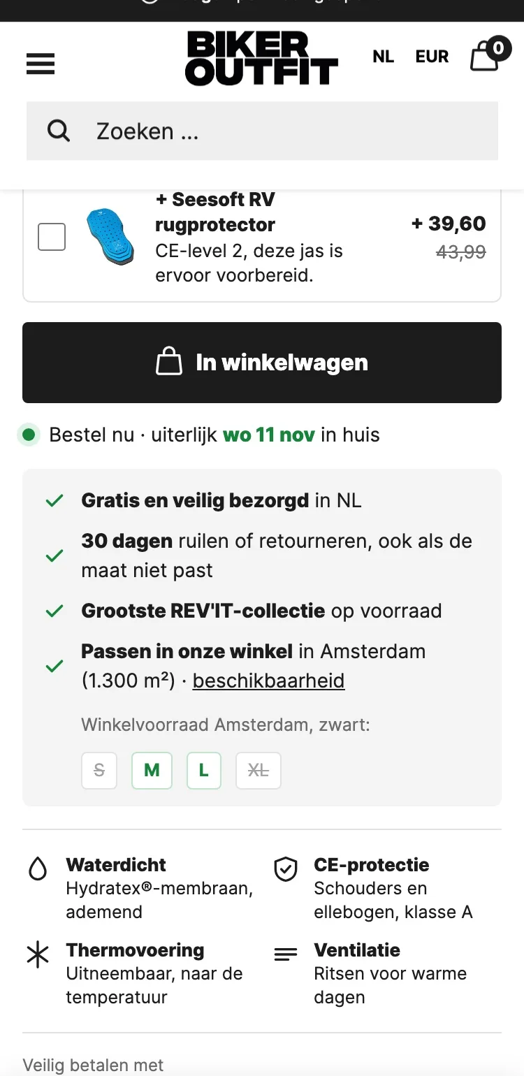
- 01Back protector includedThe jacket is prepared for a back protector. With one tick above the button you add it, in the right size.
- 02Delivery date and guaranteesThe latest day the jacket will arrive and that you can exchange it are now right under the button. That removes the last doubt.
- 03Shop stock per sizeIf you’d rather try it on first, you see right away whether your size is in the shop in Amsterdam. That saves a wasted trip.
What the jacket can do.
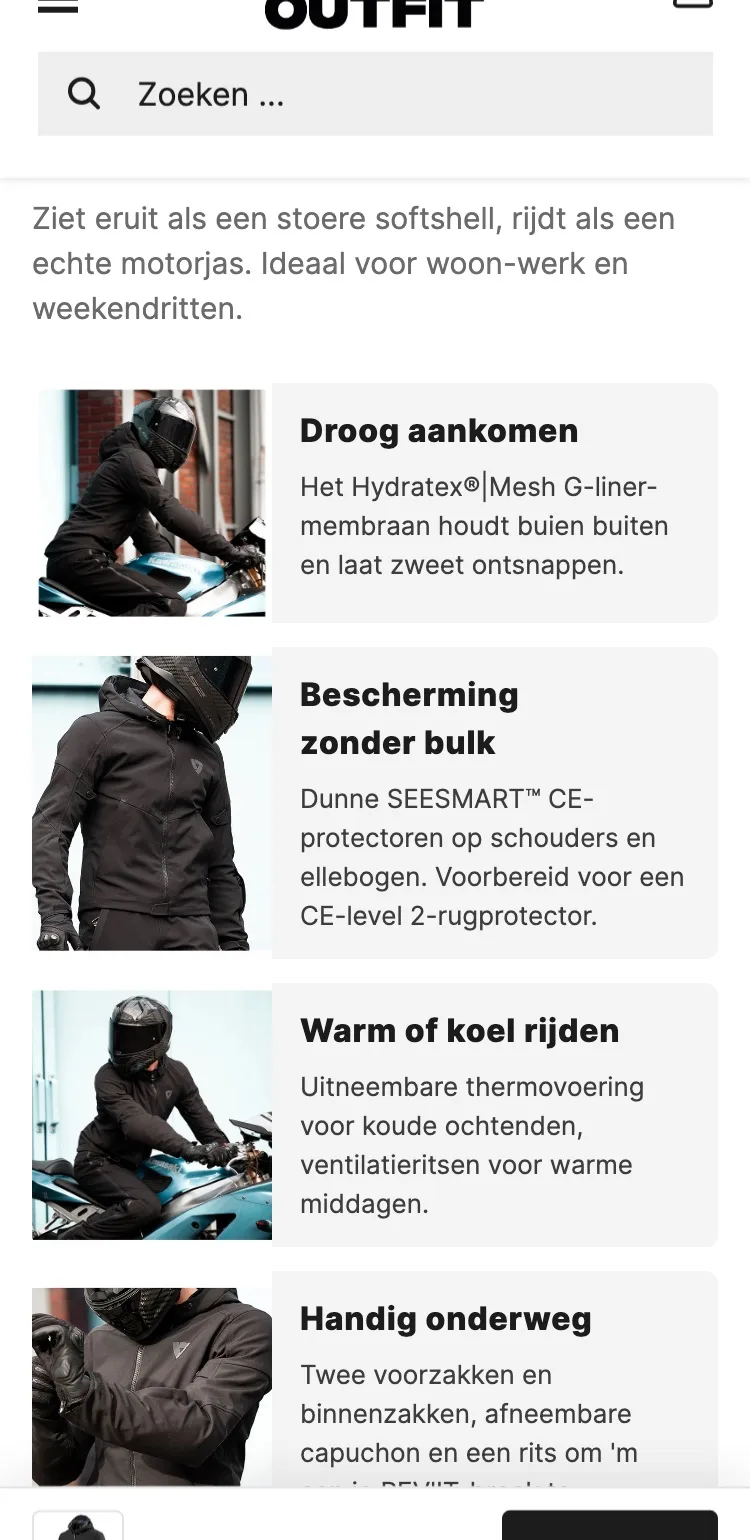
From closed blocks to benefits you scan on the go.
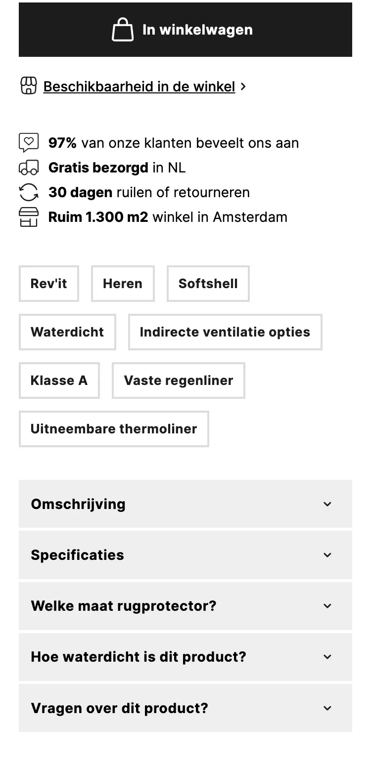
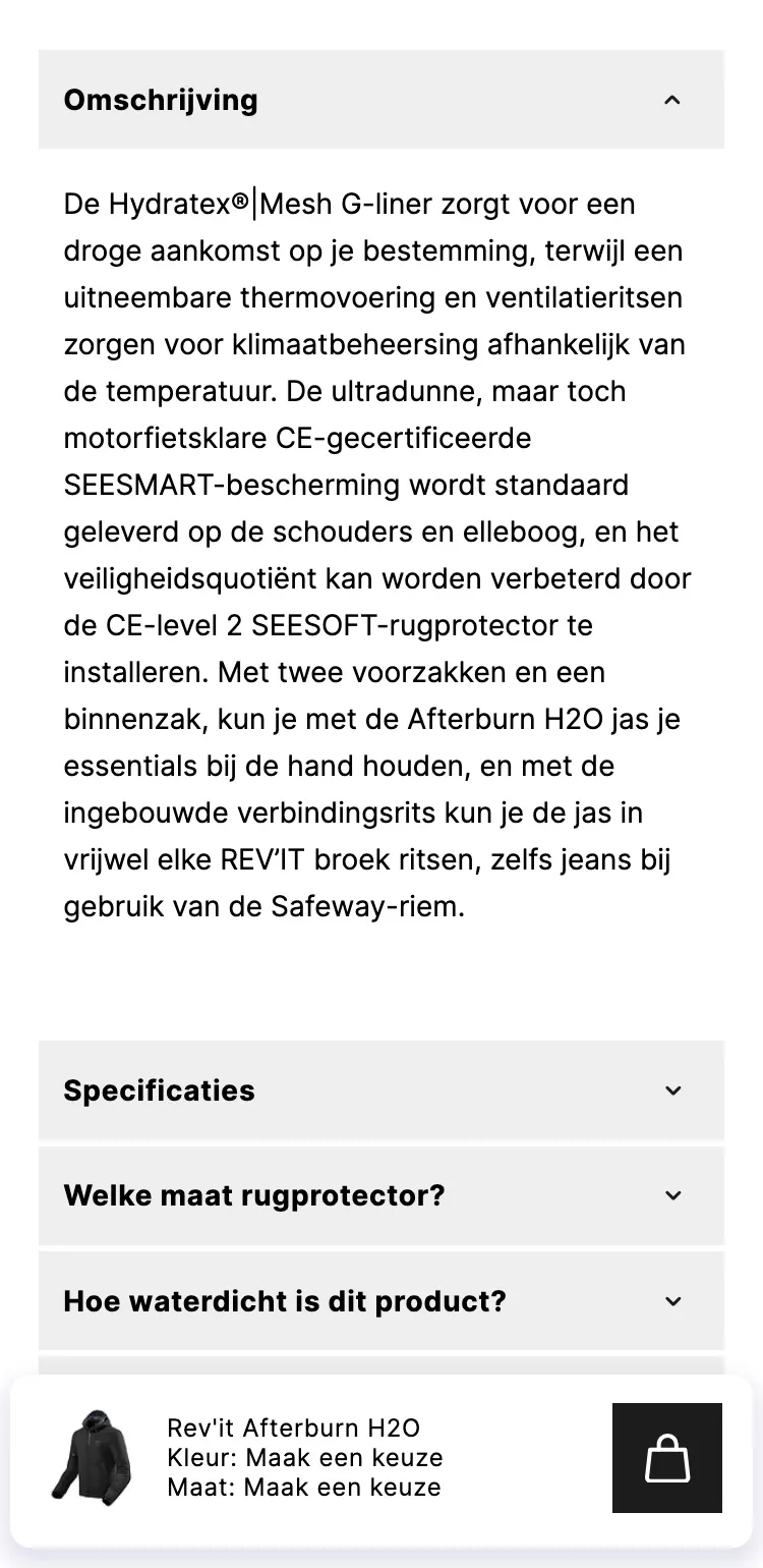
- 01Benefits with imagesNobody reads one long wall of text on a phone. Four blocks with images say the same in a few seconds.
- 02Honest about rainKnowing what the jacket is good for prevents returns. For hours of rain we honestly point to Gore-Tex.
- 03Specifications collapsedThe long table sits behind one button, so the page stays short for anyone who wants to order quickly.
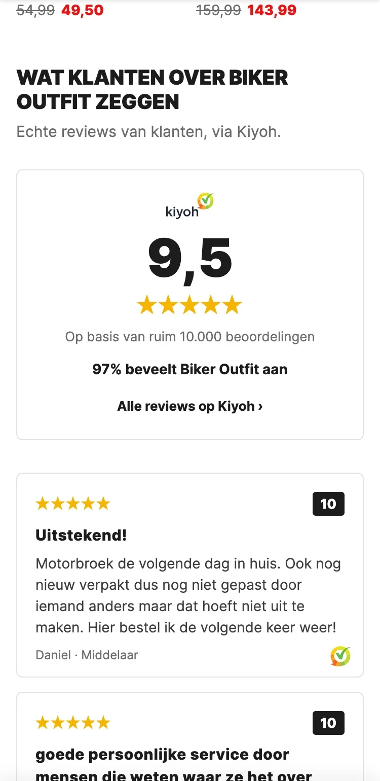
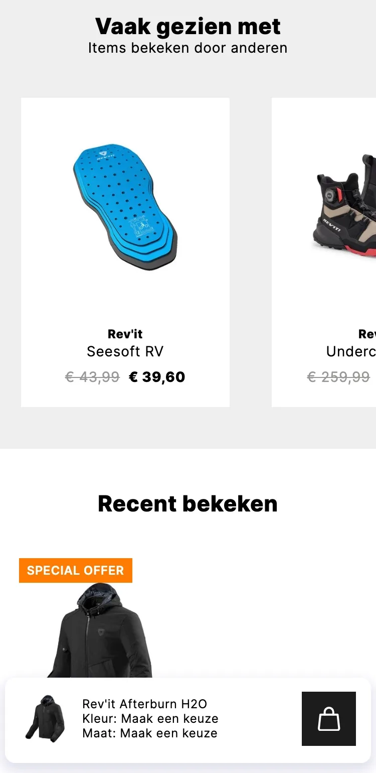
Reviews.
Over 10,000 reviews with a 9.5, on the page itself.
- 01Score with Kiyoh logoOn mobile there wasn’t a single review. A big 9.5 with the Kiyoh logo shows right away that Biker Outfit can be trusted.
- 02Real reviewsThree real reviews, taken word for word from Kiyoh, stacked and easy to read, with the Kiyoh icon as proof.
- 03What customers mentionFast delivery and expert staff as short labels: the reasons to buy here, at a glance.
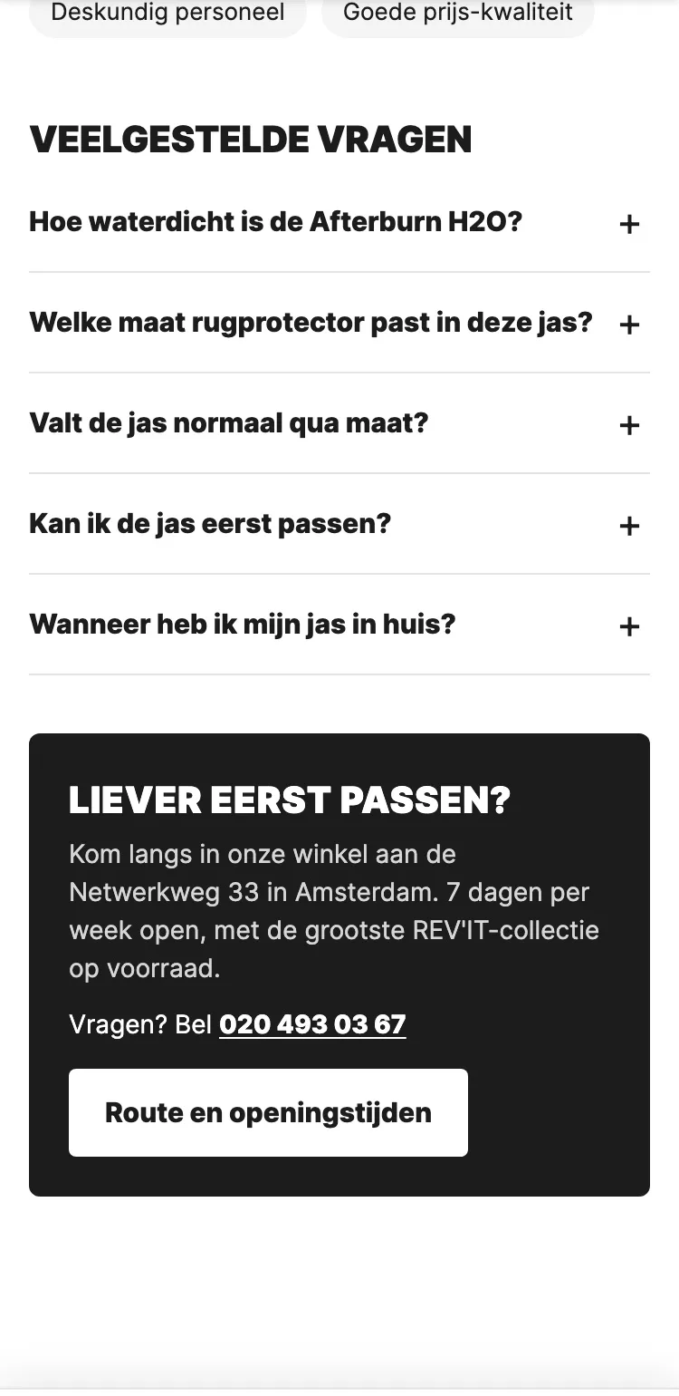
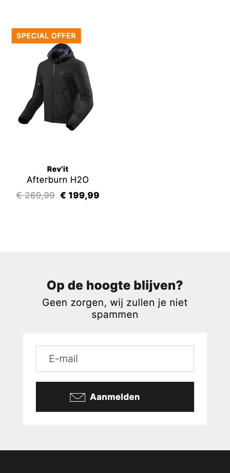
Questions and the shop.
Answers without having to email, and a reason to drop by.
- 01Frequently asked questionsQuestions about waterproofing, size and trying on are answered on the page, so nobody has to email or wait.
- 02Rather try it on first?The shop is a strong asset for anyone unsure about the size. Now it’s shown as a clear option.
- 03Call right awayOne tap and you’re calling the shop. For someone in doubt, that’s often the final push.
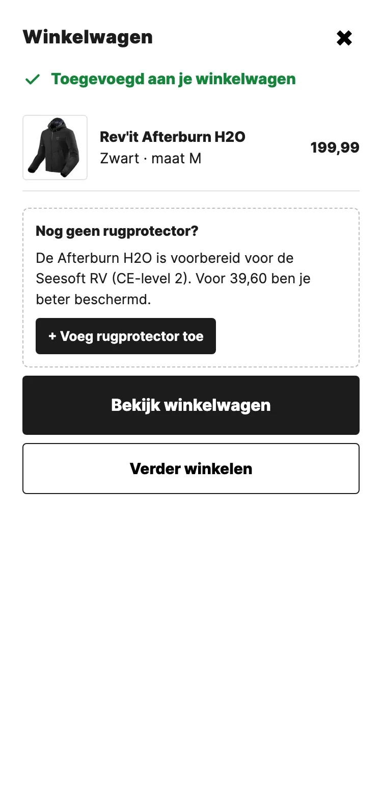
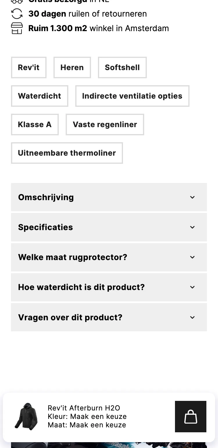
Ordering.
Always a button within reach, and a clear confirmation.
- 01Sticky buy barThe old bar showed ‘Maak een keuze’ (Make a choice) without a price. Now you always see your color, size, price and the button.
- 02Confirmation with your sizeAfter adding it you see right away what’s in your cart, so you know for sure it worked.
- 03Back protector as a tipIf you forgot the back protector, the confirmation offers it once more, to add with one tap.
Click through the new design yourself.
The design works like a real page, on desktop and on your phone. You just can’t place an order with it yet.
From design to more orders.
This is how we take the new design live, and measure what it delivers.
- 01Only the pageHeader, menu, USP bar and footer stay exactly as they are now. We only change the content of the product page.
- 02Test first, then go liveWe run the new design in an A/B test next to the current page and measure orders per visitor.
- 03Your own strengthsYour own photos, visuals, reviews and tone of voice: it all came from you already, just in a better place.
This design live
on your online store?
With the AI Design Agent, we put this design on your existing online store, and then keep improving it every month with CRO. Built by our specialists. Without spending thousands of euros a month on it.
- No rebuild, no migration
- Your back office stays the way you know it
- Only goes live after your approval
- 01Ongoing development for a fixed monthly feeNo separate quotes for every change. If we see an opportunity or you have an idea, we build it.
- 02CRO improvements, implemented right awayWe analyze your online store and implement improvements in days instead of months.
- 03Safe, and you see what changesWe build and test everything in a preview first. It only goes live after your approval, and every version is saved.