 Google Ads
 Meta Ads
 Email marketing
 Lightspeed eCom Toolkit
 Shopify Toolkit
Your product page,
redesigned.
A new design for the product page of beachim.nl: Dante6 Onique wide leg satin pants (orange). Below you see every screen before and after, and what we improved.
- 13 before-and-afters
- 24 improvements
- beachim.nl
Every screen, compared.
Pick a screen and drag across the screenshot. On the left you see the current page of beachim.nl, on the right the new design.
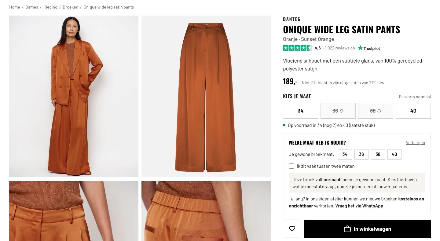
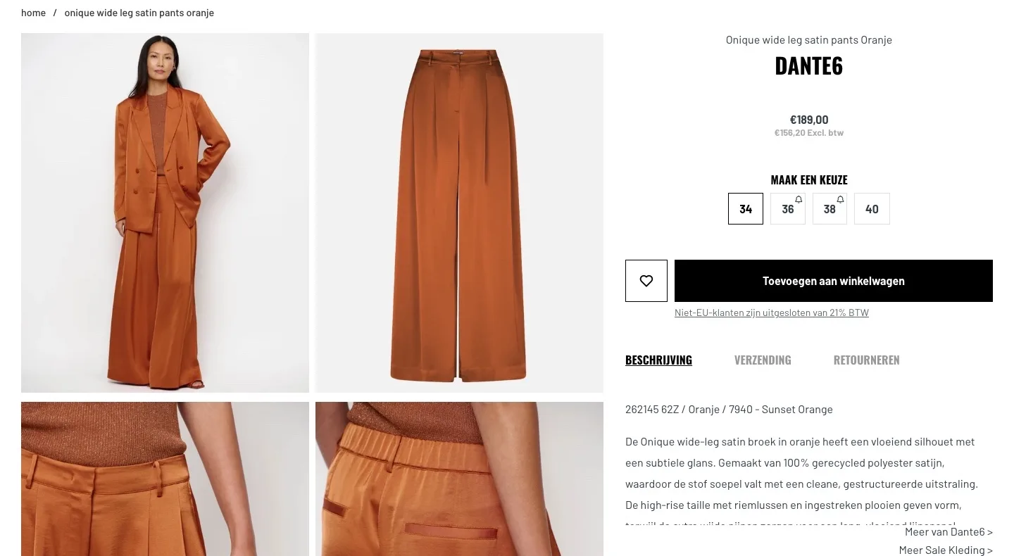
Product page.
Name, score, size and advice at a glance.
- 014.6 on Trustpilot by the nameYour 1,022 reviews were nowhere to be seen on the page. Now the score sits below the name, with the Trustpilot logo.
- 02First the pants, then the brandThe brand was big and the pants small. Now you read right away what it is, with the color and a short pitch about the fabric and drape.
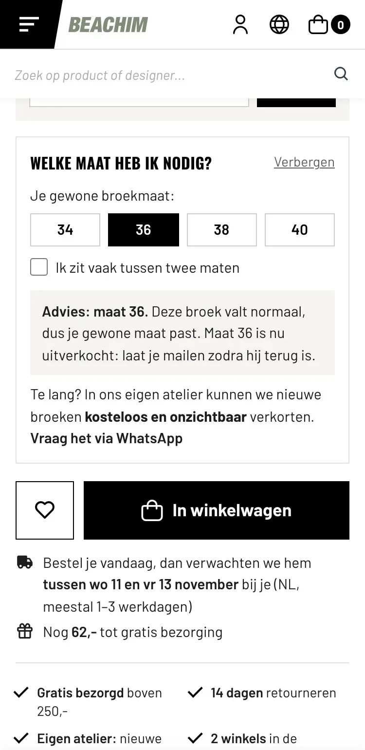
- 03Size help is openSize 34 was already selected and ‘pasvorm normaal’ (regular fit) was at the bottom. Now you choose yourself, with advice and the stock per size.
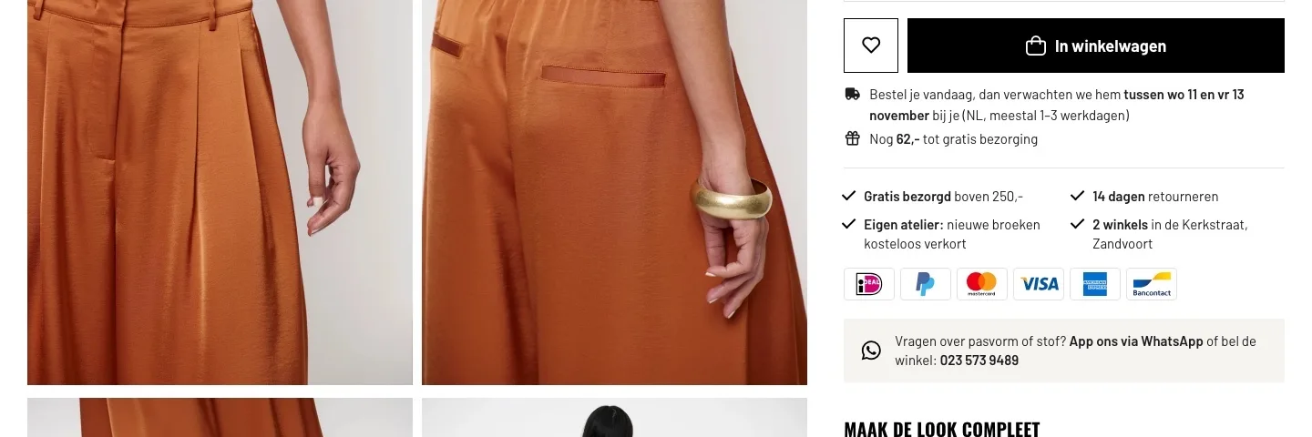
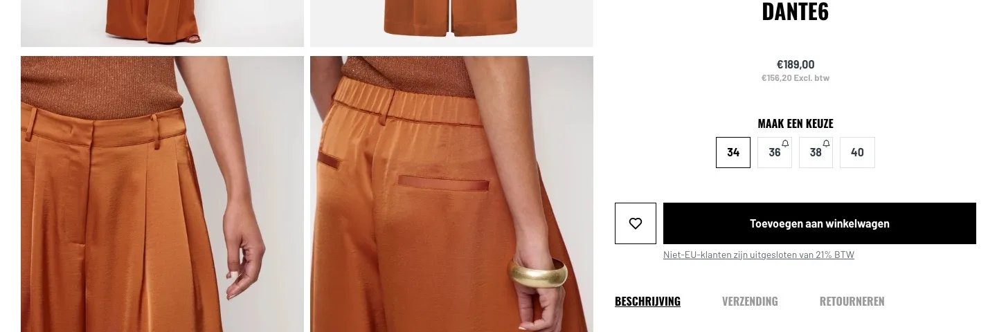
Around the button.
When it arrives and what you get, right by the button.
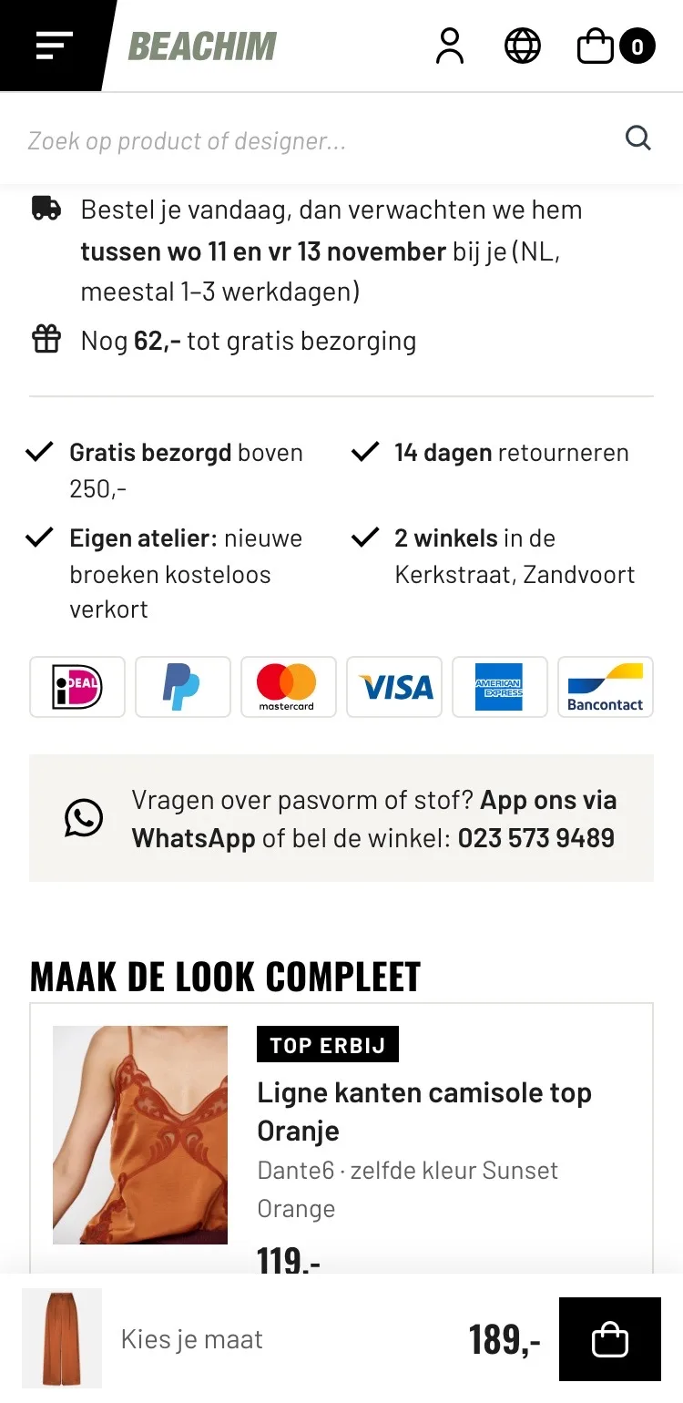
- 01You see when it arrivesThe delivery time was behind the ‘Verzending’ (Shipping) tab and the shipping costs weren’t on the page. Now you see below the button around which day it usually arrives.
- 02€62 to go until freeFree delivery over €250 was nowhere near the product. Now you see right below the button how much more you need for free delivery.
- 03Your own strong pointsThe atelier, two stores and WhatsApp weren’t near the product. Now they’re by the button, where the doubt comes up.
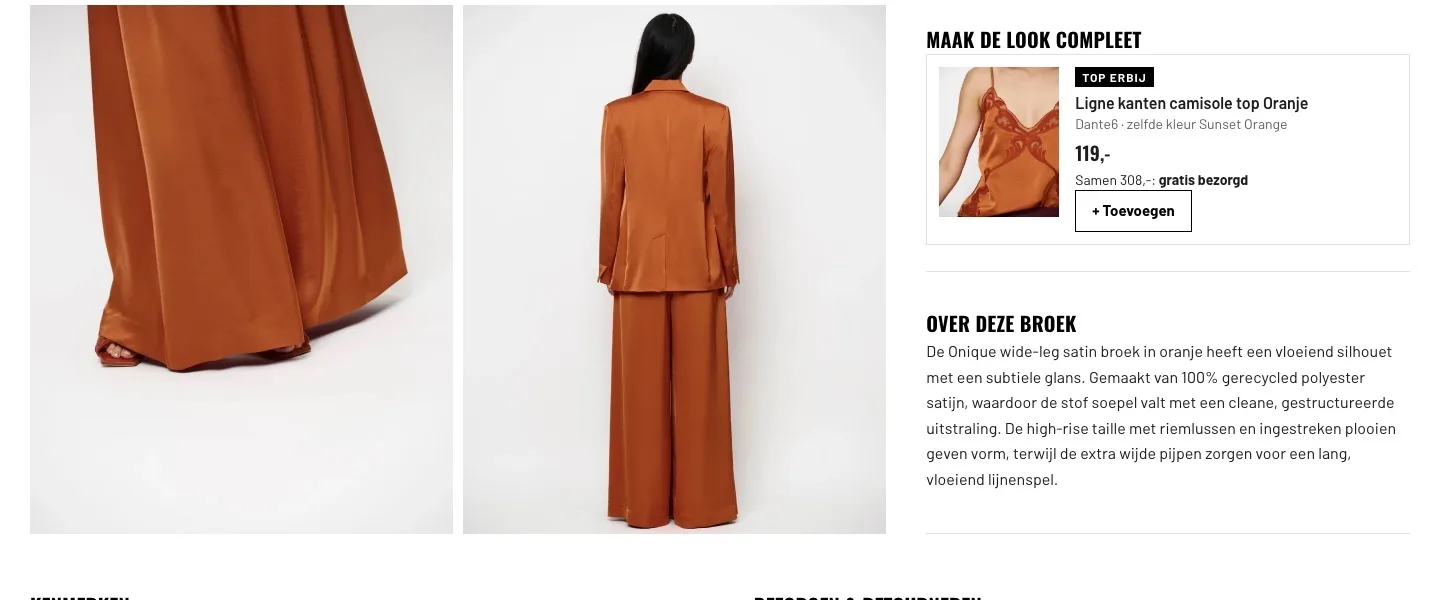
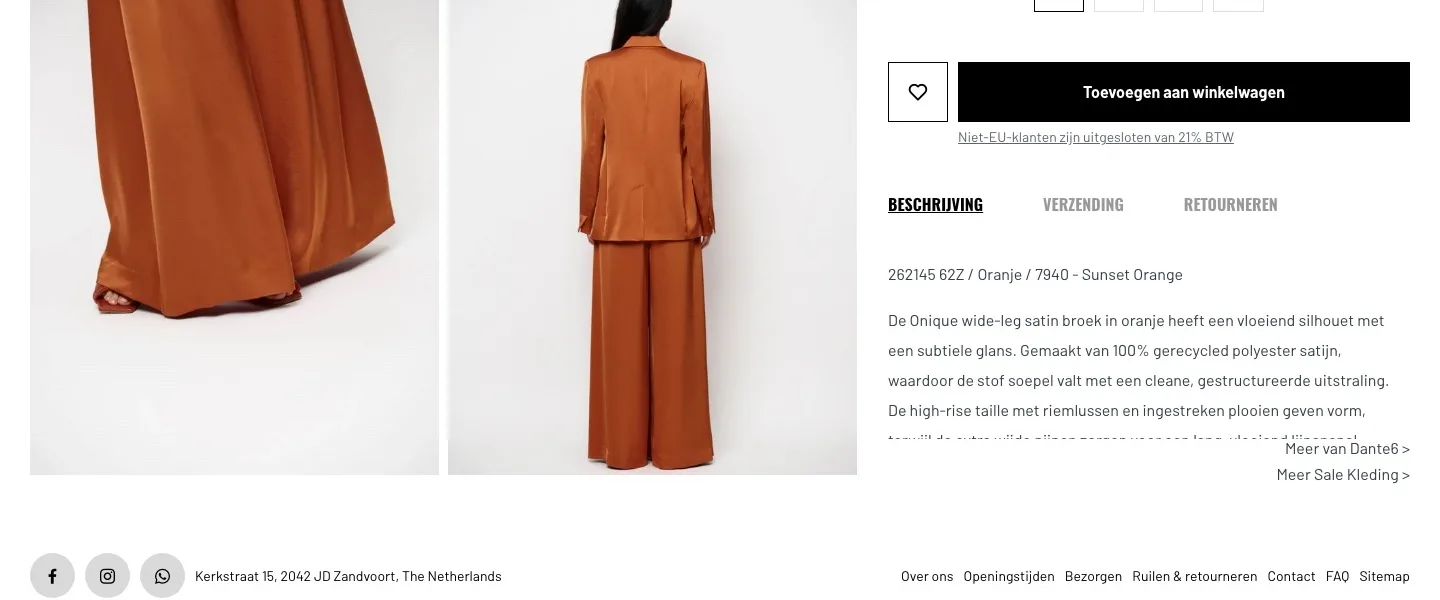
Look and description.
Completing the look and everything about the pants, next to the photos.
- 01Complete the lookThe matching top wasn’t shown with the pants; only on the homepage as ‘Shop the look’. Now it’s here, with its own button.
- 02Description fully readableThe text started with an item code, got cut off and ran under the links. Now it’s complete and calm.
- 03Each block its own headingDescription, shipping and returns were behind three tabs. Now each block has its own heading and you simply read everything one after the other.
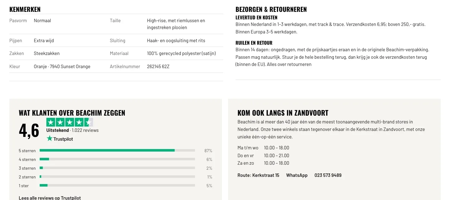
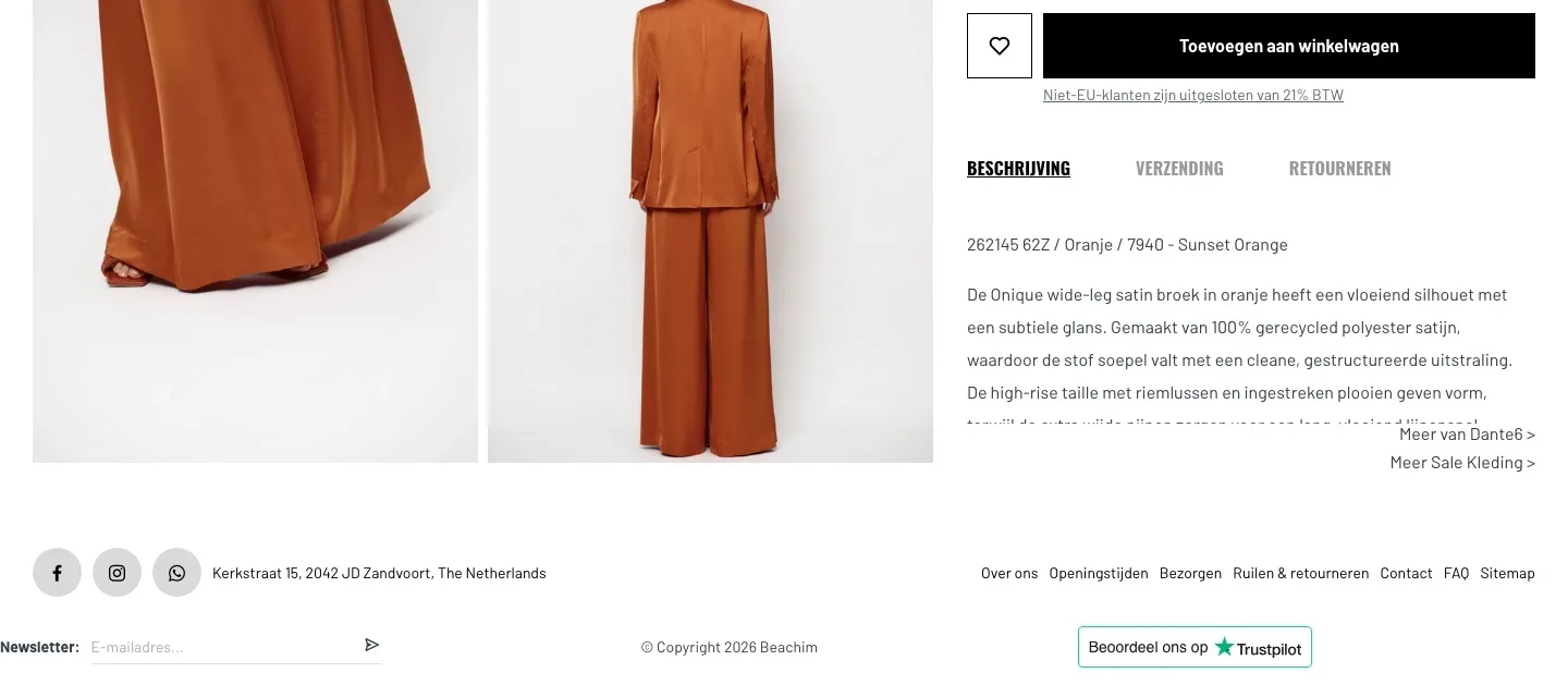
Features and reviews.
The facts side by side and the trust of 1,022 customers.
- 01Features side by sideWaist, closure and pockets were in the running text, fit and material separately below it. Now everything is together in one overview.
- 02Delivery and returns in shortThat information was in tabs and long texts. Now delivery time, costs and 14-day returns sit together, short and clear.
- 03Reviews that convinceThe footer only said ‘Beoordeel ons op Trustpilot’ (Rate us on Trustpilot). Now you see the 4.6, the breakdown and a link to all reviews.
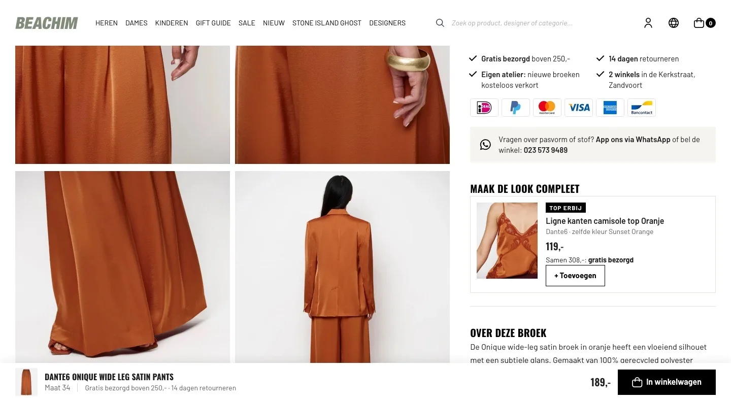
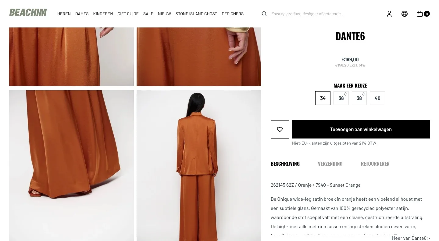
While scrolling.
The button stays within reach, even by the photos.
- 01Compact bar at the bottomOn the live site the whole buy block scrolled along, with tabs and text. Now only a calm bar with photo, size and price stays in view while you look.
- 02Your chosen size includedThe bar shows the size you picked, so you can order without scrolling back up.
- 03Benefits by the buttonFree delivery and 14-day returns travel along in the bar, at the moment you decide.
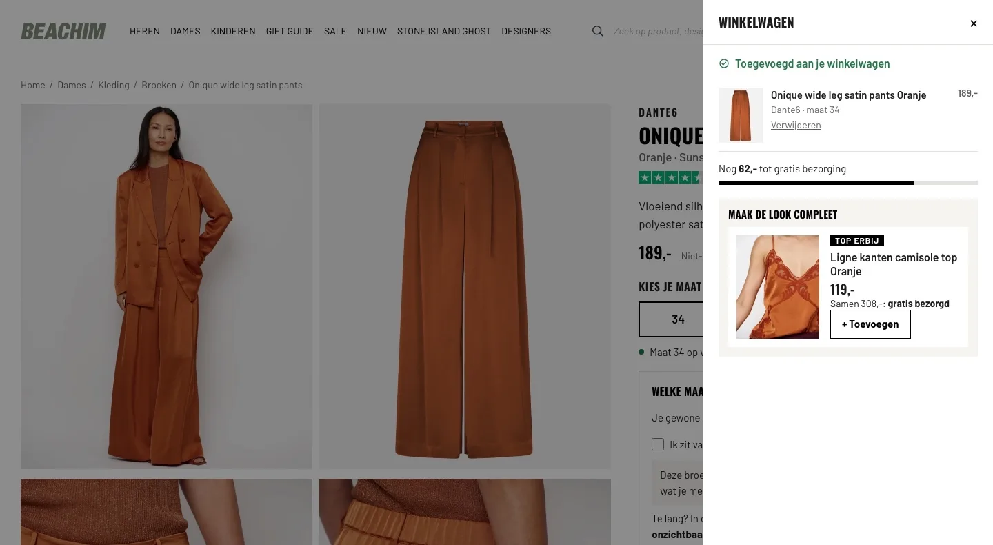
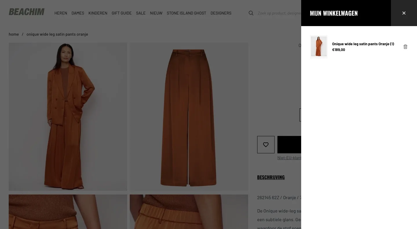
After adding to cart.
Confirmation and the next step on the page.
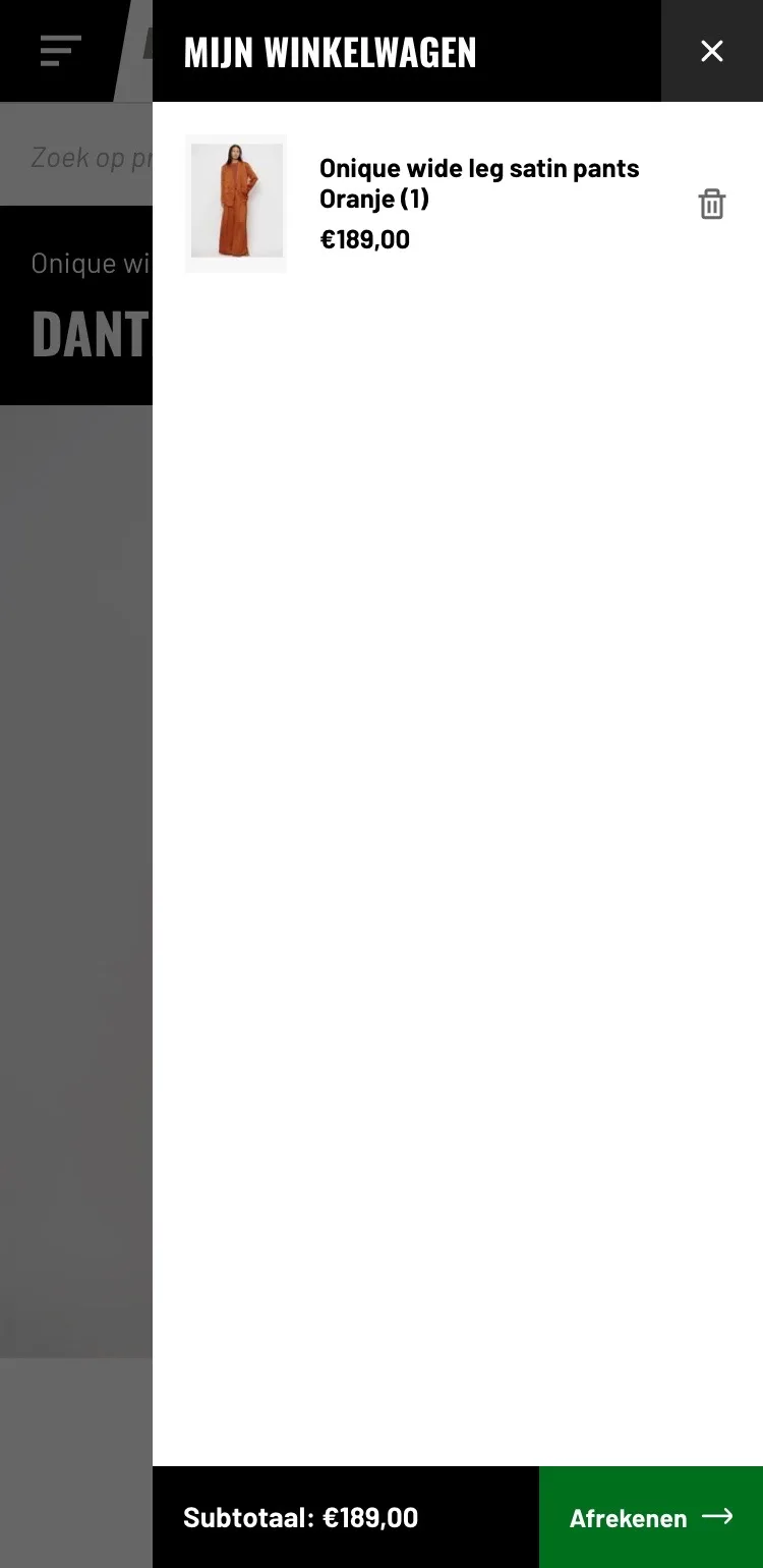
- 01Panel stays openOn the live site the cart panel closed again after a second. Now it stays open, with a free delivery bar and the top.
- 02Free delivery in sightA bar shows how much more you need for free delivery, at the moment you might still add something.
- 03The top as a logical additionThe matching camisole top is right there with one button, so the look is complete.
Product page.
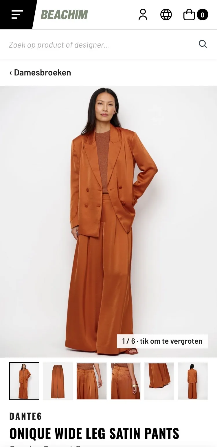
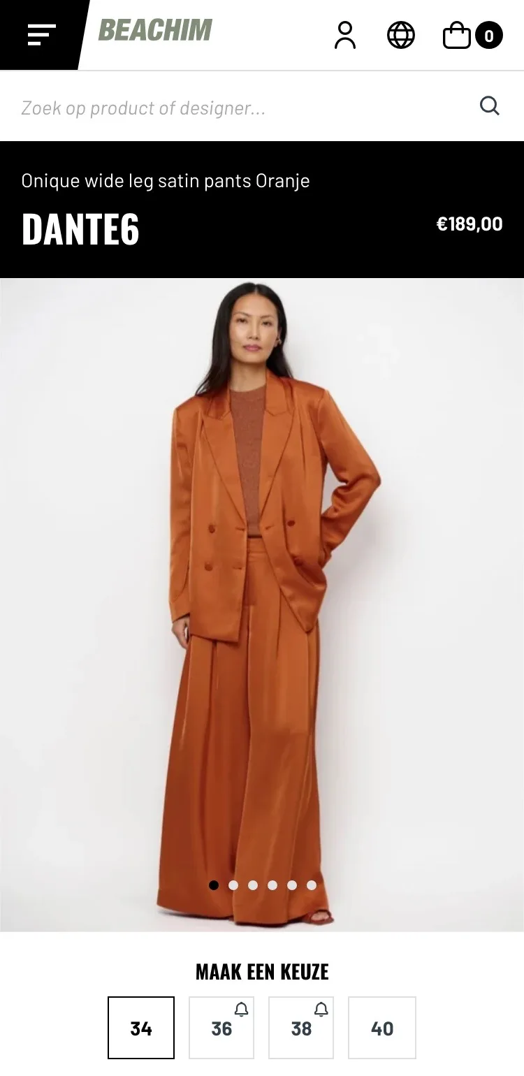
Photos and all images within thumb’s reach.
- 01Back to the categoryOn mobile there was no breadcrumb; only ‘Meer van Dante6 >’ (More from Dante6 >) at the bottom of the text. Now ‘‹ Damesbroeken’ (Women’s pants) takes you back in one tap.
- 02All photos in a rowBelow the photo there were only dots. Now you see thumbnails of all six images and tap straight to the right one.
- 03Tap to enlargeNothing said you could enlarge a photo. Now you see it by the counter, so you can look at the fabric up close.
Choosing.
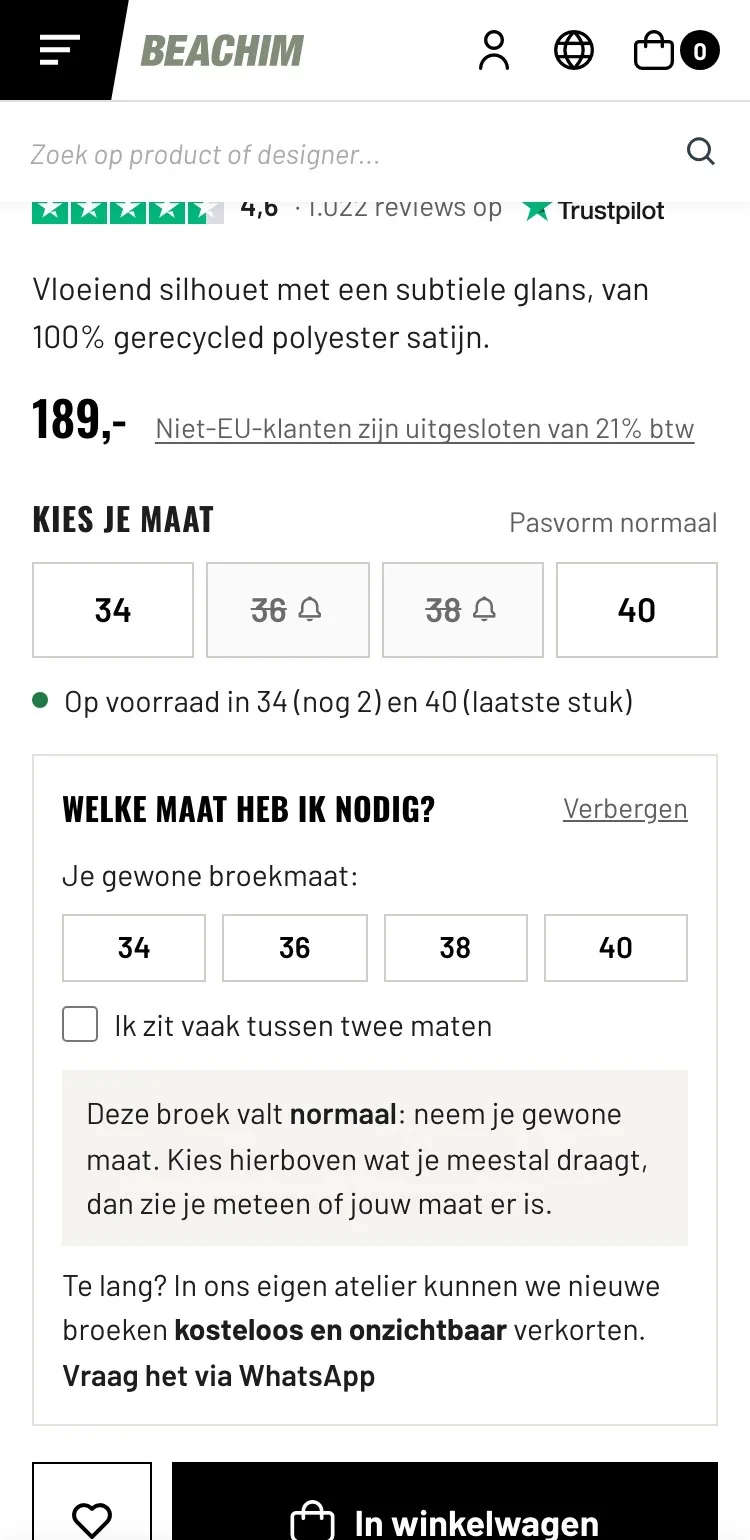
Score, price and size neatly one below the other.
- 01Trust by the nameOn mobile there was no score. Now you see the 4.6 from Trustpilot right below the name of the pants.
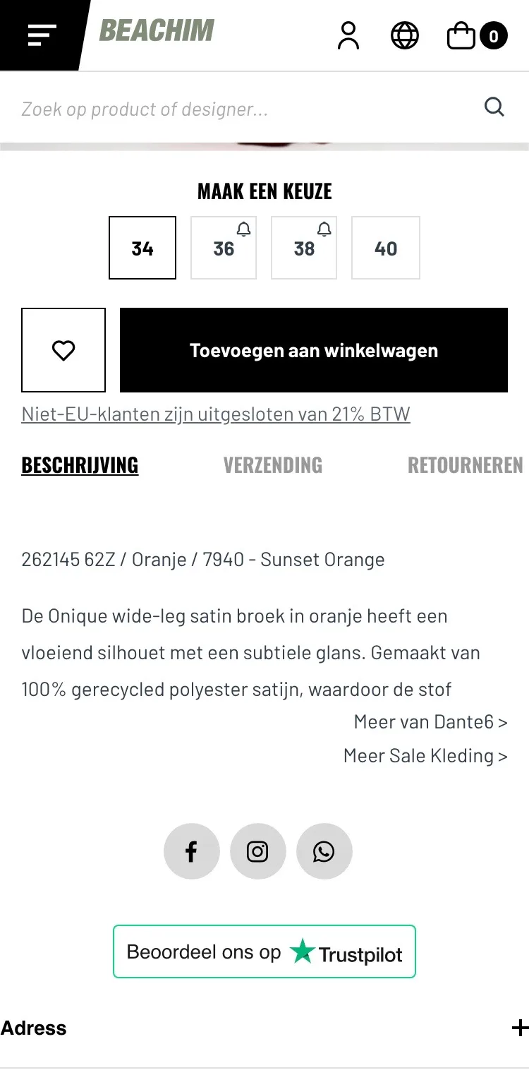
- 02Stock per sizeYou couldn’t see that only 2 are left in size 34. Now the stock per size is shown right there.
- 03Sold out is clear36 and 38 only had a small bell. Now they’re struck through, so you see right away which sizes are still available.
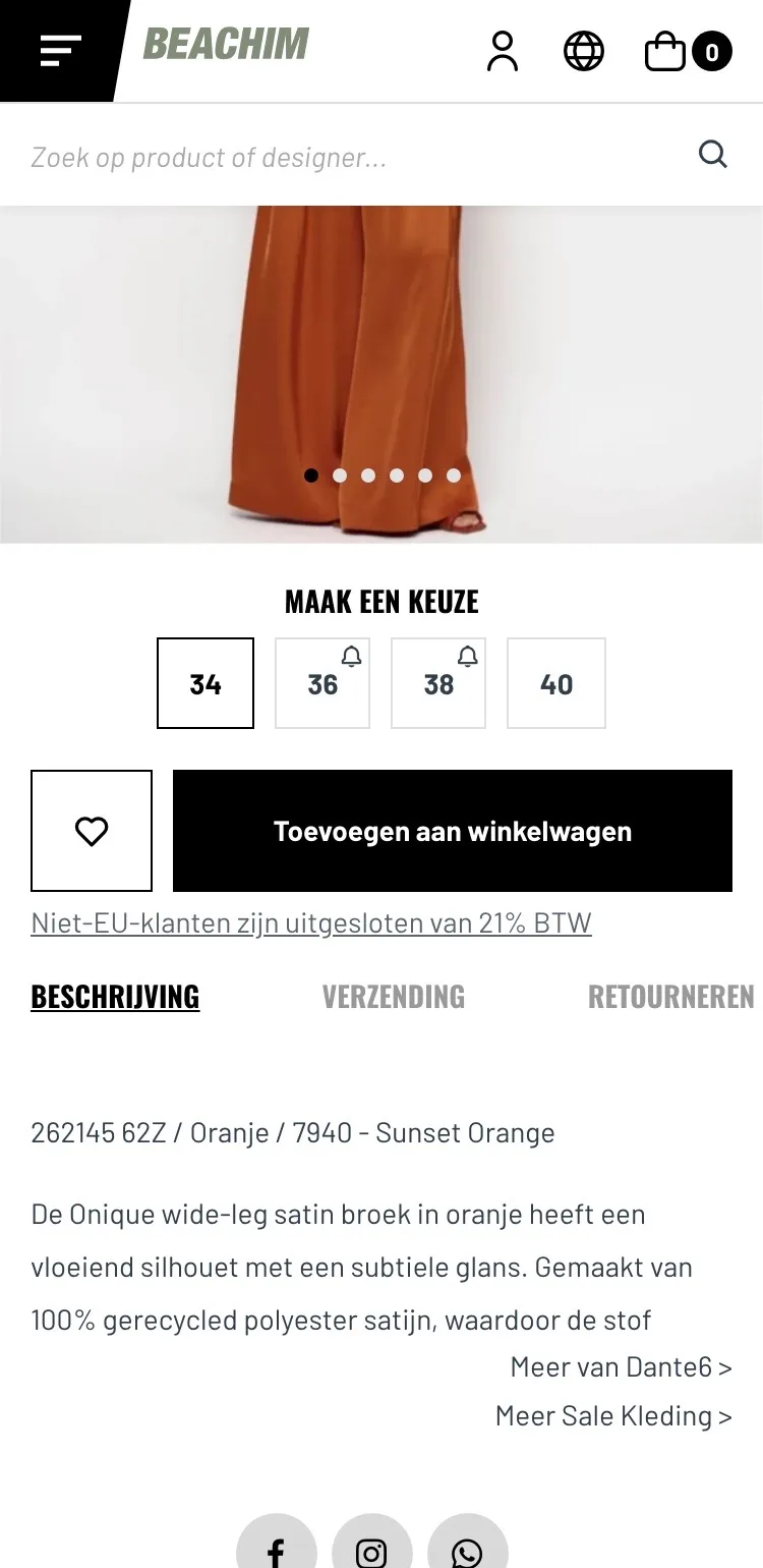
Size help.
Advice that responds to your size right away.
- 01Advice for your sizeThere was no size help. Now you choose your usual size and see right away which size fits and whether it’s available.
- 02Between two sizes?With one checkbox the advice adjusts, with the reason included. That way you order two sizes less often.
- 03Too long? AtelierThat you shorten new pants free of charge wasn’t shown with the product. Now it’s where the doubt about the length comes up.
Around the button.
Delivery day, free delivery and help below the button.
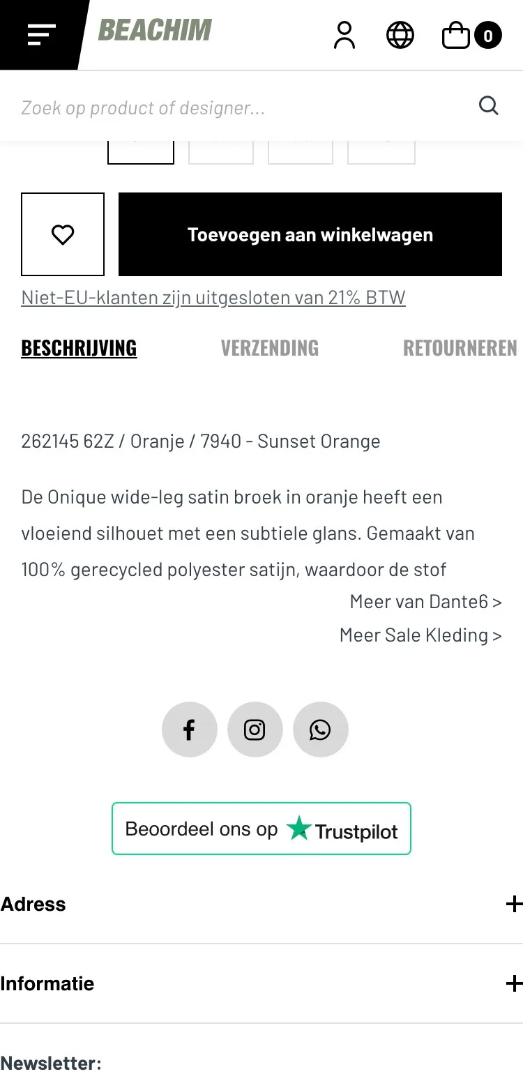
- 01When it arrivesBelow the button there was only a VAT line. Now you see between which days you’ll usually have the pants at home.
- 02Benefits and payment logosBy the button there were no benefits and nowhere did it say how you can pay. Now you see free over €250, 14-day returns and six payment logos.
- 03Message in one tapWhatsApp was only an icon in the footer. Now you can message right away with a question about fit or fabric.
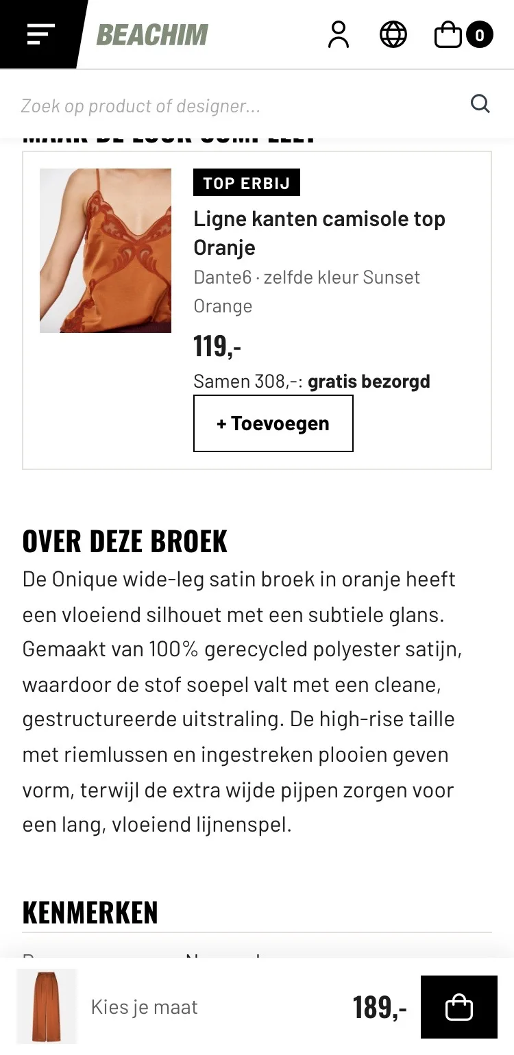
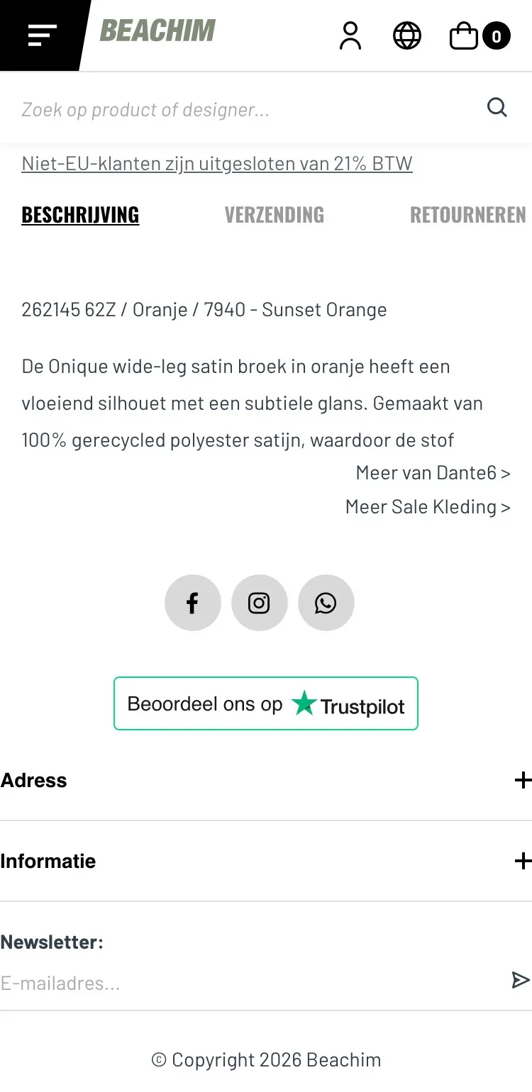
Look and description.
Add to your look and everything about the pants, without tabs.
- 01The top includedThe matching top wasn’t shown with the pants. Now you see it with its price, label and its own button.
- 02No cut-off textThe description was cut off halfway under the links. Now you read the whole text calmly.
- 03No more tabsDescription, shipping and returns were behind three tabs. Now you simply scroll past them.
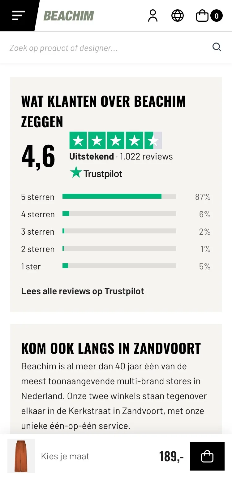
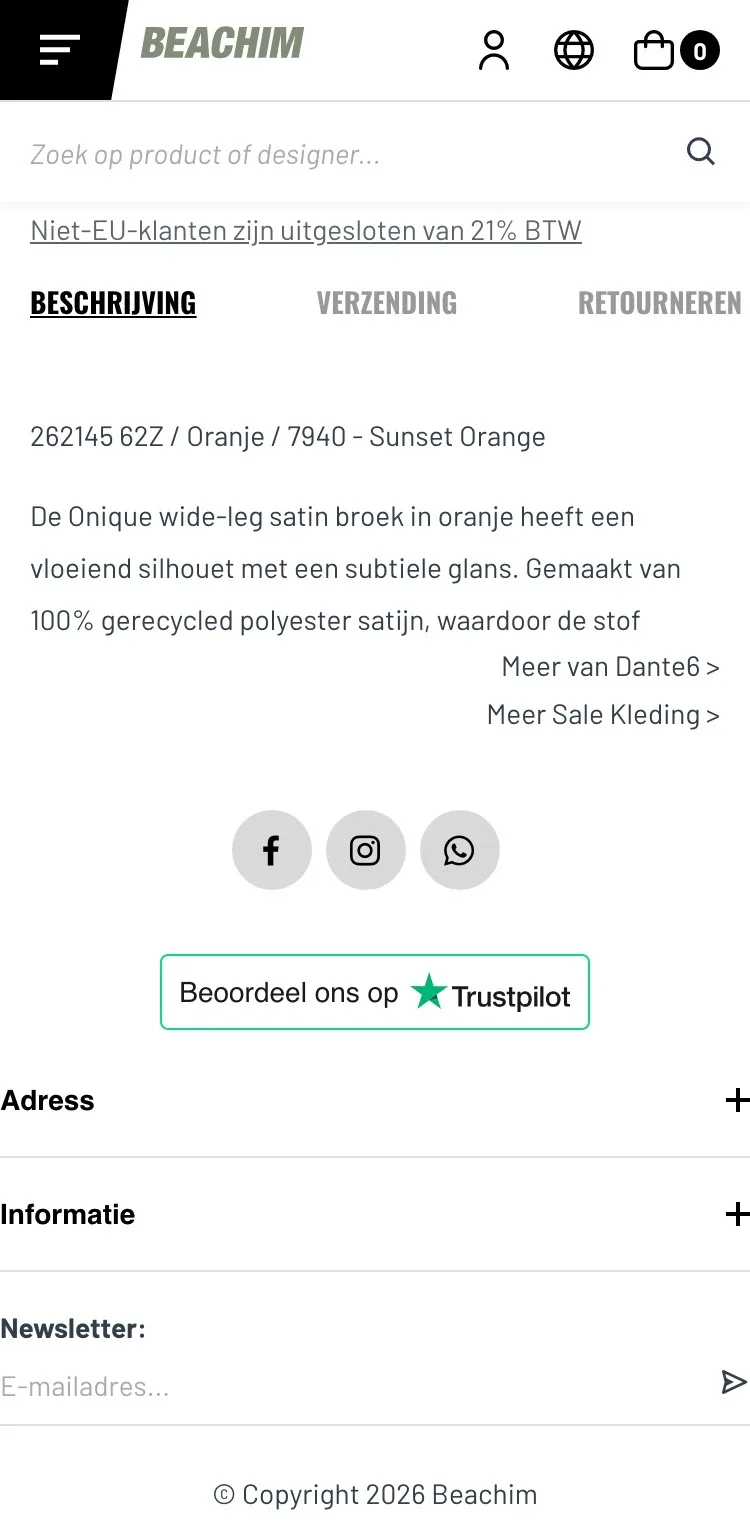
Reviews and store.
The trust of customers and your two stores in Zandvoort.
- 014.6 from 1,022 reviewsOn mobile it only said ‘Beoordeel ons op Trustpilot’ (Rate us on Trustpilot). Now you see the score and how customers rate you.
- 02Two real storesThat there are two stores in Zandvoort wasn’t visible near the product. Now the hours and directions are included.
- 03Call or messageContact was only a link and a WhatsApp icon in the footer; no phone number on the page. Now you call or message in one tap.
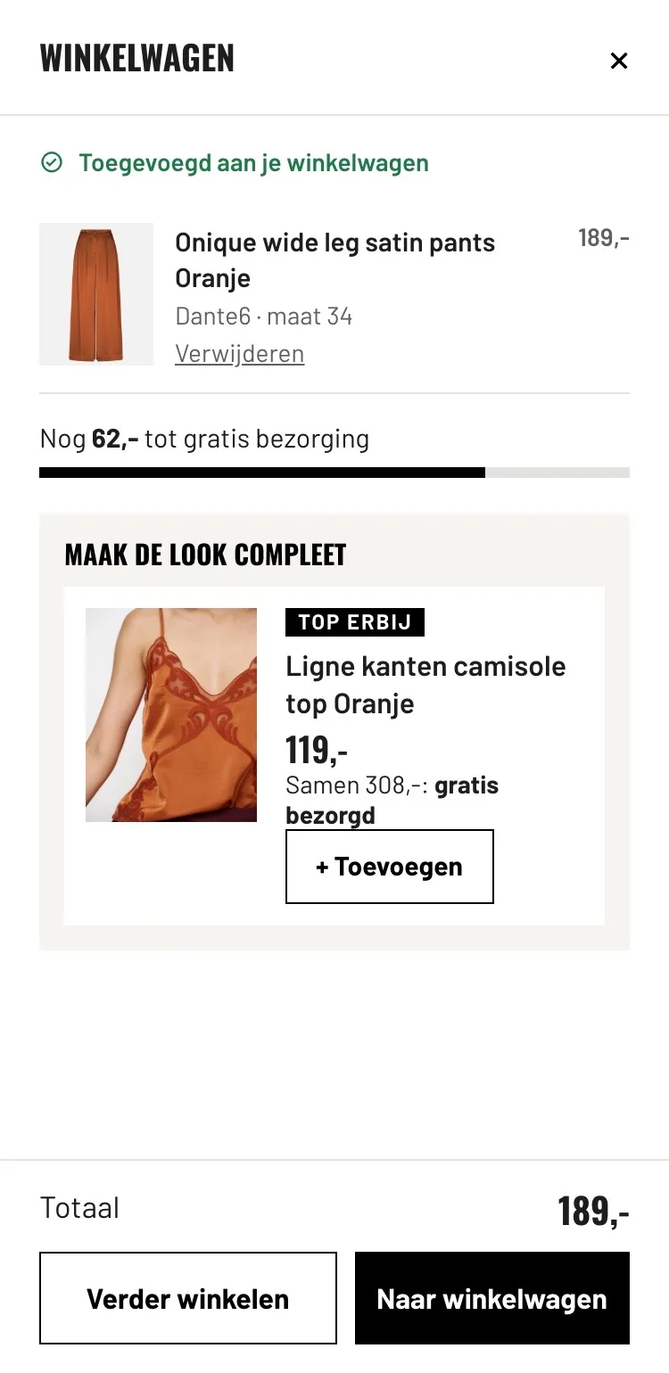
After adding to cart.
Confirmation with the next step.
- 01Panel stays openOn the live site the cart panel closed again after a second. Now it stays open, with the delivery bar and the top.
- 02Free delivery as a goalA bar shows how much more you need for free delivery.
- 03The look in one tapThe matching top is right there, with its own button.
Click through the new design yourself.
The design works like a real page, on desktop and on your phone. You just can’t place an order with it yet.
From design to more orders.
This is how we take the new design live, and measure what it delivers.
- 01Only the pageHeader, menu, USP bar and footer stay exactly as they are now. We only change the content of the product page.
- 02Test first, then go liveWe run the new design in an A/B test next to the current page and measure orders per visitor.
- 03Your own strengthsYour own photos, visuals, reviews and tone of voice: it all came from you already, just in a better place.
This design live
on your online store?
With the AI Design Agent, we put this design on your existing online store, and then keep improving it every month with CRO. Built by our specialists. Without spending thousands of euros a month on it.
- No rebuild, no migration
- Your back office stays the way you know it
- Only goes live after your approval
- 01Ongoing development for a fixed monthly feeNo separate quotes for every change. If we see an opportunity or you have an idea, we build it.
- 02CRO improvements, implemented right awayWe analyze your online store and implement improvements in days instead of months.
- 03Safe, and you see what changesWe build and test everything in a preview first. It only goes live after your approval, and every version is saved.