 Google Ads
 Meta Ads
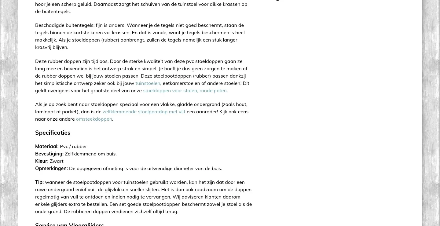
 Email marketing
 Lightspeed eCom Toolkit
 Shopify Toolkit
Your product page,
redesigned.
A new design for the product page of vloerglijders.nl: Stoelpootdoppen - ombuis - rubber (chair leg caps, outer fit, rubber). Below you see every screen before and after, and what we improved.
- 14 before-and-afters
- 21 improvements
- vloerglijders.nl
Every screen, compared.
Pick a screen and drag across the screenshot. On the left you see the current page of vloerglijders.nl, on the right the new design.
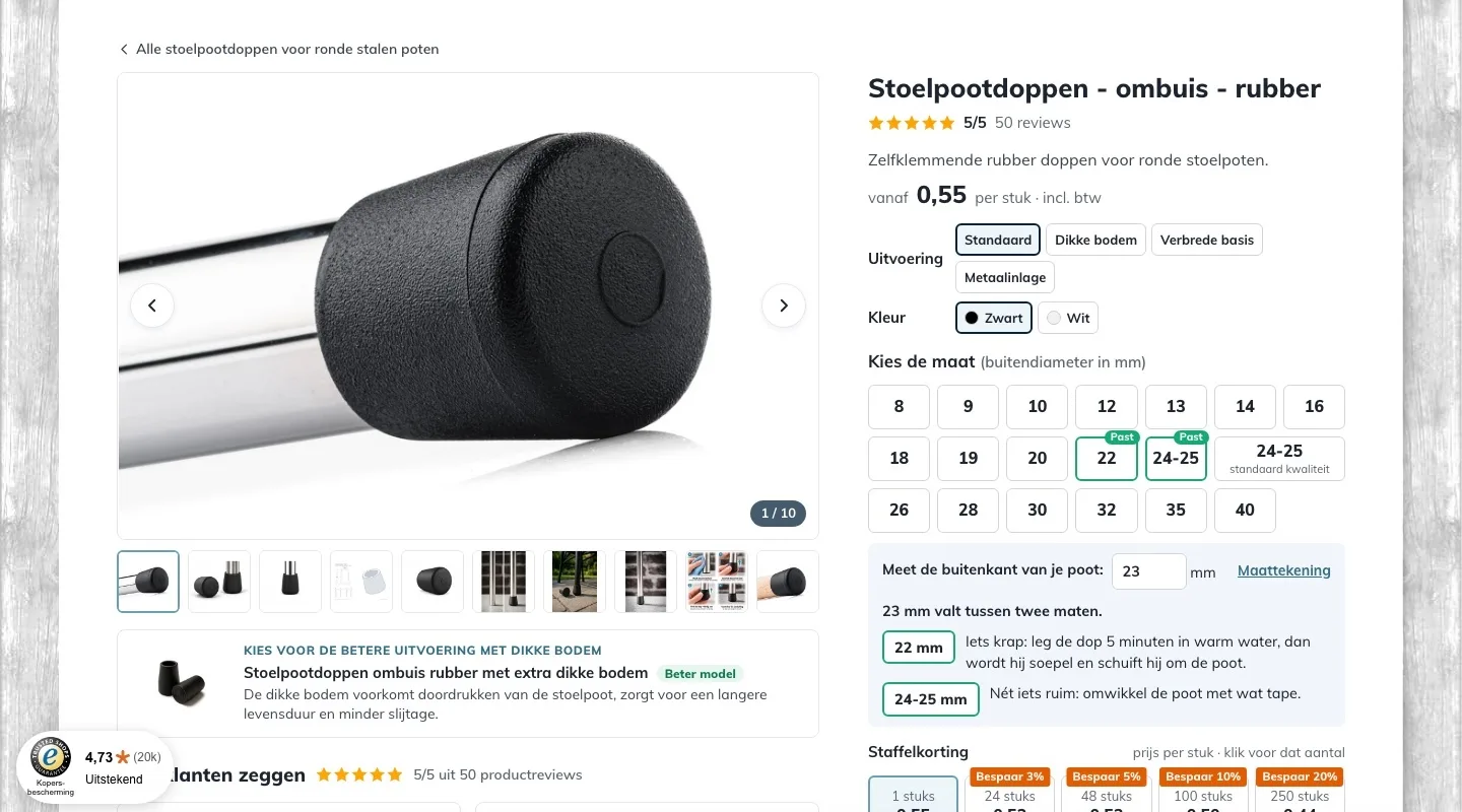
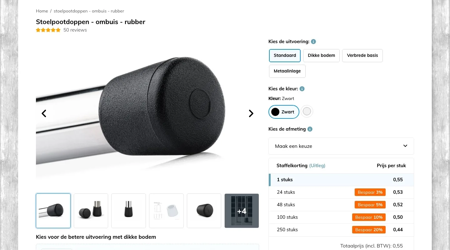
Product page.
Choosing and measuring your size, right next to the photo.
- 01All sizes at a glanceThe 19 sizes were in a dropdown ‘Maak een keuze’ (Make a choice). Now they sit side by side as buttons and you choose with one click.
- 02Help with measuringHow to measure was in the Maatvoering (Sizing) tab. Now you enter your size and see which cap fits, even between two sizes.
- 03Price right by the nameThe price was only in the tiered pricing and the total, for 8 mm. Now you see it right by the name.
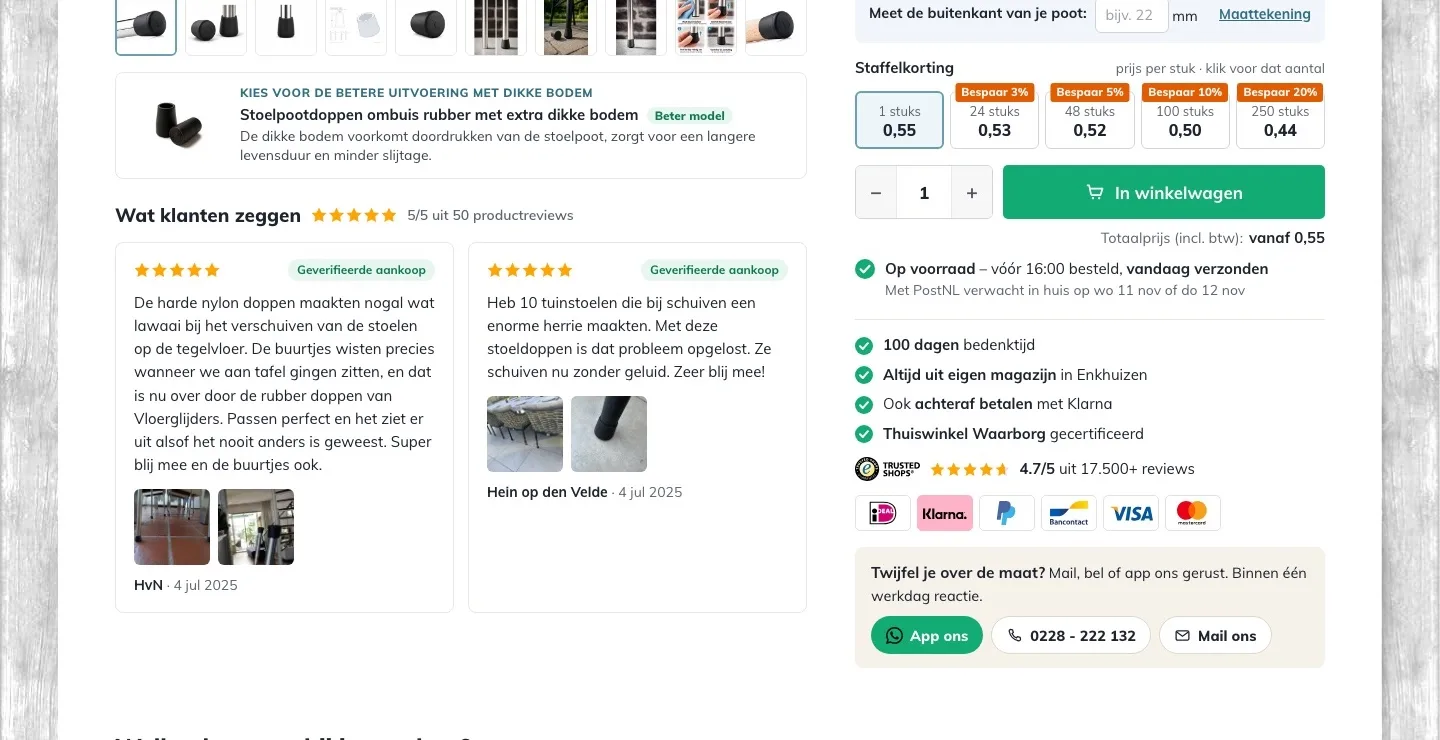
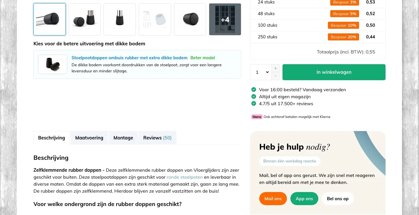
Next to the photo and by the button.
Customer experiences and everything that gives certainty.
- 01Reviews next to the photoBelow the photo, the ‘Beter model’ (Better model) was followed by long tabs. Now the Beter model is compact, with customer experiences and their photos below it.
- 02When it arrivesBy the button it said ‘vandaag verzonden’ (shipped today). Now you also see on which day PostNL expects to deliver it.
- 03Trust below the buttonBelow the button were three check marks and a Klarna line. Now also 100 days to change your mind, Thuiswinkel Waarborg and the payment logos.
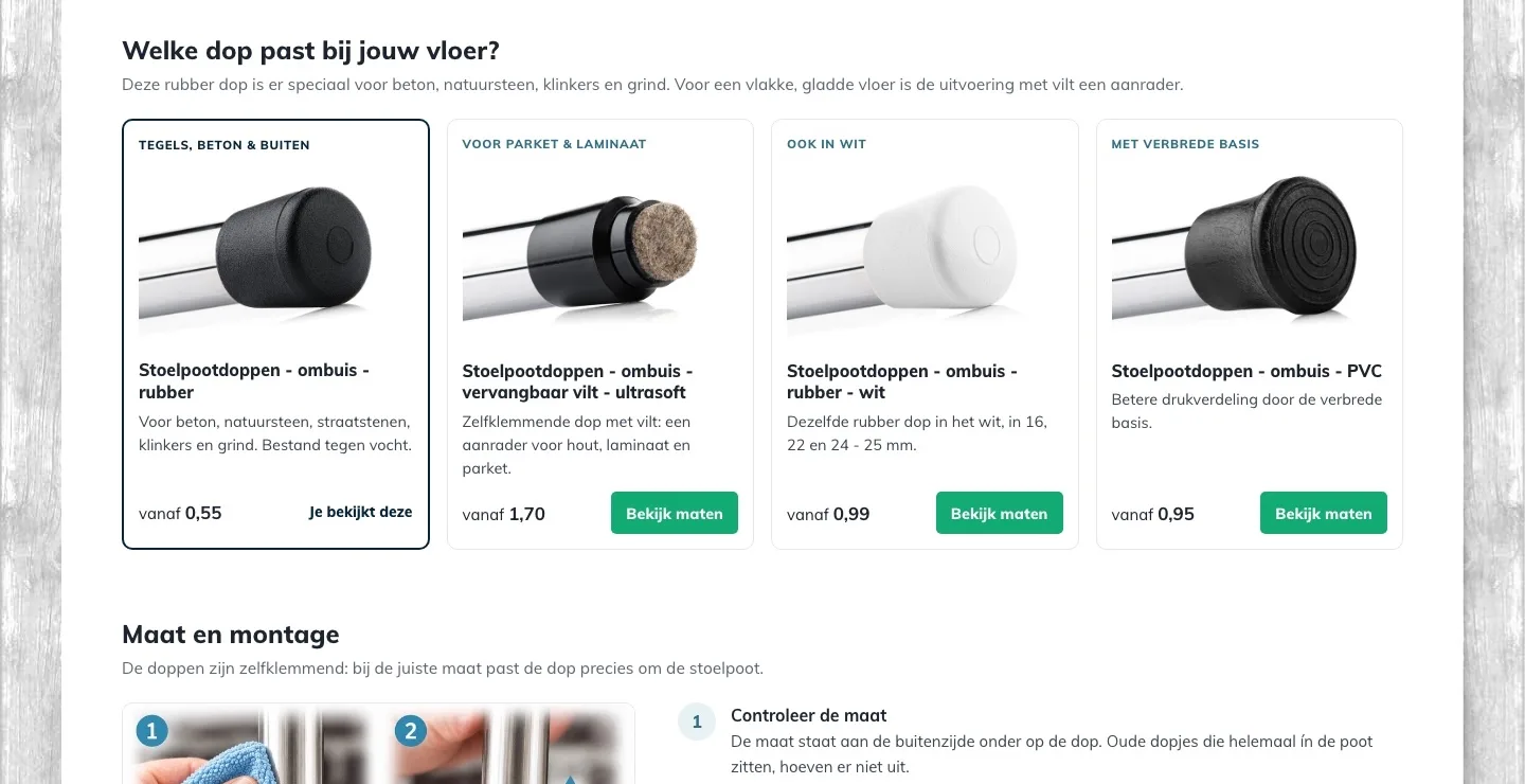
Which cap fits your floor?.
Your own advice as a choice, right below the buy box.
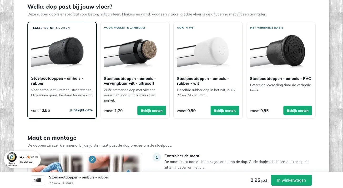
- 01The right cap for your floorThe advice for parquet and laminate was in the middle of a long text. Now you choose the cap for your floor at a glance.
- 02Price and button includedThe felt version was only a link in the text. Now it sits with a photo, a from-price and a button next to the other versions.
- 03Each label tells the differenceNow a label says how each version differs. The other versions have a ‘Bekijk maten’ (View sizes) button.
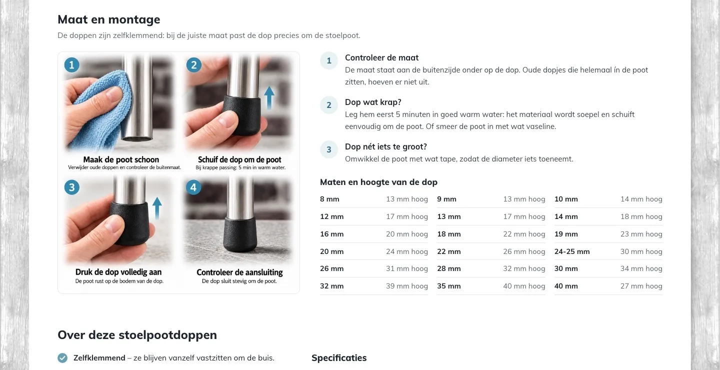
Size and installation.
What was in closed tabs, now open and in view.
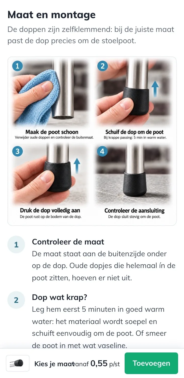
- 01Installation in viewThe installation steps were in a closed tab. Now you see them right away, with your own installation photo.
- 02Too tight or slightly too loose?Warm water for a tight cap and tape for a loose one: now it sits next to the photo, exactly where you look for it.
- 03Size chart with heightThe sizes with their height were in the Maatvoering (Sizing) tab. Now they’re open, so you can compare the height too.
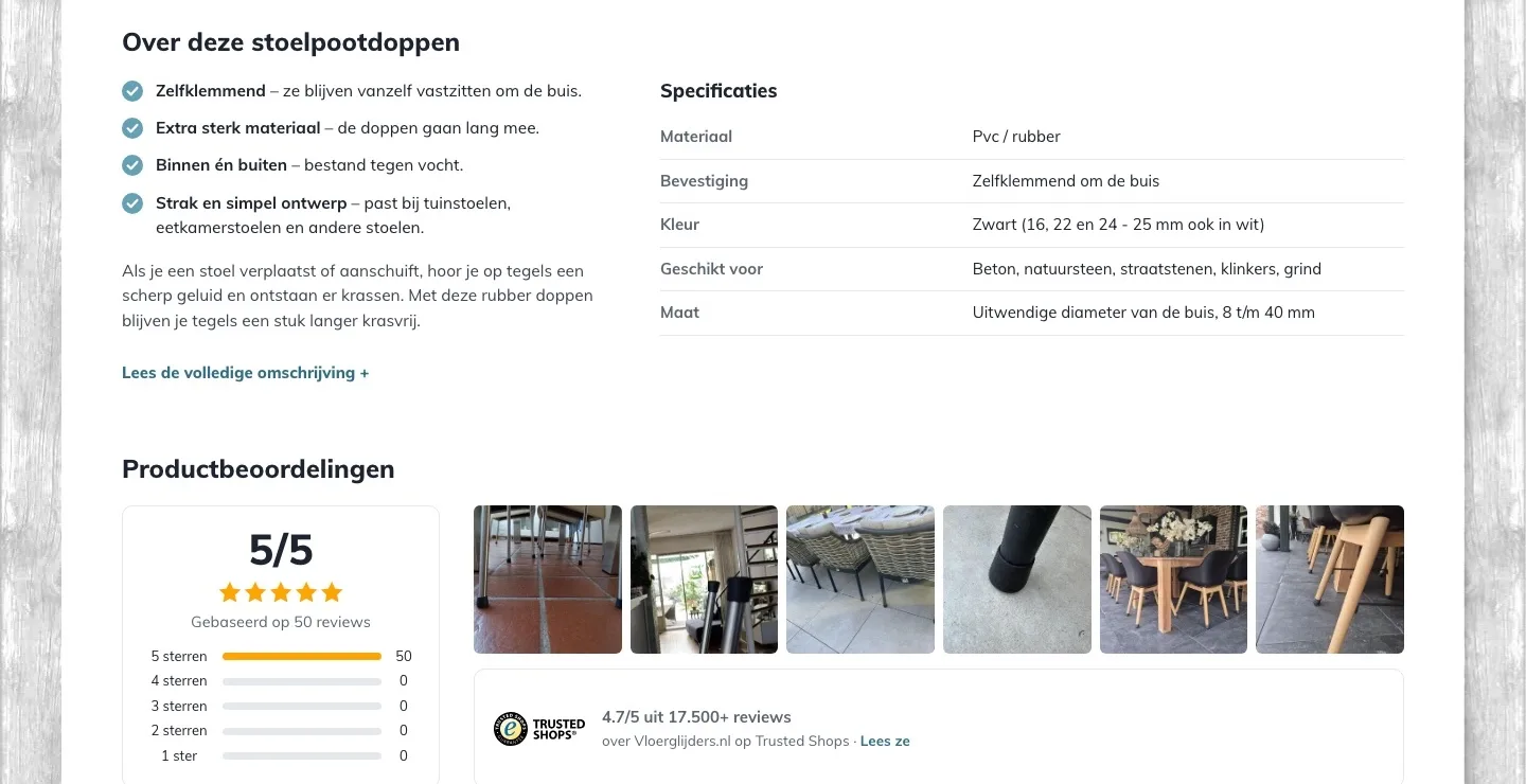
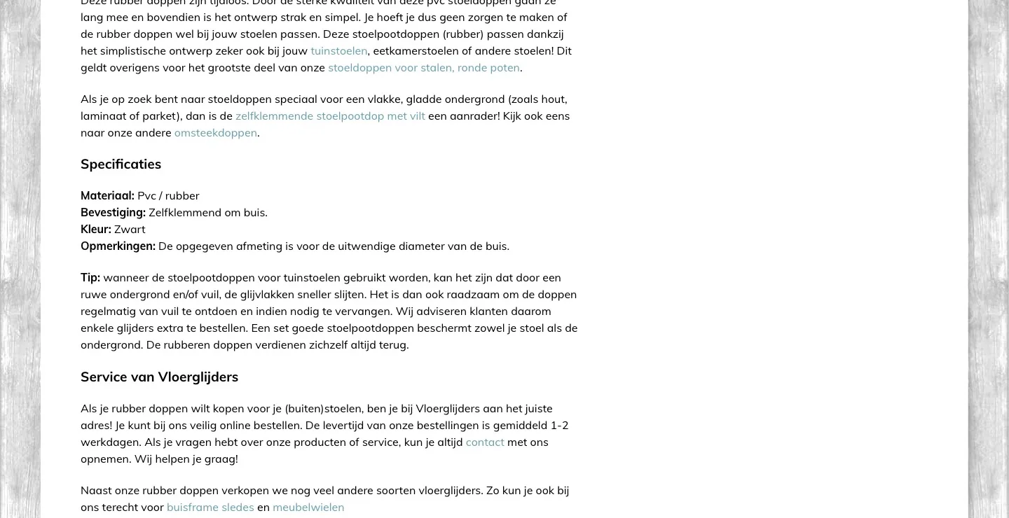
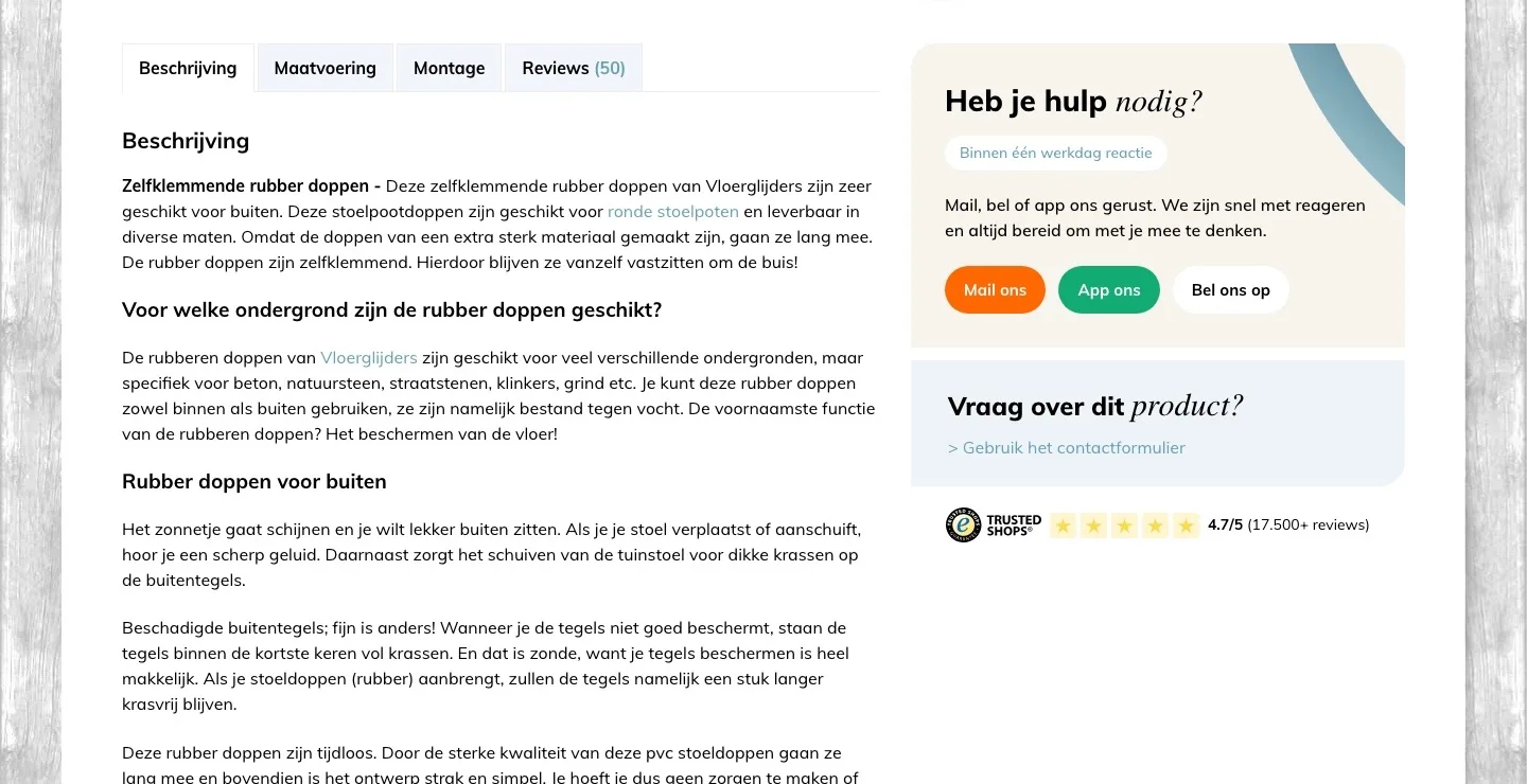
About these chair leg caps.
Short and scannable, the full text stays available.
- 01Four featuresThe description was one long text. Now you read in a few seconds what makes these caps good.
- 02Specifications as a tableMaterial, attachment and color were separate lines in the text. Now they’re in a table next to it.
- 03Nothing lostThe full description is still there, behind ‘Lees de volledige omschrijving’ (Read the full description), for anyone who wants to read everything.
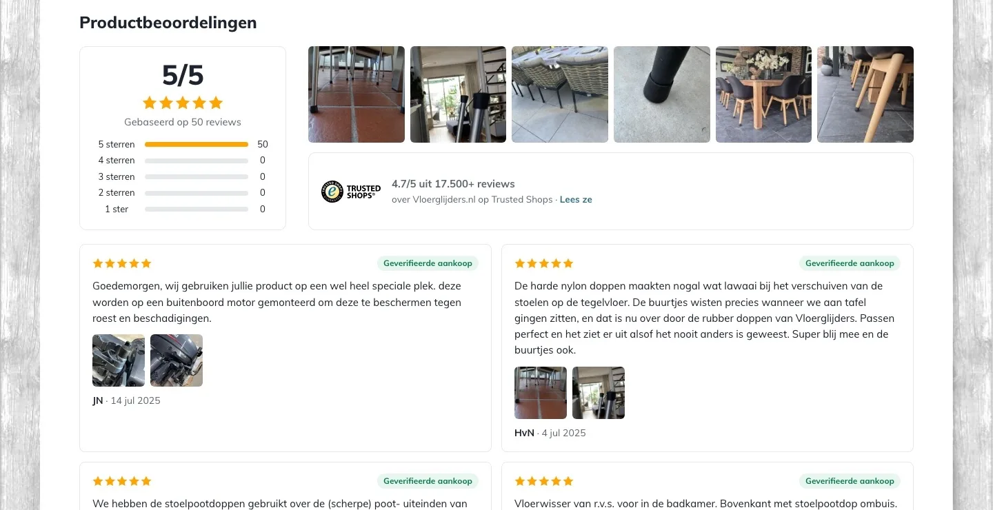
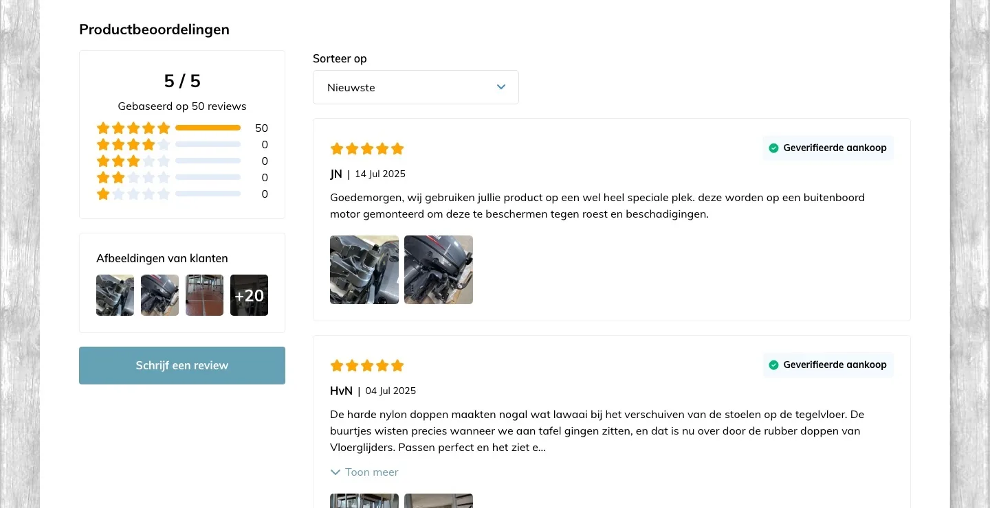
Product reviews.
Your 50 five-star reviews, bigger in view.
- 01Customer photos bigThe customer photos were small in a corner (‘+20’). Now you see a row of big photos of real chairs.
- 02Two scores togetherThe 5/5 from the product reviews and the 4.7/5 from Trusted Shops now sit side by side, with the logo.
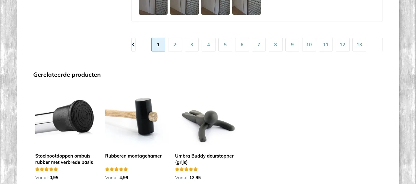
- 03More reviews at a timeYou paged through 13 pages of four. Now you see six at a time and ‘Toon meer’ (Show more) adds six more.
The end of the page.
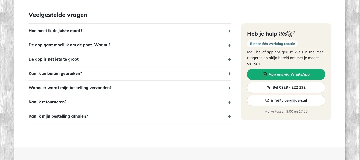
Last questions answered, help next to them.
- 01Answers to last questionsThe page ended with related products. Now you find answers there about size, outdoor use, shipping and returns.
- 02Help next to the questionsAnyone who still has doubts after reading can message, call or email right from the block next to it, with your opening hours.
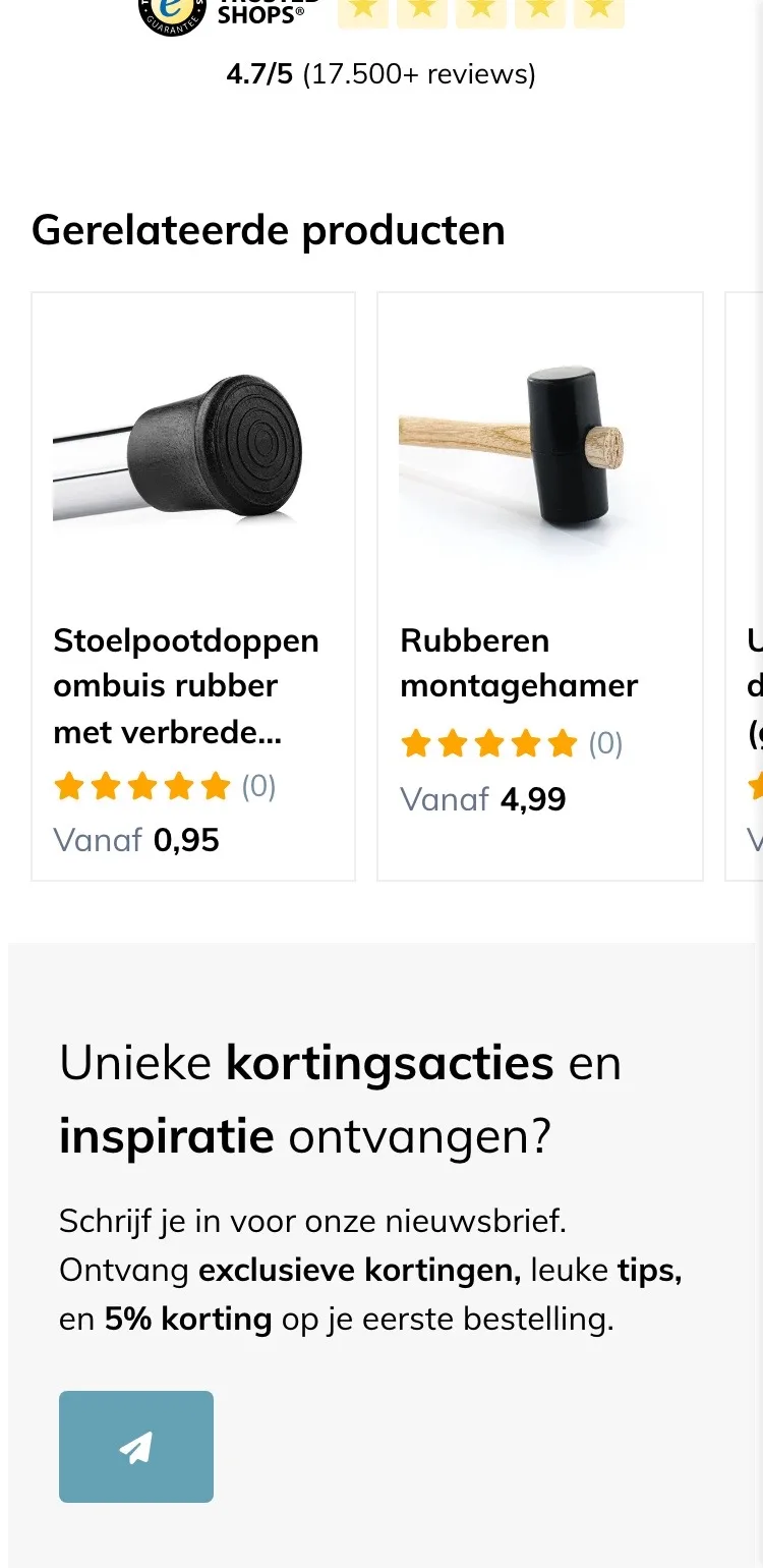
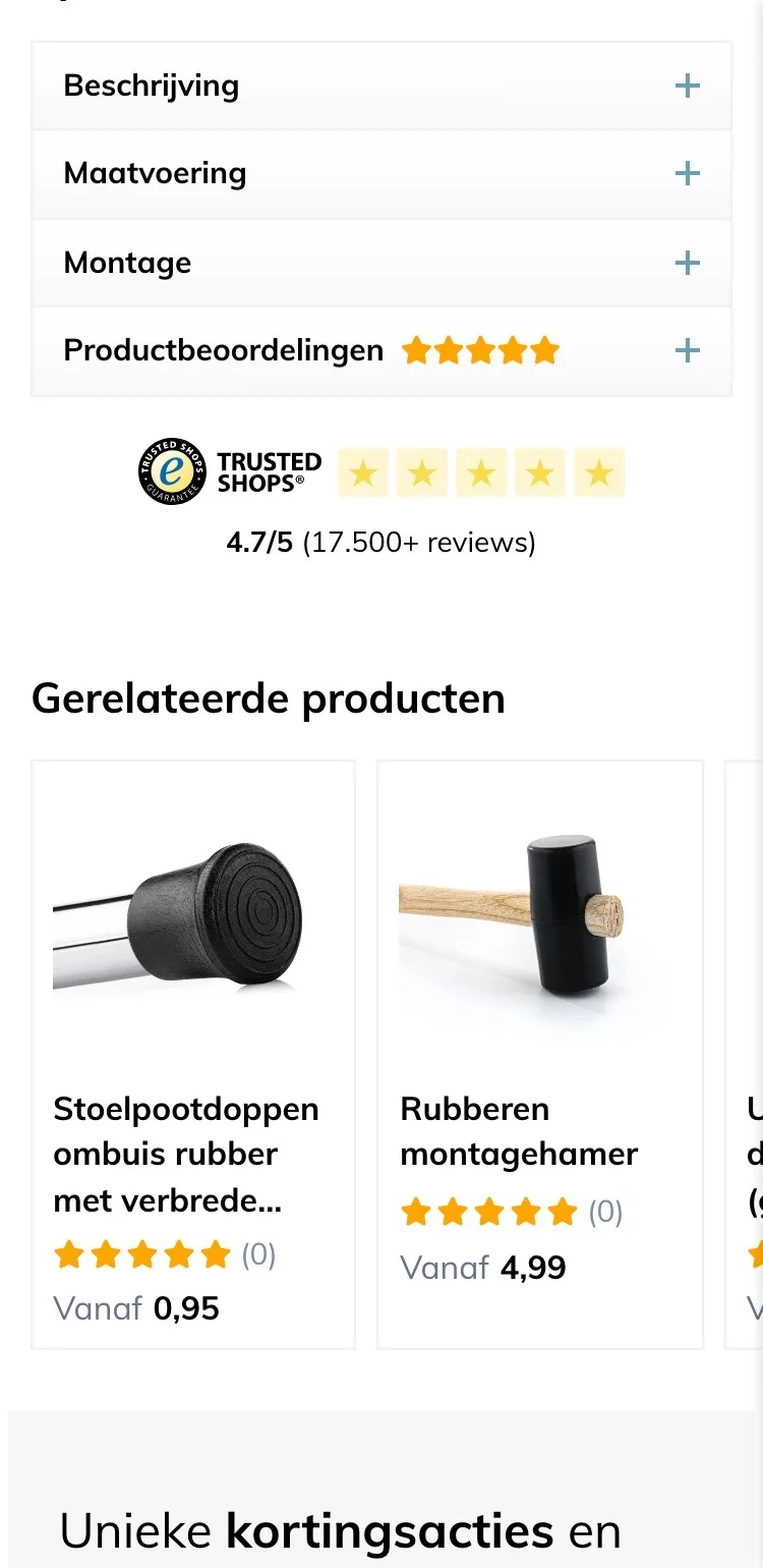
- 03No more stray hammerThe hammer and door stopper at the bottom didn’t help with this choice. The matching versions now sit higher up.
While scrolling.
The button stays in view, with the size you chose.
- 01Button always at handAfter scrolling, the button was out of view. Now a bar at the bottom shows the photo, chosen size, price and button.
- 02You see what you’re addingThe chosen size and quantity are in the bar, so you know for sure you’re ordering the right cap.
- 03First the size, then into the cartWithout a size, the button only said ‘Kies eerst een afmeting’ (Choose a size first). Now it opens the sizes.
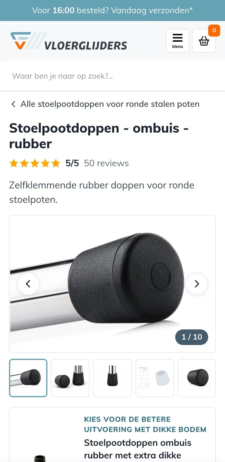
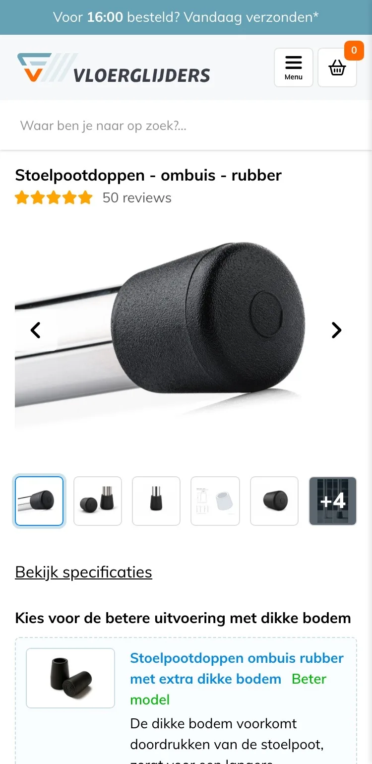
Product page.
On mobile, the name, the explanation and the photos right away.
- 01A short way backOn mobile there was no breadcrumb. Now one tap takes you back to all caps for round steel legs.
- 02First, briefly what it isThe photo came right after the name. Now you first read in one short sentence what it is.
- 03All photos within reachSix small photos and ‘+4’ became ten photos you swipe through five at a time, with a counter on the photo.
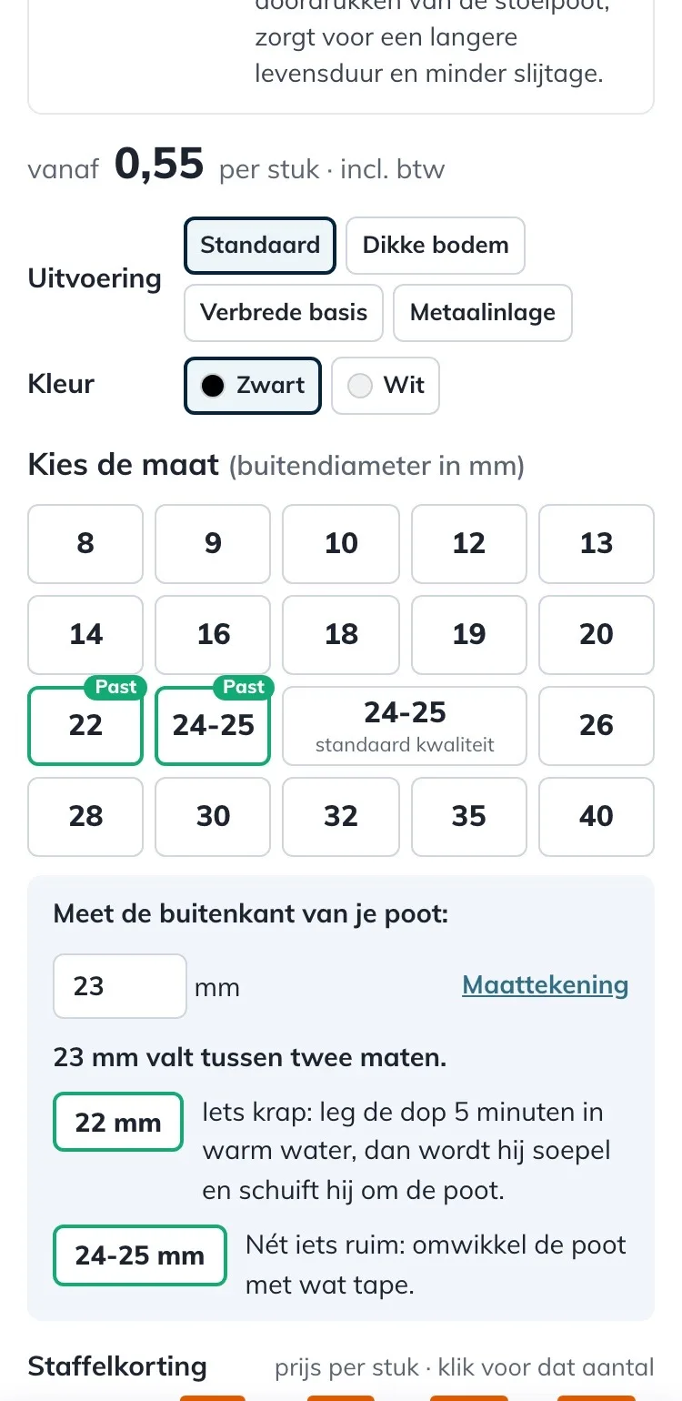
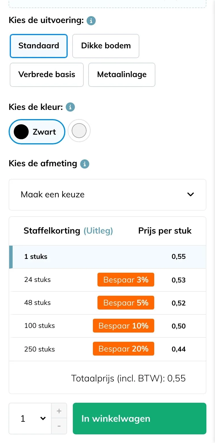
Choosing a size.
The biggest doubt solved right away.
- 01Sizes as buttonsThe dropdown ‘Maak een keuze’ (Make a choice) hid 19 sizes. Now you see them all and choose with one tap.
- 02Will it fit my leg?Enter the size you measured: the cap that fits gets ‘Past’ (Fits).
- 03Between two sizesIf your size falls in between, you read right away which cap to choose and why.
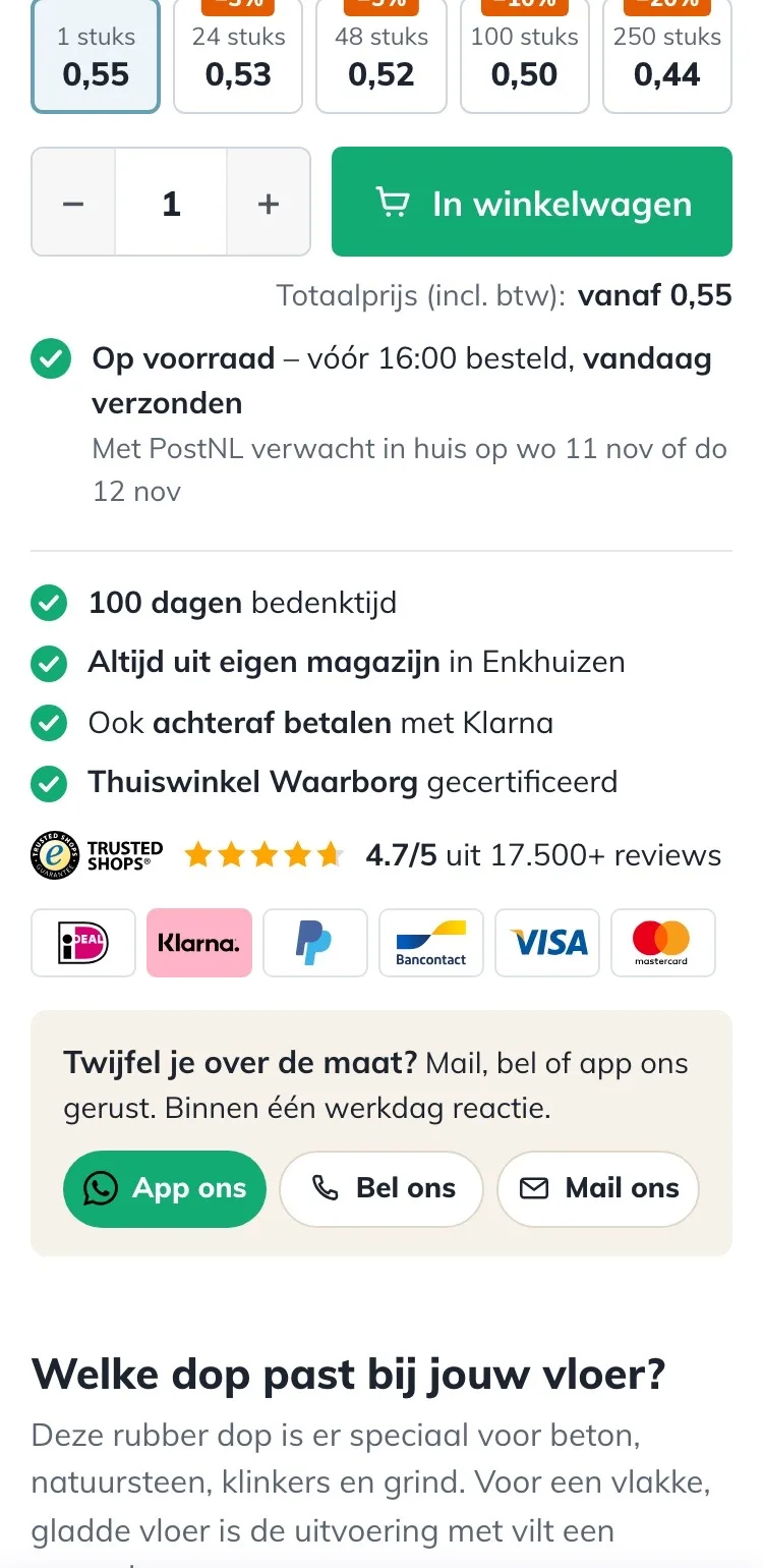
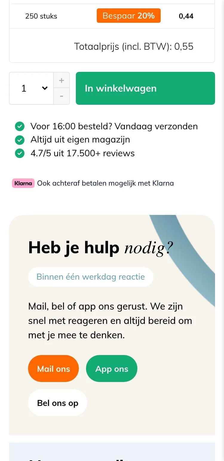
Around the button.
Delivery day, certainty and help with the size.
- 01Delivery day included‘Vandaag verzonden’ (Shipped today) didn’t say when it arrives. Now you also see the expected PostNL delivery day.
- 02Logos and guaranteesNext to the score you now also see 100 days to change your mind, Thuiswinkel Waarborg and the payment logos.
- 03Help with the sizeBelow the button was a big help block. Now there’s one line with message, call and email; the block itself is further down.
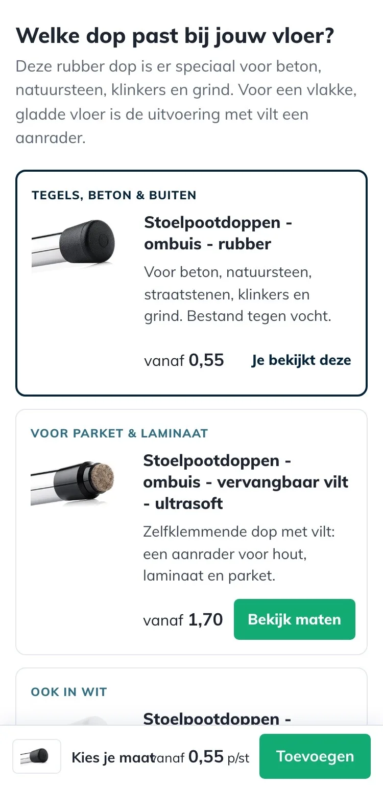
Which cap fits your floor?.
Alternatives with an explanation, instead of separate products.
- 01Explanation per versionRelated products sat side by side without explanation. Now a label says how each version differs.
- 02Everything readableThe third tile was half off screen. Now the versions are listed one below the other, with name and price.
- 03Straight to the sizesThe other versions have a ‘Bekijk maten’ (View sizes) button, so you find the right cap right away.
Size and installation.
Open instead of in collapsible sections.
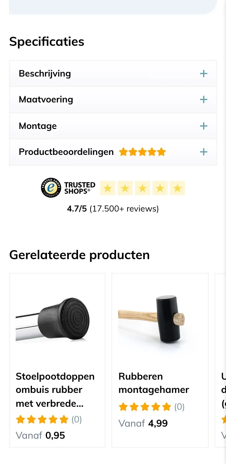
- 01No more searchingBeschrijving (Description), Maatvoering (Sizing) and Montage (Installation) were closed in collapsible sections. Now installation and sizes are open.
- 02Installation photo in viewThe four steps are right in view, with your own installation photo.
- 03Tips for tight or looseWarm water or tape: the solution is right below it, so nobody has doubts after it arrives.
Product reviews.
50 five-star reviews, now open.
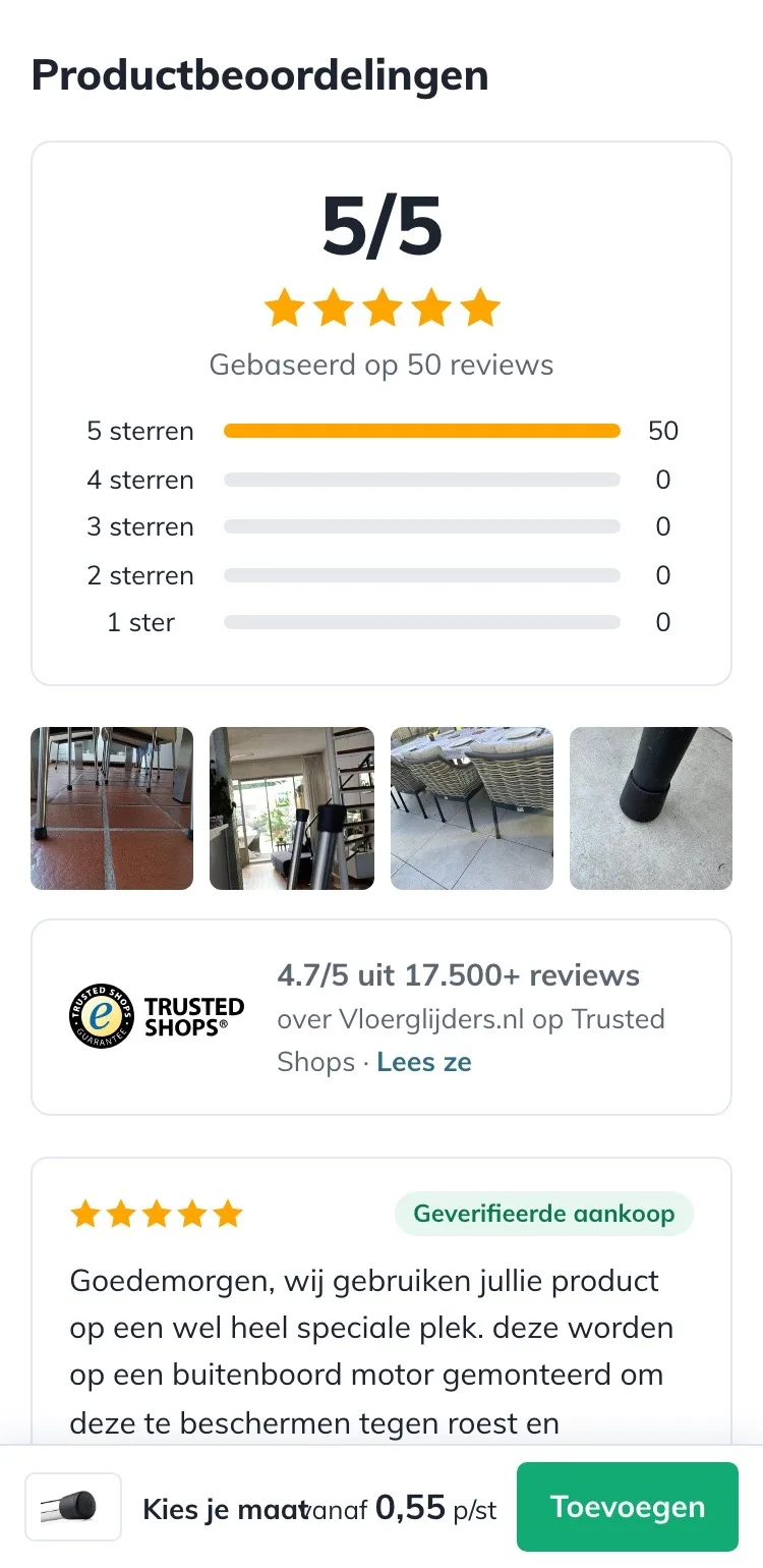
- 01Reviews open‘Productbeoordelingen’ (Product reviews) was closed in a collapsible section. Now you see the score, customer photos and reviews right away.
- 02Two scores togetherThe 5/5 from 50 product reviews and 4.7/5 from Trusted Shops now sit together.
- 03More, step by stepYou first see three reviews; with ‘Toon meer reviews’ (Show more reviews) three more are added each time.
Click through the new design yourself.
The design works like a real page, on desktop and on your phone. You just can’t place an order with it yet.
From design to more orders.
This is how we take the new design live, and measure what it delivers.
- 01Only the pageHeader, menu, USP bar and footer stay exactly as they are now. We only change the content of the product page.
- 02Test first, then go liveWe run the new design in an A/B test next to the current page and measure orders per visitor.
- 03Your own strengthsYour own photos, visuals, reviews and tone of voice: it all came from you already, just in a better place.
This design live
on your online store?
With the AI Design Agent, we put this design on your existing online store, and then keep improving it every month with CRO. Built by our specialists. Without spending thousands of euros a month on it.
- No rebuild, no migration
- Your back office stays the way you know it
- Only goes live after your approval
- 01Ongoing development for a fixed monthly feeNo separate quotes for every change. If we see an opportunity or you have an idea, we build it.
- 02CRO improvements, implemented right awayWe analyze your online store and implement improvements in days instead of months.
- 03Safe, and you see what changesWe build and test everything in a preview first. It only goes live after your approval, and every version is saved.