 Google Ads
 Meta Ads
 Email marketing
 Lightspeed eCom Toolkit
 Shopify Toolkit
Your product page,
redesigned.
A new design for the product page of dekoffiebaron.nl: Segafredo Intermezzo coffee beans 1 kg. Below you see every screen before and after, and what we improved.
- 14 before-and-afters
- 17 improvements
- dekoffiebaron.nl
Every screen, compared.
Pick a screen and drag across the screenshot. On the left you see the current page of dekoffiebaron.nl, on the right the new design.
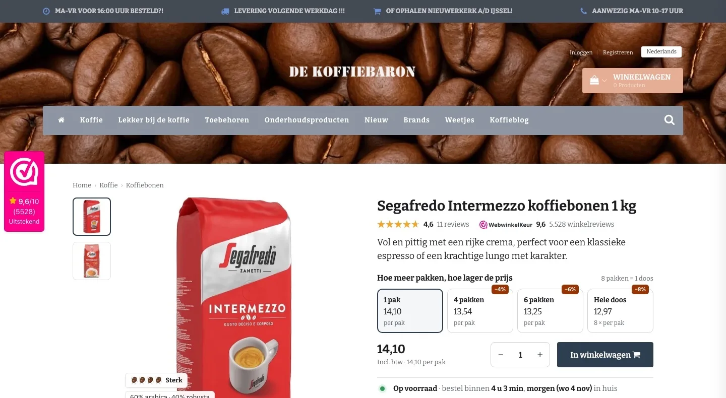
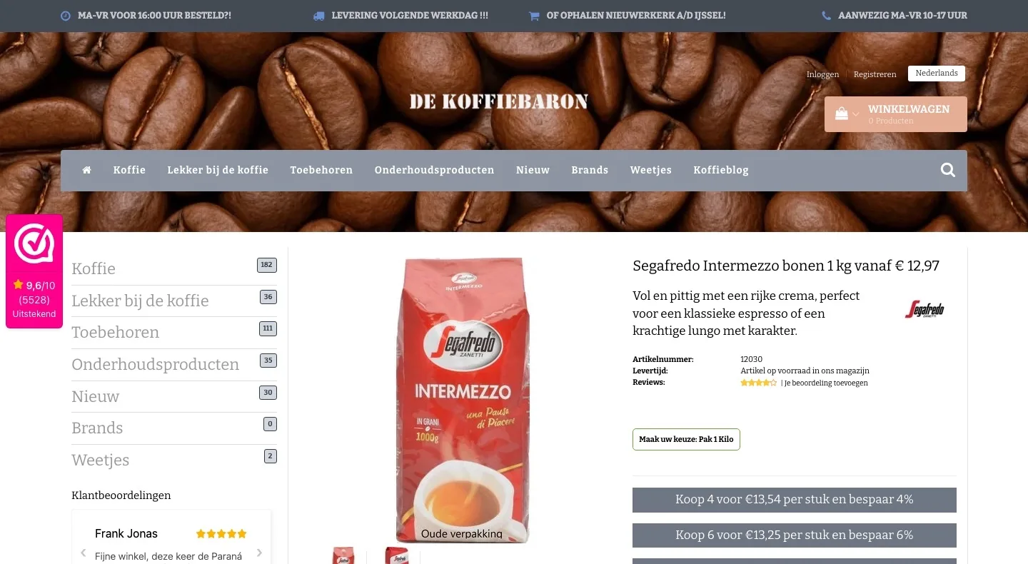
Product page.
The coffee gets the full width, with the score right by the name.
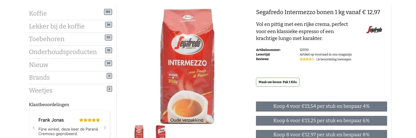
- 01New packaging firstFirst you saw the old packaging, with ‘Oude verpakking’ (Old packaging) on it. Now you see straight away the pack you’ll get at home.
- 02Title without a confusing priceThe title said ‘vanaf € 12,97’ (from €12.97) while the price shown was €14.10. Now the title is just the coffee, and the price sits with the choice.
- 034.6 and 9.6 by the nameSmall stars without a score. Now the 4.6 from 11 reviews and the 9.6 from WebwinkelKeur sit right under the title.
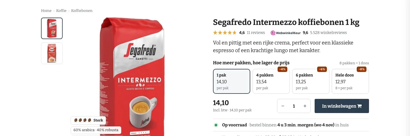
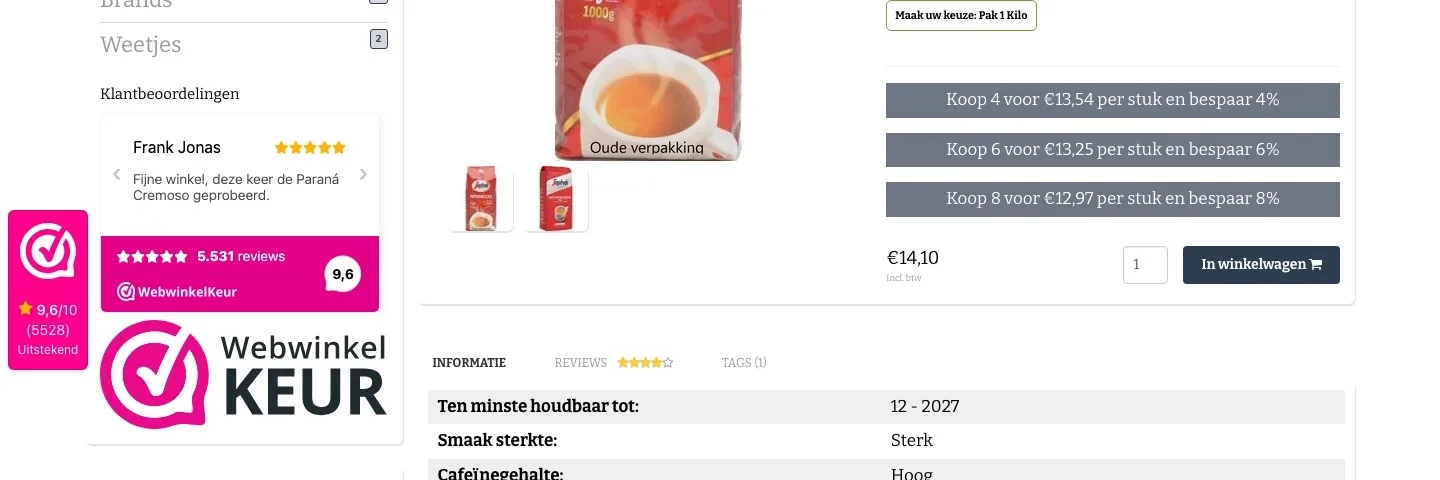
Choosing and buying.
The more packs, the lower the price: in one click.
- 01Volume discounts you can clickThe volume discount lines looked like buttons but did nothing. Now you choose 1, 4, 6 packs or a whole case with one click.
- 02You see what you saveThe total price and ‘Je bespaart €…’ (You save €…) update with your choice. That makes a case feel like a smart choice.
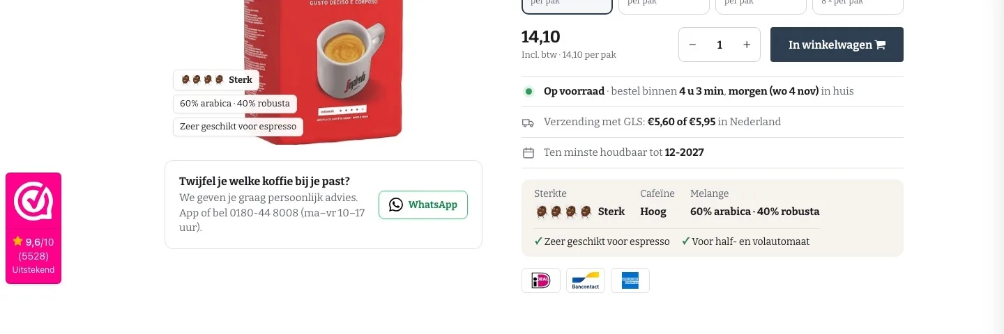
- 03Button right under the priceThe button only came after the volume discount lines. Now price, quantity and ‘In winkelwagen’ (Add to cart) are on one line.
Around the button.
When your coffee arrives, and what you can count on.
- 01At your door tomorrow, with date‘Op voorraad in ons magazijn’ (In stock in our warehouse) was small. Now you see how long you have left to order and which day it arrives.
- 02Honest about shipping costsThe shipping costs and the shelf life sit by the button, so there are no surprises at checkout.
- 03Payment logos by the buttoniDEAL, Bancontact and American Express were only in the footer. Now you see them right under the button.
Reviews.
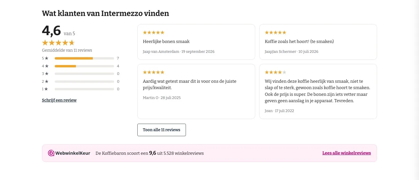
Your customers’ 4.6, now right where you’re in doubt.
- 01Out of the tabThe 11 reviews were hidden behind a tab. Now they sit right under the buy box, with the breakdown per star.
- 02Real experiencesFour reviews are open, the rest one click away. That way you read what other coffee drinkers think of it.
- 039.6 from WebwinkelKeurBelow the product reviews is the shop score from WebwinkelKeur, with a link to all reviews.
About the coffee.
What you want to know, short and clear.
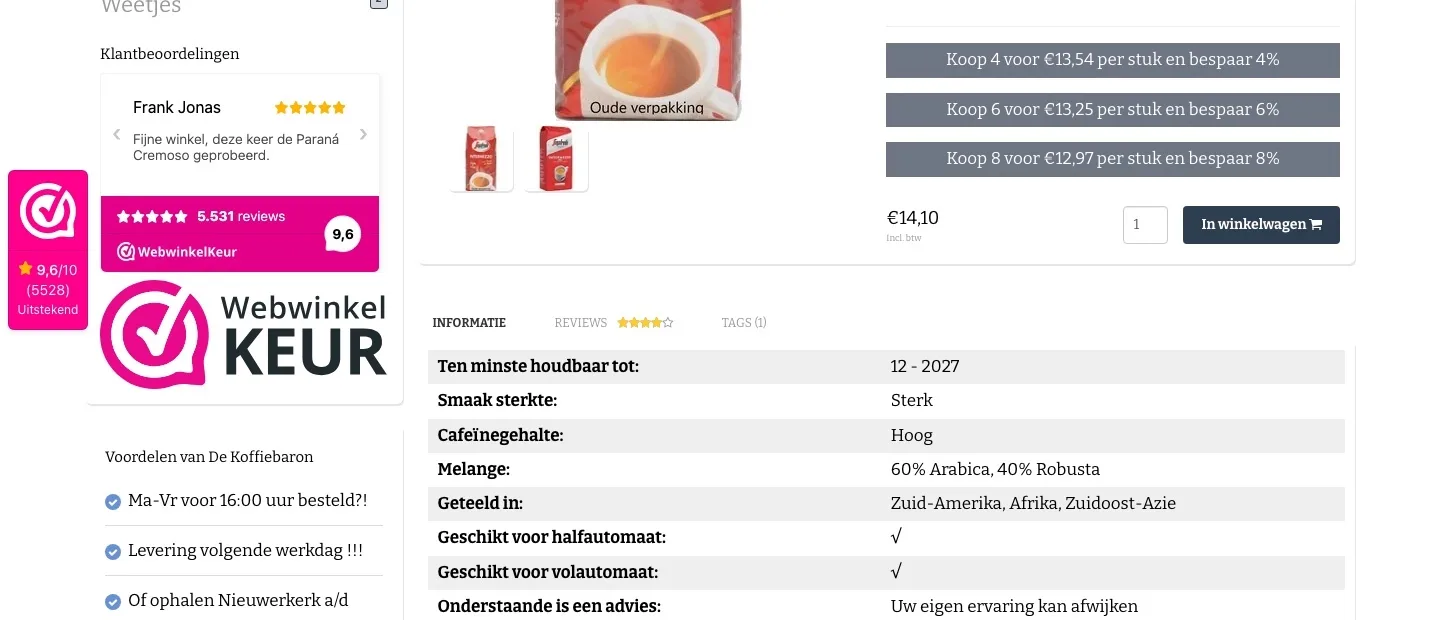
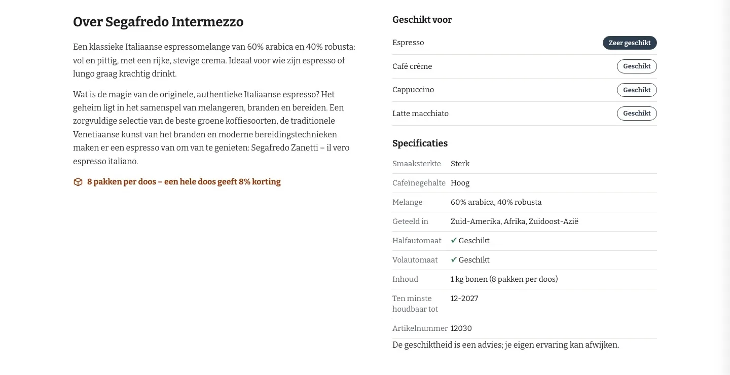
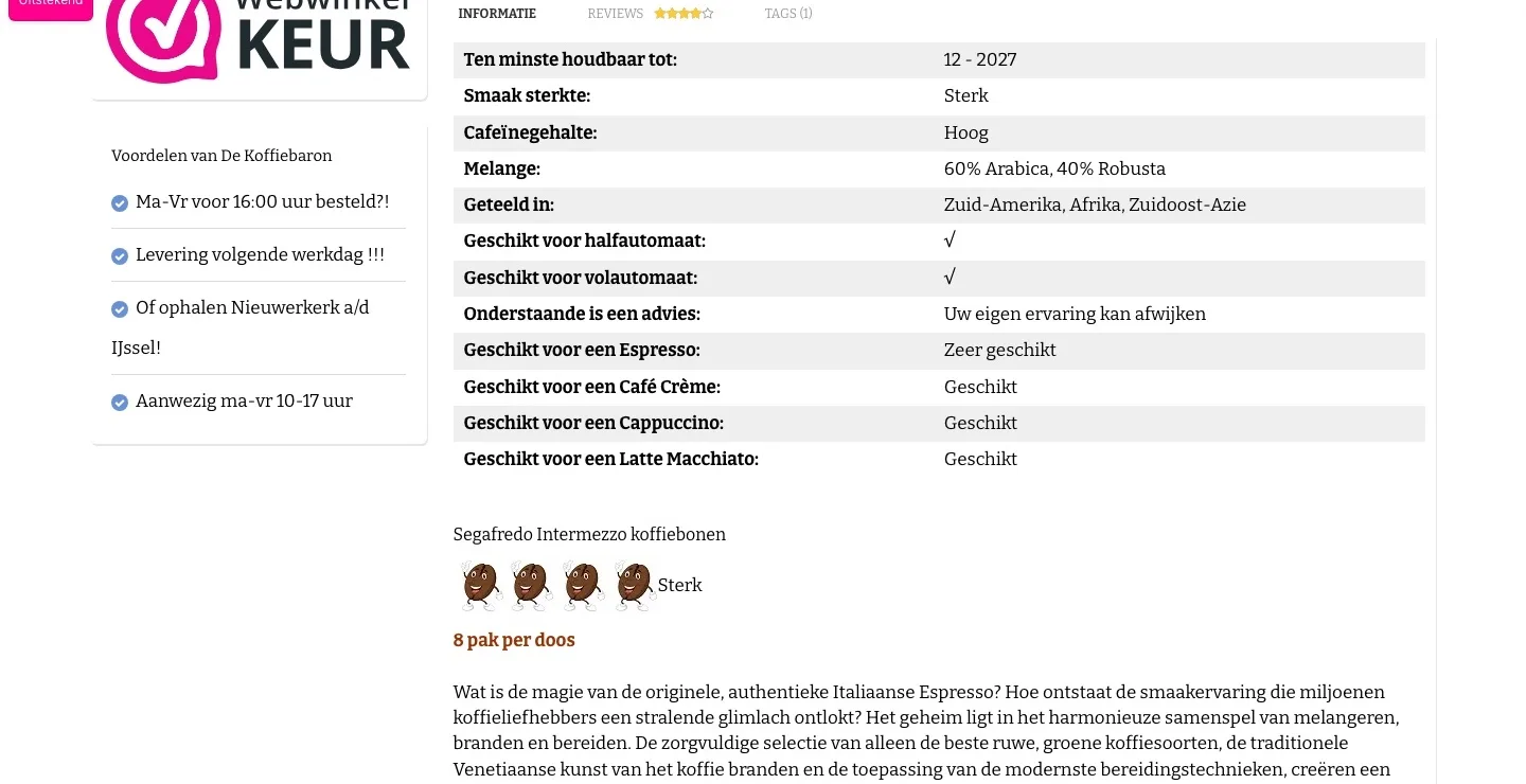
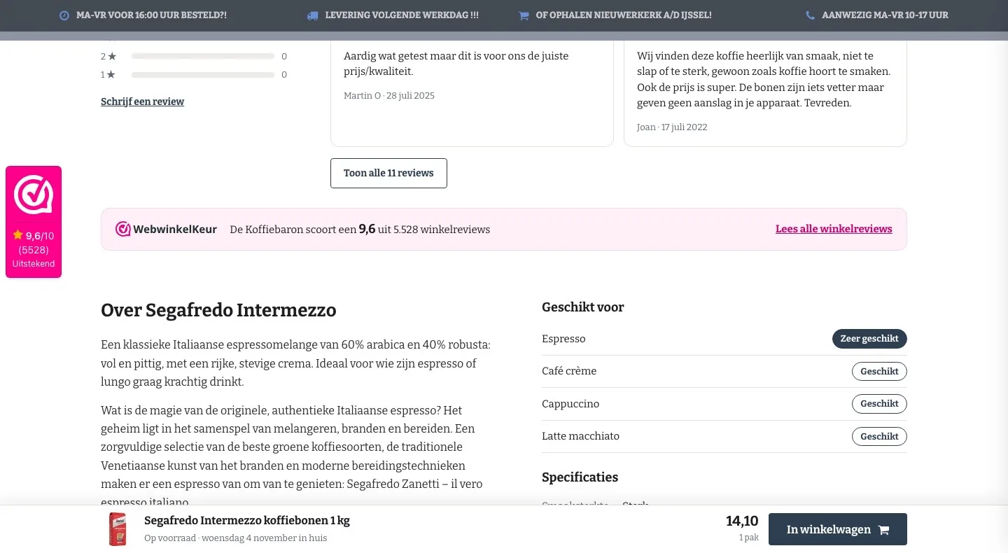
- 01‘Suitable for’ as labels‘Geschikt voor een Cappuccino’ (Suitable for a Cappuccino) was in a long table. Now you see at a glance what this coffee suits best.
- 02Shorter specificationsOnly the details that matter, neatly listed, with a tick for semi-automatic and fully automatic machines.
- 03Case and discount includedUnder the text it says a whole case is 8 packs and gives 8% off. That way the page invites you to buy more.
Tasting packs and more Segafredo.
A logical next step, added with one click.
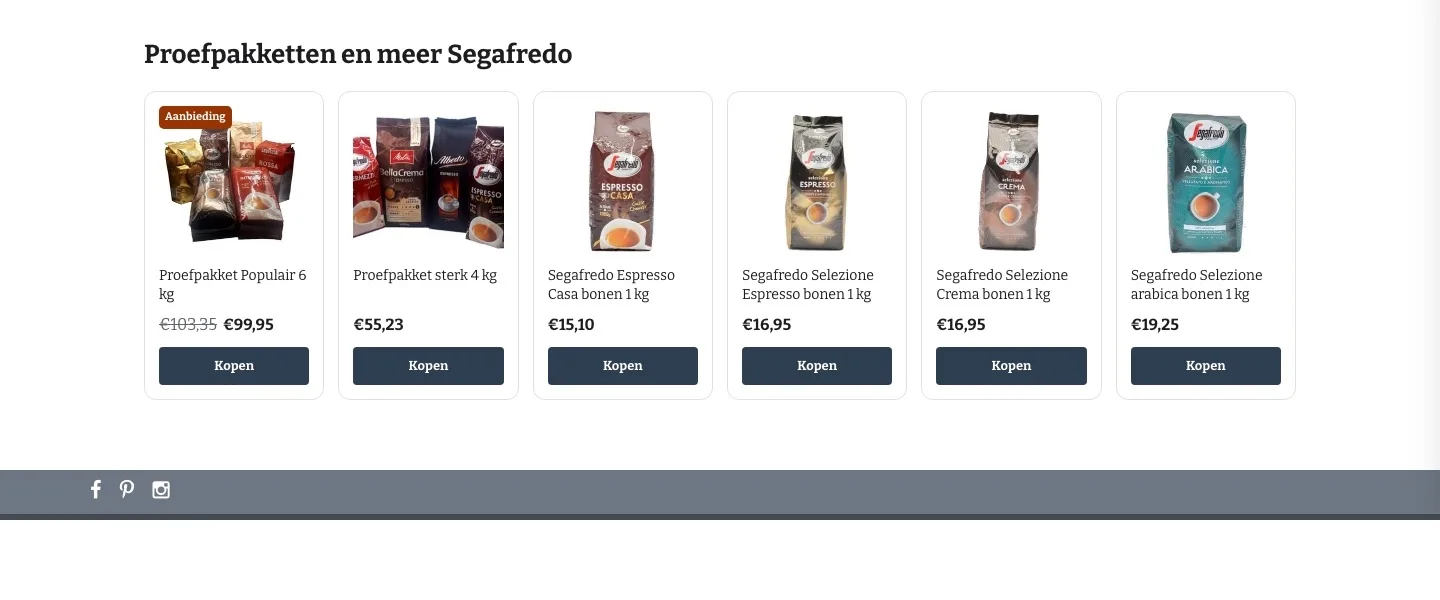
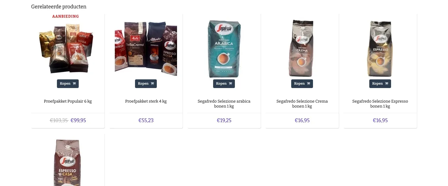
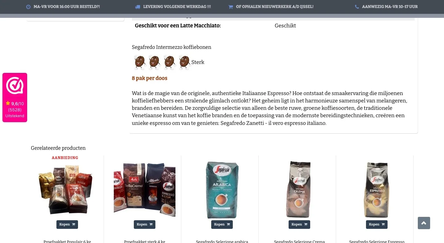
- 01Calm row of productsThe related products ran over two rows. Now they sit neatly side by side, with a clear button.
- 02Tasting packs firstIf you still want to try first, you see the tasting packs first. That way there’s a next step for everyone in doubt.
- 03Identical cardsPhoto, name, price and button sit in the same place on every card, so comparing is easy.
While scrolling.
The button stays within reach while you read.
- 01Sticky buy barWhile reading there was no button in view. Now the bottom always shows the coffee, the price and ‘In winkelwagen’ (Add to cart).
- 02Delivery in the bar‘Op voorraad’ (In stock) and the day your coffee arrives stay visible while you read.
- 03Without covering the textThe bar is slim and white, so the reviews and the specifications stay easy to read.
Product page.
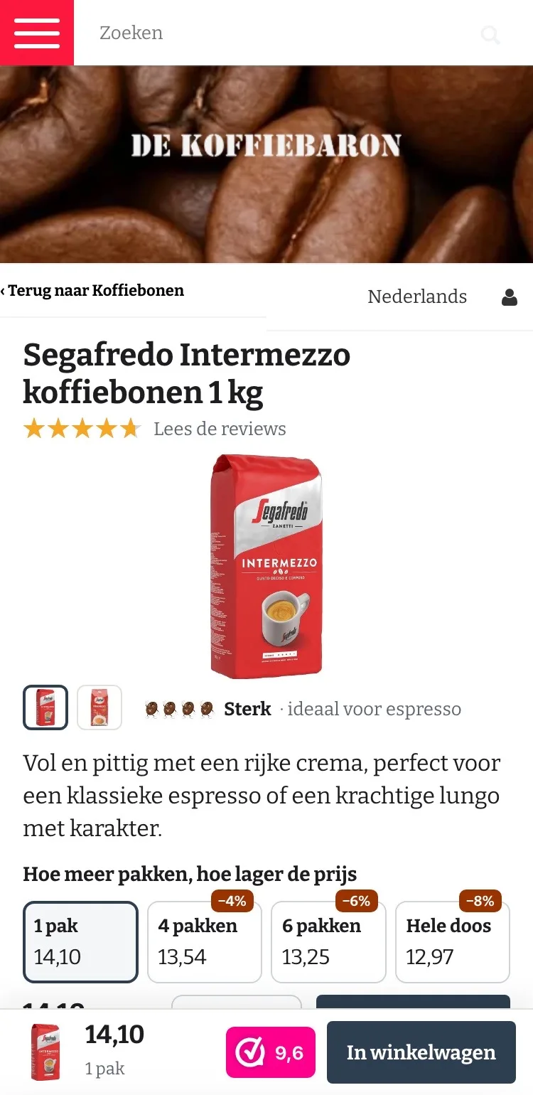
On mobile, the name, score and photo right in view.
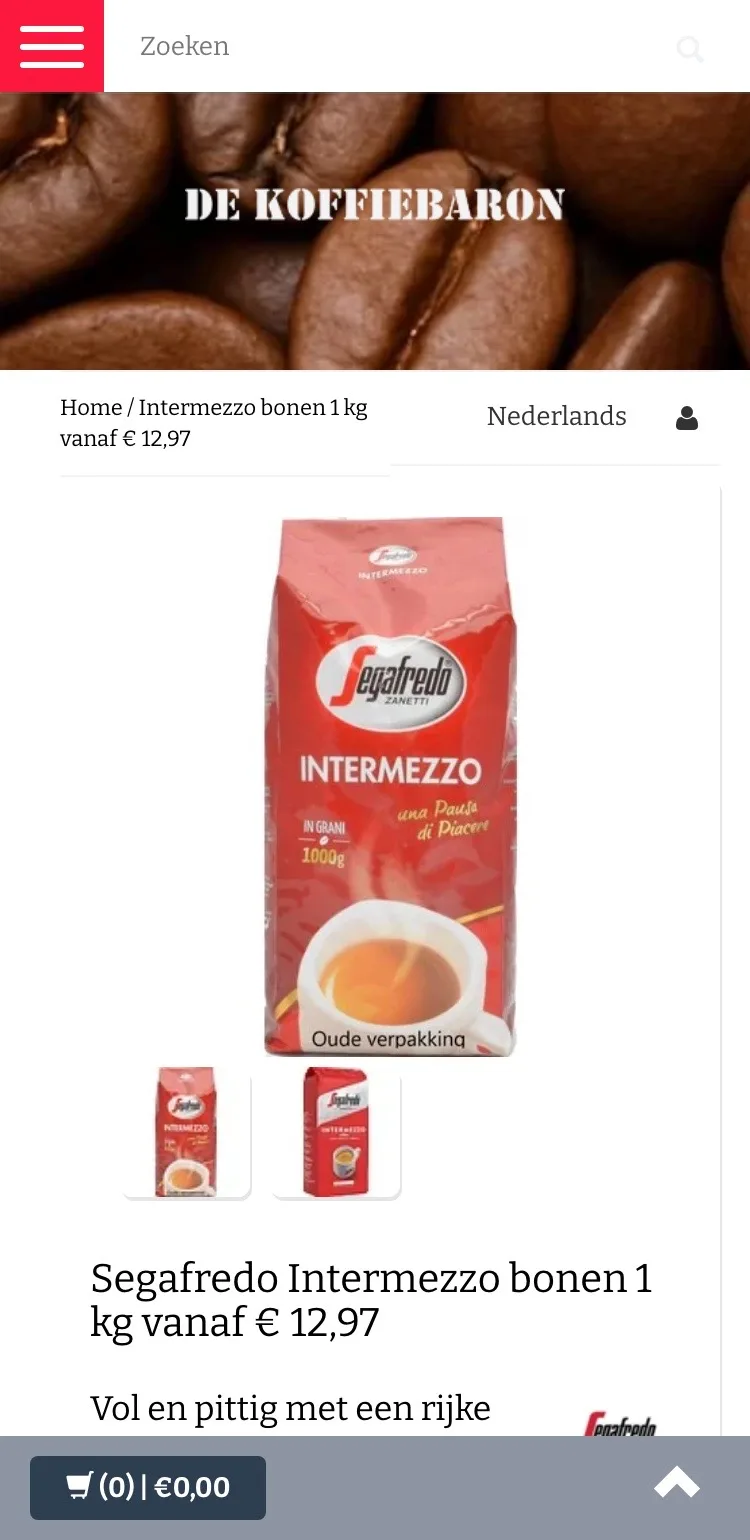
- 01New packaging firstFirst you saw the old packaging. Now you see straight away the pack you’ll get at home.
- 02Title without a confusing price‘Vanaf € 12,97’ (From €12.97) was in the title, while you pay €14.10. Now the title only names the coffee itself.
- 03Always a button at the bottomThe bar at the bottom only showed ‘(0) | €0,00’. Now it shows the price, the 9.6 and a button.
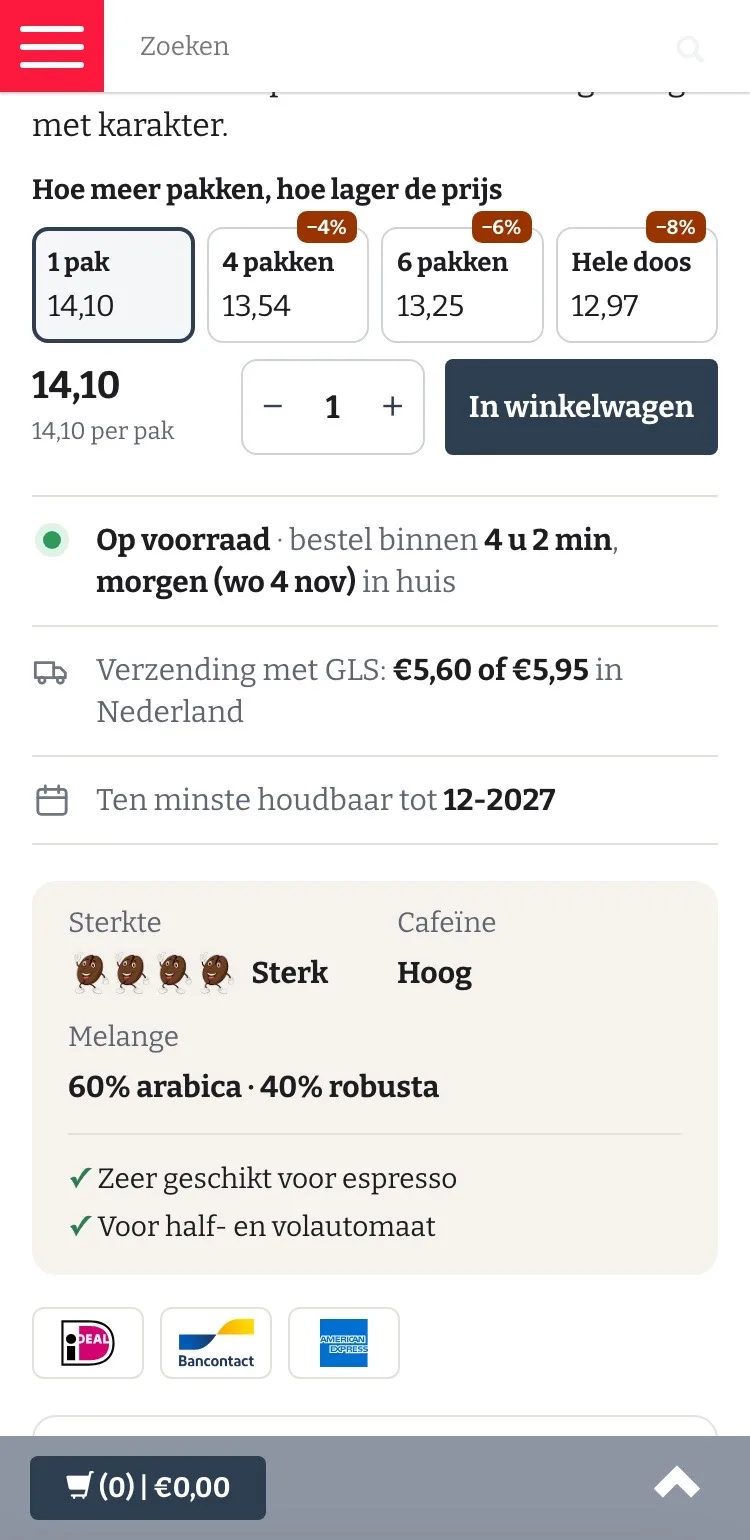
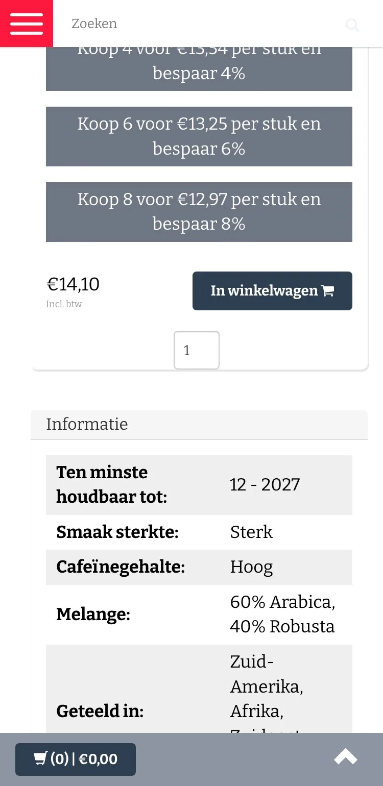
Choosing and buying.
Volume discounts, price and button together in view.
- 01Volume discounts you can tapBig gray lines that did nothing. Now you tap 1, 4 or 6 packs or a whole case, with the discount shown.
- 02Price per packWith every choice you see the price per pack, so you see straight away what 4, 6 or 8 packs get you.
- 03At your door tomorrowUnder the button you see how long you have left and which day your coffee arrives.
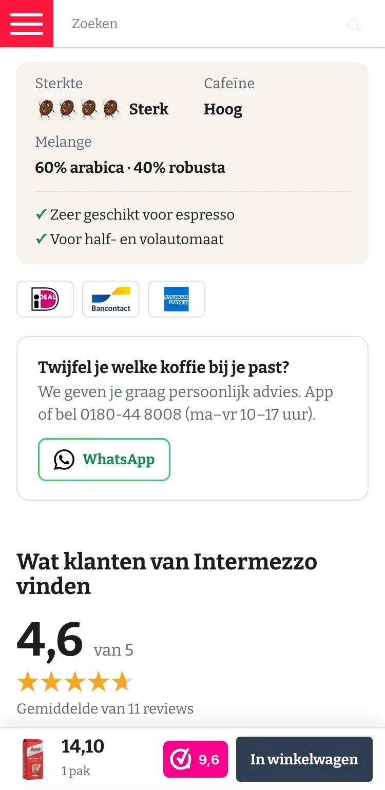
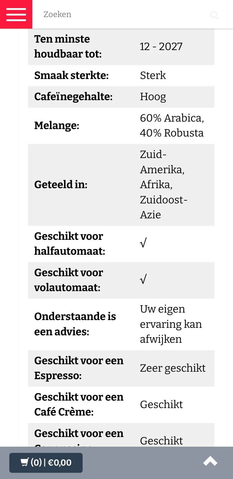
Taste and advice.
From a long table to what you want to know.
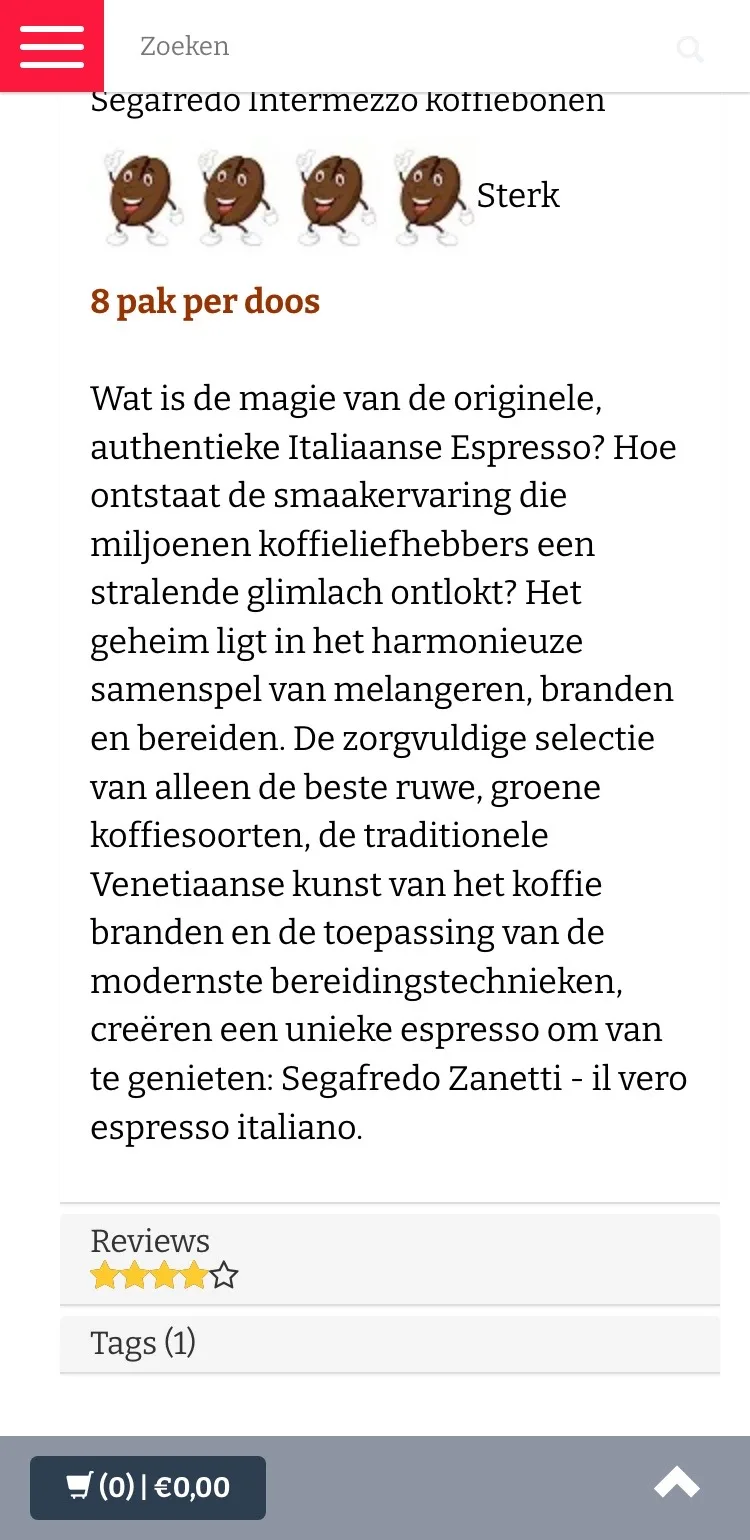
- 01Taste at a glanceStrength, caffeine and blend were in a long table. Now they’re in a short block with the bean icon.
- 02Personal adviceIf you’re in doubt, one tap sends a message on WhatsApp, the channel you already use.
- 03Payment logos by the buttoniDEAL, Bancontact and American Express sit right where you buy, not just in the footer.
Reviews.
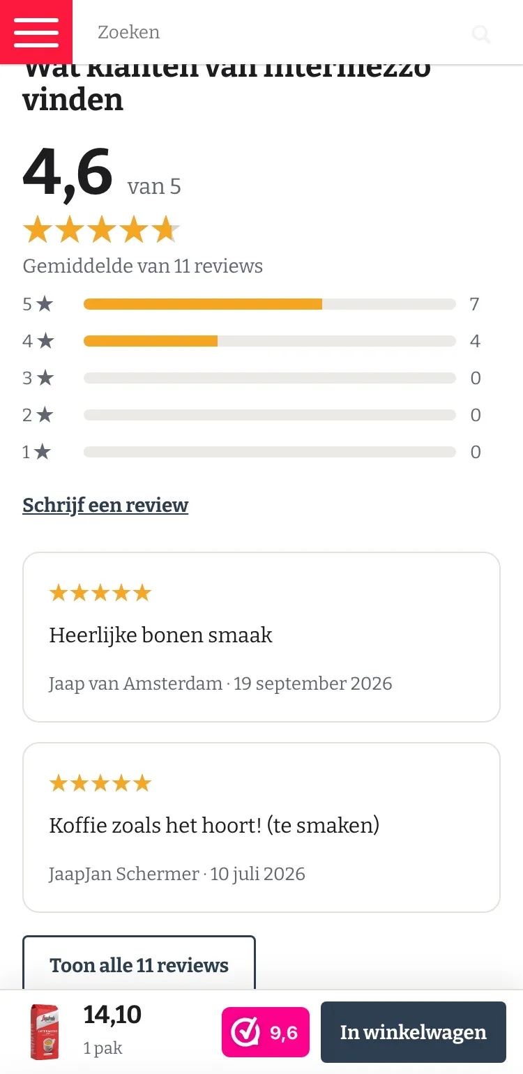
Your customers’ 4.6, high up the page.
- 01Out of the tabThe reviews were at the bottom, behind a tab. Now they come right after the buy box, where you’re in doubt.
- 02Breakdown per starYou see at a glance that 7 of the 11 reviews give five stars.
- 03Two open, the rest one tap awayThat keeps the page short, and you can read all 11 reviews if you want.
About the coffee.
Quick to read, even on a small screen.
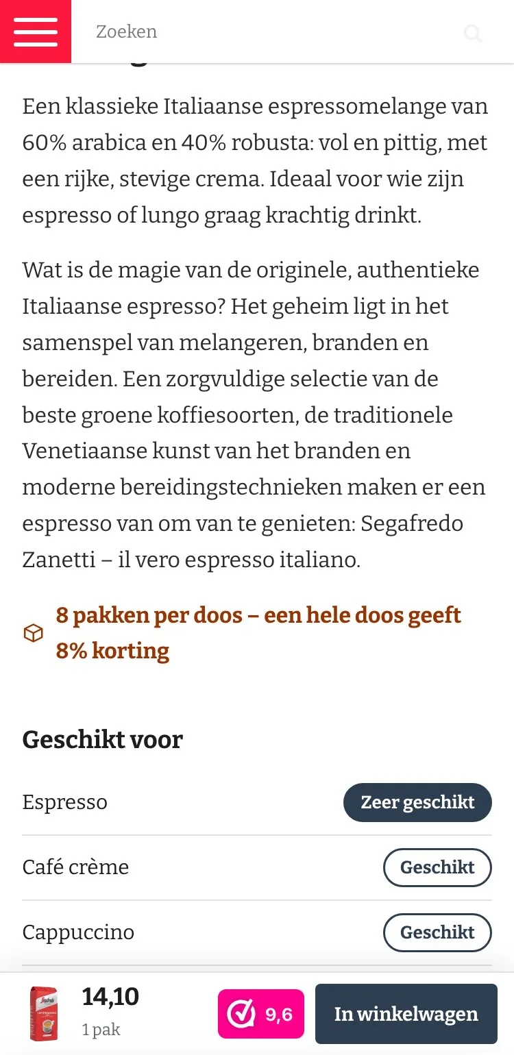
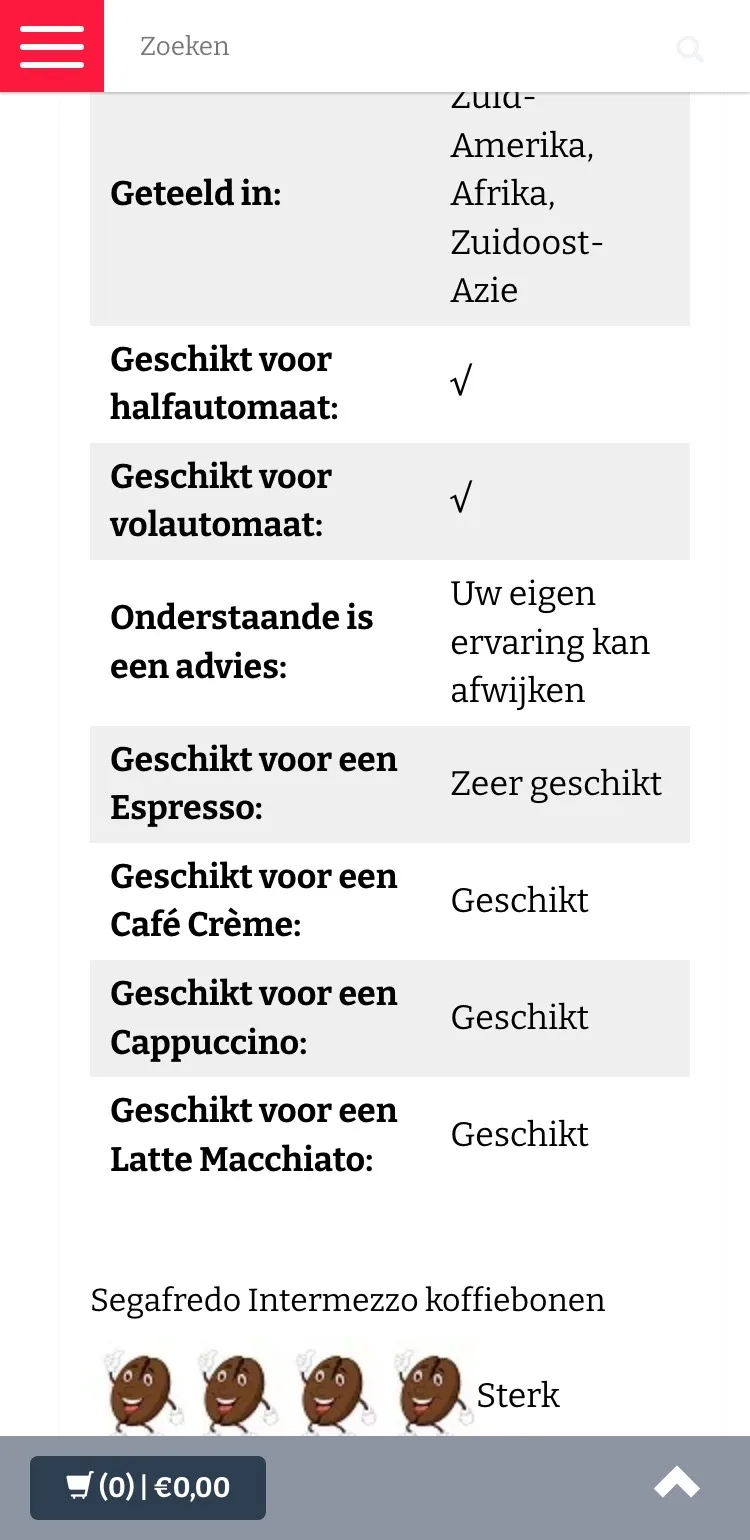
- 01‘Suitable for’ as labelsEspresso, café crème, cappuccino and latte are now labels, not in a long table.
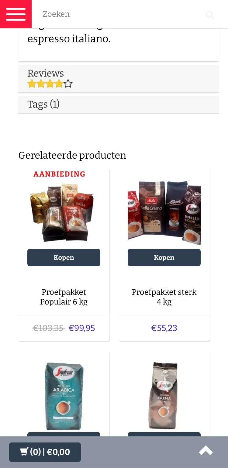
- 02Case and discount includedUnder the text you read that a whole case is 8 packs and gives 8% off.
- 03Shorter textThe description starts with the taste, so you quickly know whether this coffee suits your cup.
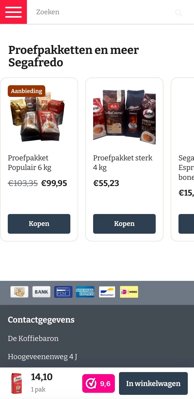
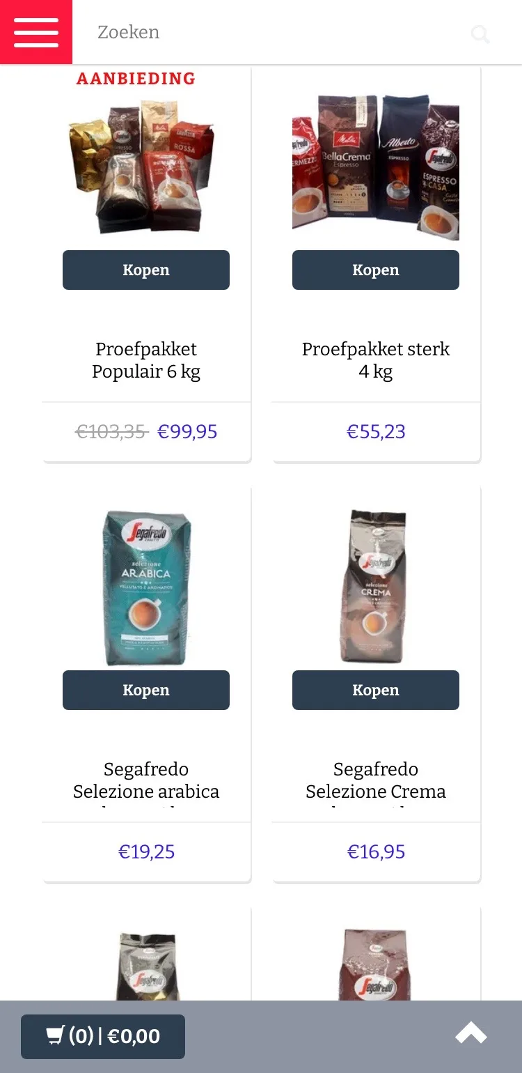
More Segafredo.
Swipe through tasting packs and other beans.
- 01Swipe instead of scrollThe products were stacked in two columns. Now you swipe through all the beans in one row.
- 02Tasting packs firstIf you still want to try first, you see the tasting packs first, with a clear button.
- 03Identical cardsPhoto, name, price and button sit in the same place on every card.
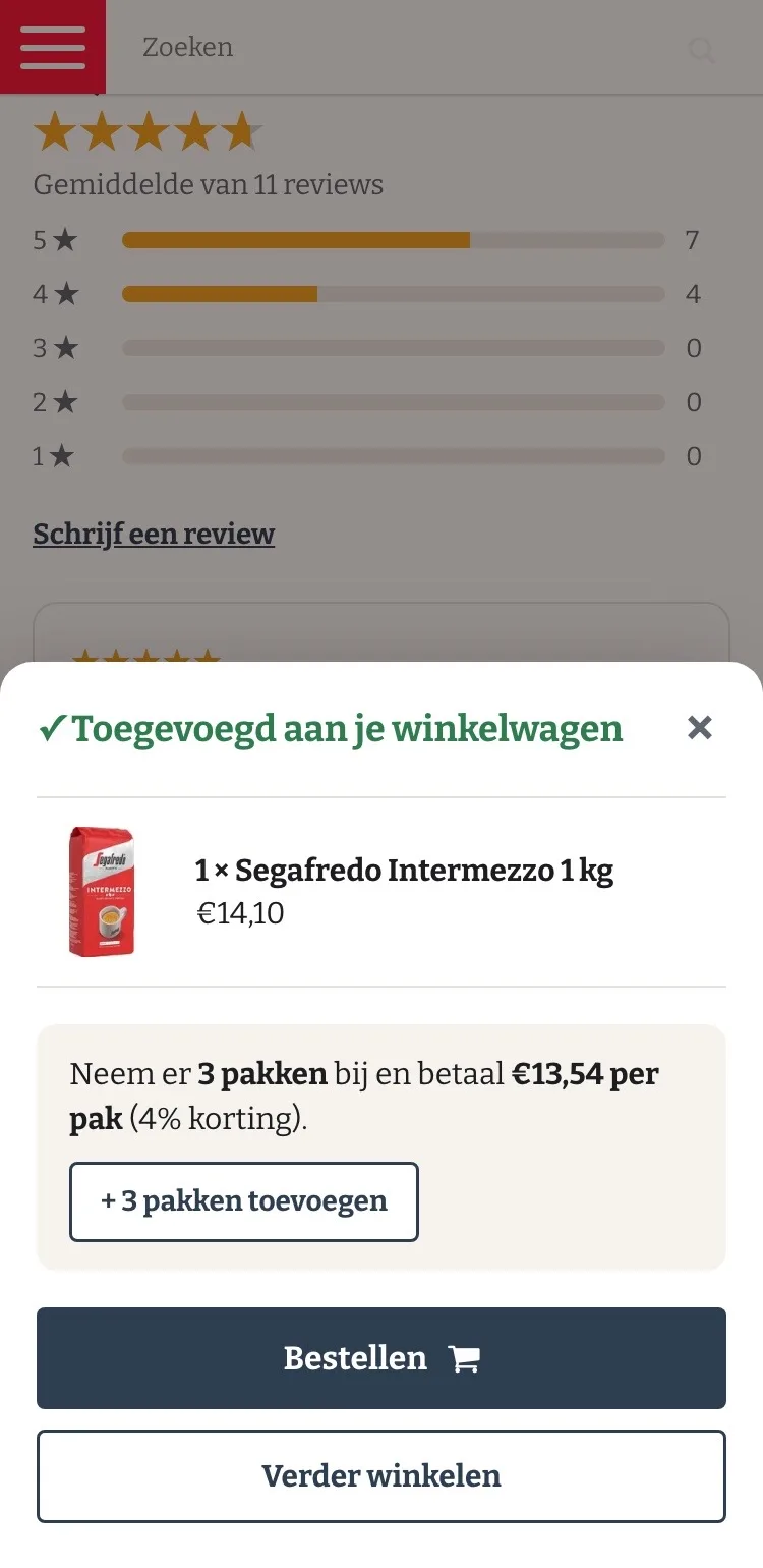
Ordering.
After adding, a clear next step.
- 01Confirmation with your choiceAfter adding you see straight away which coffee and how many are in your cart.
- 02Tip to save‘Neem er 3 pakken bij en betaal 13,54 per pak’ (Add 3 packs and pay 13.54 per pack) with one tap. That makes buying more feel logical.
- 03Order or keep shoppingTwo clear buttons, so you choose how to continue.
Click through the new design yourself.
The design works like a real page, on desktop and on your phone. You just can’t place an order with it yet.
From design to more orders.
This is how we take the new design live, and measure what it delivers.
- 01Only the pageHeader, menu, USP bar and footer stay exactly as they are now. We only change the content of the product page.
- 02Test first, then go liveWe run the new design in an A/B test next to the current page and measure orders per visitor.
- 03Your own strengthsYour own photos, visuals, reviews and tone of voice: it all came from you already, just in a better place.
This design live
on your online store?
With the AI Design Agent, we put this design on your existing online store, and then keep improving it every month with CRO. Built by our specialists. Without spending thousands of euros a month on it.
- No rebuild, no migration
- Your back office stays the way you know it
- Only goes live after your approval
- 01Ongoing development for a fixed monthly feeNo separate quotes for every change. If we see an opportunity or you have an idea, we build it.
- 02CRO improvements, implemented right awayWe analyze your online store and implement improvements in days instead of months.
- 03Safe, and you see what changesWe build and test everything in a preview first. It only goes live after your approval, and every version is saved.